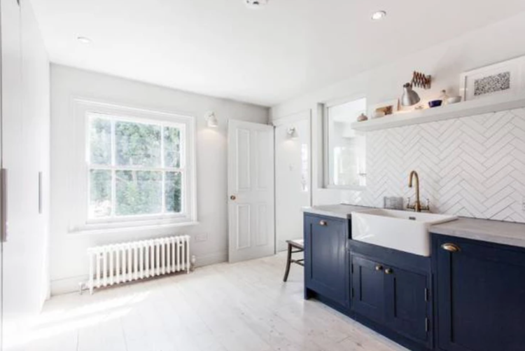
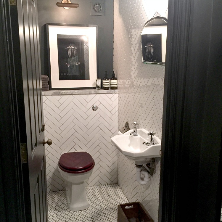
As some of you may be aware, last week I went to the George Northwood salon for an insanely expensive haircut to get over my raging midlife crisis. Well the haircut was lovely and clearly I am now ruined for anywhere else but, more to the point, what a gorgeous salon. I instagrammed a picture of the loo (you can see it below) and the designer, Sarah Ellison of Frank & Faber popped up and invited me to have a look around the rest of her projects.
Some of these projects were created with her former business partner Camilla Leech, who now runs Element, and they are marked as such – Trunk Creative – which was their joint enterprise. Anyway, back to Sarah.

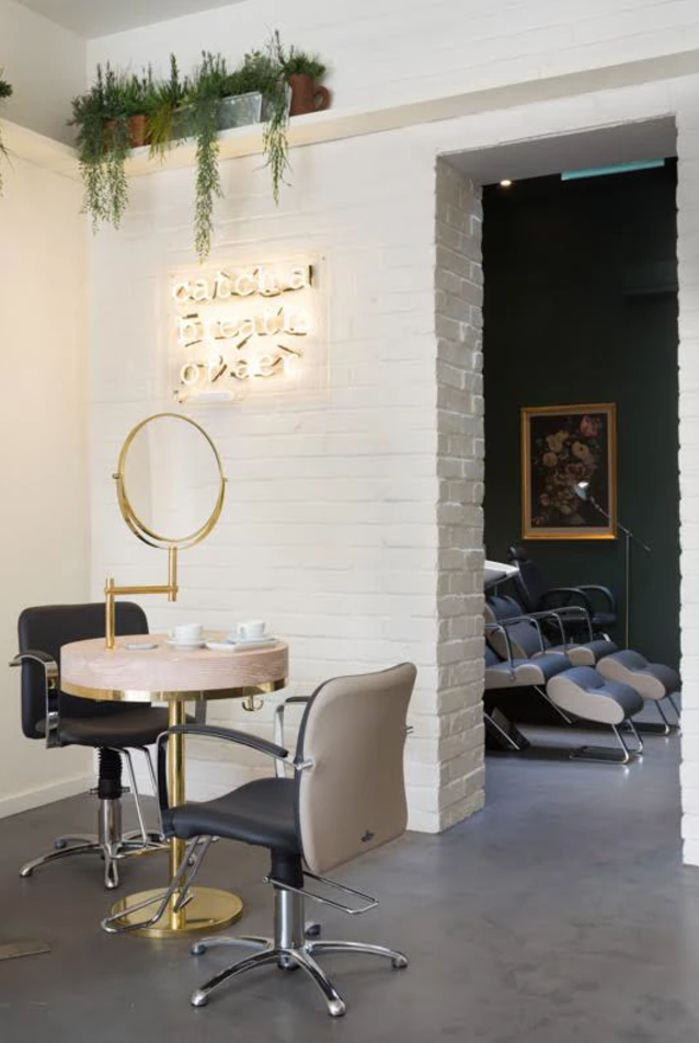
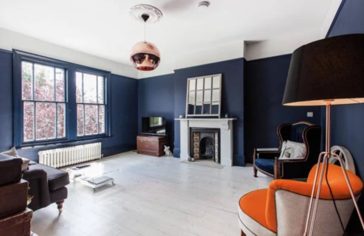
We had a long chat and one thing that she was keen to emphasise is that interior design is not all about massive budgets. She’s very good at small spaces ( and big ones obvs) and using clever tips to make it look more expensive than it was. When it comes to her commercial projects, a couple of which I have shown here because there are ideas which are easily transferrable to houses too, clients have often poured all their money into the business home to help grow that and done their actual home on a shoestring. “It’s about focusing on a few key pieces and being cost effective with the rest,” she says.
Interior design is one of those things that still feels like an incredible luxury. For most of us it remains something that other people do. People with huge amounts of money and no time or inclination to do it themselves. And I say that even though I help people with their homes too although I’m mainly about layout and sourcing rather than huge projects.
Chatting to Sarah, whose own home is featured here, and she is a woman after my own heart: “You can buy one expensive thing and then the rest can be cheaper. It’s like having an amazing pair of shoes and the rest of the outfit is from Topshop.
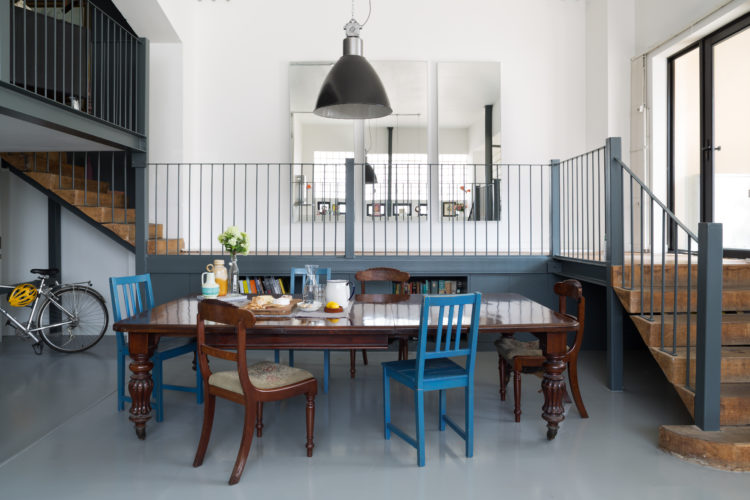
“My pendant light was expensive because you can see if from everywhere and it’s a focal point. But the rest of my furniture is either hand me downs, my mum’s or reclaimed.” She points out the doors behind the pendant lamp – £150 from ebay and they look perfect.
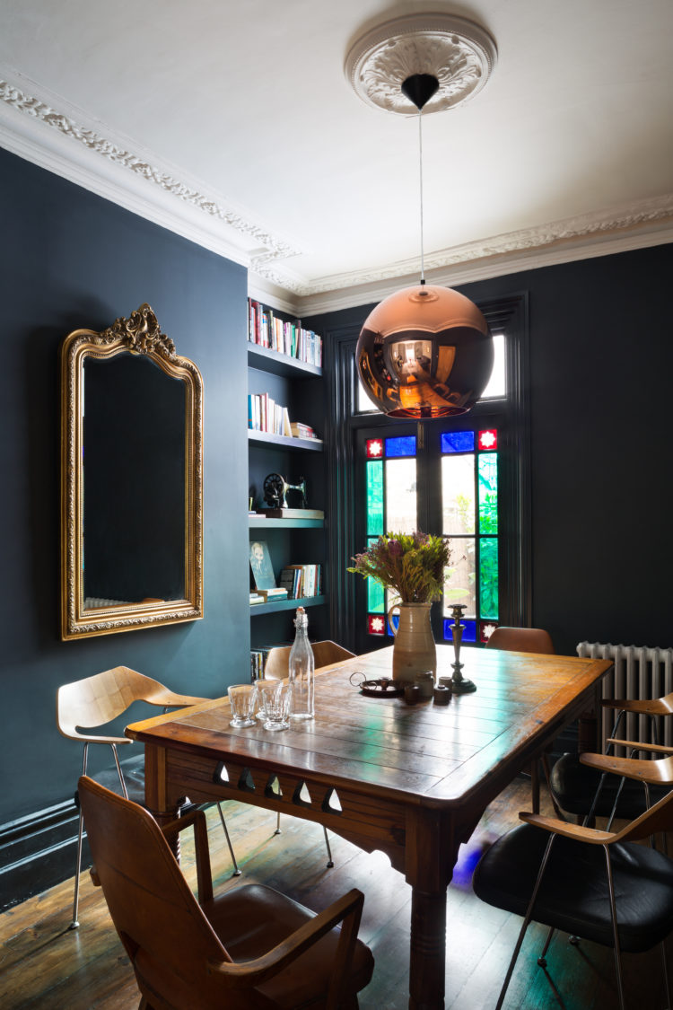
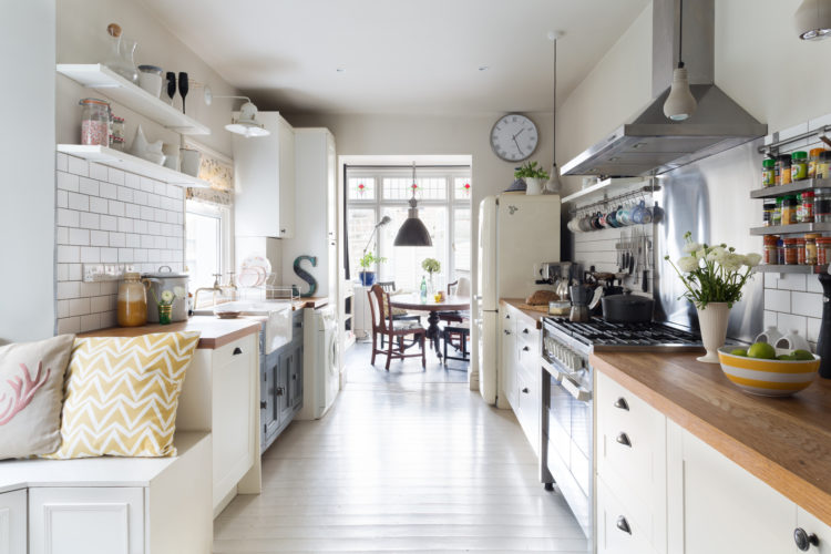
Sarah’s other tips include – yes it’s the touch points again. So it’s chairs and light switches and all the things that you interact with. But she will often source IKEA carcasses for her kitchens and then dress them up with new doors and worktops – much as we have done here at The Mad House.
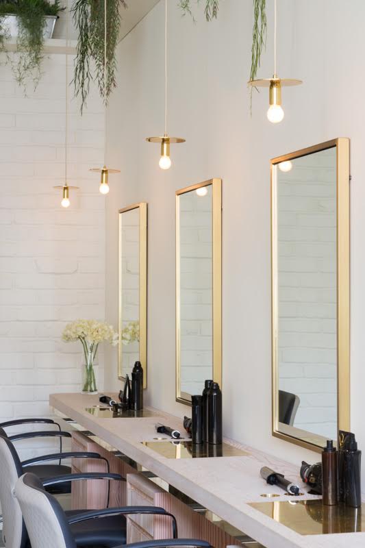
When it came to the loo at George Northwood, the tiles were dirt cheap – around £19 a metre – but they were laid in an interesting pattern to make them look more expensive. The shelves at Aer are made from Douglas Fir with brass inlaid – rather than whole shelves of brass.
Like me, Sarah is a fan of dark paint – Railings is her current favourite but sadly the pink was specially mixed so I can’t help you with that.
In addition, vintage or old stuff. Crucial to every project. It brings in your personality and a bit of character. “Even if you have to buy the old stuff rather than fetching it down from the attic we will always source something old.”
Indeed when Sarah starts a project she always has a look at the old things that are lying around and makes sure clients bring them out for the finished result.
So there you have today’s 10 Beautiful Rooms. I hope you like them and have found some inspiration for your own spaces.
photographs by Paul Craig


Hey Kate,
Great post and awesome interiors! I also love vintage and old stuff! I think old things have a soul and I like to listen to it… I know it may sound a bit weird hehe
Thanks for the inspiration!
Funny thing about hairdressing salon bathrooms – you should go into Daniel Hersheson to use the loo too, it is really lovely.
Even if the tiles are cheap they look really good. I really also like the bath-tub in that first photo.
What a lovely inspiring piece, when you have a small budget vintage finds for the home can be such a great alternative, plus they had lots of character and charm.
Yes, picture of the hair, please!
Hi Kate,
I completely agree with this philosophy of recycling something old in all my projects. It’s always interesting to take a tour of one’s own home with new eyes and try to really see familiar objects that can be repurposed or placed elsewhere for more impact. And many times using inexpensive materials in imaginative ways can add style on a shoestring budget. I like to use square 15×15 white tiles set in the way more traditional subway tiles are placed. (Kind of getting tired of seeing the same metro tiles in every kitchen in the Western hemisphere….) Using honed white/grey granite instead of marble is another way of achieving style without the price tag or maintenance. Love the loo!
Monica
What pattern do you mean for the tile layout, please?
I have loved subway tiles for thirty years, especially with marble work surfaces and promised myself I’d use them one day. Like you, however, I am getting pretty tired of seeing them, so I need a plan B for my two bathrooms and my kitchen, too.
Any and all suggestions, gratefully received!
But, what about your hair, Kate?!
Hi Denise,
Traditional subway tile layout is called offset, running bond, or brick, the layout you have seen for thirty years. I too, love these tiles and have used them in my kitchen and main bathroom but now use square white tiles in all my recent projects. They look more modern and I always use light or medium grey grout. I even tried a larger 20×20 size with dark grey grout but found it was a tad too graphic–depends on the look you are going for. Whichever the size tile, greenery and natural baskets warm it all up, right Kate?