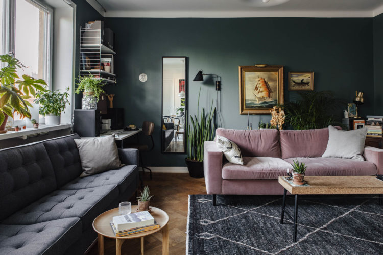
Starting off this week’s edition of 10 Beautiful Rooms with some deep, dark colour. This sitting room could be either dark green or dark grey – I imagine it changes with the light and also reacts to the camera. This makes it a strong contender for Farrow & Ball’s Down Pipe which, in some lights, has a definite greenish tinge. And you can see that, either way, it’s great with pink and plants.
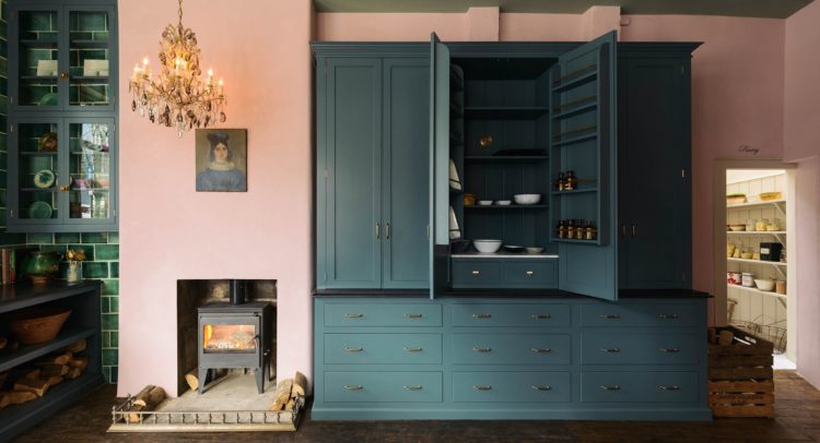
Sticking with pink and green, a combination which has been seen a lot in magazines but which, I think, has yet to take off in the real world of real people, is this Devol kitchen in their Clerkenwell showroom. I have been to see it and can attest to its gorgeousness. Would I paint my kitchen pink? The jury’s out on that one. I wish I would, but I think I would be more likely to put this combination in a sitting room, as we have just seen, or a bedroom. Coco Chanel’s bathroom was painted this colour as she felt it was the most flattering to her skin.
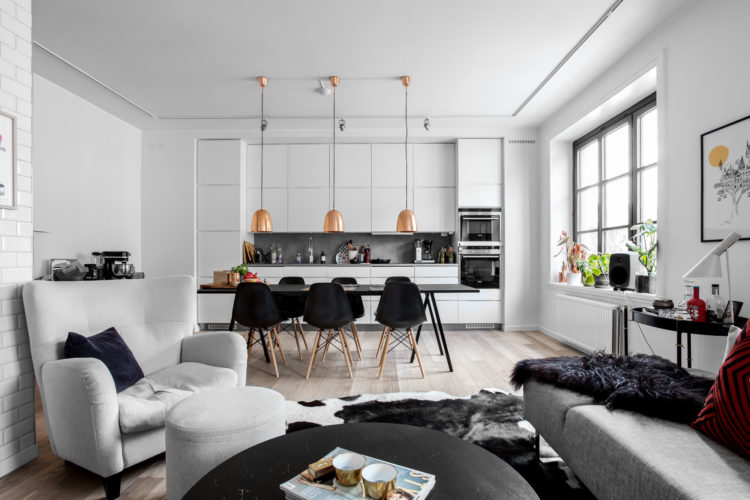
Sticking with kitchens but moving to a pair with a more classic, shall we say restrained, colour palette. And the question is – does this make you feel that navy/black and white is dull and safe and make you more likely to choose a vibrant colour like pink? Or not?
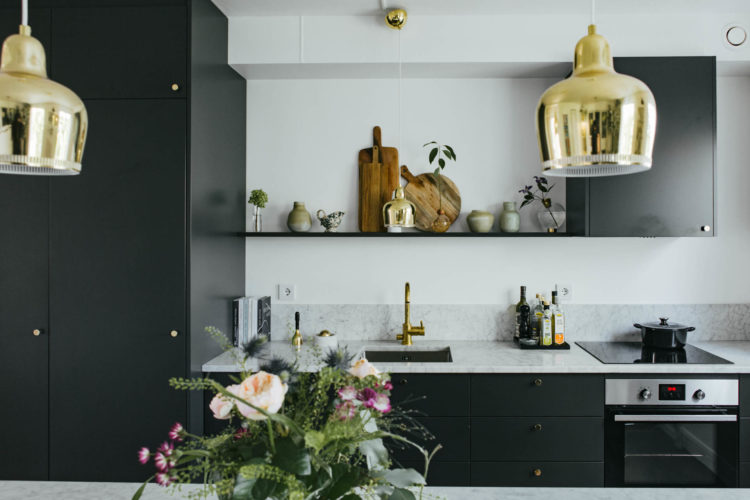
I can tell you that the Mad Kitchen is getting a little revamp this year and it won’t be green or navy or black. And that’s all I’m going to say about THAT. At this stage anyway. I do love both of these though and they are classic colours which you will not tire of so they’re safe in that regard.
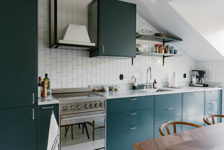
Mind you, we are definitely heading away from the dominance of the safe, white kitchen. Although if that is yours and you aren’t about to change it completely then you can always add interesting handles or tiles (note the vertical subway ones below) to personalise it a little more.
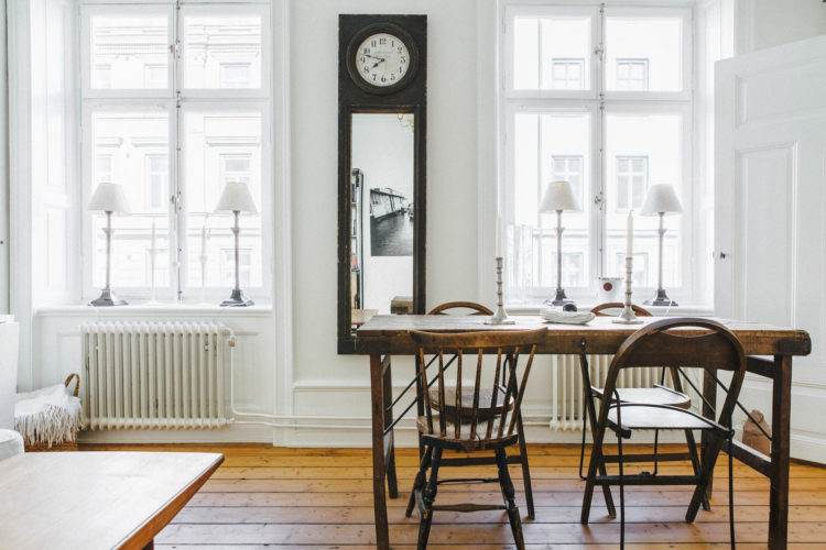
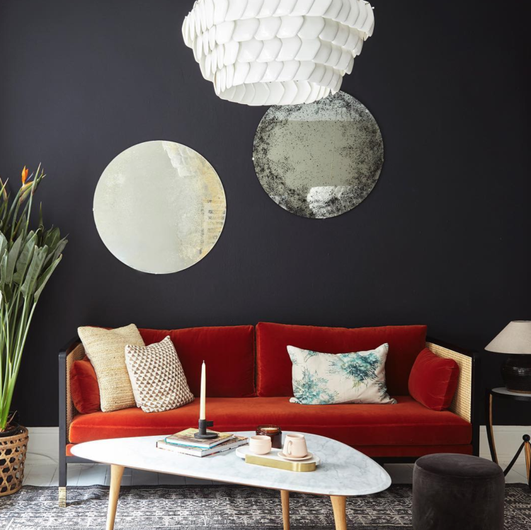
Now for a pair of pale rooms. As much as I love a dark and dramatic colour, there is something about an all white scheme which is still very beautiful and restful. This adds interest with the punches of black throughout, which stop it feeling dull. The metallic lamps over the table do the same job. See also the velvet red cushion in the foreground. You could add any third colour to the basic palette of black, white and gold to ring the changes. And if black and white is too harsh for you then go for charcoal and ivory. Still dramatic but a little softer.
Another white room but this time, instead of black, the owners have opted for an antique, or at least vintage, dark wooden table. This has the same effect as black and also adds character. I subscribe to very few rules when it comes to interior design, but you will all be familiar with my mantra: Something new, something old, something black and something gold (by which I mean metallic). If you do nothing else you can do that and it will improve any room.
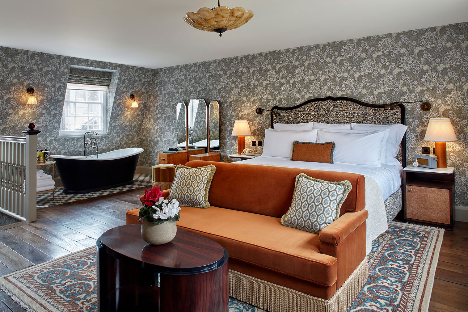
Now, moving away from monochrome, to this fabulous room at the newly revamped Kettner’s Restaurant, part of the Soho House group. I adore this room. First – wallpaper. I spoke about that last week. Pattern is back and you’ve got to use it like you meant it. That means all four walls.
Let’s just pause for a minute to discuss the feature wall. Yes, basically the feature wall in the old sense is now out of fashion. It will come back, but for the moment we’re over it. Having said that, if you have a room, perhaps in an attic, with an odd shape, or a slope at one end, then you can pull it off as you are – literally – making a feature out of that wall. That works. You could, at a pinch, have got away with that in the room below as a) the wall slopes and b) it could have acted as a way of zoning the bath area. But it looks better on all four. And, crucially, it looks like you meant it. Papering a random wall behind the sofa runs the risk of looking like you didn’t quite have the courage of your decorating convictions. Or that you couldn’t afford more. Choose it, use it, own it.
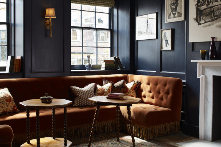
Otherwise, stick with paint and you can see the same burnt orange coloured sofa (another colour that’s going to creep up on us this year) with the dramatic navy blue walls looks fabulous. This time the interest comes from the panelling which is appearing like a rash all over instagram at the moment and is probably coming to a wall near you sooner than you quite realise. I would love some. I might get some.
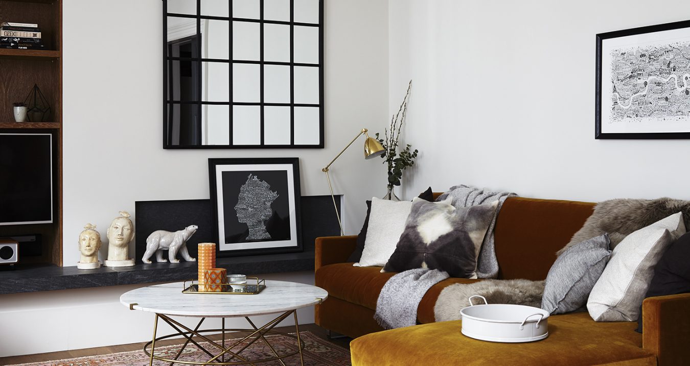
I was planning to move away from the orange at this point – this post seems to have divided itself into pairs – but then I saw this similarly toned sofa in a white room. This time with lots of black accents to add interest and this is an equally great room. I probably prefer the dark one but I love this one too. We’re back to the needing two houses thing again. A white one for the daytime and a dark one for the evenings.
And finally, the Houzz house. The interiors website, for which I am the agony aunt, has taken over a five-story townhouse in Greek Street, Soho and decorated it in this year’s top trends. It was created by the London design studio Run for The Hills (who also designed the room above) and I can’t wait to see it later today. It’s open until 31 January between 11am and 9pm and entry is free.


I have Cole and Son Prism on one wall in the living room as to have it all round would be bewildering in my small room but I am planning to wallpaper all the way round in the bedrooms. I’m looking forward to hearing your plans for the kitchen
Great article and awesome pictures.
Just painted the business end of the kitchen pink, it looks fabulous when the sun is going down in the west with matching clouds !
Oh I bet it does!
Looking forward to hearing more about the revamp on the mad kitchen. I am getting a new kitchen later this year and had decided on having F&B studio green for the cabinets, with marble worktops and brass accents. However I’m now seeing this combo pop up everywhere and I’m worried it’s too trendy! Would love to know your thoughts. Is a green kitchen going to look SO 2018 in 5 years’ time?
I had pink walls and a green sofa (dralon) in the 1980s – clearly years ahead of my time!
you so were!
Yes, but.. (Don’t you hate that phrase?). Wallpaper… Some fabulous designs out there but we can only have them if we wrap totally around? But what can be stunning as a feature can be horrendously overpowering looming at you from all directions. We could be joyously uplifted by pink elephants coming out of the waincoating around the fireplace but I wouldn’t want to be in the middle of a herd of them. Even if they did do wonderful things for my complexion.
yes a fair point. There are options – is that the right paper for the room? can you do half the wall – below the wainscotting – or above – divided by a dado rail. Or should you, in fact, have a feature wall after all because it’s your house and you know what you like!
First off, the pictures are awesome. And I like the dean street picture. Way the navy blue wall uplifts the orange sofa displays a rustic beauty to the room. All the rooms are flawlessly perfect. My favorite, the kettners room as it utilizes the space functionally with zero-wastage of the floor space. A good article, Kate. Looking forward to more from you in the next post 🙂
Thank you so much