As always a selection of images that have caught my eye this week and which then turn out to have a theme, so today we are looking at curtains and how they can be used differently, styled differently and serve different purposes. It’s not just about windows you know.
I have written about curtains a couple of times before (what to know about style, length etc and here – what about blinds and ready-mades) so today, when I saw these pictures, I thought it would be perfect to just have a look at different ways of using curtains and incorporating them into your room scheme.
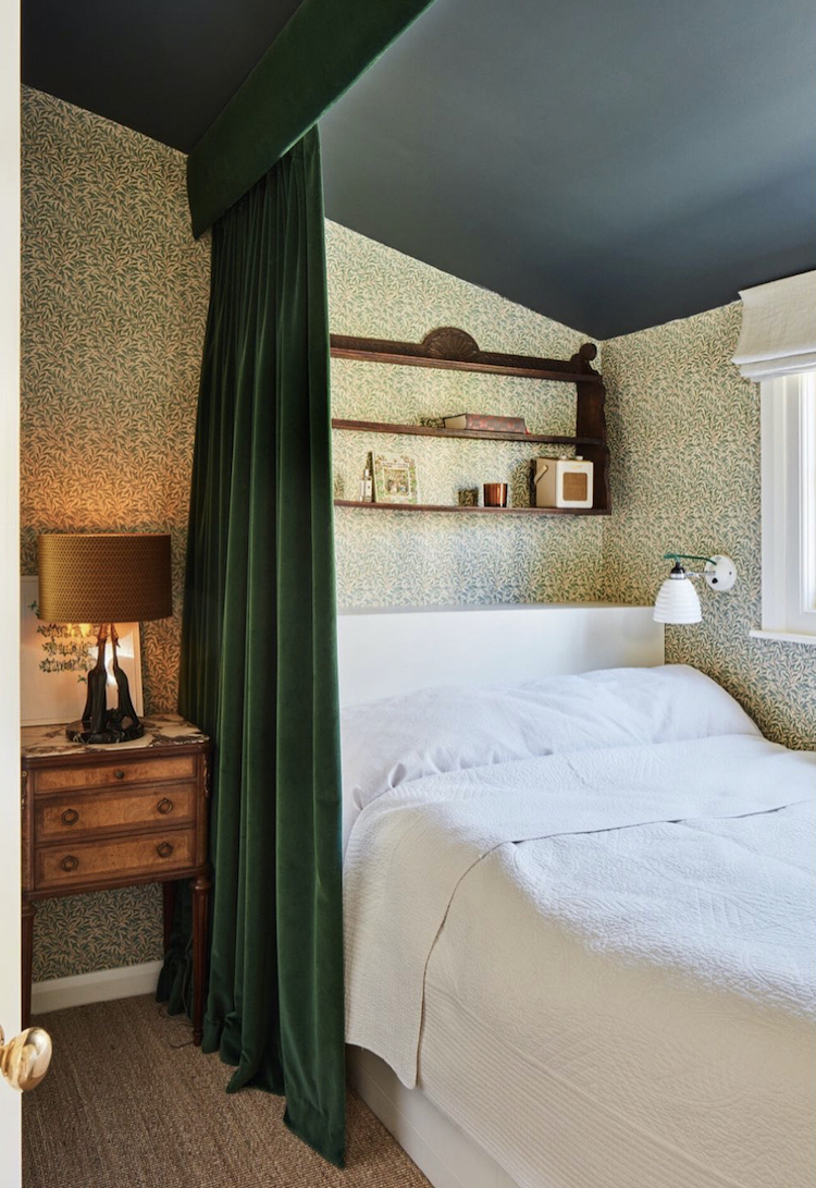
So above is this gorgeous little guest room by Laura Lakin Design and there are a couple of points to make here. First this is a great way to curtain off a bed if you have to work in your bedroom. Secondly, it’s an opportunity to bring in more colour, pattern and texture to a space, which is also a consideration for many, although note the plain blind which doesn’t fight with the bedside curtain. If you can put the bed somewhere else so it’s not in front of the window it might work better if you need to use this room during the day and still want to curtain off the bed.
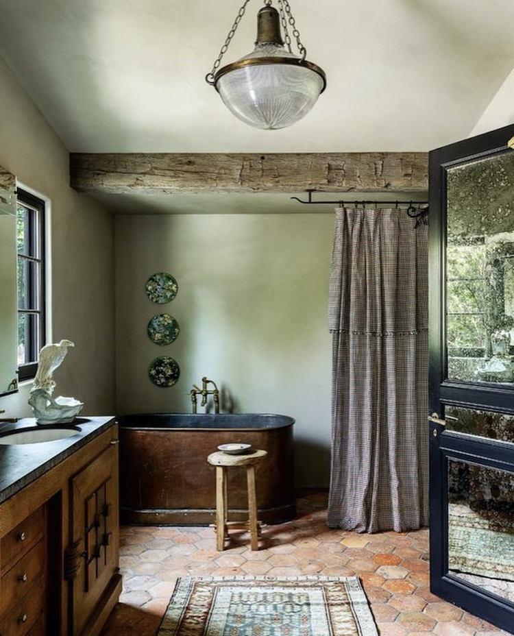
Above, the curtain has been used to screen off the bath in this bathroom (possibly, it also doubles up as a shower curtain as well) but the fabric brings another texture to this room with its rustic tiled floor and reclaimed vanity units.
Before we leave the curtain as screen idea though, it’s probably worth pointing out that for some of us, of a certain age, the curtain across a corner might feel like a studenty solution but it’s perfectly possible to do this with refinement as Laura demonstrates above. Spend a bit more money on the fitting (she has installed a pelmet to finish it off better) and it will look like a considered part of the design and not a temporary solution to hide a mess. It’s all (nearly always) about the detail.
It goes without saying that this will work in any room with multi-functions and nor does it have to be a huge room. Of course, a divider curtain will make a small space smaller but you have to make sure you choose a pattern/fabric that you adore and are happy to look at all day but you’d be doing that anyway right?
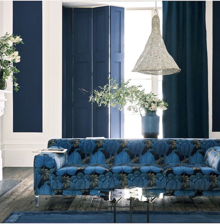
Next is this rather fabulous sofa (never, ever rule out the joy of a patterned sofa, it will hide stains and mess much better than a plain one ever will and, I think, may bring you more daily happiness) covered in Liberty fabric in front of wooden shutters painted in a Farrow & Ball archive colour from their recent collaboration. Of course, many/most of us don’t have shutters (and I’m not talking about those modern slatted café style things). But if you do, and the natural wood isn’t bringing you delight, then pick an amazing colour and paint them and, while you’re at it, why not match them to the sofa?
However, if you look more closely you can see to the left of the image that a matching blue panel has been painted on the wall at either end, and there is a matching blue plain curtain that pulls across the shutters which will soften a room full of hard surfaces, as well as draught-proofing, adding warmth and probably helping the acoustics as well.
And this is what I mean about a patterned sofa – so often we default to a patterned curtain and a plain sofa. Sometimes a simple inversion of the norm is so much more dramatic and stunning than you would think it could be. It’s a trick that is more than the sum of its parts.
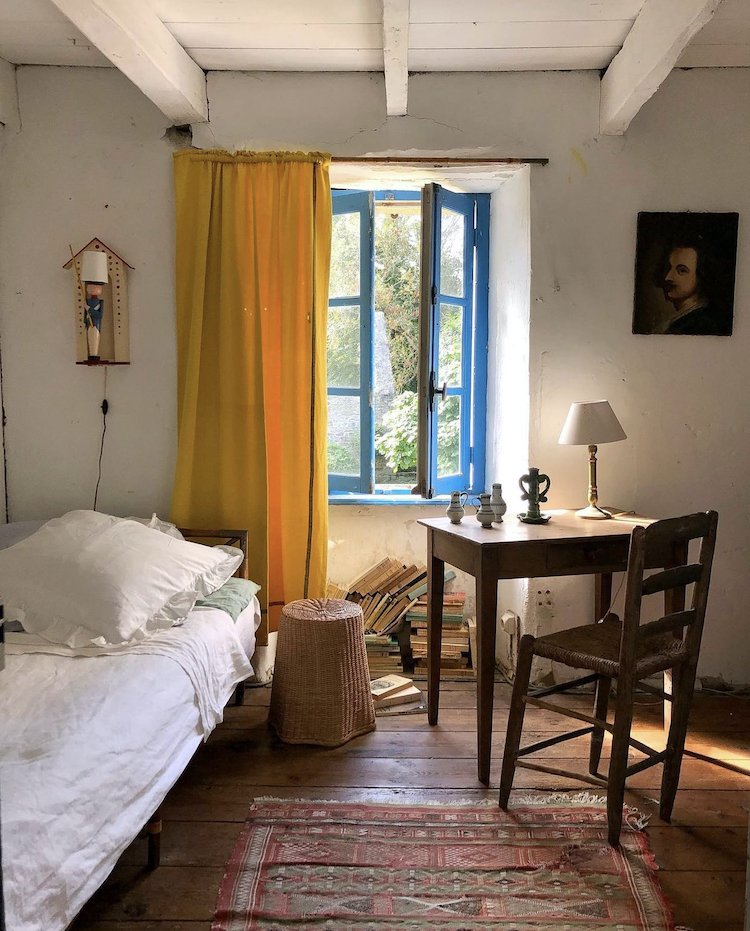
I have spoken before about the effect of yellow on a room and this pretty little room is really enhanced by the yellow curtain at the window and the blue frame. The point here is that the rest of the room is really quite neutral (within the context of an old beamed cottage) with white walls and bare floorboards. Yes, there’s a coloured rug and the pile of books also add to the decor, but the blue window and yellow curtain are not matching the rest of the room. They have been created together as a decorative feature as the owners have, perhaps, decided that that is the key feature of the room – the window and the view beyond it.
And on the basis of my top ten design beliefs – that every room should have one wow factor in it – in this case it’s the window. You could do this in any room and if you don’t want a curtain then just paint the window frame instead. Think of it as manmade sunshine.
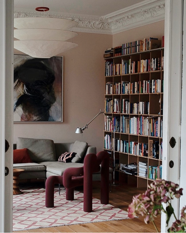
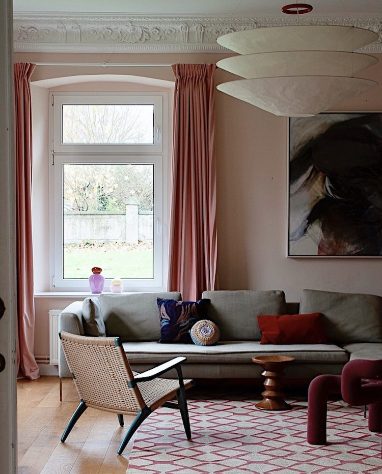
I’m showing you the next room in two halves. Again see how the books add to the decor in the image above. But then note the pale pink walls and how that fabulous burgundy chair ( I can’t for the life of me remember its name as I write, but the Moustache bold chair is similar) that brings it together along with the patterned rug and dark cushions. It’s worth pointing out that the sofa is grey and for those of you who may have bought a grey sofa a few years ago and feel it’s not justifiable to change it yet, do take note of how easily grey can be warmed up when teamed with other colours.
The curtains in the image below complete the look. Again they are plain and nothing spectacular in themselves, but they are darker than the walls and not as dark as the statement chair. I will always be a fan of tonal decorating as I think it’s relaxing and luxurious at the same time and this is a great example of how to make it work really well.
And for a final deconstruction of this space always remember to consider your shapes. Look at the lampshade and the small wooden side table, the diamonds of the rug and the weave of the rattan chair, the round vase on the window sill, the round cushion and the round top of the aforementioned side table. If you have “finished” a room and it still doesn’t feel quite right then take a look at the shapes – you can probably improve things dramatically by swapping things around or changing them a little for contrast and cohesion – both are needed.
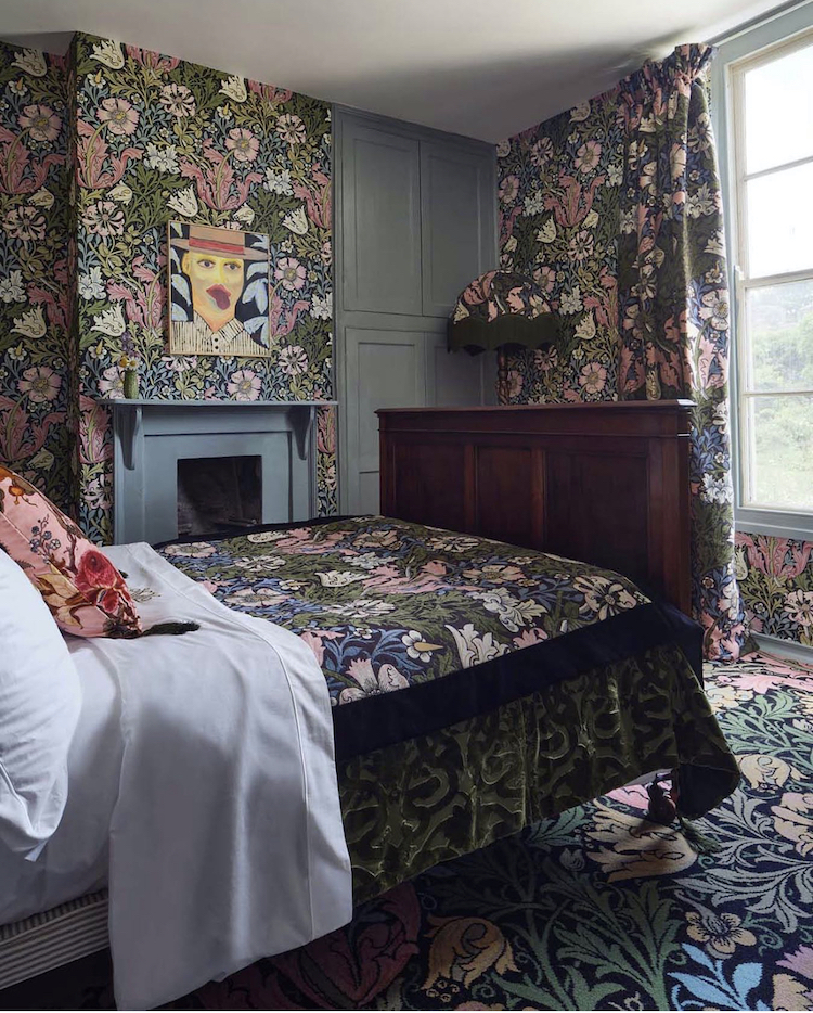
This next picture may prove controversial as we are going to address the so-called design crime of matchy-matchy. Now, much like the maligned feature wall, It ain’t what you do it’s the way that you do it and that’s what gets results (who sang that then – bet you only get half of the answer – comments below and apologies for the ear worm that all those who were alive in the 80s will now have for the rest of the day). Matchiness doesn’t work when it’s three cushions, or four sculptures and this is because it can look like you weren’t paying attention. It’s a bit “add to cart and checkout” vibe. Even three cushions the same colour but in different shapes will look like you meant it. And that’s why this extreme matchiness by House of Hackney works so well – and bear in mind I’m not asking you to like it or reproduce it necessarily – we are here for the analysis and the inspiration.
There is currently a fashion for wallpaper and matching curtains. Some of you will have done it first time round and hate it this time. For others it will feel new and exciting. Here the matching carpet has been added into the mix. I’m going to say that most of us won’t go to this extreme but, in the spirit of subverting the norm, I’m going to say imagine matching curtains and carpet and leaving the walls plain. Or papering the ceiling and matching the curtains. Or even matching the ceiling and the carpet and leaving the curtains and walls plain. It’s heavily dependent on finding a pattern you adore and can look at all day which brings us back to where we started.
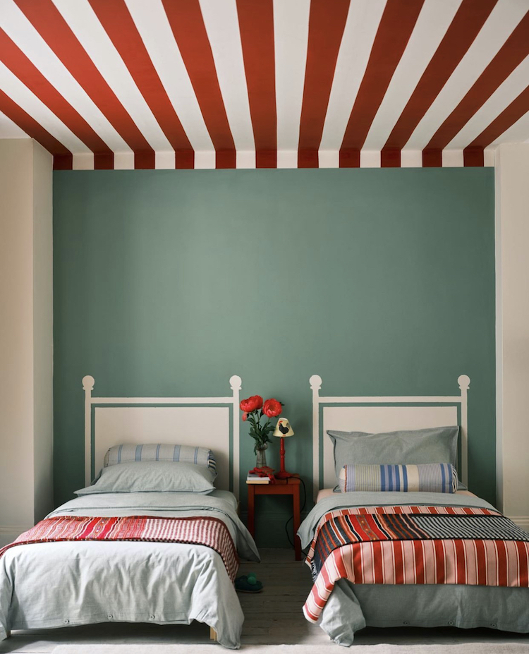
Although, in the spirit of a palette cleanser, I’m going to end with this. Not a curtain in sight but stripes will always slice through a maximalist pattern overload and this lovely bedroom is a very muted shade of green but the ceilings stripes are a wonderful note of flamboyance. Look closely and you will also see that the bedheads are painted too, which is a very cool way to amp up a divan bed without taking up extra space in a small room. Which is also where we came in. So on that note I shall be going out. I hope you have found some inspiration for your own places and spaces from this post. I certainly have.


The bright yellow curtains by atelier vime is just divine! Looks so chic in that rustic environment too.
Best/ Olivia
https://lovflowers.co.uk
I feel like the ‘unmatchy matchy’ pendulum is swinging too far. A little matchy is good. Cheers from Canada!
I’m hazarding a guess that the curtain in the bathroom in the second image is hiding the loo since the curtain can’t be pulled far enough over to screen the bathtub.
Fun Boy Three and Bananarama
Some great ideas and inspiration here as always.
It aint the meat it’s the motion. Maria Muldar.
The blue shutters shown. I have exactly the same design of shutters in our “modern” bedroom. They were supplied by Shuttercraft. tel 01992 829876 Anton Taylor fitted them perfectly.
I could stay in that pretty little guest room all day long, especially if there’s a view of some kind out the window. But I definitely see myself bonking my head on that wall sconce every time I moved, so would have place it a bit higher up on the wall.
Such a range of fantastic images thank you!
Fun Boy Three with Bananarama, thanks for the ear worm Kate, happy days!!!
…although Ella Fitzgerald might be a bit peeved; her original is also very good!
That second photo, the bathroom one, is a good lesson that we don’t need to use those horrible bathroom rods to hand a shower curtain. That I like! But… The lovely curtain itself seems to be made of regular fabric and is pooling down on the floor, however great looking it might be, I can see it also gathering water and mold in no time! Goodness me, my practical side kills any creativity!
And, in my experience, men and children are apparently blind to artfully arranged curtains and stand all over them!
I’m really confused about the bathroom curtain. What is its purpose? It doesn’t look as if it is possible to draw it around the bath, so it can’t be a shower curtain. Perhaps it hides an ugly boiler?
My best guess is that there is a separate wall-mounted shower (that perhaps isn’t that pretty) and it’s the curtain for that. And perhaps that the curtain is an outdoor fabric?
I think it’s from Kirsten Dunst’s LA home. So anything goes! I think she sourced the reflective door from Jackie O’s Manhattan apartment.
Yes, I just watched Kirsten Dunst’s AD home tour and that’s definitely her bathroom – condor soap holder and all. I loved her house!