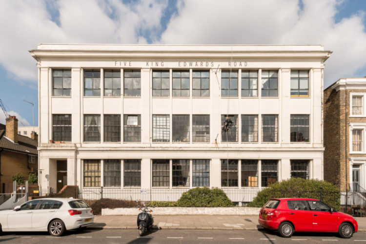
Last week was houses, this week two bedroom flats. The ideal first purchase – if you can get it. But even if you can’t, or you rent one, there are always ideas that you can borrow from other people and this converted warehouse in east London, which is on the market for $650,000 with The Modern House has a few.
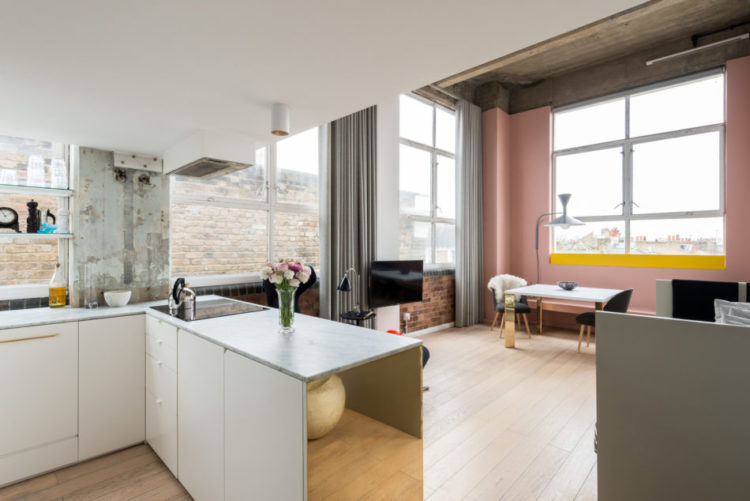
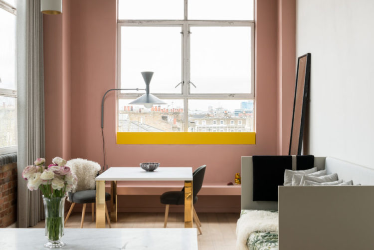
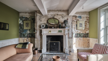
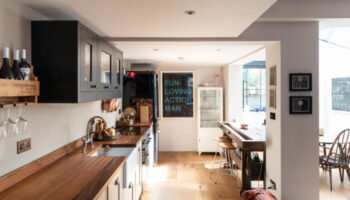
First up: that pink wall. So millennial. Or the new neutral of choice. But then, that yellow stripe is just fabulous. And I speak as someone who doesn’t really like yellow. I’ll make an exception for this combinatin though as it just really makes this room into something. So point one – think of adding a little unexpected touch. It will make a big difference.
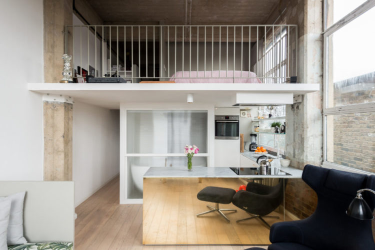
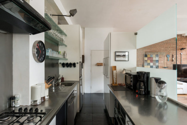
Next up, the mirrored cabinet. This will bounce the light around, make the cabinet disappear – which is great in an open plan space, make the room look larger and, also, is just cool. It’s a bit French cafe too. This is something you can do in any size kitchen and is one of those small details that will make a huge difference.
You can also use a piece of foxed mirror, or a metallic board as a plinth along the bottom of the cupboard if this is too much for you. That will reflect the floor and give the impression that the cupboard is floating. Which is back to that old trick of the more floor you see the bigger the space appears to be.
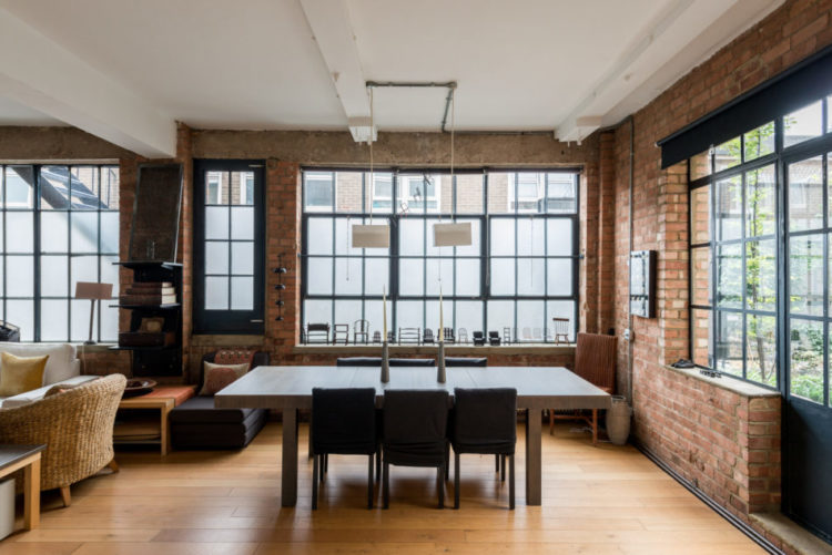
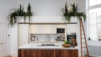
So talking of clever ideas for open plan spaces, this loft apartment in north west London (The Modern House £1,350,000) has put a piece of glass as a screen. The frosted part at the bottom hides the backs of all the gubbins on the worktop and provides a window to see though. I might have left the top clear too but it works as a way of dividing the space without putting up a wall.
Mind you if this was my view I mightn’t want to block it off at all. Or, I would have tried to have the screen mimic these wonderful warehouse windows. But you know I love an internal window.
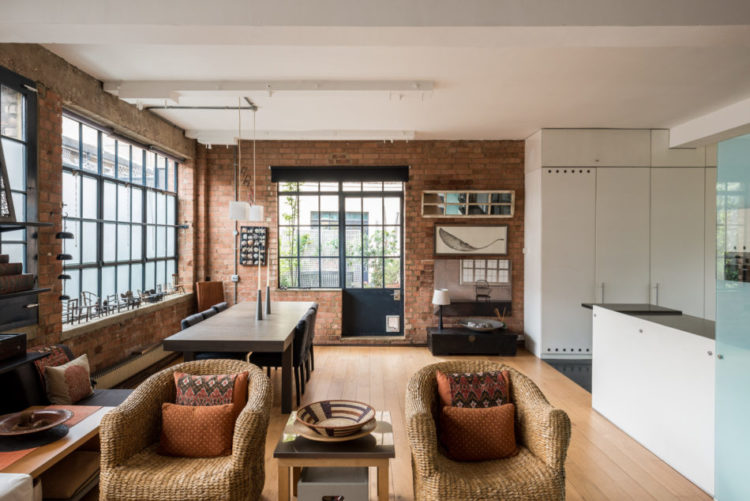
These rattan chairs also work perfectly in this space too although so would velvet. We had a garden table as the kitchen table for many years as we couldn’t afford an indoor one. Mind you, when the boys were small we did find an awful lot of food on the floor underneath as they used to post it through the gaps between the slats of wood.
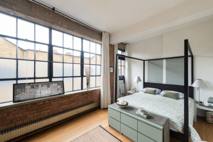
Finishing up with a shot of the bedroom – these are all original Crittall windows by the way. The conversion from factory to flats was done in the mid 1909s by Eva Jiricna, who did the Joseph stores and is also known for her pioneering use of glass. She has also worked with Richard Rogers overseeing many of the interiors in the Lloyds of London building too.
So there you have this week’s pick of the properties. Hopefully some ideas in there that you might like for your own homes be they flats or houses, large or small. There’s always something in there. Wishing you all lovely weekends. The holidays have finally started and I won’t need to get up at 6.40am for the next six weeks. Bliss.
Both great but the second one is the one for me — minus the weird glass partition between kitchen and dinning room/LR. I would have gone for the internal windows, like you say. Loved the terrace. I would, if by magic, make the access door to the terrace larger without loosing the Crittall-ness. Well done. Happy weekend!!
Yes the mirrored unit creates a strange shot for us to be viewing. It does make it appear that the end is open but eventually I worked it out. I don’t like the settee in the first flat it looks so uncomfy and too many cushions, did I just say that!!
I do like the second flat, it has so much more going for it, everywhere.
Could be right Panda about the unit end being mirrored thank you. Having looked at he Estate Agents site I saw where the loo was positioned…interesting ….especially when the light is on in the bathroom and a bloke is peeing behind the glass wall!!!
Lovely pictures. These are simply beautiful.
Oh lord, I could stare at The Modern House website all day. Must. Get. On. With. Some. Work. F
So what’s the explanation for the kitchen base unit being left without an end in flat 1? Storage is vital in a 2 bed flat. No cupboard shelf and no end to hide the contents…surely a ridiculous position to display an object? My first thought would be…Oh extra money needed for new kitchen units on top of the sale price. Thankfully they will take their, unattractive, uncomfortable looking furniture away with them. Poor show dear Kate!
I think the end is mirrored along with the side? So it looks like there isn’t an end but it’s reflecting what’s opposite… unless we’re talking about different things.
Agree that flat 1 is very light on storage though! It’s the kind of place that would be great until you actually moved in and realised you had nowhere to put all your stuff…
A lovely evening touch in the first flat was the pale pink bed linen just seen on the mezzanine level. Both lovely and liveable but I’d scrap the glass screen on no. 2 entirely.