Anita contacted MadAboutTheHouse to ask for help with choosing paint to co-ordinate with her wallpaper.
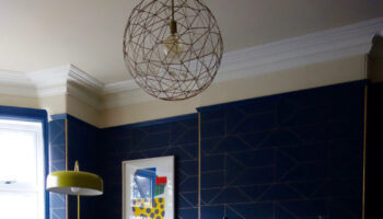
Q: We have chosen Harlequin Camille Delphine Collection pattern number 110125 for two of the walls in our two daughters’ playroom. I love the bright colours and the stripes but can’t decide how to paint the other two walls. I have bought samples in all four of the colours in the paper and can’t work out which is best for the gorgeous factor. The carpet will be a neutral beige but with lots of tones in so it’s more practical. Can you help?

A: That is indeed gorgeous paper, Anita. It’s not too “baby” so hopefully the girls will like it for many years to come as it can grow with them. First of all, have you thought about hanging it horizontally? It’s just a different look and, while I don’t know the shape of the room, it can be great if it’s at all long and thin and it will give the illusion of making it wider. It will also look great with shelves along it – sort of helps the eye somehow.

So, the colour. Well I think it has to be grey. For several reasons which I shall explain below and also because you can then perhaps have a little more fun with the floor.
Grey is the most modern of the neutrals. That old chestnut Magnolia really does look rather dated now and is, in fact, quite yellowy in colour so it doesn’t actually go with as much as we all thought it did. Grey looks new and fresh and goes with all the other colours, including different shades of itself, really well.
Secondly, if you use the other colours – the pinks or the green, you run the risk that the playroom is going to look like the set of CBeebies and, while this may be the girls’ ideal scenario, their tastes will change and you don’t want to be redecorating in a year’s time.
The other, I think, quite key factor, is that this is the playroom. Which means that this is where you intend to store all the plastic tat so the other rooms in the house will be an oasis of zen-like minimalism and good taste (yes?). Which means that this room is going to be a riotous clash of colour ALL THE TIME. Now that wallpaper, which is gorgeous and will co-ordinate fabulously with Barbie’s van (don’t fight it, they’re girls it’s hard-wired – I have boys, my house is full of grey Lego, I know – brilliantly on trend) is also, shall we say, quite vibrant, and if you paint the other two walls in the pink and the green and then hurl in a mountain of yellow, pink and blue plastic, you are literally going to feel ill every time you go in there to tidy up.
Of course, I am going to advise you to spend some money on good storage to avoid this problem. The Billy shelves from Ikea can have plain or wicker baskets slotted in and you can attach labels making it easy to hurl all the dolls in one and all the trucks in another when it’s bedtime. They come in white and, if the room is tidy then the wallpaper will stand out beautifully. If, on the other hand, and I cast no aspersions here, the room is slightly less tidy than that, you need to keep the rest of the colours to a slight minimum.


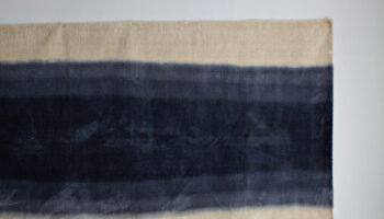
A final word on the floor. People often make really bold choices with their walls and then slightly wimp out when it comes to the floor. There is no doubt that a multi-toned beige is practical choice and will go with the rest of the room but it might look a little bit like you lost your bottle when it came to finishing off the room. If you do go for grey walls with that wallpaper, the most obvious (and modern) suggestion is a neutral grey carpet. If you are careful and choose a charcoal shade, it won’t look like an office. I might be tempted to go for the bright bright pink – it won’t show when your best lipstick has been smeared all over it – but I can see that might be a bit scary. I don’t know what’s under the carpet but if it’s boards, which are the most practical solution, then how about buying a bit of carpet and binding the edges in a contrasting colour to make a giant rug? Regular readers will know I did this trick in my spareroom when the shop had run out of the only grey carpet I wanted.

Briefly – buy a large piece and have the edges bound in a contrasting colour. Mine is charcoal and pink, you could have pink with the green or the same as mine. It was a nylon carpet, so it won’t cost the earth to replace when it’s ruined, and we just painted the floorboards round the edge of the room.
I hope these are ideas are helpful. Let me know what you decide to do and send us a picture when it’s finished.


i have recently bought Arthouse Vintage Twilight Green wallpaper for the main wall in my living room. Problem is , what colour paint do i use for the three remaining walls? Don’t want to use the green of the flower and the dark silver background is quite dark. Help
Hello, Angela, that wallpaper is stunning. I see what you mean about not wanting to use the green again or it would be too much. But you could go with a very very pale green, almost white with a hint of? Or a very pale grey to echo the silver? Or, this might be more bedroom than living room, versions of pink depending on the rest of the furniture – to make a contrast with that wall. I would probably go neutral – chalky white, palest grey of a whisper of green…. Let me know what you decide.
Firstly Kate may I say thank you for your advice and amusingly stopping us creating a set of CBeebies which is exactly what we were about to do with our first choice of pink! Amusingly my husband suggested grey but hey what does he know… I do agree with you on the flooring and we will now be looking to do it right and go grey so that’s a great additional tip. The biggest difficulty with doing any room in our house is the love for wallpaper that I have. There are so many fabulous designs unfortunately I seem to always manage to pick the expensive ones. Once again thank you and if you are ever looking for someone to conduct a ‘research trip’ to the great design houses in Paris behind St Germain then happy to be of service.