In this week’s episode of the podcast Sophie and I report back on London Design Festival and what we found there. This event gets bigger every year and more and more venues now take part. Set up in 2003, over a million people from 75 countries now visit the capital to see both new products at the trade shows and visit the installations of which there are an increasing number (and increasingly ambitious) every year. This year, for example, the V&A museum had nearly 170,000 visitors through its doors during the week long event of which 22 per cent said they had never visited it before and had come purely because of LDF.
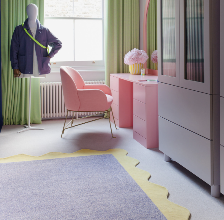
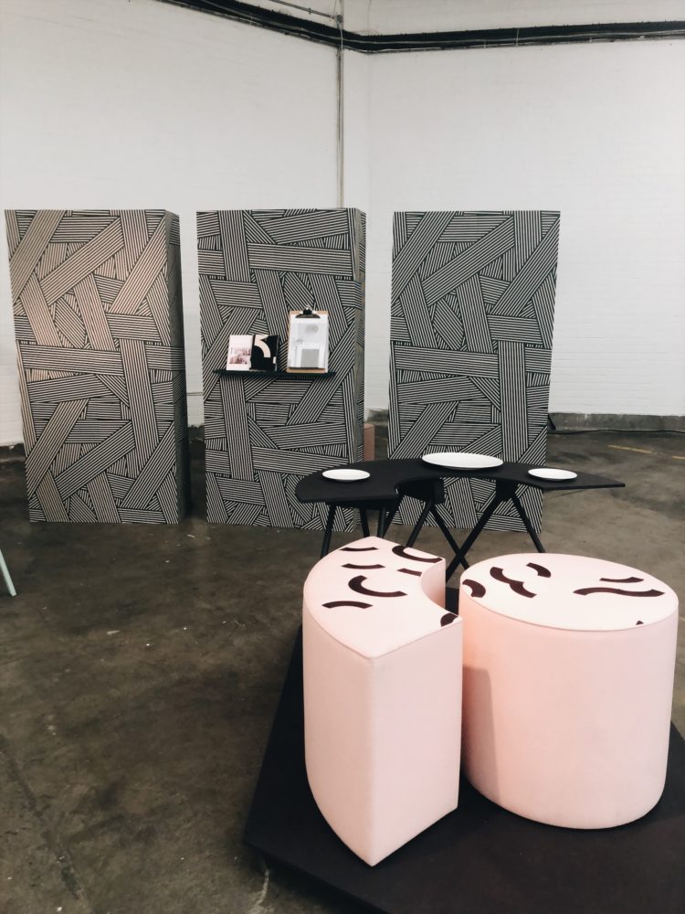
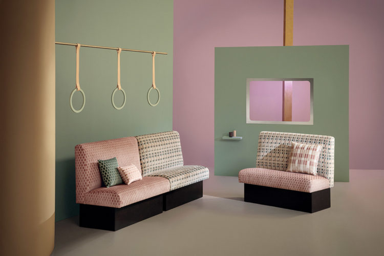
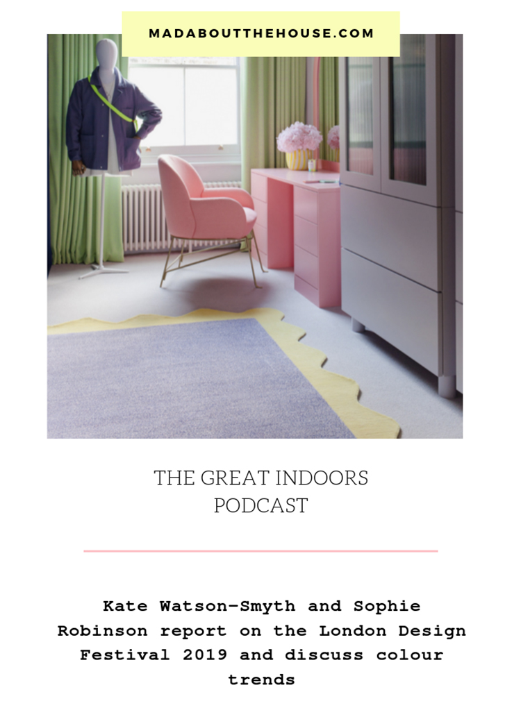
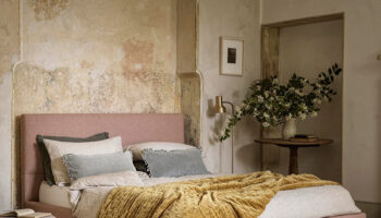
Now all that is well and good for trade in the capital, but what we want to know is what is the new stuff? What are we going to see and buy over the next few months? Well it’s the usual story of much has changed but much is the same. I went to East London where the story was all about curves and art deco influences and lots of pink and green. The difference being that it was the combination of the two this time rather than one and then the other.
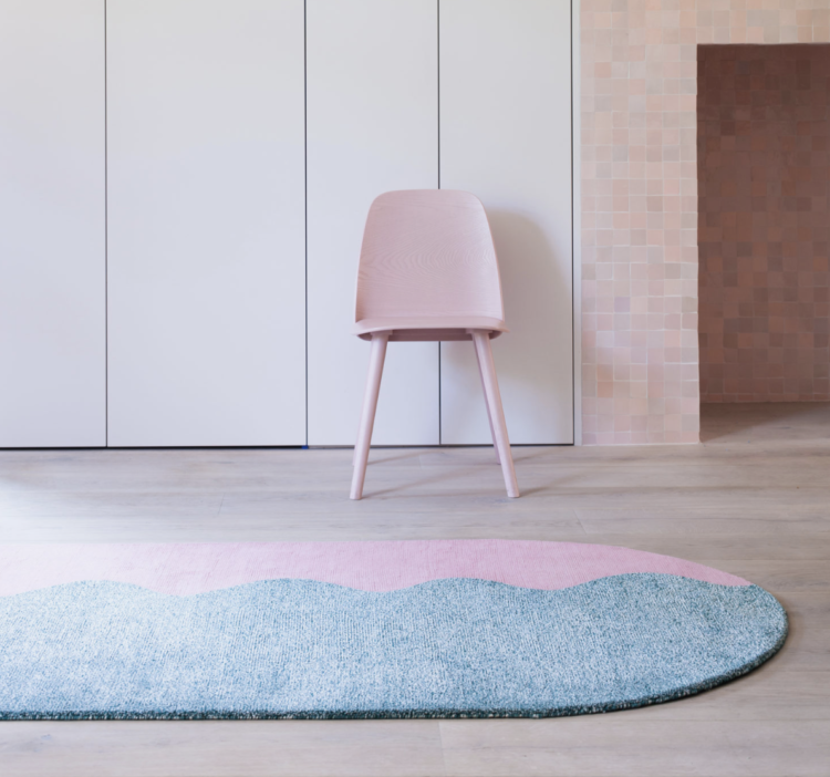
The curves were shown in scalloped edges (see the Floor Story x 2lg rug collaboration above) as well as on furniture. I’m getting several press releases a day showing these curves on furniture and accessories at the moment so it’s now pretty hard to avoid if you don’t like it. Well it’s not that hard, you don’t have to buy it but be aware that like the mustard/saffron/turmeric or shades of biscuit of seasons past it’s all anyone seems to be stocking at the moment.
The other big, and more important, story was sustainability. There was much less plastic on show, lots more wood and more products made from waste. At the London Design Fair, where I was, there was flooring made from corn husks and in West London, where Sophie visited 100% Design, she saw a number of designers working with unusual products.
One was making furniture out of a leathery resin type material which turned out to be blood. Yes it was. Sixty billion animals are slaughtered every year and 1bn of them in the UK. Blood is a waste product that is discarded and one designer is trying to find a use for it.
Less controversial Benjamin Stanton, came across a vast stash of discarded denim jeans legs that someone had cut off to make, and sell, shorts for Glastonbury. He decided to repurposed them into furniture.
This kind of work is pioneering and, in most cases, too expensive for many of us to buy – particularly as it comes in limited editions – but just as haute couture is only for the very few to wear but its influence trickles down to the high street, so designers like this will do the same thing. Conversations will start, products will made and, one hopes, eventually there will be a proper mass-produced use for waste.
One other example; a few months ago I went to the relaunch of the Cowshed for Soho House beauty products. They have recently changed their packaging to one made from recycled coffee cups and now all their bottles, and the labels on them, are made from a by-product of the sugar cane industry that would otherwise be wasted. Yes, they have to bring it from Brazil, where it is produced on a carbon negative factory, but, as I have said before. It’s a Do Less Harm step on the way to doing No Harm. The company’s aim is to be plastic free. They are also using glass and aluminium where possible and selling products in larger bottles so you buy fewer and less frequently.
Back to LDF all these images are of new products and paints and fabrics that were launched at the show. You will see a preponderance of the colours and shapes I have spoken about and yes I have used these pictures to illustrate the words but that’s because these images informed the words. Above is a new paint range from Craig & Rose, which I’m not sure has launched yet but look out for their foresty dark green called Ottoline – pictured above.
Leaving the festival, Sophie and I also discussed the new colour of the year which I wrote about a few weeks ago as well as the tile of the year. If you are able to listen to the podcast you will hear interviews with Marianne Shillingford, the creative director of Dulux about how and why they chose Tranquil Dawn and well as, earlier in the show, Sophie chats to Barbara Chandler, columnist for The London Evening Standard and the doyenne of interiors journalism, about her role in finding and promoting young designers for LDF and how important it is that products are not only sustainable and solve problems but that they must also be beautiful or no-one will want to buy them. “Beauty is a function too,” she reminds us.
But Topps and Dulux are not the only ones getting in on the product of the year wagon. Graham & Brown chose the festival to announce both their wallpaper and their paint of the year. The wallpaper, Bloomsbury, was named in Neo Mint, which is a massive colour in fashion. In fact, as I was walking through the London Underground yesterday I noticed lots of adverts on a neo-mint background which is another sign that it’s a popular colour.
This wallpaper, which is a fairly traditional pattern, looks completely different with such a modern background though. And don’t worry, you can still buy it with a more traditional grey, black or emerald background.
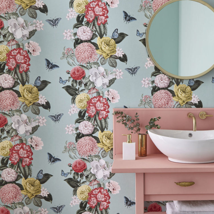
Here it is pictured with Adeline, their colour of the year. A dark green that works brilliant with both the neo-mint and blush pink of the wallpaper. In fact, if you want to sum up the current trends in one image I think this picture might be it: green – in all shades, big florals, pale pink, curves, natural materials (marble and wood) and velvet. This, readers is 2020.
As Marianne said: “Green is huge in politics and in life at the moment with all it stands for. It’s also right in the middle of the visual spectrum so it’s very easy to look at. It is, actually, a neutral colour and it works with everything whether it’s adding a plant to a room or painting a wall.”

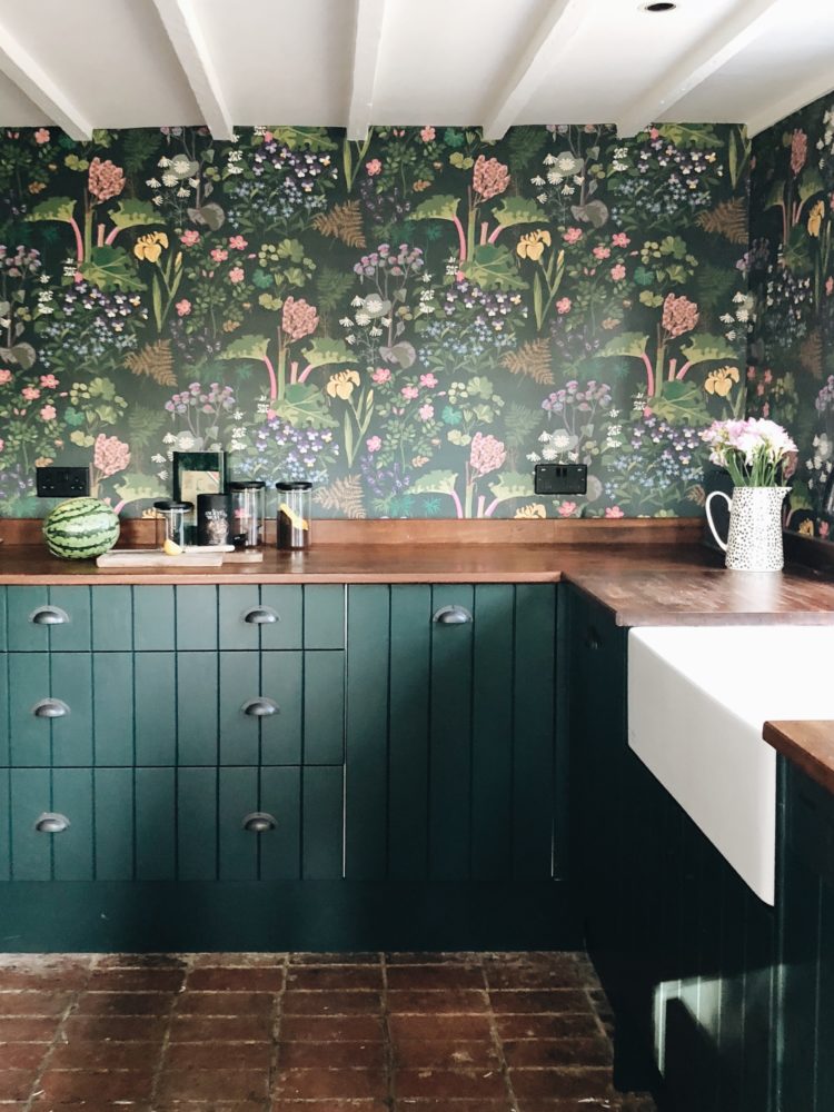
And to sum up a trend, here is Sophie’s pink and green kitchen and we talked about colourful kitchens to finish off. I wrote about that last week when I told you about Rita Konig’s paint collection so you can read about that at the link.
I hope you enjoy listening and that these extra links and images prove helpful. And if you don’t listen then these posts are designed to stand alone as well so you can still have the relevant news and subjects that I would be writing about anyway.
As a final word I would just like to say a massive thank you to our new sponsors John Lewis & Partners. This is the fifth series of the podcast and we are thrilled that such a stalwart of the British High Street has come on board and partnered with us to produce the show. They will be with us until Christmas and in the rest of the series we will be interviewing Michelle Ogundehin, presenter of Interior Design Masters and former editor of Elle Decoration and Rachel Khoo, tv chef and author as well as discussing new book releases – some great ones coming up, how fashion rules apply to interiors and much much more besides. I hope you will tune in.

Not sure that shipping stuff all the way from Brazil can really be called at all environmental, even if it is made in a ‘carbon negative’ factory (really?). Surely it would better for Soho House to use FSC endorsed paper labels made here, and the same sugar by-product bottles made here, too ? It saves on the half-way round the world transportation, and if it costs a tiny bit more to make them in, say, Birmingham rather than Brazil, well, I don’t think that Soho House members are especially price-sensitive anyway.
And while I love the colours in Sophie’s kitchen, the white of the carcasses showing behind the dark green at the edges of the doors and drawers would drive me bonkers. I’d be at it with a black Sharpie.
Delighted with that pink and green trend (is it a trend if it’s not completely new?). I’m studying Interior Design and had to come up with a ‘brand image’ and chose pink and green as background for my presentations. Good choice!