A visual tour of images that have caught my eye this week that might ease your start into Monday. First up this gorgeous green room in an apartment in Stockholm.
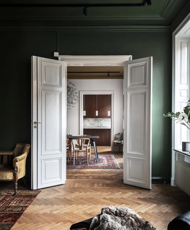
Now there are many things about this scene that you think might not translate to your own home but it’s as much about the red thread as the fact that it has fantastically high ceilings with double doors and parquet floors. So let’s deconstruct it a little and see if there is anything you can take away.
Firstly, the doors are white rather than as I often say – painted to match the woodwork. But look again how, when they are open, which may be much of the time, they draw the eye into the white room beyond. And they may also be green on the other side so they disappear when the doors are closed. So the first thing is that doors don’t have to be the same colour on both sides. If you want to imitate this then the rule is that the hinge is the same colour as the room it is facing when open – in this case white and the handle side should be green (which makes me suspect that these doors are white all over).
As I say, you may not have double doors but do always consider the view from one room to the next and how to really make it work as an inviting scene, a beautiful picture, a place you want to go to. Note also how the ceiling has been painted to match the walls. And, finally the red thread of the rugs. The kitchen at the far end is a similar colour palette to the Persian rug in the middle room which links to the one in the front.
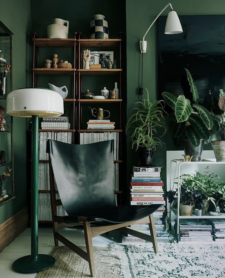
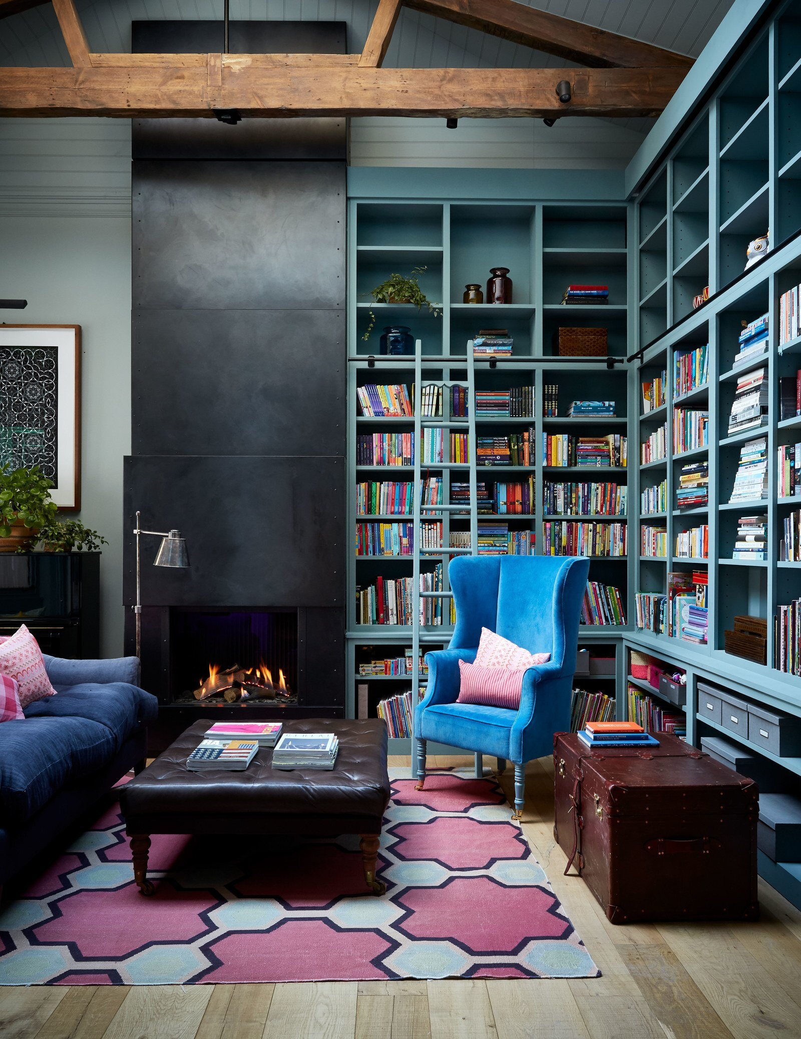
Above is just a gorgeously immersive green corner by the stylist Laura Fulmine. The plants bring life and the white touches of lamps, the magazines and the trolley lighten it all and make it look like a place you want to sit because there is so much to look at and explore from the books to the objects on the shelves. Even the floor lamp, which is quite low creates an intimate and cosy feel which draws you in.
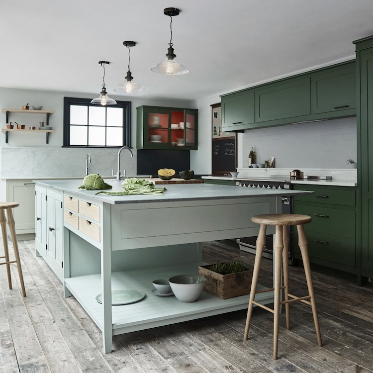
Now this is a new collaboration between Heals and Brookmans, a kitchen brand own by Smallbone of Devizes. This is the first time the store, which is known for championing British design (as well as all the classics) has sold kitchens and it’s an interesting departure. But what I wanted to flag was the contrasting colours.
I have said for many years that you don’t have to paint all your cabinets the same but for many of us, myself included, two contrasting colours is too dramatic and not relaxing. But if you go tonal the whole things is much easier on the eye. Here the mint green island sits in front of the darker green cabinets and you can recreate this with any colour combination you like from shades of grey and blue to, perhaps, a more traditional cupboard colour and then push it a little on the island so you could have sober dark green with a pink island for example. Or you could just paint the stools if you wanted to use a stronger colour in a smaller amount.
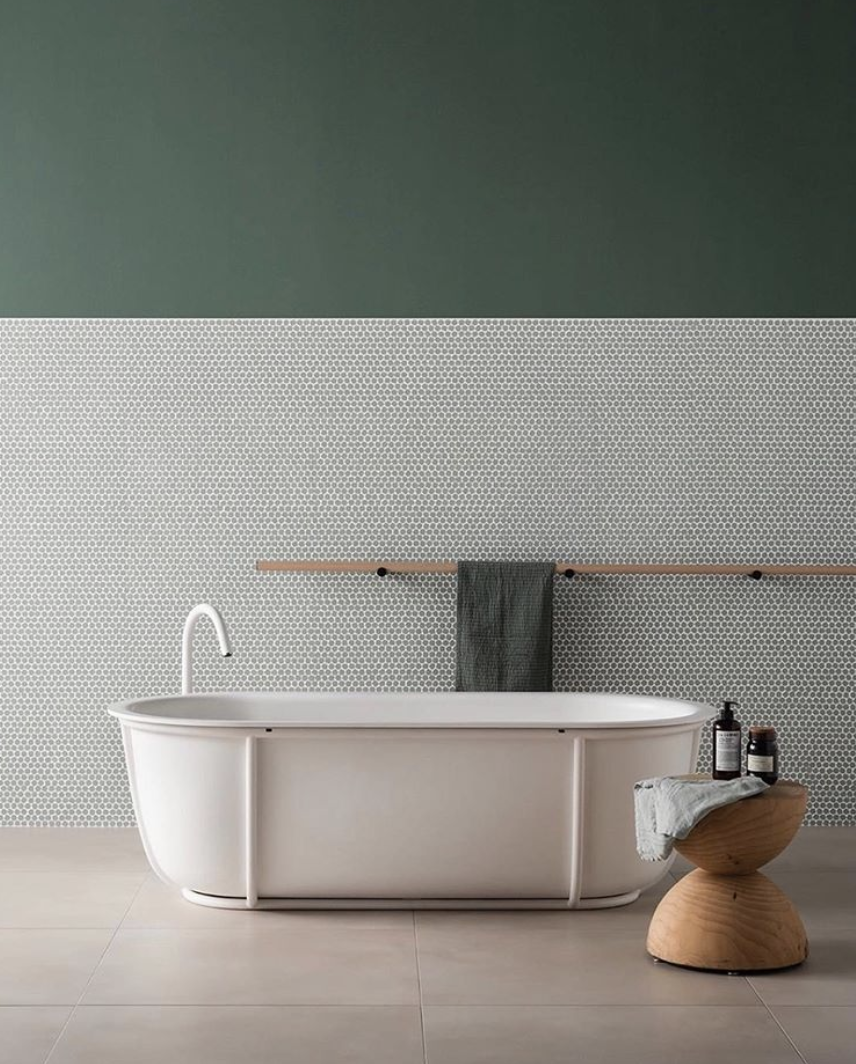
I have always loved the Agape bath by Patricia Urquiola so it’s always nice to have another excuse to look at her latest work but this is more about the styling. Joa Studholme, the colour curator at Farrow & Ball, says it’s easier to have the dark colour on the bottom and, if you are at all nervous about using more colour in your own home, then stick with that. Here, though, that has been reversed and I like it – the green towel brings the two areas together though so remember these pictures are never created haphazardly. It’s fine to take inspiration from professionally styled product shots – and we all do – but do bear in mind that nothing in there by chance and you need to remember that in your own home.
That is why copying a look off Pinterest won’t always work in your own space. Here you need to factor in that the simple wooden towel rail echoes the framing on the bath, the curved wooden stool does the same for its shape and the towel colour was carefully chosen. They didn’t just grab one out of the cupboard and fold it up. So if you are taking inspiration from photos you see that aren’t real homes (which I also feature – especially on Friday’s Househunter) do take into account all the elements of the picture.
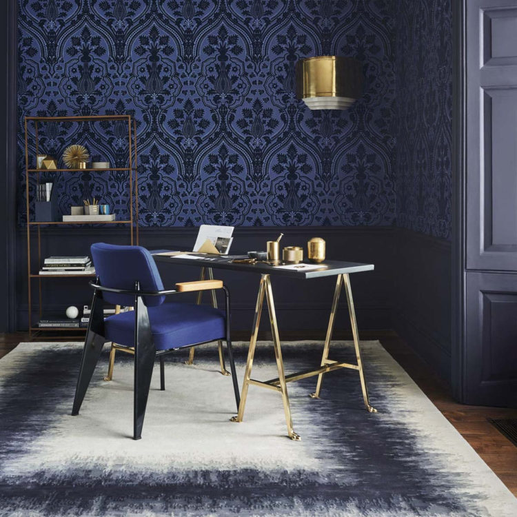
This is another example. This picture has been created to make you want that wallpaper. It might do that. It might also inspire you to want panelling with wallpaper on top in your own home. So here there are elements of brass to lighten the scene and draw the eye to the paper. The shapes of the furniture are very simple and linear to allow the flamboyant paper to shine and there is no pattern other than that on the walls.
Finally, this joyful blue and pink Notting Hill home where the colour palette is minimal but it all works joyously well. The blues don’t all match and the dark pouffe and wall pull out the dark outlines on the rug and stop it turning into a matching pastel fest. It might look like it all just came together perfectly but it has all been meticulously planned. You can do that yourself whether it’s by looking at inspirational pictures or making lists of what you want to achieve and why you like certain images. That’s the way to find your own style and work out how to make your home right for you and the people who live in it.
Can you tell me the brand and colour of the paint on the shelving? Thanks!
Beautiful! Thank you.
What a wonderfully informative post Kate, thanks so much. I love the way you show aspirational images and then analyse the techniques so we can employ them within our own homes.
I just have to ask, do people really buy and sit on such uncomfortable looking chairs in real life? The chair in the Laura Fulmine image is great to look at but I can’t imagine ever wanting to sit on for comfort. I tried out a lot of smaller armchairs in a shop recently, some without arms, and felt like a giant sitting on a child’s chair. Having so much of my body outside the body of the chair made me feel oddly exposed. But I suppose they wouldn’t keep making them if people weren’t buying them!