So here we are then. It’s certainly not the new normal yet is it, but it’s the new reality at least. I hope you are all staying well and indoors. Can I firstly say thank you all so much for your messages of support for my post last week. I will absolutely continue to write for you here. I am also, as some of you may have noted from last Friday’s piece, reading a story out loud on Instagram live at 5pm every day. It’s called Percy Jackson and the Lightning Thief and while the aim is to give parents a break from the kids, I realise that also it may give them a chance to watch the Prime Minister’s daily briefing without them interrupting and that they can then think about how to present the news to them later with a few minutes delay to think about it. Finally, as this seems to be message round up. I have included a clip from Broadcasting House on BBC Radio 4 yesterday where the podcast was mentioned which was a) a great thrill to us both and also allows me to tell you that Sophie and I will be continuing to produce the show by recording remotely, so if you are looking for new things to do/read/listen to and haven’t heard before then you will find every episode here. Worth noting too that every episode has a blog post to accompany it so if you check the date on the episode you are listening to and then search the archives by month or just put a key word into the search box you will find it with accompanying pictures.
Right then, onwards for today. And I enjoy a theme as much as the next person and have been trying to find one in recent weeks, but that has eluded me this time and I am simply presenting five images that caught my eye… with a very loose theme of a drop of pink now I look at them in more detail.
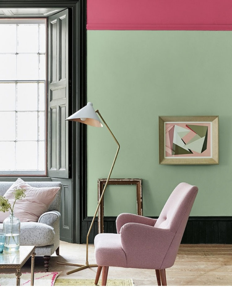
First up is that gorgeous pink band of colour around the top of that room. We can’t tell if it goes up over the ceiling but it would be great if it did. Or you could take the green over the ceiling and have a gorgeous pink band around the top of the room. Yes it’s bold but it lifts my spirits every time I look at it. And of course you don’t have to choose those colours if you don’t like them. You could knock it back with much softer pink or a deeper green. Usually when we say we don’t like a colour it’s because we aren’t looking at the right shade of it. I will often say I don’t like yellow but actually the slightly muddy ochre and old gold tones I love. It’s just the primrose and daffodil versions that aren’t right for me – unless they’re growing in the garden.
This is another great way to create some impact as shown here by Bianca Hall. This, and the image below – no pink (well just a glimpse) but a clever way to use leftover paint and I’m sure we’ve all got some of that. If you find a gallery wall too random for your tastes or you have an odd collection of pictures that don’t really work together, but you have a bit of wall that needs filling then think about painting a grid to bring them together that way. Or, as Bianca has done, you can make a set of carefully hung pictures have even more impact by framing them this way.
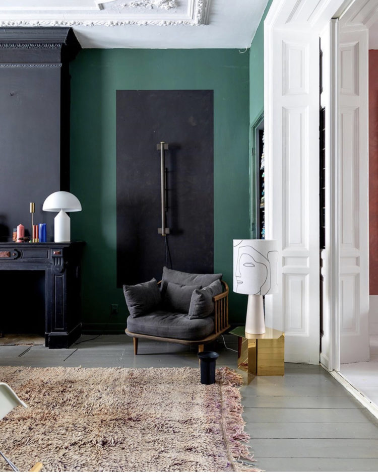
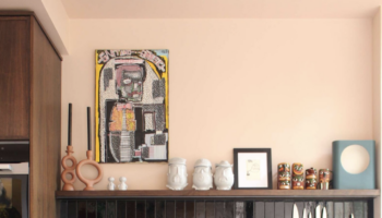
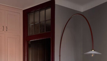
Below is a similar idea but it has been used to give impact to a wall light and it looks fabulous. It matches the chimney breast but instead of the chimney breast being a feature wall it links the two spaces together and creates something both different and pretty. If you have an alcove that isn’t rammed full of shelves and cupboards this can be a really good way to decorate a room. And, possibly, if you are a renter who isn’t allowed to install shelves this might, with the relevant permissions, be something you can do to add interest to a bland space that would be simple to paint out afterwards.
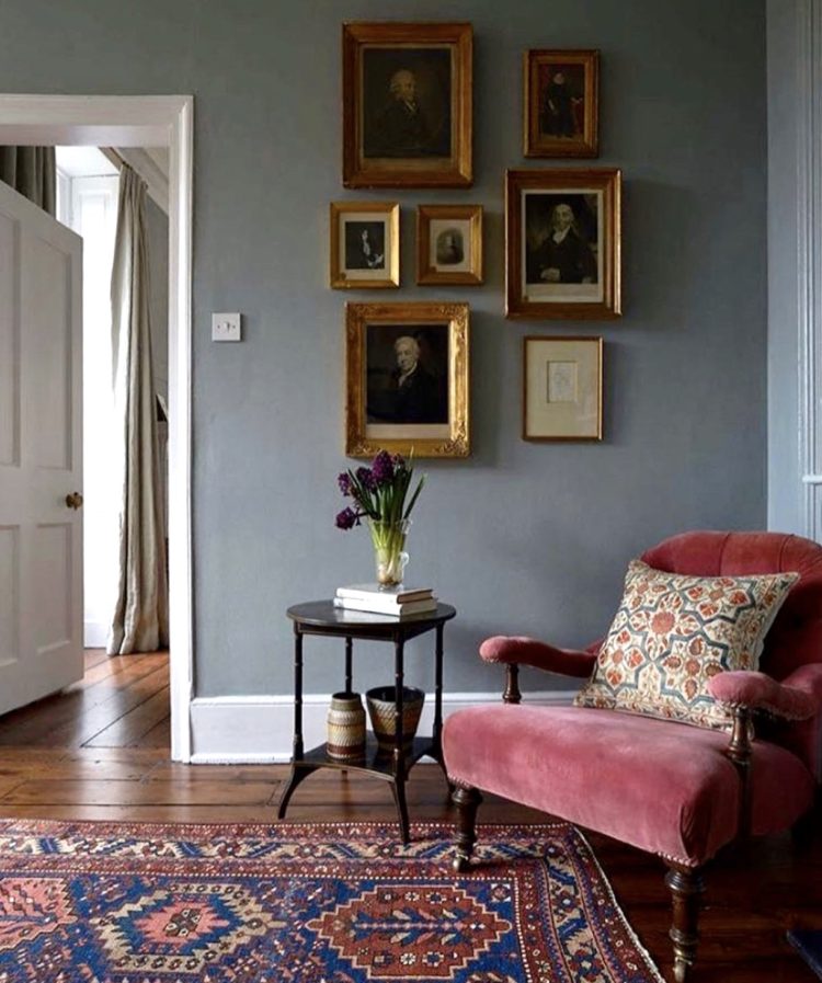
Moving away from paint effects – although I do urge you to ponder if any of them would work for your own house as it’s a relatively simply DIY that may not even involve going out to the shops, and, if you plan it right, you might not even have to get up a ladder – to just this lovely warm reading corner that feels very cosy and inviting at the moment.
The pictures have all been linked with gold frames – another thing you might be able to do relatively easily with a small amount of paint or spray. And never underestimate the impact of putting a small picture in a large mount and then framing it to give more oomph.
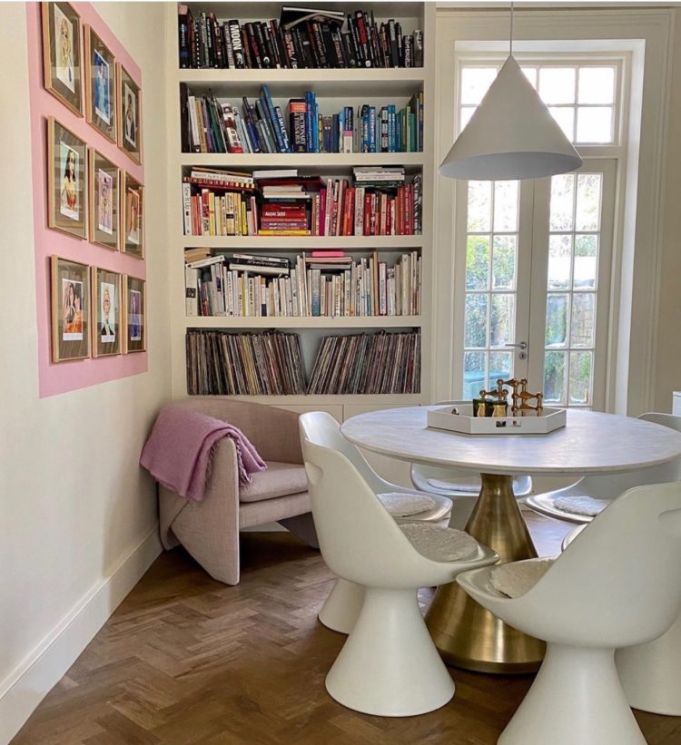
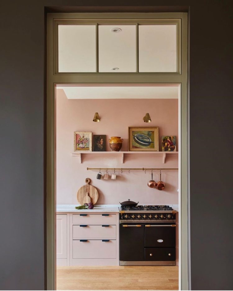
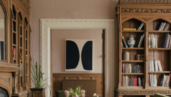
And finally, this soft pink kitchen and the importance of using your door as an actual frame for what it leads to rather than in the literal sense of something that holds said door in place. See how the shelves, painted to match the wall, give more weight to the things that are placed on them. And also look at that window over the door. That’s such a good way to make a door look taller and also borrow and share light between rooms. I plan to investigate the cost of doing this. I appreciate it’s not DIY but I suspect that many of us are going to be compiling a list of things-we-have-worked-out-are-wrong-with-our-houses-during-this-period-and-what-to-change-when-it’s-over. Yes?
Until tomorrow when, in common perhaps with many others, I’m going to take a look at working from and the tips and tricks I have learnt in 20 years of doing so. I hope you will join me. Stay safe and wall and indoors everyone.
That was a very smart and easy way to connect the space to the chimney next to it. Sometimes the most simple solutions are the best. Good tip Kate.
Absolutely love the pea green and pink border, now where can I use it home….
Really enjoy reading your posts, stay safe xx
Fabulous “Plug” as we say in the US. Love your posts. I do not respond every time, but will try to do so now. I think if we partake of someone’s creativity, we owe it to them to say thank you
I’m so enjoying your daily posts. Thanks for continuing with them, it helps to have distractions at this time and maybe get some inspiration at the same time. Congratulations on the BBC radio mention for the podcast. Totally deserved.
I’ve subscribed to your website for your interior design ideas, but I absolutely love your trousers Kate – could you share where they are from?
They are from And Other Stories but two years ago now I’m afraid x
Good morning Kate!
I love those paint effects – I never would have thought of painting behind a gallery wall, but it looks great and it makes it even more of an accent. And the other one with the black/very dark grey against the green also looks fab – I very much like those two colours.
Have a lovely day, and stay safe.
Renaud
http://blogbyrenaud.wordpress.com