Today’s Beautiful Rooms post comes to you full of stripes following an afternoon at the Bridget Riley exhibition at the Hayward Gallery in London yesterday afternoon. Although she is best known for her black and white paintings of the 1960s (which, said the 16yo, made his eyes go “weird” the most interesting (for me at least) section was the collection of her drawings and prep materials showing how she created her intricate bending stripes patterns. And so, when looking for images to inspire the week ahead, I was suddenly drawn to stripes.
In addition to this, tomorrow I’m going to write about the main trends I saw at the Paris trade show Maison et Objet during a lightning quick visit at the weekend and these colours were definitely a feature. We’ll talk about the stripes tomorrow too.
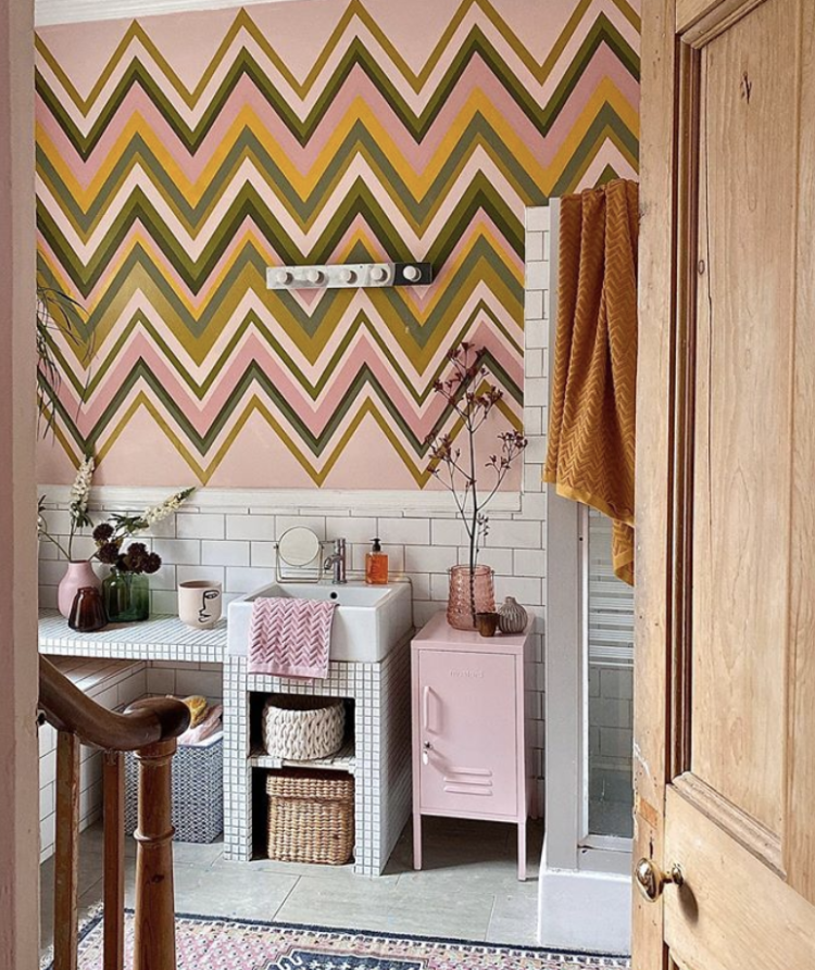
But first up look at this wonderful zig zag wall by the artist Anna Jacobs, who lives in a rented flat. She will have to paint it back before she moves out but the landlord has given permission for her to do this for now. I love the colour combinations – it’s a bit Wes Anderson meets Marni and is a great palette to take through a house.
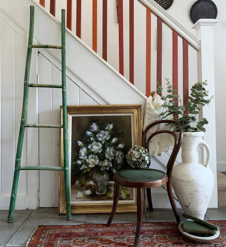
This is a much simpler way of doing stripes if you can’t face the zig zags (and Anna said she would never do it again!) and that’s doing the spindles on your bannister. Still fiddly but very effective. Tamara has done a mix of three or four shades but you could do whatever you liked.
In fact, it’s a great way to use the leftover paint from the rest of the house as you will probably have a palette that all goes together so it’s almost like an introduction to the rest of the house. Or you could do them all one colour and add in a disrupter colour two thirds of the way up. A bit like the green painted ladder here.
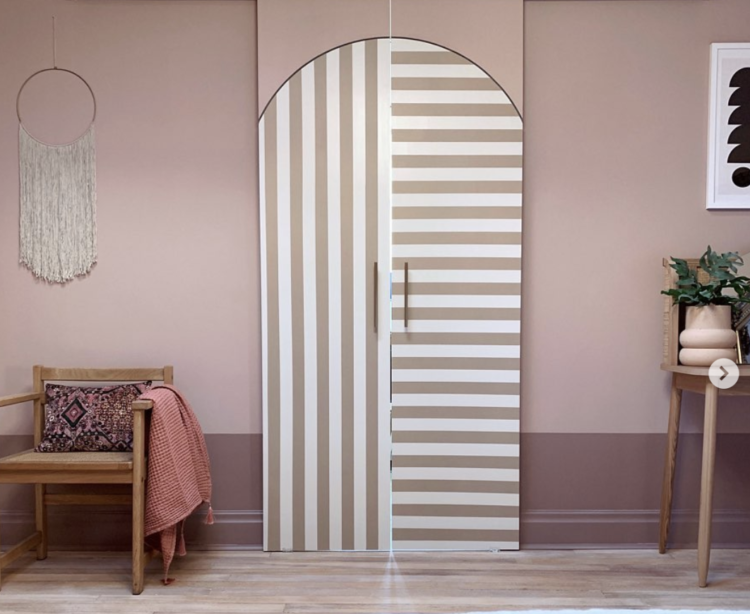
Or what about this? Look closely and you’ll see it’s a pair of very tall sliding doors (made out of plywood) but the stripes and the arch have been painted on to stunning effect. You don’t have to have a sliding door either. I saw on instagram the other day that Hayley Stewart had simply painted an arch over an existing doorway to create the same effect.
Before we leave Marisa and Chris though, if you have ever felt that the skirting boards were too shallow and you wanted to make a feature of them then just paint them a bit higher to create the effect. I can hear the hollow laughter as some of you pause to snort that you have never, ever stopped to think about the height of your skirting boards but I have (interiors geek alert) and this is a very good solution and much cheaper than installing new ones.
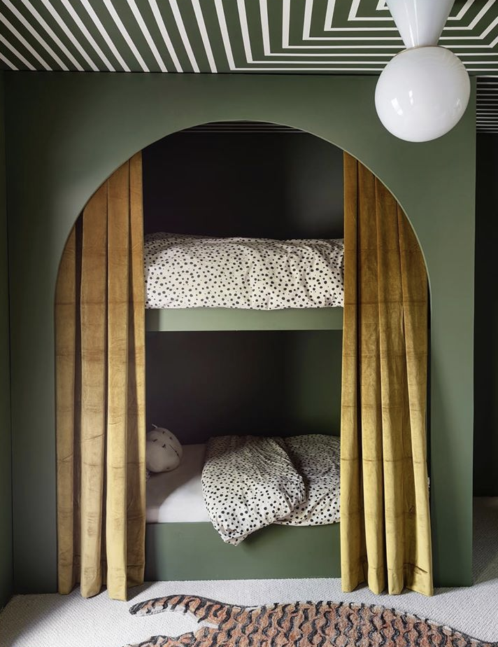
Sticking with stripes (and arches come to that) and this is the bunk beds created by designer Sarah Sherman Samuel. Many of you will stop at the bed and what an amazing den that would be to sleep but as well as the colour combination – green and gold is a classic – look at the ceiling which is very Bridget Riley as from this angle it looks like it bends round the corner although it’s actually a series of concentric squares.
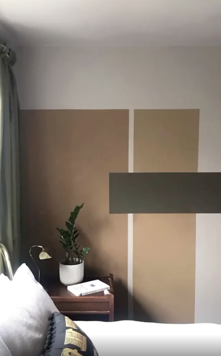
Below, staying with green but less a stripe and more of an earthy colour block but this sums up many of the things I have been saying about paint in recent months. You don’t have to use one colour and spread it between all four corners of a wall. You can do something like this. And this particular design works in two ways – either it functions as the art on the wall and you don’t need any more, or you can hang pictures within the colour blocks and create more dramatic frames. And we’re still using tester pots or leftovers.
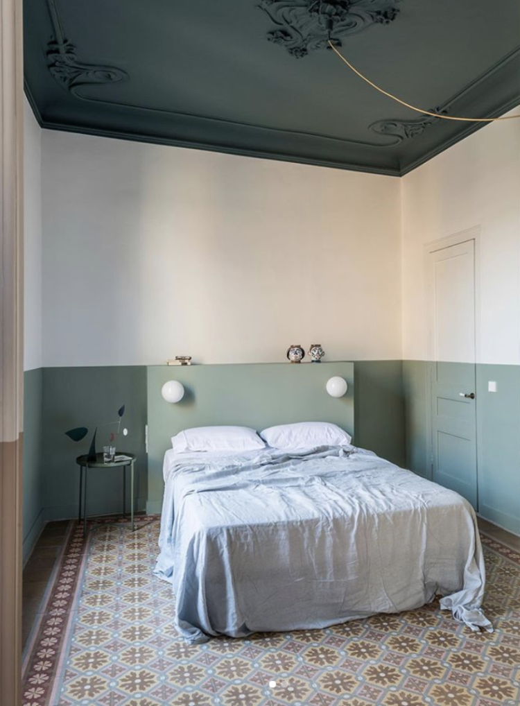
Finally, this isn’t really a stripe – well only in the loosest sense – but it’s such a clever use of colour. Firstly the pale mint stripe (more on that tomorrow) goes right round the room including the door. I imagine the headboard was made to measure and you can see that it sits forward from the wall so there is a little extra storage behind for books or, more likely, all the stuff you want by your bed at night but also want to hide in a drawer. Those little cubby holes were perfectly for that. You could create something very similar from a piece of ply or mdf. Note also how the lights have been wired in and you don’t see any of the trailing sockets or electrics so it’s a much neater effect. It’s such a simple idea for a bed and so effective.
But, before we leave this room, the ceiling is simply a darker version of the colour on the wall. Yes it’s a very high ceiling and this dark colour serves to bring it down a bit but you can do a variation on a theme. So you could swap the dark and pale greens around if you were worried the dark would make the ceiling too low. Or you could take the lower green higher up the wall to narrow the band of white. Or bring the ceiling colour lower down the wall.
These are all just ideas that I hope will help you with your own places and spaces. It’s about seeing something that sparks an idea and putting your own interpretation on it.


I love the last bedroom!