There’s no doubt that Autumn is my design season. I wear her warm sludgy colours all year round and my house is full of soft pinks and plums with deep chocolate and warm cream tones with, yes, the occasional splash of ochre (this is creeping in more) and, in one or two places, the odd olive accessory.
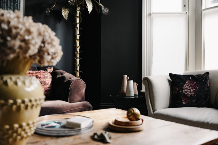
My sitting room (above) is about to be warmed still further in the next few weeks with the addition of a collaboration I have been working on since before lockdown and which will be revealed at Decorex (and here) on 11 October and I can’t wait for you to see. In the meantime let’s celebrate the rich colours of Autumn with the following images which caught my eye this week.
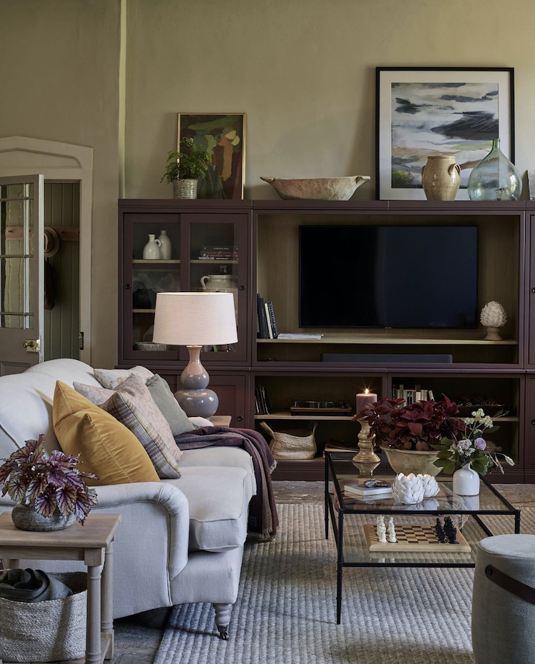
Every season Neptune adds to is paint range with a new colour and this time it’s Clove, seen above on the shelves. It lies somewhere between plum and chocolate but there’s a hint of juniper berries which means in some rooms it will look more purple than in others. Tester pots people tester pots.
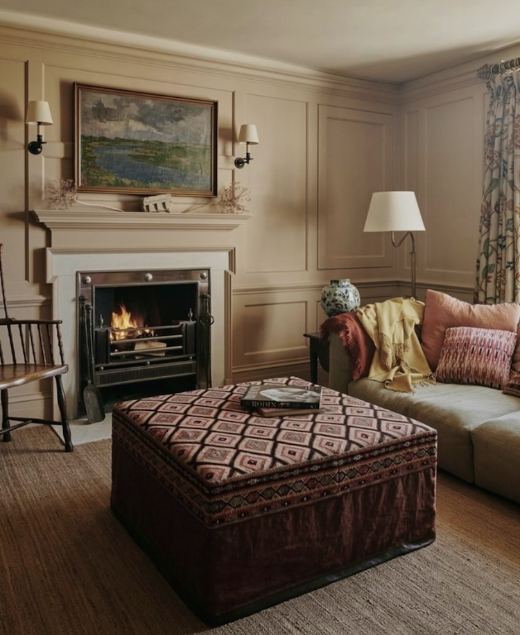
Because, just to prove that different people see colours in different ways – and rooms are no different – below is Clove by Edward Bulmer, which, if we’re being honest, looks nothing like the cloves in your spice drawer, and more like a deep beige with a warmth from the red oxide it contains. The clever thing about Edward Bulmer is you can buy it in the original colour or 60, 40 and 20 per cent lighter. So for all those times you have admired a colour and wailed that it was too dark – well now it isn’t.
And note, in both rooms, the presence of a dash of dirty yellow to offset it – below a throw, above a cushion and, in fact, in my own sitting room the vase on the table.
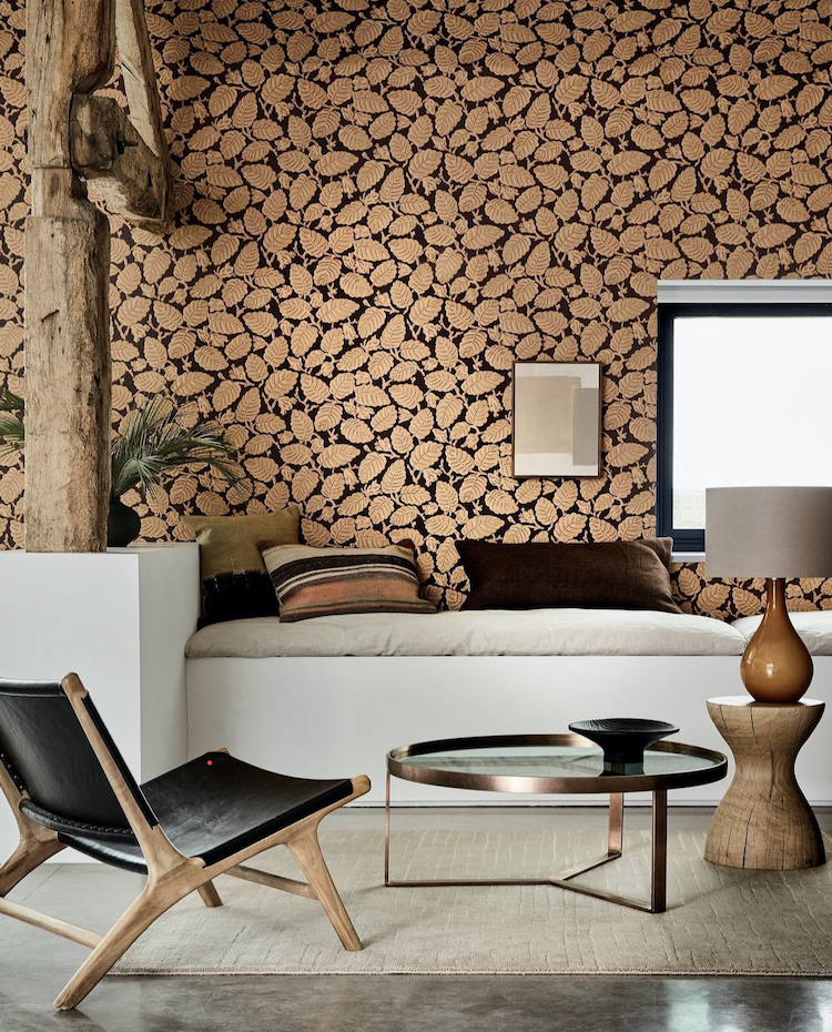
For those who like a little wallpaper what could be more Autumnal than a leaf pattern and yet so often the botanical prints are summery greens with flowers. A style I like looking at but am unlikely to bring into my own home. Here then, new for this season is Beechnut, part of the Cordoba range and perfect for those of us who dive deep into this season.
Check the styling around it though for clues as to how to bring it into your own home – chocolate velvet, cream linen, a hint of copper for the metallic (but not a shiny version) and lots of natural wood. Note also the stripy cushion – tradition has made us frightened to mix patterns but the stripes tone so well with the leafy paper that it works, while the dark background is picked up in the leather chair. And, I notice as a I scroll up to add the captions – it’s a perfect mix of the two clove paint colours above.
So we could leave it there but we won’t as I’m often asked about decorating low ceiling and beamed cottages and it’s true it can be hard to find inspirational images to illustrate the points so here are two I found in a week. Above a kitchen from a house that is on the market with Inigo. True these beams are a rich chestnut shade (maybe real maybe a little photo enhancement) but either way they aren’t painted black as so many are. I grew up in a beamed farmhouse and my grandmother regularly had her beams repainted black, but they’re so much nicer natural. Then my mother moved into a house with single beam across the sitting room ceiling and on touching it to point out the – natural – colour she realised it was plastic and had been installed to hide the cabling that the previous owner hadn’t been bothered to chase into the plasterwork!
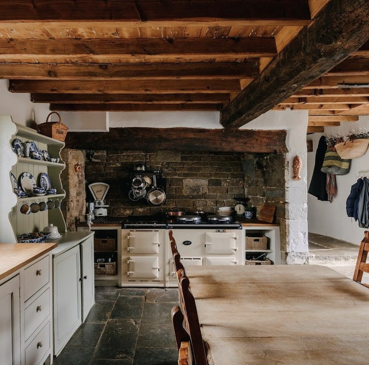
But wood or plastic, natural or not, you can decorate with beams. Some people paint between them – any of these warm autumn colours would work and if you want to stay neutral then then Little Greene’s Slaked Lime is a warm white – some people add wallpaper panels. Or you can keep the colours simple and add textures. In the picture above there are the wooden beams, exposed bricks, flagstone floor, baskets, the enamel of the AGA and a soft green shelving unit.

In this room – also styled by Neptune, the walls are perhaps Limestone, a dark warm neutral which is picked up in the rug and table and which allows the chairs to stand out while, at the same time bringing a contrasting warmth to the space. I remember only one line from the Marcel Pagnol Le Château de ma Mère, which I read for O’level (and that term alone tells you how long ago that was) and it was this: L’automne a sonné dans sa trompette d’or – Autumn has sounded her golden trumpet – and these colours herald, for me the most beautiful time of the year.


I love autumn, my favourite time of year to make an interior look homely and cosy. There is nothing better than incorporating interior colours into your home either. I have a kitchen unit matched to Dulux ‘ Eygptian Cotton ‘ and it’s the perfect colour all year round but especially in autumn. It’s from my family company Recuro.
I love Autumn colours and have fallen in love with ochre quite recently. I have always loved deep reds and have deep red in my dining and sitting rooms. I inherited a lovely painting from my late Mother-in-law, (her own work), which features ochre against my deep red walls and that has sparked an ochre cushion and throw in my sitting room.
Thanks for all your great posts, Kate. They are a joy in these difficult times! 👍
Yes new cashmere throw in ochre/ mustard on bottom
of bed as I write … your advice about clothing inspiration is very true .. I always have a bit of mustard somewhere in my wardrobe .
At last…a designer who acknowledges the issues in a cottage with low ceilings! Sometimes it’s difficult to translate desirable designs because of light and practical issues such as scale. Most colours look more intense and sometimes flat with the lack of reflected light due to deep windows. Don’t even get me started on lighting….Having said all that I love my Welsh longhouse but it definitely brings its challenges!