Last week I wrote about post pandemic design and how there is a theory that white will make a return to our homes because of its association with cleanliness and hygiene. You can read it here if you missed it or want to have another look now you’ve had a chance to ponder.
This week I’m looking at strong colours again and yes I have touched on this before – right at the start of the lockdown as it happens and you can look at that here – but this week I am focusing on one colour in particular. I have spoken about I am drawn to yellow ochre shade at the moment but this one caught me right out of left field. And yet, had I stopped to think about it, the signs were there. Two years ago I bought a vintage Marni bag from eBay in a bright emerald green. It was entirely out of character but I loved the style and wear it regularly with my customary all black outfits.
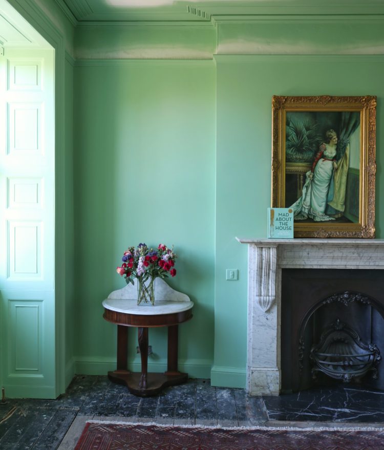
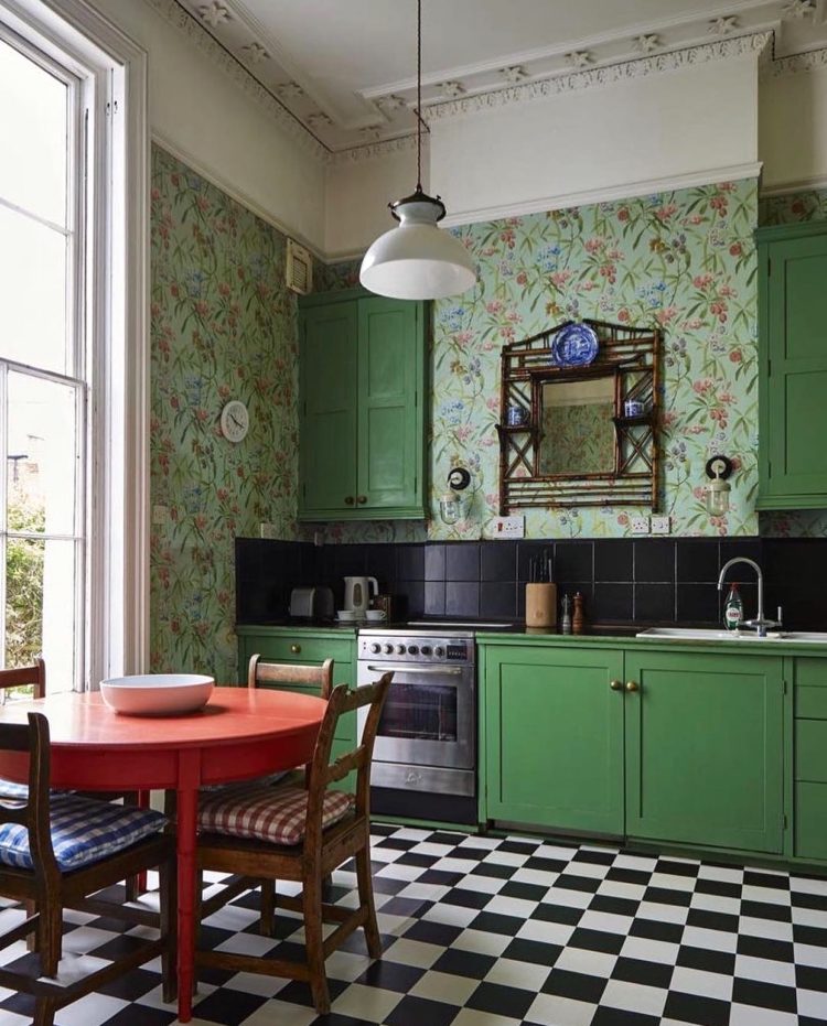
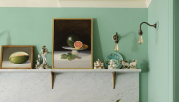
Then, at the start of lockdown I bought a pair of green trousers from Me + Em. It has taken me until now to put the two things together. And let’s not forget that one year ago I had to choose the colour for the cover of my book that came out on 5 March. It’s based on Farrow & Ball’s Arsenic and you can see from the room above how well it goes.
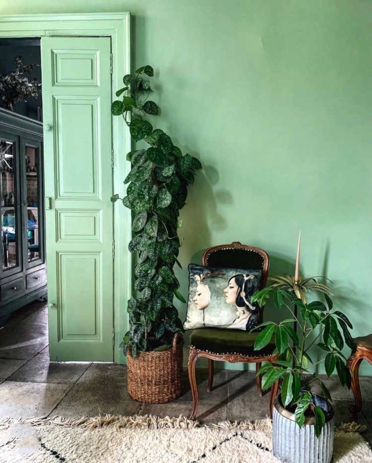
This punchy shade of mint has been gathering pace over on instagram but so has its deeper darker sister emerald and the two work can work beautifully together as shown here. Or, you could employ the trick from last Friday’s househunter post and paint the walls in mint and the window frames in a darker version of the same shade.
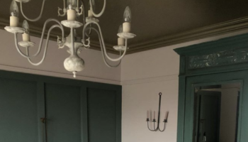
Erica Davis, who has loved green for ages, has just repainted a kitchen cupboard in a bright green from Annie Sloan and admits to feeling so much happier now that it’s no longer dark blue – like the one next to it.
When I started this post I was going to write about how, perhaps, we are drawn to green at the moment as its so reminiscent of nature; the grass outside that we can’t get to as often now. That might also go someway to explaining my desire to bring in some yellow to my home too. But, for me at least, the evidence is that I have been gradually drawing closer to this colour for some time. There is still no yellow in my wardrobe for example, which, on past performance would indicate a more reliable route to my walls – I have both pale pink, chocolate brown and navy blue (in the loft) in clothing form.
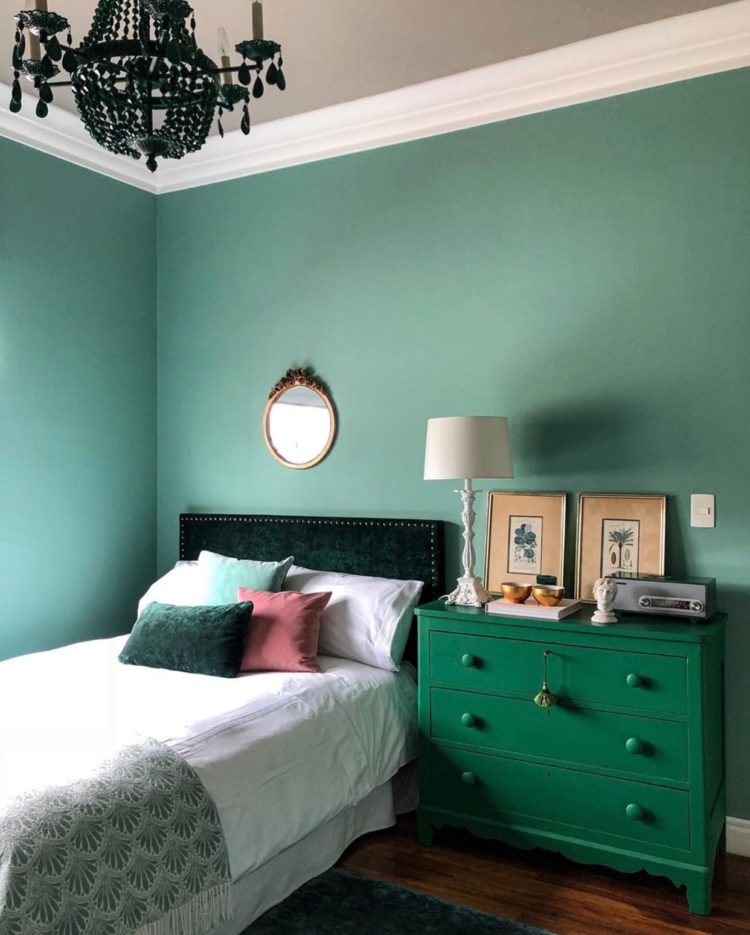
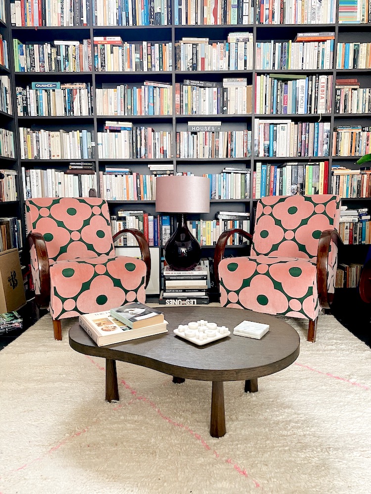
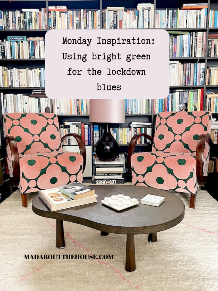
As yet there is only the merest touch in the furniture. The background of these new reupholstered chairs is quite bright in some lights. At the moment I’m not pondering a full redecoration but I wonder… I just wonder if, in a couple of years time. Either that or I shall strong arm the 16 yo, whose room does need decorating, that this is the perfect colour for him. Or are these chairs to sign of things to come….?
What do you think? Are we craving colours of nature now that we can no longer have them or are we being nudged along? It’s certainly a colour that seems to nourish my soul at the moment but only time will tell if emerald green is a cure for the lockdown blues.
By the way I will be chatting to Annie live on instagram at 3pm on Wednesday 20 May if you fancy tuning it. I’m sure it will be saved to her stories later if you can’t make that time.


I too am really being drawn to green lately. Most especially Peridot, Emerald and Pear colors. I love nature so I think I find these colors very soothing. I recently went to a friends home and she had purchased an Emerald green sofa and chair in a contemporary squarish shape. I thought it looked fabulous and coordinated nicely with a black and white themed farmhouse style hutch she had. And yes Kate, thank you so much for your wonderful and inspiring posts during this trying time! I am in the US where now we have sadly moved on to rioting..
Painting walls has definitely to cope with this lockdown. I think it has to do with retaining some control over one’s life in a crisis. I love muted greens. We’ve painted the bedroom in Little Greene’s Boxington 84 and the office in Fleetwood’s Avalon Teal. Admittedly, the latter is not a green but a blue with a greeny or yellowy hue.
I was worried that the teal would have felt depressing in the northeast facing bedroom whereas the office gets quite sunny. The dark green with its underlying yellow tint makes the room feel much brighter and warmer than it was before (sad and tired magnolia). It also feels calming which is great in a bedroom.
Now, all of this courageous new colour scheme (it’s a rented house) came about thanks to your blog, books and the podcast. Thanks Kate and Sophie (I realise that’s your blog Kate but I’m not on Facebook)
Green is the one color that shows up in my very neutral wardrobe as well. We just did a budget rehab of a bathroom that ended up with warm white walls, black trim, and bright green ceiling. I love it!
I’ve ALWAYS been a lover of greens, although not mints or grey-greens, more chartreuse through emerald through forest to olives then backtrack / left turn into marines, turquoises and teals. Energising, rejuvenating, calming and deeply satisfying no matter where I’ve lived or what the circumstances. I went through a monochrome phase when I was deeply unhappy following a divorce; the very first sign of an internal lightening up was when I started to bring in green accents through homewares and plants. Love your blogs, books and podcast, Kate, keep it coming!
I have always loved green; its been my red thread for forty years! Not so much emerald green, though – I love muddier greens, olive or eucalyptus or a deep petrolly teal. I’ve just painted a room Studio Green and I love it. Green is soothing and goes with all my other favourite colours: pink, rust, brown, petrol blue.
I LOVE green, it is the red thread in our house, somewhat accidentally but it pops up everywhere in our house and now I struggle not to have it! Love it, from neon through to sludgy colours. About to start a loft conversion (sorry neighbours!!) and trying very hard not to add green in every room…
I often pop up extolling my love of white but I consider green to be a red thread. I have pale green ( almost grey green) accents around which echo the eucalyptus growing in my garden – I have noticed being drawn to what I am seeing in nature.
We recently painted an old chest for my daughters room, using chalk paint. I was somewhat horrified when she chose a jade green paint but it looks fabulous in her white bedroom.
We are all so different, aren’t we? I recoil from green! When house-hunting online and seeing a green room, I have often imagined that never mind arriving with kettle, coffee and biscuits at the ready, for me it would have to be paintbrush, paint (anything but green!) and the stepladder! Each to his own…..
I had similar mint green in first picture a few years ago.I painted walls and skirting. It certainly brightened things up for a while but I tired of it quite quickly. Perhaps because in a hallway and stair with rugs and carpet I found it hard to co-ordinate. Now I have Farrow and Ball in green smoke -a richer admittedly darker but warmer and more practical. So I still love greens but here prefer the emerald to the mint.
I have no doubt that green in all its shades is good for the soul because it is the colour nature.
Oooh I love this Kate! I’m a total recent convert to green, and now absolutely love it! I also think it will grow in popularity, due to its association with health and healing and biophilic design xxx