As ever, when I began looking to put this post together I had no theme in mind. Then I looked at my most recently saved posts on Instagram and realised I had been drawn to doors this week. And then, because if you can’t become introspective in a lockdown when can you (?) I realised that this happened in the week I had my vaccine (Pfizer should you wish to know, and yes absolutely fine, no side affects at all thank you very much, please don’t refuse yours) and there also were moments when it felt almost Spring-like and so doors it is. And maybe that’s a metaphor for our lives starting to open up. And maybe it’s just that a plain white door is a wasted opportunity for colour or to draw the eye to what lies beyond. You can make of it what you will as you stroll through these rooms…
There follows a collection of doors in various joyous shades all of which are enhancing not just the room they are in, but the room they are leading too, providing, of course, a frame of the view. Not a white door to be seen. And that’s not to say you can’t have a white door if it makes your heart sing. I have plenty.
And actually they don’t make my heart sing as such, but what I have got is a collection of doors that are all painted different colours on each side. I have chosen to coordinate my doors with the walls of the room they are in. So my office door is book wallpaper on one side and burgundy on the other, my sitting room is off white (wimborne) on the hall side and fallen plum on the sitting room, my bedroom is wimborne (again) to the landing and threadneedle inside. I have not made as much as a feature of my doors as these gorgeous rooms but I’m only ever (as are you) a can and a brush away from a change. And, more to the point, not one of my doors is white for the sake of white.
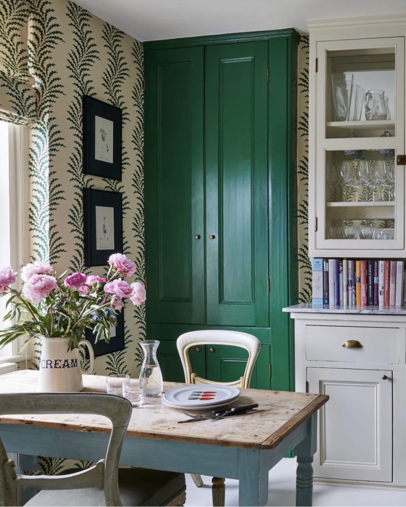
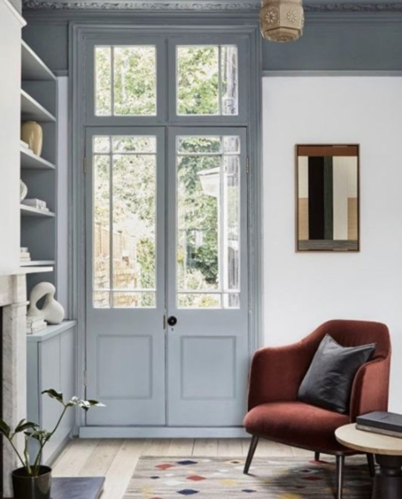
Up at the top is that cupboard door in an incredible shade of green – try Puck by Little Greene, which I have just used in my son’s room and had planned for my office until he decided he wanted it more. This is followed by Mylands pale blue – longacre – which has been used on the ceiling and on the woodwork and essentially works as the decor in an otherwise white room.
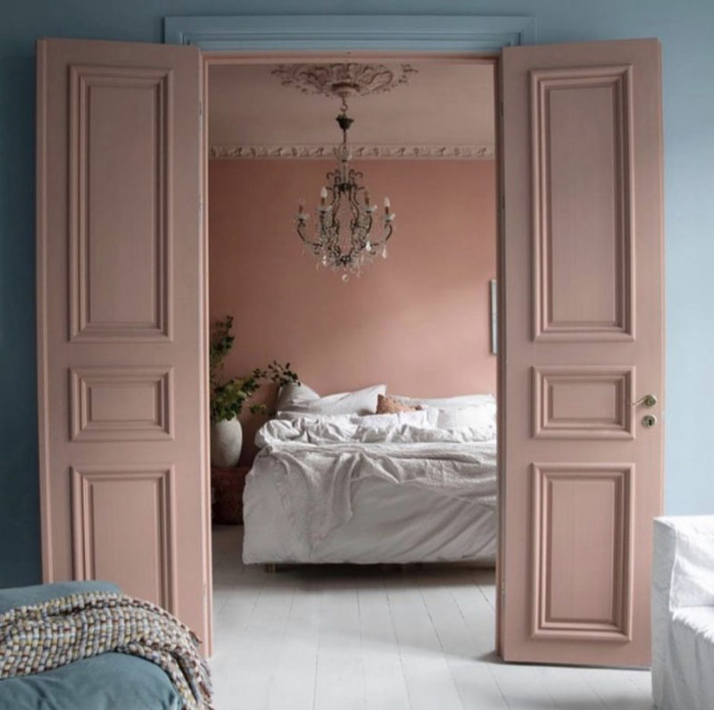
That is followed by blue walls contrasted with pink doors, which, when closed will match the ceiling of the room they are in and provide a paler version of the walls. When open, like this they make the opening into the room behind seem larger and, when closed, if they are blue on the side we can’t see, they will disappear into the wall and make that room feel larger as your eye won’t be distracted by a random white door serving only to alert you to the exits.
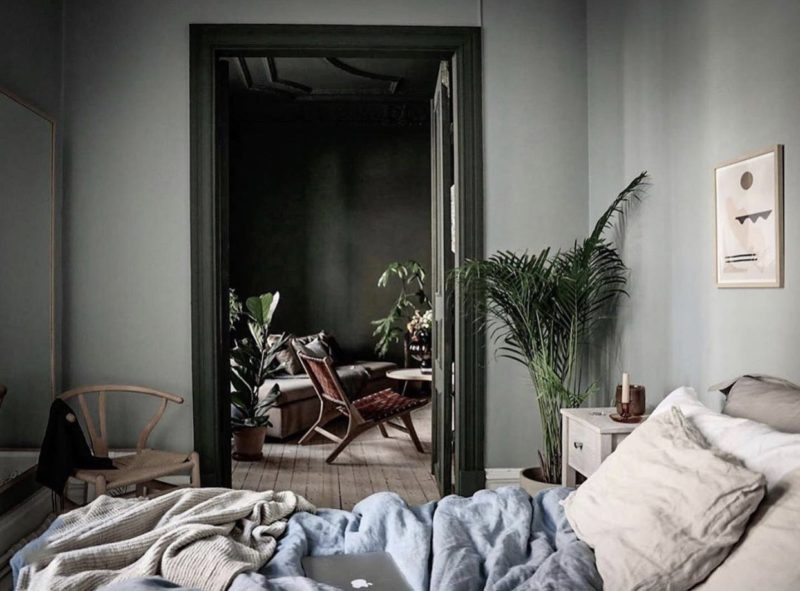
Above, Sofie Izard Hoyer has used the same trick, painting the woodwork of the front room to match the darker shade of the room behind, which serves to frame the view when the door is open and provide a dramatic, yet toning, focal point when closed.
If contrasting strong colours makes you nervous (as it can do me) then using the same colour in darker and paler versions works really well for this trick. And if you live in a house where the rooms lead off landings and halls (rather than each other as above) you can still do the same thing and bring the colour of the room out into the hall. Or, if you live in a narrow Victorian house where the smaller rooms have been knocked into one larger space you can play with tones by painting the furthest darkest room in the darkest version of the colour and lighten it as you come to the front – and link it all with the darker colour on the woodwork or ceilings.
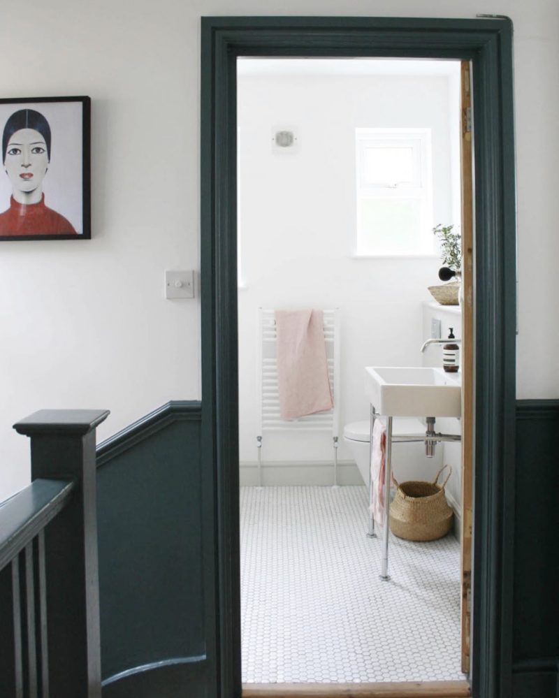
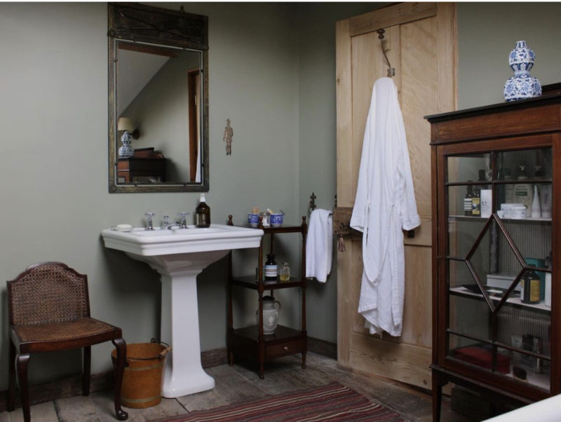
Next, two doors which have been stripped back to their natural wood. This is lovely if you have nice doors. Above, Katy Orme, of Apartment Apothecary, has taken the inchyra blue from the stairs, around the door framing the bathroom and left the door natural. Below the same trick has been used and, it’s worth noting, both rooms are bathrooms where the addition of natural wood (especially vintage) will always soften all those hard white lines of the sanitaryware and bring character and warmth.
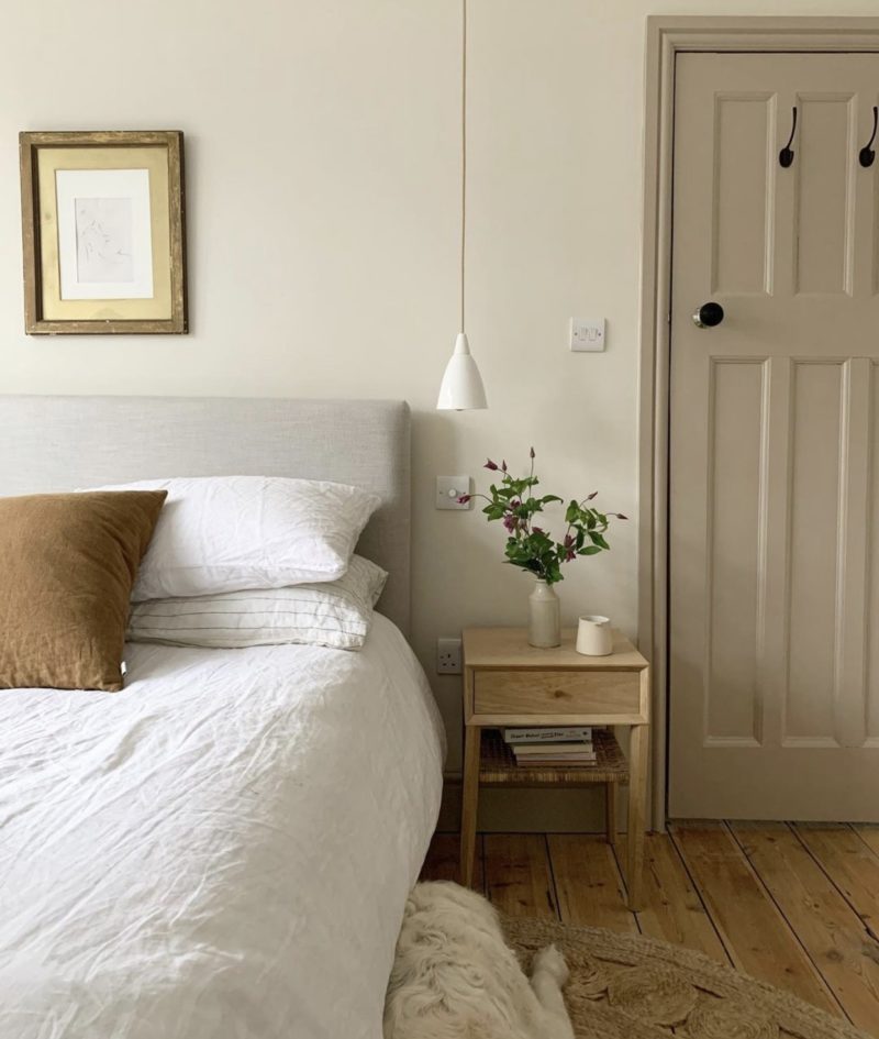
Finally, Katy has painted this door in a soft mushroom colour which contrasts just enough with the warm cream walls but provides a focal point and gives more weight to the cushions and picture frame. So, while I have nothing against a white door, take a moment to consider if that is the best look for your room before you reach for that brush.


I dreamt with this green door last night and just ordered a sample pot from Little Greene. Oh dear…
I love the door and ceiling by mylands. In the master bedroom i have carried on the theme of the halfpainted walls onto the door and frame. But each night in bed the white bit of the side of the door stares at me, so rectifying that as soon as!
I also like the idea of the door and the room behind it being the same colour. The landing idea by katy omre is lovely. My landing is tiny so a dark colour might be too much, but a complementary darker shade of the walls might work. So many ideas now!
I have an unfortunate, featureless, windowless landing so have painted the doors Inchyra with a thin stripe of Arras framing each one. The effect is surprisingly subtle but lovely and provides a badly needed shot of personality.
I have always thought I’d be a “paint the entire house white out of choice” kind of gal but recently painted the woodwork and doors on our 1st floor landing in Dulux Raven Plume (a deep navy blue) and I love it so much as it gives so much more interest against the white walls. I’m a convert!
This post is making me feel rather timid, since I am in the process of having most of the doors in my house redecorated – in Fired Earth Oyster. In my defence, the change is radical in that I am removing the horrible dark brown paint and varnish combo which sucks all the light from the space and makes the (Edwardian) house feel like a museum piece, not in a good way. The staircase will be painted Mylands Sinner, as will the inside of the front door and a linen cupboard. And there will be various zingy little knobs in shades of hot pink and orange/cream. I’ve painted the inside of the linen cupboard Pink Ground and covered the shelves in a vintage green and pink bird print paper. Small steps! So maybe, just maybe, once the filthy brown has all gone, I’ll feel more inclined to expand my colour palette. Great post, thanks.
Your colour scheme sounds lovely – and it’s about not defaulting to bright white (unless the overall look calls for it) and you haven’t – you have chosen a lovely soft off white that will tone perfectly with the rest of your scheme. There is room for all here. It is, as always, about making sure you check what is best rather than defaulting to tradition – unless the tradition is best.
Ooh, thank you. (Preens.)
Have been listening to the podcast as well – it is such fun and works amazingly well – I thought, how will this work for a visual subject matter – but yes!
The Mylands image is my house. When we moved in the doors were ugly 80s French windows. My 76 year old stepdad made this set based on the original design. He’s absolutely delighted to have his work featured on the MAH blog!
That’s so cool! Does he want to come and make me some doors…..?