LOOK INTO YOUR WARDROBE
One of the most common problems I come across is people not knowing what colour paint to choose for their homes. In many ways it’s not surprising; Dulux alone have over 3,000 to choose from and when you add in all the different companies and all the different versions of each particular shade, it’s no wonder it can be a bamboozling choice.
Then it’s about knowing if you want the wall to match the sofa or the rug. Or that particular leaf in the cushion which is a gorgeous colour but really there’s only such a tiny bit of it would that be too much on a whole wall? I know, I get it. So here is how you start. You go to your wardrobe and you stand in front of it and have a gaze.
No, I know you’ve got nothing to wear for that party tonight, that is a different blog post. Actually, that’s a different blog. Back to the question in hand: if you are comfortable wearing it then you are comfortable living in it. It’s that simple. And if your clothes are a sea of black then these days it’s fine to have a black wall. Or perhaps you might just prefer a black door? And if you’re scared of dark colours (and we’re coming to that in a couple of days) then look at your sock drawer. There’s bound to be a clue in there.
For example I did this backwards because I am contrary but I have recently bought a navy blue sofa for the loft. There is no navy blue in my wardrobe. At least there wasn’t until I bought that sofa. Suddenly I’m having a navy blue moment. Or take olive green, there is none in my house. But as I type this I am wearing a pair of olive green trousers and there are several green sofas on my Pinterest board. It’s coming….
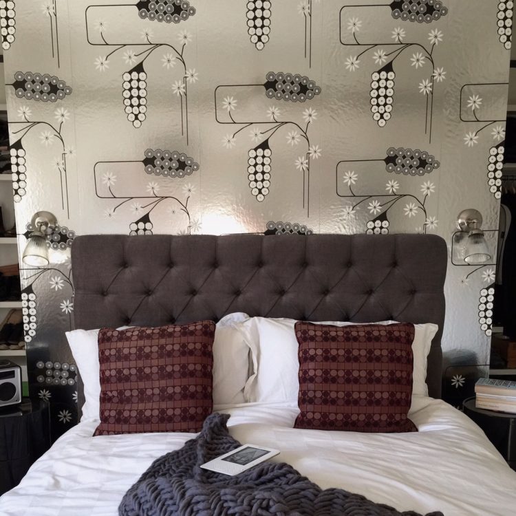
And you should know, as you look at the picture above of my newly decorated bedroom that I bought a pair of silver boots a couple of years ago that I wear ALL THE TIME and I have trousers in the same colour as those cushions too.
Both my wardrobe and my house are shades of black and grey with elements of blush pink and raspberry. I wear it and I live in it. Try it for yourselves.


In many cases this is a sure fire way to get it right. However, all too often,sadly, people wear colors that are not good for them – wrong for the skin tone. A winter person wearing summer colors. I see this with lavender & purple a lot. This is especially true for the bedroom. If there is one room you want to look good in, it’s there. I normally start with their eye color.