Today I am bringing you the first of two posts on paint. One is the new trend colours as identified by Farrow & Ball from their existing palette of 132 colours and next week we will look at their extensive range of neutrals and how to combine them to best effect.
The talk was given by Farrow and Ball’s colour consultant Joa Studholme who develops the company’s new colours which only come out every three years. So we’re not due anything until September 2018 but in the meantime here are the four colours that Joa is predicting will be big in the coming year. She also spoke about how to use them so it’s all much easier for anyone who’s having a little panic about what goes with what.
The colours are Hay, Radicchio, Studio Green and All White. As Joa said we have embraced colour now. While there will always be a place for neutrals we have become much bolder in our use of colour in the home. These four colours, she said, are both traditional and contemporary, dramatic and classic as well as comforting.
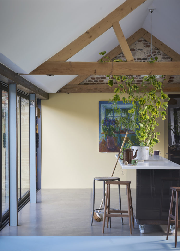
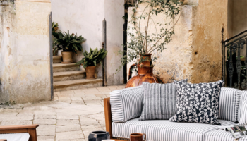
HAY, says Joa has long been ignored but she predicts that yellow is coming for us in a big way and this is a soft quiet version that is not at all sunny or bright. It has a traditional feel that goes well with wimbourne white, setting plaster and oval room blue as in the top picture.
“It has a feel of a space that has been there for ever and that you just came across and tidied up,” she says. Which, if you ask me, is the perfect feel for so many rooms. I particularly like the hay and setting plaster with the wimbourne white – which is a version of one of Monday’s beautiful rooms if you remember.

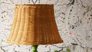
The next colour is ALL WHITE which is a magic colour apparently. It has no pigment in it except white so there is no blue glare that you get from a brilliant white. It’s just a fresh natural colour that is comforting and inviting, says Joa who suggests teaming it with strong white for the woodwork and cabbage white for the floor. It’s a great backdrop for other natural materials such as rattan (deeply fashionable) and wood.
After those two soft shades comes the colour. The first of which is RADICCHIO a strong raspberry shade which is a step forward from the soft pinks which have been around for a while. Joa talks of a defiant optimism in the face of world events. I’m not sure I’m there yet with that but it’s her job to forecast the trends so perhaps she knows something we don’t.
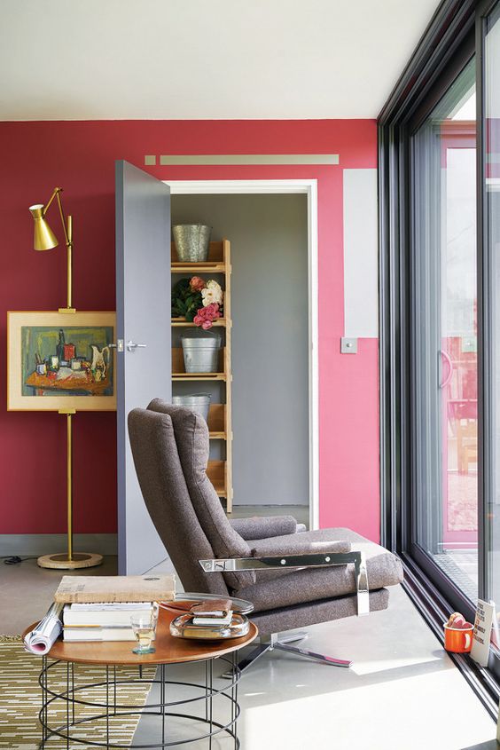
“The world is tumultuous and we want our homes to give us a hug.” This colour will do that. Mix it with Mole’s Breath and Ammonite – one of the easy greys (more on that next week).
If your house is already full of shades of grey (not looking at anyone in particular…..) then radicchio is an easy colour to bring in as it will go with them and create a happy space. If you’re nervous of using it in the open then paint the back of a cupboard where you will only see it occasionally.
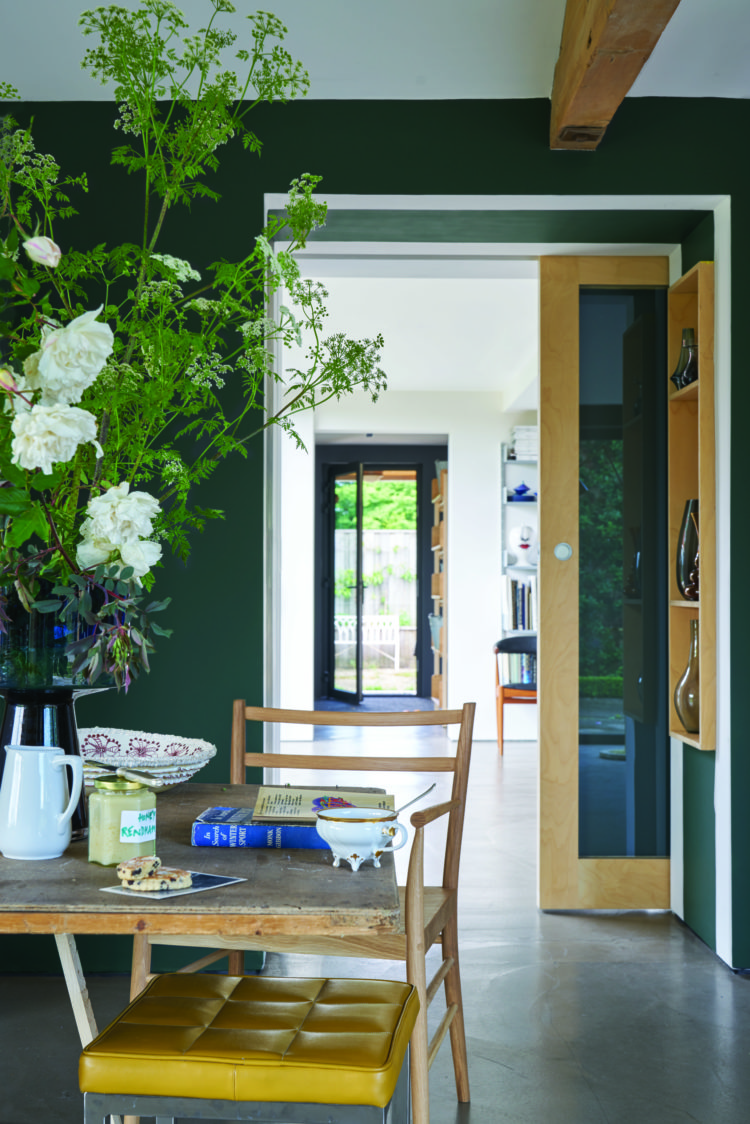
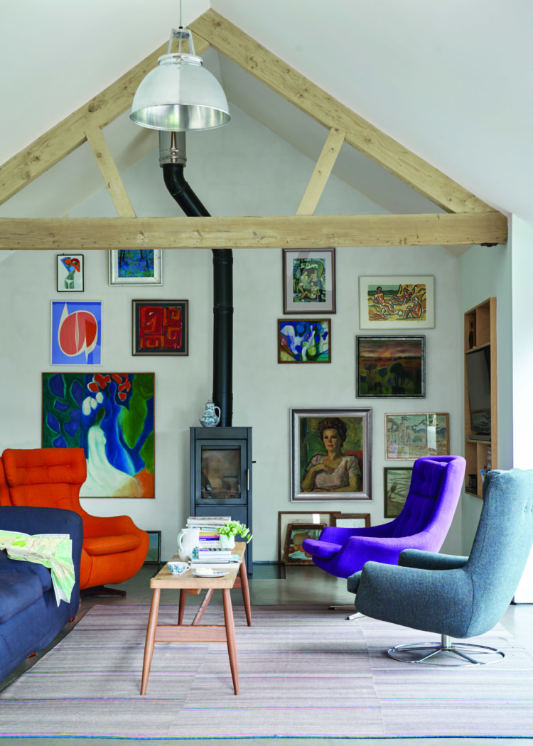
Finally STUDIO GREEN which is a lovely colour that we tested for our bathroom but it was a little too dark for in there. Amanda Lamb, who guest blogged the other day about selling houses, has painted her sitting room in studio green and it’s a great colour. It is quite simply, says Joa, the new Down Pipe. For anyone who is moving on from charcoal but wants a dark shade, this is that colour. It is a timeless alternative that works well in modern spaces. Mix it with New White and White Tie for contrast.