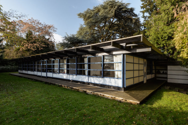
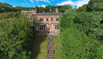
Right then let’s see what you make of this. Following on from yesterday’s eco house tour in a 1960s property, this was built in 1979 and is a house that would have been screamingly unfashionable until very recently. But times have changed. As Oliver pointed out, these houses often have big square rooms and large windows rather than long dark corridors with poky rooms. For that reason they can be easier to live in as a modern family. This one is in Cambridge and is on the market with The Modern House for £1,295,000. Coming in?
It was designed by Syd Furness, an architect and professor at Cambridge University, for himself and his family and while it is close to one of the city’s most desirable roads, the lack of vehicle access – it lies at the end of a 200ft long footpath – the house was constructed as a simple timber frame building that was clearly influenced by Frank Lloyd Wright.
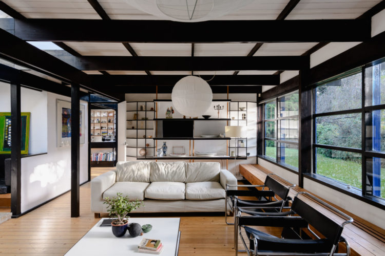
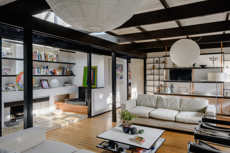
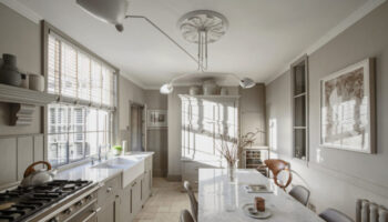
There is lots of glass framing the views to the outside and you can see how the design is on a similar grid system inside. The layout is based around a central, and open plan, kitchen and dining room (see yesterday’s post for how that is good for fostering family relationships) with the bedrooms at one end and the living space at the other.
The dining room has a set of glazed doors which can slide right back to connect the space to the garden (another key issue for living well) during the summer months. But I’m interested to know what you think of the interior design.
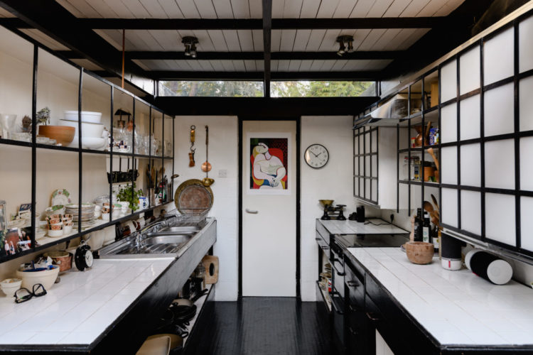
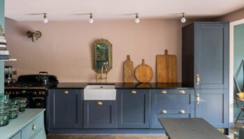
You can see above that the kitchen has no windows (something you could possibly change by reconfiguring the internal space if that was a deal breaker) but it’s the black and white grids that I want to talk about. On the left they are made from open shelving units, on the right it looks more like frosted glass cupboards.
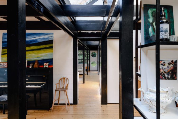
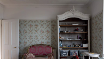
All the woodwork has been painted black to match the window frames and it works as a framing device throughout the whole house. I rather like it although I sense it might be controversial. For me it’s much better than leaving it the traditional white which doesn’t frame any views at all although may open the space up – if the walls were white too. I might also paint the ceilings all the same colour and leave the vertical woodwork dark. That would still match the windows without labouring the point.
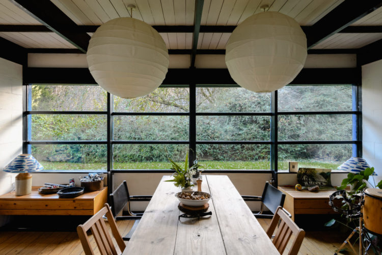
Another good detail is the use of paper lamps. There are natural materials throughout but the round lanterns contrast well with the grid of the windows and shelving and that’s a good way to soften all the straight lines. You can do this with side tables and patterns on soft furnishings as well.
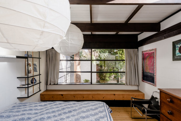
Of the four bedrooms, three of them are only eight feet wide which isn’t massive but there are two very large open plan living spaces so if you despair of teenagers spending all their time on their own in their bedrooms, this might encourage them out.
So, what do we think? Forget the money – it’s Fantasy Friday – this is about the living and the layout (and the lottery).
A beautiful space. I’ve been admiring your floors and it got me wondering about the choice to go with wood. inspired me
The black beams are a bit too much for me. I would definitely soften it with some plants, etc. to make it feel homey!
The house is on the desirable side of town, and the footpath to the door can easily be over come with a trolley to take goods to and from the house but it does look so unwelcoming.
Are the exterior window frames are painted blue? I wonder the state of the roof? Mean boardwalk around the house that should be extended. The property just looks so tired so if you buy it be prepared to overhaul and possibly re design the place.
I agree with the other comments that the black beams are oppressive. Also, if the house is accessed via a 200m footpath, I cant see myself making 3-4 trips back and forth with my food shop every week (or, if you have it delivered, that the driver would be happy to trot back and forth either).
I like your idea of black woodwork as a framing device, in principle. It works well in some houses you’ve shown us in the past. But here, there’s simply too much of it. It doesn’t direct the eye so much as confuse it. I would leave door and window frames black, I think those work, but replace the rest with white.
And I like the paper globe lights, though they’re losing the fight with all the framing.
I Love it, my dream home. Black and white can be tricky to pull off but this house just gives of itself to that particular colour aesthetic, the open plan, large windows and wood flooring, I can find little to fault.
The Japanese aesthetic is a bit heavy handed – all those grids are a bit oppressive and veering onto the 1980s pop video. A lot of plants and less other stuff might help! But perhaps the space works better when you are in it, with the view outside – must be quite rural. Not for me (Victorian girl). Thank you for showing it to us!
I’m surprised at how much I like this house as I’m not a fan of black interiors. However, the black ceiling beams would be the first to go as even though I’m on the petite side, I would find them catching my eye I think and making me want to duck. And any layout that potentially encourages teenagers out of their rooms gets my approval.
I looked at the floor plan and I like the layout and the window wooden ledges in some of the bedrooms but I find all some black beams on walls and ceilings very oppressive so I would paint them the same colour as the walls which would sort of defeat the purpose. I won’t be buying this one with my lottery money!