Now look at this. I love it when you can really see how an architect has taken notice of the surroundings. We have a new build not far from us which is on a hill and the houses above have gone from looking at a lovely view down the hill to a grey roof and very possible into the house that sits below them. This new development, by Kennedy Twaddle, has mitigated the impact of building on the existing, and surrounding houses, by creating this green roof.
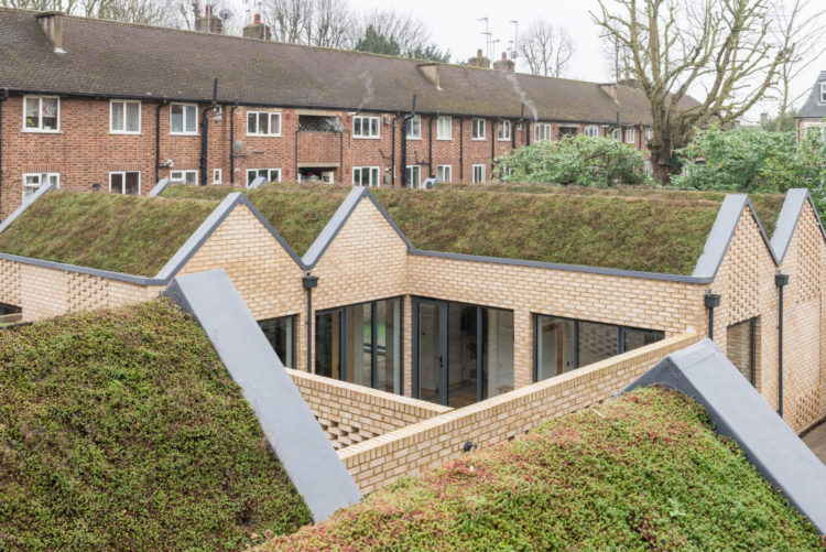
It’s a development of five homes – three single storey houses and two apartments – in a former merchant’s yard in Finchley, north London, and this one is on the market with The Modern House for £875,000. It has three bedrooms, two bathrooms, two courtyards and a large open plan kitchen, dining living space pictured below. This is the largest of the properties and has its own private courtyard.
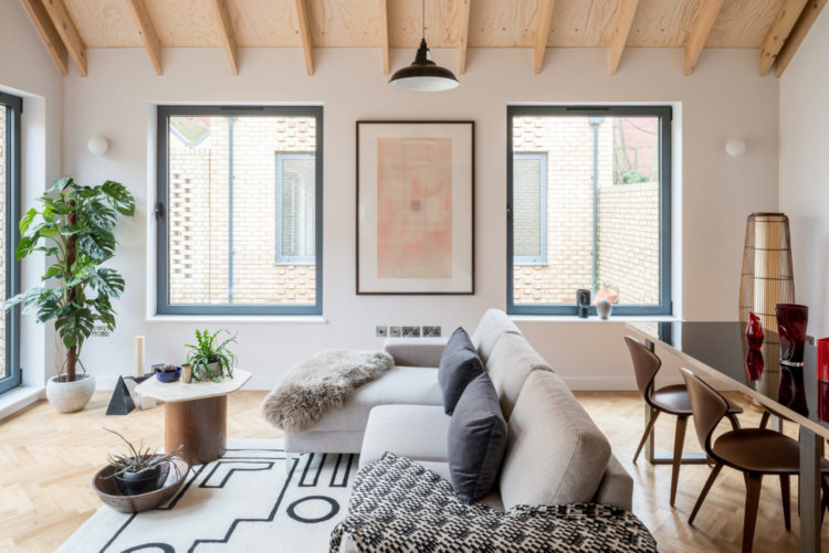
Now come into the main space first. From this angle you can see how the space has been zoned by putting the table behind the sofa to create two distinct spaces. Yes, you could have put it under the windows but then, while you might have had more open space, you would always be able to see the kitchen and the dining area and would always know that you were in one room. This way you change the views, change the aspect and can give yourself the impression that you have two or more distinct places to be in. It really is a good idea to be able to turn your back sometimes.
Here, however, when the camera pulls back we have, I think, a less successful zoning and that’s partly down to the rug. It’s verging on the island. I would suggest a much larger one (remember you can buy a piece of carpet and hem the edges for a more affordable way to get the size) that the whole sofa and coffee table could sit on. That would be much more effective at creating the impression of a separate area. I would also pull the sofa forward to give the table more space.
Another option would be to move the table out from behind the sofa and take it close to the kitchen, which would have the added advantage of giving you more prep space – scroll down to see the kitchen, we’ll get there in a minute. You could also have a round or oval table to break up all the rectangles in this space but that’s a question of preference.
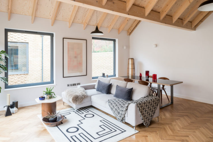
You can see above how you could move the sofa foward a little and how the red chair – brilliant use of a disrupter colour – would create a more pulled together sitting room. Before we go to the kitchen though that little red chair is brilliant. In a sea of black, white and wood (always a classic combination) it really pops out and looks great. And once you notice that you will see a couple of red things on the table and on the kitchen shelves below. A literal red thread.
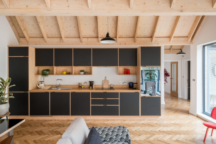
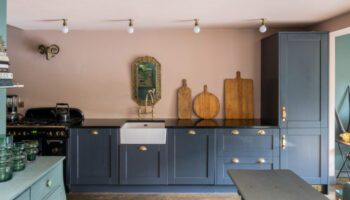
Here’s the kitchen and I reckon you could pull the table over to be closer to the kitchen as there’s currently a lot of empty space there that isn’t being used. Or you could swing the sofa the other way and have it’s back to the kitchen rather than the table. Arranging furniture in spaces like this is lovely because you have choices – just don’t stick it all round the edges with the coffee table in the middle. That’s what those of us in narrow period properties have to do.
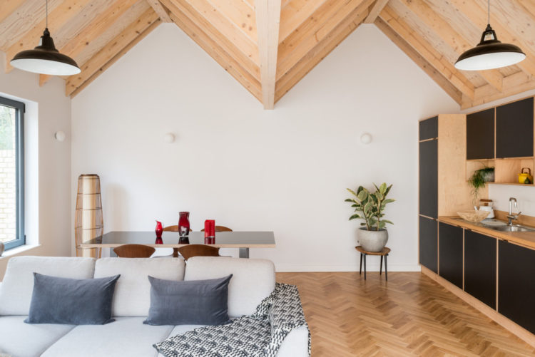
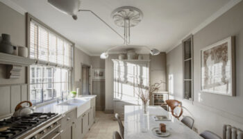
And this really shows you the ceiling. What a great idea to add character to a modern building. I know this isn’t something you can retro fit as we mostly have the ceiling we have but it really adds to the room and look how the herringbone parquet floor picks up on that too.
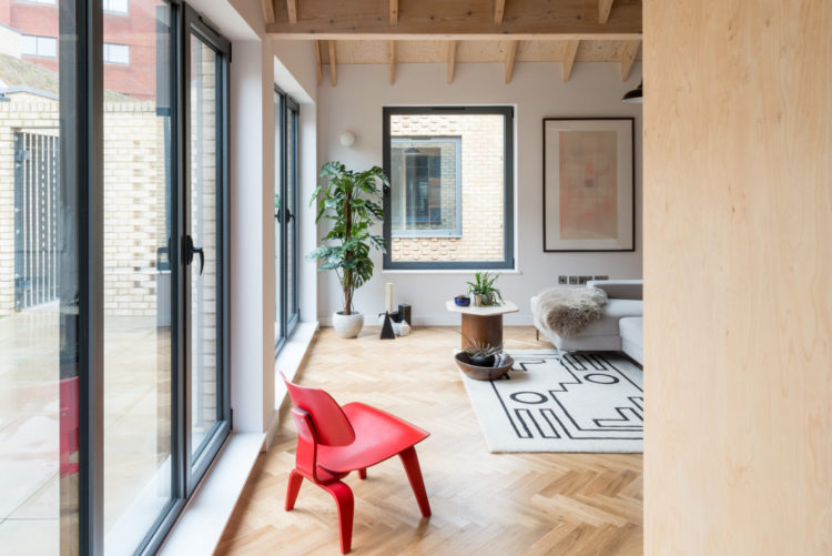
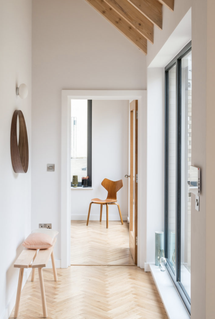
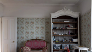
Finally before we go, and you can follow the link above to have a nose around the bedrooms, this is a classic example of why you should never forget to check the view from a door as you pass by. This chair may actually be a chairdrobe most of the time but when the photographer comes by it looks great framed in the doorway and draws the eye in. You could do the same thing with a picture on the wall if you don’t have room for a chair or even a hanging pendant light (see yesterday’s post) which would create a focal point and still light the room. Remember if you have a central pendant you can buy more flex and rewire the light so you have enough flex to drape it across the ceiling and hang it from a cuphook in the place you want it to be. In a bedroom this is nearly always better than lighting a random spot of floor at the end of the bed where the centre of the room happens to be.
Anyone fancy this? Lots of ideas to take away at least.
The development look like a gem in an ugly housing area. The lighting is not well thought out in the kitchen cum living area so an electrician would be needed by me for starters. Kate, you should have been asked to do the interiors. Some soulless person was asked instead!
No pics of the bathrooms! I wonder if they are the only areas that have not been updated.