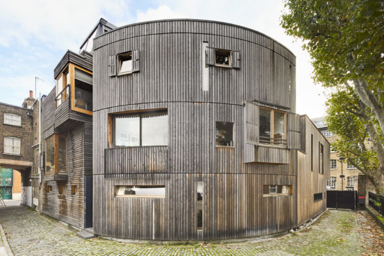
As this has been a week full of room inspiration and analysis I thought today we might just take the time to have a look at the kind of property that we don’t normally get to see that often. This is an award-winning newly built wooden house that offers flexible living and is flooded with natural light and high ceilings. It’s on the market with The Modern House for £1,550,00 and while I don’t imagine that many of us are building our own homes I always think it’s interesting to look at something that is a) very different from the usual and b) was built from scratch knowing what we know now about materials and the environment.
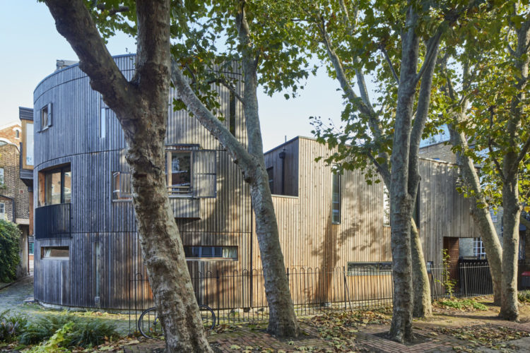
That said, the second thing I noticed after the striking exterior, was that it measures 1,200sq ft internally and has only two bedrooms so I should jolly well think there is flexible living. My last house was also arranged over three floors and measured 1400sq ft and had four bedrooms. But it does make more sense when you look at the floorplan.
So, in common with many new build houses these days the bedrooms are on the ground floor so the living spaces above can benefit from as much natural light as possible. This is an increasingly accepted plan these days and I have to say, having just come down from my bedroom on the second floor (where the cat is lying on the bed bathed in sunshine) past the 20yo’s bedroom on the first floor (likewise full of light) to plant myself back on the sofa where I immediately flicked the light on, it’s a plan that makes sense. Now those of us living in urban terraced houses probably won’t want to sleep next to the front door but it has crossed my mind that the 20yo’s bedroom would make a lovely day room when he leaves home.
Of course the other thing that this house has, since it is new is that it has been angled to ensure maximum privacy – again something that’s not possible with our period properties but it does bring me back to an oft-repeated maxim. When you move into your new property take the time to consider if the rooms are in the right place for the way you live. Yes it will cost money to move the kitchen and/or bathroom but if the result is a sitting room that is full of light with a good view and a small, cosy bedroom next to a large bathroom with a dressing area then perhaps it’s a good way to use your budget?
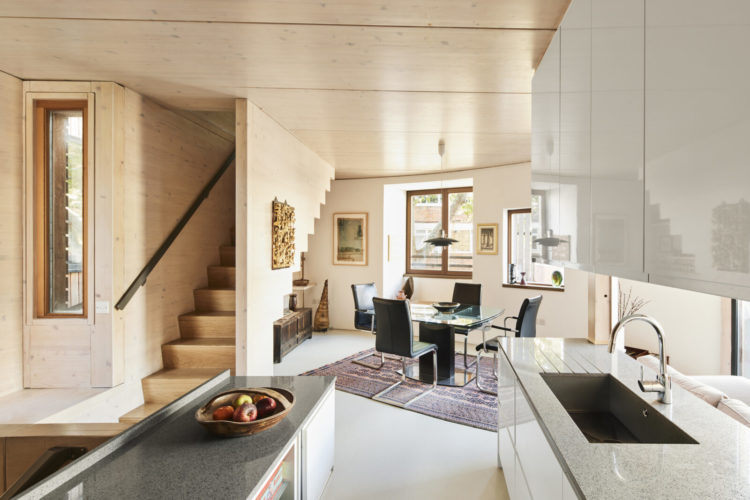
The next few pictures are the first floor kitchen and reception room and this is a classic example of broken plan living. Of course here it’s an odd shape but the idea remains the same. If you have no internal walls (or you have taken them down to maximise the available light) you need to zone the space. Here there is a kitchen, dining room and sitting area and while the kitchen is basically internal it has been constructed so that it can borrow light from the rest of the room.
The upper cupboards also work to divide the space as well as storage. By cladding the cupboards in wood they turn into walls so you can hang pictures on them too and the sitting area has its back to the kitchen which also gives a sense of space. One of the key tricks if you have open plan is finding a way to turn your back on parts of the space. Not only does this change the view but it means you aren’t constantly staring at all the space you have.
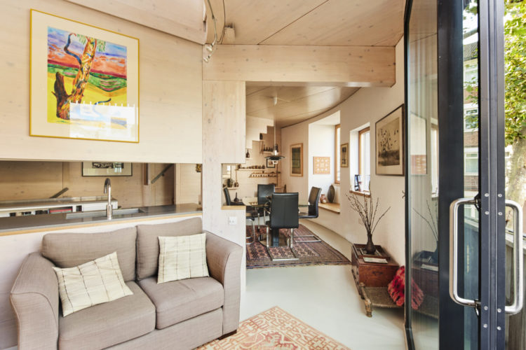
The other point to note (and this will be marmite for some) is the pared back, natural colour scheme. When the space is as open as this sticking to a limited colour palette will make it feel larger but you will need to bring in lots of textures to create interest. Here the rugs, which add some splashes of muted colour, help to zone the room while there is lots of wood, linen, leather and glass. The glass dining table helps keep a certain lightness while a heavy wooden one might just draw the eye at the expense of everything else. Again ideas to bear in mind in your own spaces which may be very different.
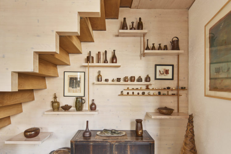
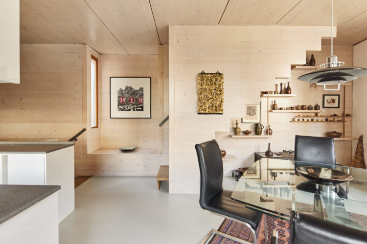
From this angle you can see how the walls are soft and warm looking in a way that white (and the dreaded grey tiled floors ) would not be. Below you can see how every space has been used – under the stairs a series of display shelves add interest and are framed by the treads above.
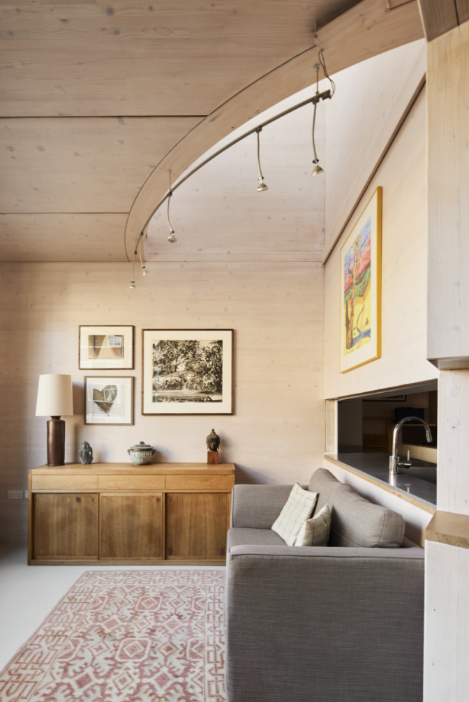
Michelle Ogundehin talks of planes (surfaces) when it comes to decorating in her book Happy Inside and she means that no surface should be left unconsidered. If you want to leave a wall blank then consider how that will look next the other surfaces nearby – not just the floor and ceiling and other walls but the tables as welll. If you want to decorate it – with shelves or artwork – then consider how that will all work together.
Below is a good example of what she means. From the left of the picture the eye travels past the art in the alcove which, imo, is begging for a cushion to be a mini window seat, to the gold wall hanging which takes you past the stairs and to those shelves. From there your eye comes out past the stepped stair treads and asymmetric shelves to the stepped form of the black light which takes you down to the black chairs.
Now I don’t imagine it was put together with such mathematical precision but spelling it out like this might allow you to take a fresh look at your own homes and see if you want to add or take away from what you have.
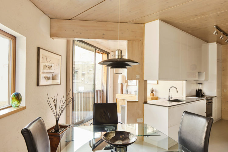
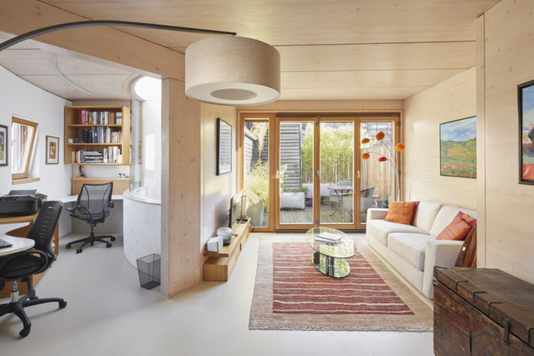
Coming up to the top floor with its roof terrace and curved working space, the colour palette remains the same and it still feels warm and tactile. The oval glass coffee table provides a contrast to the boxier sofa and allows the eye to travel past to the outside while also reminding us of the unusual shape of this house.
What do you think? I have always thought that modern houses weren’t for me but I love the shapes in this one – I imagine there are fabulous shadows throughout the day as the sun passes over all the lightwells. I also hope that you can take away ideas from here even if it does look very different from your own places.


Living in a small converted garage due to personal mobility issues, I utterly concur with the advice here for small-spacers….
arrange your room so that you “aren’t constantly staring at all the space you have”. For me that is a major bone of contention, both from an aesthetic point of view, annnnd a practical one. How cleverly to combine these paired issues in a restricted space. I’m sure I can’t be the only one with the tedious view syndrome!
It’s not really even a two bed house: the second bedroom is accessed off the first, and it doesn’t seem to have a window, so can’t be classed as an actual bedroom according to building regs. So this is a small, oddly shaped, very expensive, one bedroom house. I think I’d spend my 1.5 million somewhere else. Ply wood is really inexpensive.
Outside – fabulous.
Inside – meh.
Has many ideas I remember from Susanka’s Not So Big House
I can see this house doesn’t really have a garden but generally what puts me off upside down floor plans is that you basically kiss goodbye to any hope of indoor/outdoor living. No one is going to traipse up and down stairs with plates of food for an outdoor meal and keeping an eye on children playing outside must be a nightmare. The idea of harnessing the extra light by rearranging the living accommodation is a good idea in theory but would not be enough to persuade me I’m afraid.
We live in a first-floor flat and eat in the garden regularly – many flat dwellers do. What isn’t so fun or practical is things like taking out the bins – but then again in a flat you need to take your keys so it is more faff than a house where the downstairs door is your own front door.
I too live in a two bed house over three floors, but it’s a cheap conversion rather than architect-designed. My bedroom is in the living room, which is also the study and the front hall (looking out on a busy London road). There is barely a right angle in the whole place. I have really enjoyed the challenge of making this work, though I’m not quite there yet!
I wonder if the space behind the kitchen sink was designed to be the dining area? There is a sofa there now, but placing the dining table there would allow for dishes to be passed between kitchen and dining table – a modern take on the kitchen hatch?
I love that wood panelling on the ceiling – am inspired!
Despite its 1200 sq ft size and al the light the place feels claustrophobic. There is no natural flow from one room to the other and all the off-angles make me feel dizzy. I did like the weathered wood on the outside though.
I think the lack of toilet on the first and second floor would be really annoying! Having lived in modern architect designed buildings at different points of my life they are endlessly clever at getting the most out of the space and yes, the light is always fab.