This week the 10 beautiful rooms is another house tour. Not, sadly, of a client of mine, but of an interior designer who has no need of my help for his home. It is the gorgeous flat of Oliver Thomas, who may be familiar to some of you as the runner up on The Great Interior Design Challenge.
At the end of the show the judges felt that Oliver’s style hadn’t quite been represented on the show and when I saw his house on the last episode where they talk to the finalists about their own homes I’m sure I wasn’t the only one who agreed with a gasp and a desire to see more. His house is an amazing riot of colour, and while I wouldn’t necessarily be able to pull this off in my own home, Oliver has given his space some grounding and edge with lots of black so it’s easier (for me) to live with.
Every space has been thought about. Every shelf curated, every collection arranged. This is also a lesson in how to clash your patterns and colours by an expert. The other expert is Sophie Robinson, a judge on the aforementioned show and if you want to see her video tour of Oliver’s house then it’s here.
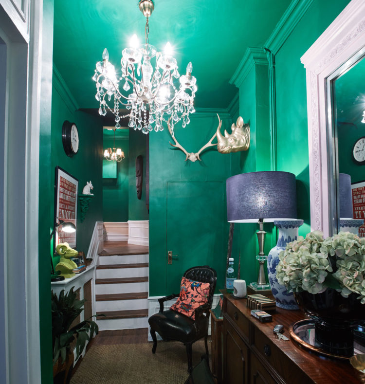
I love that emerald green in the hall. It feeds into everything I have ever said about going dramatic in the hall. You are literally passing through on your way to other rooms so you can be brave. Also this is a signal that the rest of the house is going to be fun and interesting too. Oliver has made the bright colour easier on the eyes by washing it over the ceiling and cornicing as well. It would be more jarring if it was broken up with white trim but this way it’s cool and dramatic without overwhelming. If this colour scares you imagine it in a darker green or a soft navy.
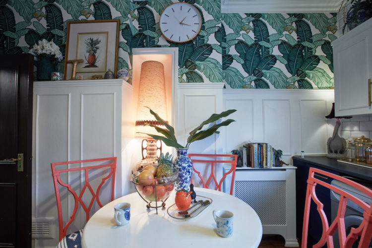
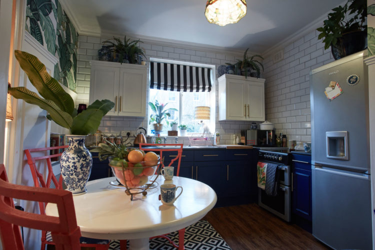
The green continues into the kitchen but here it has been broken up with classic white metro tiles and real plants. The coral chairs is a great touch and one that works really well. If you’re nervous about lots of colours then stick to two with some black and white for emphasis.
Alternatively remember the 60 30 10 rule. Three colours in those percentages. So here – lots of white, some green and a splash of coral. If that seems like maths look at your clothes – trousers or dress – main colour, top or shoes the second, finish off with earrings or accessories for the final touch. You can do it when you dress so apply the same rules to your decor.
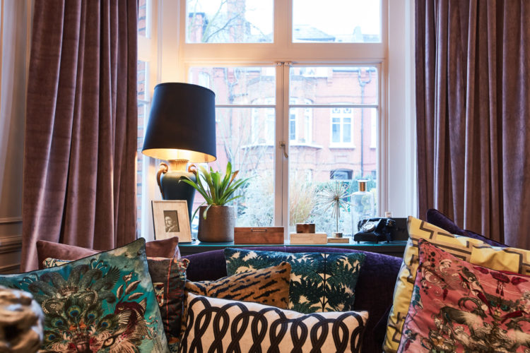
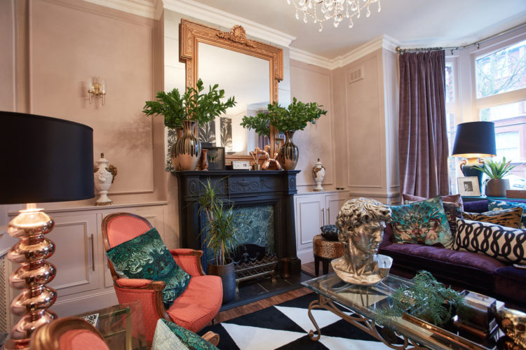
Moving into the sitting room and while, at first glance, this is a riot of clashing patterns and colours it does all work. One reason for this is the symmetry which calms everything down. I have included three images of the sitting room so you can understand why it works. And he has also used symmetry on his hall table as a balance to that strong green.
The two orange chairs are a bold colour but they match and have matching cushions which is a calming tactic. There are two matching vases on the mantelpiece and the real plants mirror the plant wallpaper which is a witty touch.
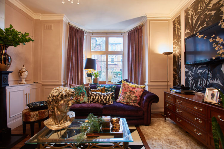
Now I have to say I don’t entirely know why all these cushions work but they do. It’s a real mix of geometric and floral, leopard and monochrome. But as Oliver says: “If it’s not working then take one away and mix them up again until it does.”
And if it’s too much for you then keep it simple. Perhaps you don’t even need cushions as there’s so much else going on. Oliver finds that depressing so he added lots.
Note again the classic statue head and the panelling on the walls. This is a Victorian building and the high ceilings help to balance all the textures and colours. Don’t try this in a modern house unless you are very confident of what you are doing.
“You need to balance the flounce with some strong shapes and colours to stop it becoming too feminine,” he says.
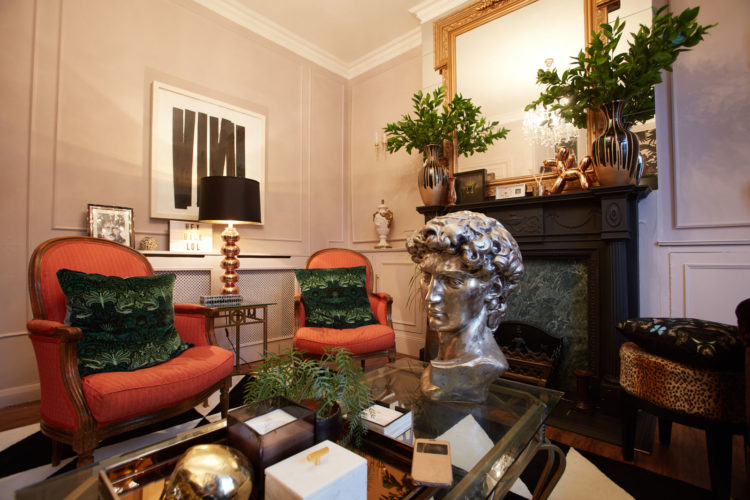
But you can see how the black lampshade, fireplace and rug anchor the space and stop it being just a collection of colour. There is real skill in how this room has been put together and I hope, even if like me you tend towards the monochrome, that it will give you some ideas to inspire and the courage to experiment. Very little is permanent after all. You can always repaint or tone down.
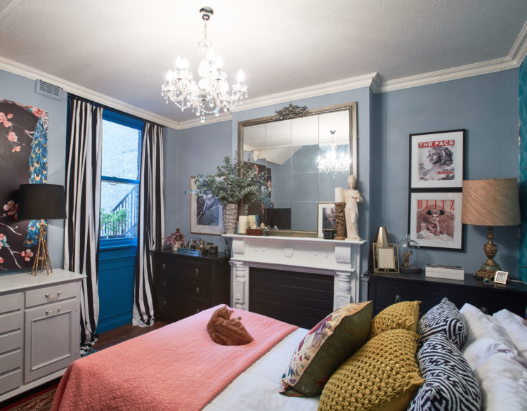
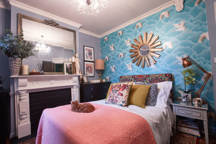
The bedroom is calmer in this soft blue but again there are splashes of stronger colours – coral (again) and mustard to add definition and painting the door in that strong blue is a brilliant touch. I always recommend adding a touch of black (by which I might mean charcoal) to a room to anchor it but if that is too much then take the pale wall colour and add something in the same shade but much stronger. It will have the same effect.
You might not feel brave enough to do this in your own home but if you like the idea of combining period interiors with modern styling then do get in touch with him at Oliver Thomas Interiors and if you want to try on your own then start with this rooms and imagine removing one thing until you feel comfortable with the layers of pattern and texture.
Don’t forget that in this bedroom the colours are all quite soft and relaxing and that if you were in bed you wouldn’t be looking at the wallpaper behind you or the cushions on the bed (as they would, by that stage, be on the floor) so from a sleeping point of view the whole space is immediately toned down.
So have a go in your own home. Black and white geometric, coloured florals and something plain. Stripes and flowers. Pale paint and dark architraves. Muted colours with a punchy overtone. Here’s to being brave with our interiors.


Re: overstuffing: The place is perfect for its owners, 2 professionals/ adults. It’s been curated in a lovely way over time, and to me nothing seems out of place. I especially like how the living room includes a not so obvious (yet rather big) TV which seems to fade to the background (leafy wallpaper). I would love to see more of Oliver’s projects outside his home to see what he can achieve for clients too.
terrible…
This is great!! I love all the green leafy wallpaper and plants everywhere
Love it love it love! If you’re going to do maximalism you have to go all the way. He’s nailed it, this pad gives you such a happy vibe
I also feel that rooms feel a little cramped , what’s worse they make me feel claustrophobic and i am not a minimalist . But what is more important is that Oliver loves it
I think it’s breathtakingly gorgeous. I love the riot of colour!
Think that ginger cat is just right for the house, rather like Enid in Kate’s own home. I’d have liked to have seen him in every room.
I agree with Leslie, but I am a self confessed monochrome minimalist. Having said that my favourite room is the pink and blue bedroom.
Maybe it is the minimalist in me surfacing, but these rooms feel very crowded. The rooms are lovely and most of the design choices are right on. However, each room feels overstuffed with little breathing room. The Coco Chanel rule can be applied: Look in the mirror and remove one accessory.