Hopefully you see before you the blog as usual with nothing amiss. Perhaps a faster loading time, but otherwise it should all be as normal. The weekend involved some maintenance and updating and as I write this before it has started, all being well it should be done by the time you read this on Monday morning…. or some point soon thereafter. And if it isn’t – well not much point my apologising as you won’t be able to see it anyway…
So Beautiful Rooms. Wanna see some? Let’s go.
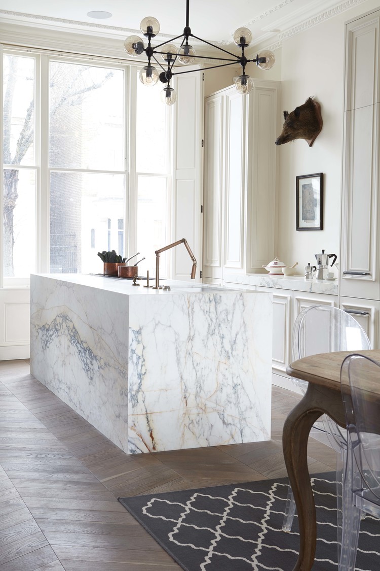
This kitchen by Blakes London has been one of my dreamy fantasies for a while now. It’s not just the gigantic slab of marble so much as the room it’s landed in. This room is Kate Moss wearing a bin bag. In that it wouldn’t matter what you put in here it would still look good. But that island is perhaps Kate in Stella for maximum va va voom.
One day I will have a marble worktop. But therein lies the clue – it will probably only be the top. Still, rolling on.
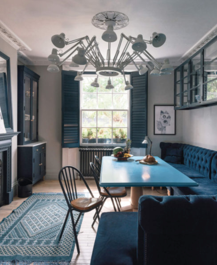
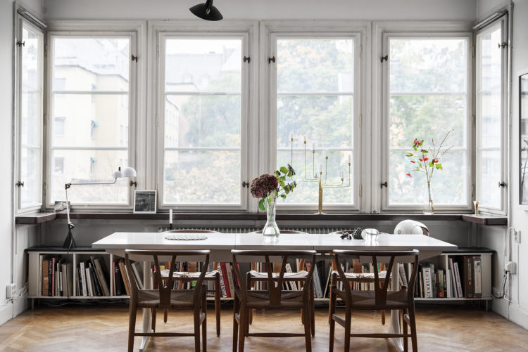
I’m showing you this again for anyone who didn’t have time to drop in on Friday as it’s a really clever way of using colour in interesting and unexpected ways. That is to say – the table is the eye catcher while the slightly softer banquette and window frames all work to make it stand out even more.
And yes I know – velvet banquettes are probably not for all but you could use a sensible wipe-clean linen if you have small children or partners who like to hurl the odd glass of red wine around.
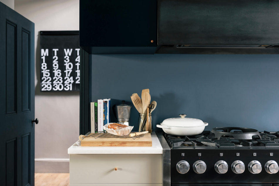
But what about going really dark? The image above is from the same house by Undercover Architecture and that deep dark navy with the pale wood and cream is just gorgeous isn’t it? Or could you go this far – this kitchen is in a tiny cottage in Petersham and was designed by Devol. I love it to look at but am confident I would have bottled it when it came to the ceiling and painted it lighter. What do you think?

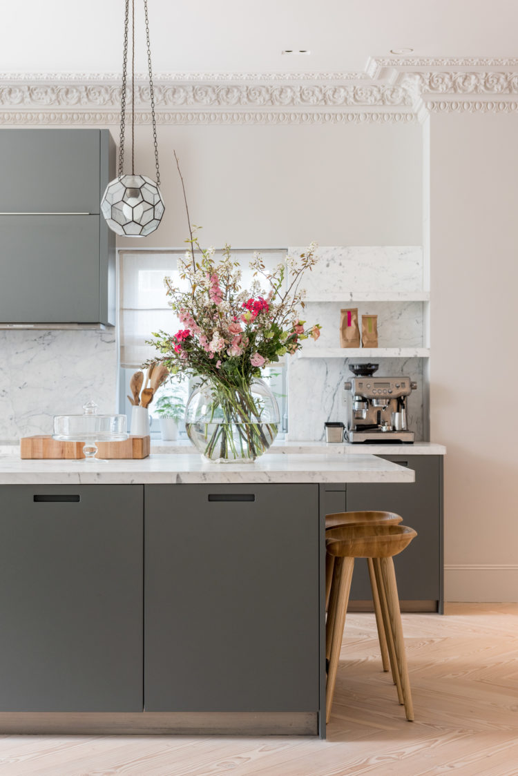
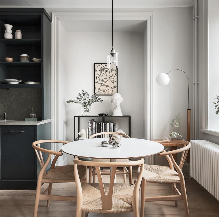
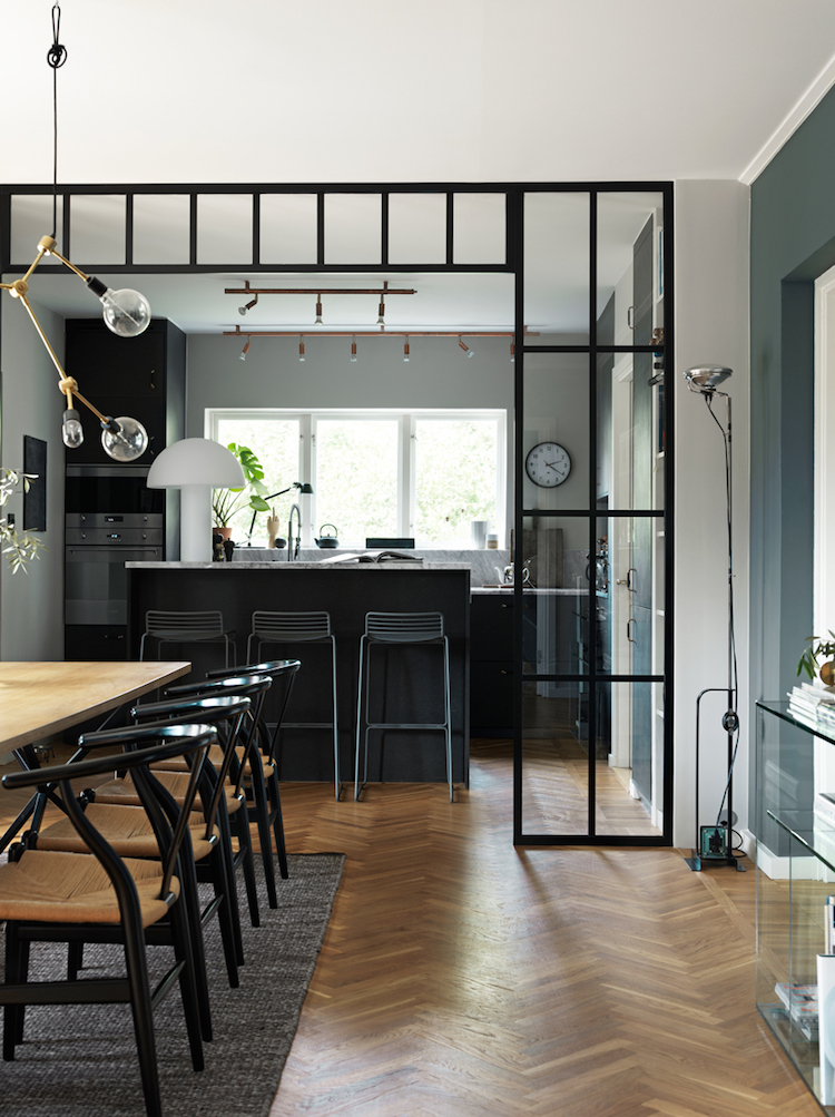
Ok back into the light now. A simple palette of grey and marble. It’s classic and safe but still beautiful and the wooden stools warm the whole thing up and bring a dash of rustic to the whole which contrasts well with the ornate cornice.
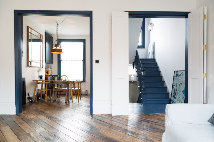
Finally the company has use the same trick as in the first house by framing the doors and windows in navy blue. It draws the eye to the far end thus increasing the sense of space while framing the view at the same time. For those who always ask me, painting the architrave of the door doesn’t mean you have to carry on round the skirting boards either. That might have made the room look outlined like a cartoon. This way the skirting boards match the walls and the door frames do the framing – clue’s in the name.
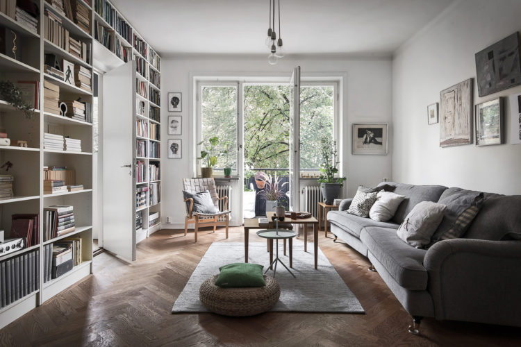
Now then books. Always good in a room. Vital for colour and interest and, er, reading. Now you may not have a bay window this big (wouldn’t that be nice) but it’s a good spot to use for books. I might have gone one step further and added a foam seat so that it was a proper reading space.
Talking of books there’s nothing better to furnish a room and here they have created a whole wall of them. If you have mainly paperbacks this needn’t take up as much room as you fear. An Elle Decoration is 26cm deep and a paperback much less. Our shelves are 30cm deep and The Mad Husband spends too much time sliding them to the front after I or the teenagers have leant against them and pushed them to the back. Narrow shelves is the key to peace of mind, lots of storage and not making the room smaller than you need to.
This picture is so restful. The soft grey walls, dark cupboard to show off the plates and the pale wooden chairs. It is completely simple and calm and doesn’t need anything adding or taking away.
Similar space but this time it’s darker. I love this one too but I might have been tempted to paint the island a little paler as that end of the room is quite dark.
So there we have it. 10 Beautiful Rooms Done. New blog host. Done (hopefully). See you tomorrow.


Hi Kate
Love your blog. One word of caution re marble worktop. Marble is soft and porous and stains easily. I learnt by making a very expensive mistake. But good luck if you still want one at some stage! 🙂
I know! I think when the time comes I will fake it with a composite which, these days, looks really good and is much tougher. It doesn’t have the same translucency but given my tendency to spill and splash and cook I think I will have to.