Monday Morning and time for a new set of 10 Beautiful Rooms. This week we are sticking firmly in the monochrome palette. This is partly because it makes a great basis for any scheme. I don’t necessarily mean black and white as that can be stark and very modern soften it slightly to charcoal and ivory, for example and you have a completely different look.
Whether you lean towards the modern or the rustic, the dramatic or the simple, this is always a good place to start and you can decide if you wish to predominately dark with light touches or the other way round. The joy of this is that you can add any other colour you please to change the mood or refresh the scheme.
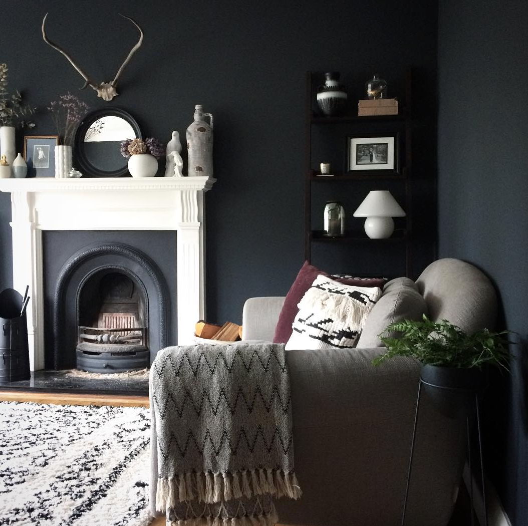
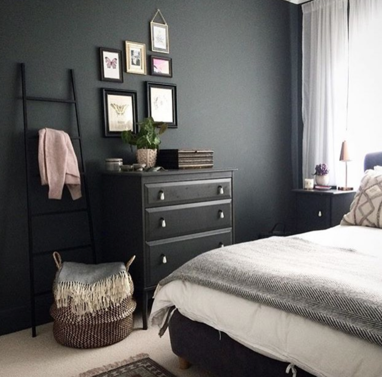
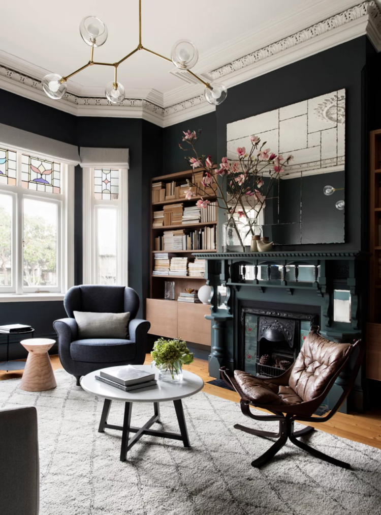
Take these two rooms by Amother Designer, for example, the pale rug and fireplace just lighten the dark walls without taking away from the drama. Both rooms have a hint of burgundy or pink (this must be why I love her – it’s a similar scheme to The Mad House) and a splash of greenery from a plant and it’s done. But you could swap the pink for orange or paler grey or cobalt blue or an inkier black. The possibilities are endless and everything goes which means you can shop for new stuff or change the sofa/bedspread without having to completely redecorate.
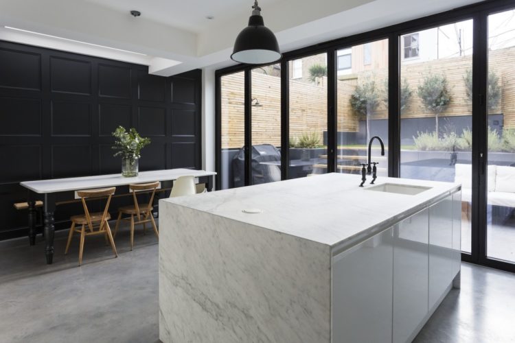
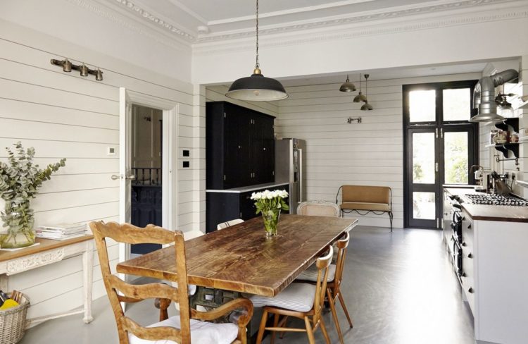
But aside from the practicalities it just looks great too. This kitchen with its contrast between the dark panelling on one wall and the modernity of the marble on the other is gorgeous and for anyone who is unsure about the wisdom of dark window frames then just absorb this. At the risk of being repetitive, the dark frames really do, er, frame the view in a way that white ones just don’t. They also provide definition to this wall of glass, breaking it up and creating interest to the interior of the room.
Now it might be different if you are gazing out over the ocean from a Malibu penthouse but for most of use the view might need a little help to pep it up and help it looks its best and, just as with a picture on the wall, a frame is really good for that.
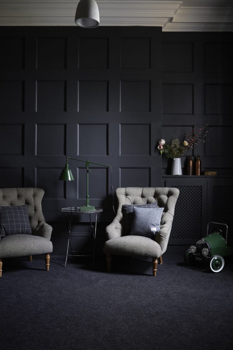
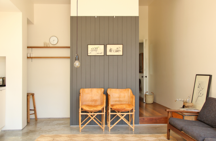
More panelling, this time with grey chairs but imagine patterns – zebra stripes or bold, blowsy flowers, neon yellow or softest green. You can bring in an ever changing cast of characters to this scene. I’d start by lowering the light and changing it to something metallic to really contrast with the wall behind.
We all hang pendant lights in the middle of the room because that’s where they have always been but then we don’t want anything too low in case we want to move the furniture for a party or not even move it but just dance on the tables. Why not move a great pendant lamp to the corner or let it hang down the middle of a wall over a sideboard or bar cart where it won’t be in the way, will act like a piece of art on the wall and still light the room. Don’t forget that modern LED bulbs which don’t get hot have completely revolutionised not only what shades can be made from but where they can hang.
A final dark room before we go to the light side and I love everything about this. The wooden floating cupboards in the alcove bring a warmth to the black and white and the mirror over the fireplace obviously bounces the light around. If you keep colours to a minimum then you can really play around with textures so in this room we have brass, glass, wood, cork, leather and wool (chair and rug).
Right to the light and swapping the elegant panelling for the more informal look of shiplap or tongue and groove, this room is immediately more relaxed. I suspect the walls are white but as it was taken in Australia, the sun is probably beating down and casting a golden light over everything *looks glumly out of the window at the unrelenting dampness of a the grey November day.*
And look at this UK kitchen with its similarly clad walls.This time it has pale walls with accents to bring definition so the light, the dresser and, of course the black window frames are all essential parts of this scheme bringing it together and helping to define the space.
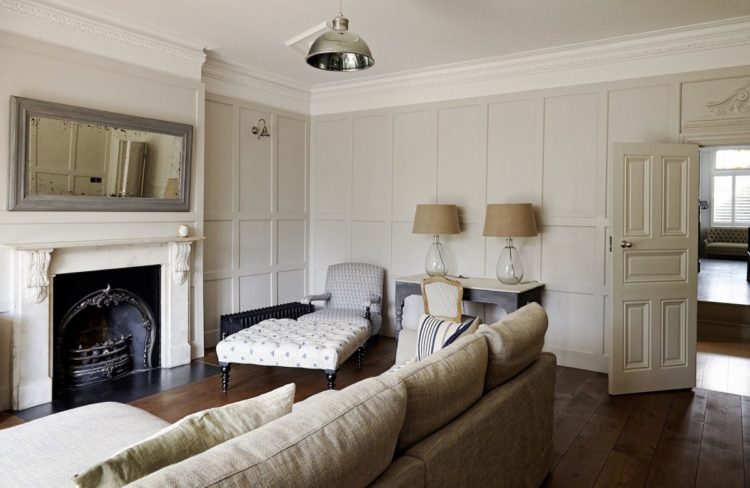
And back to panelling for contrast. This room is so elegant but still relaxing. The twin lamps bring a calm symmetry to the space and somehow make it more grown-up. This is more soft neutrals than the afore-mentioned black and white but it’s the principle. Swap the lampshades for black ones and lower the central light or drape the flex across the ceiling and having it hanging down in the corner to provide a reading light for the chair. Add a few books on the footstool and I’m ready for my Sunday afternoon.
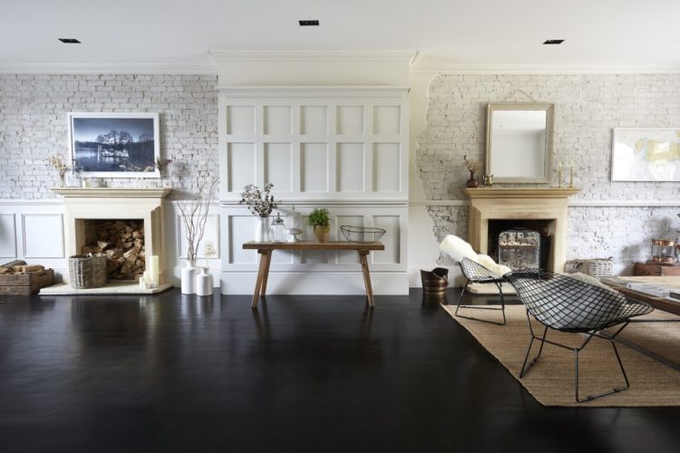
And who says we can’t have it both ways? A rustic wall of painted brick contrasts with the cool elegance of the panelling. I love this as a look but just can’t imagine that the Mad Husband would go for it. Might have to ask….
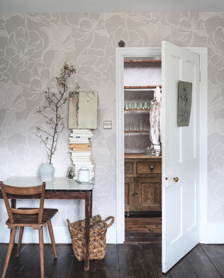
Finally, wallpaper. I have a little in my bedroom and am about to add a little more in the downstairs loo. This comes in several colourways but this soft grey with the rustic wooden floor is a strong contender to be my favourite. We’ve only just decorated the bedroom but I’m wondering if we need to start again….
So there you have it. Ten beautiful rooms – are you dark or light or somewhere in the middle?


Love the dark rooms ! I’m about to paint a whole house, not sure I’m gonna do all at once, though… but many times people comment my few choices (terra cotta in the entry way, or dark – moonlight black from Flamant, by Tollens) saying it will all darken the rooms… Ah. Maybe I’m too influenced by blogs- yours, abigael ahern’s or Making spaces- ? But white feels sterile too me. And it’s only paint, after all. And I’m all for black framed windows !!! Thanks for the rooms and inspiration, it’s great, as usual !
Love the dark rooms. Lots of ideas for me to copy here! Can you advise what wallpaper you used for your downstairs loo?i love the farrow and ball papers but think the pattern is too big for a small room.
I am going with Farrow & Ball Lotus which is big but I wanted that paper and that was sort of that. Having said that a big bold print can work really well in a small room. It’s bold and uncompromsing and a small print can look fussy so I’m completely relaxed about how it will look. We are going to add a picture rail – as it were – and paint below it in gloss paint – practical to keep clean ( I have sons say no more) and wallpaper above so it will be only half the wall in paper. The basin is going in as a type so hopefully the room will be done in the next couple of weeks. I will, of course, keep you posted.