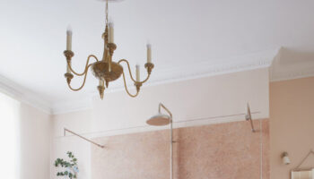
When is a feature wall not a feature wall? When it’s basically a giant alcove. Interior designers will tell you that the feature wall is over. That if you have chosen a colour or a wallpaper you should do the whole room in it – have the courage of your convictions and show it like its creator meant it to be seen.
While I’m not one for rules in principle, I do tend to agree that it has become rather a cliche to paint a chimney breast in a contrasting colour. And I have done it. I have also done a single wall of paper, partly because we couldn’t afford to buy any more, but on the whole, if you like a colour enough to use it then, well, use it.
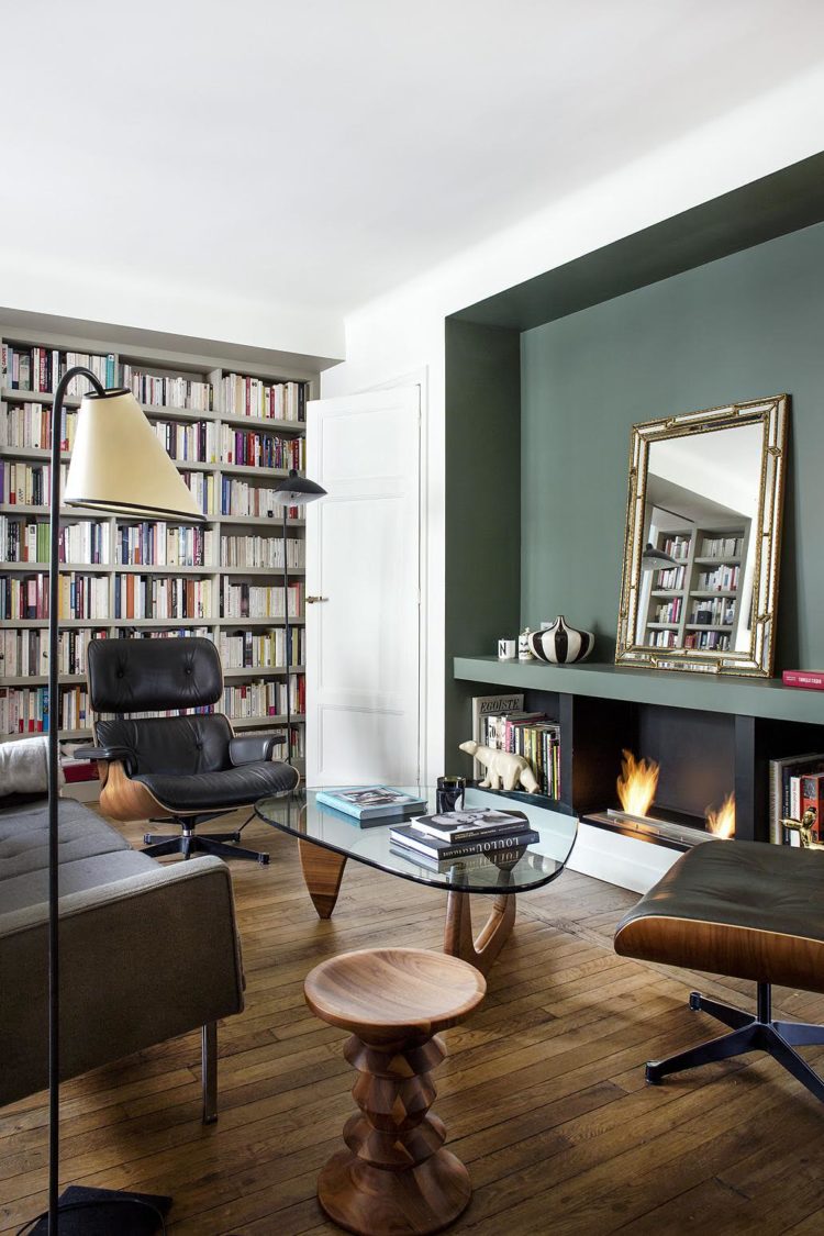
Although this is a clever idea in an alcove as it will create depth at the end of the room. And it’s a wonderful colour – green smoke by Farrow & Ball. I have a tester of it as we tried it for the bathroom but somehow just didn’t follow through. No I don’t know why either as every time I have seen pictures of it since I have loved it.
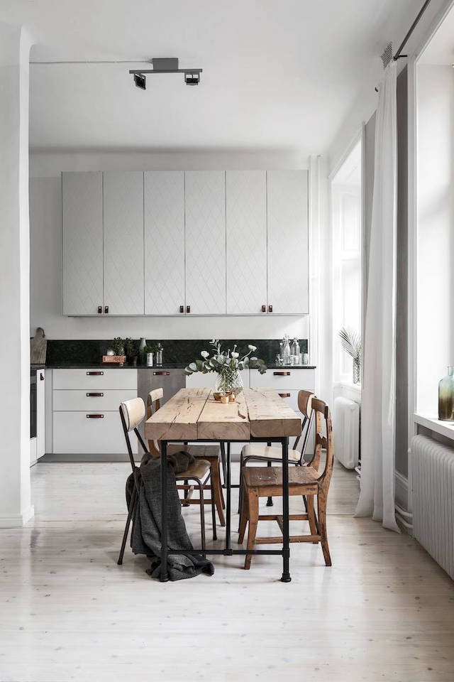
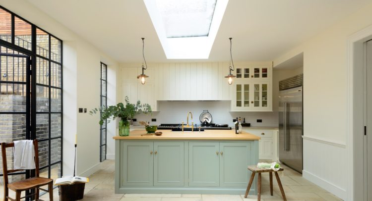
These cupboards are by Superfront I’ll wager. If you’re not familiar with them, they make doors to fit Ikea kitchens. We bought our leather handles from there although our cupboards are plain painted MDF. Note also how the rustic table brings character to this space and, together with the leather handles, bring in different textures which is a really important, and often overlooked, element of bringing a room together.
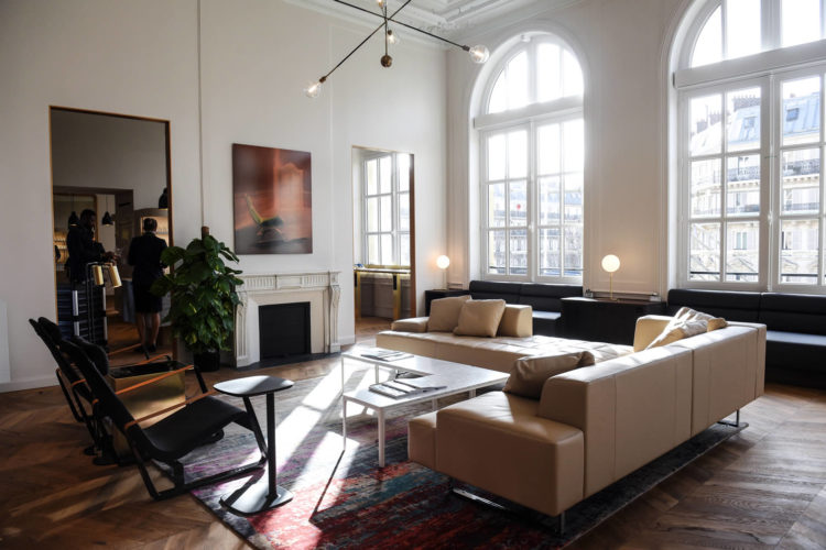
This is apparently the new Eurostar business premier lounge as featured on we-heart.com. It’s a lounge I’m unlikely to see in real life so I’m sharing it with you here. It’s at the Gare du Nord and was inspired by those classic Parisian apartments. It’s probably just as well I don’t tend to travel on Eurostar’s business tickets as, if I had access to this waiting room, I may never leave.
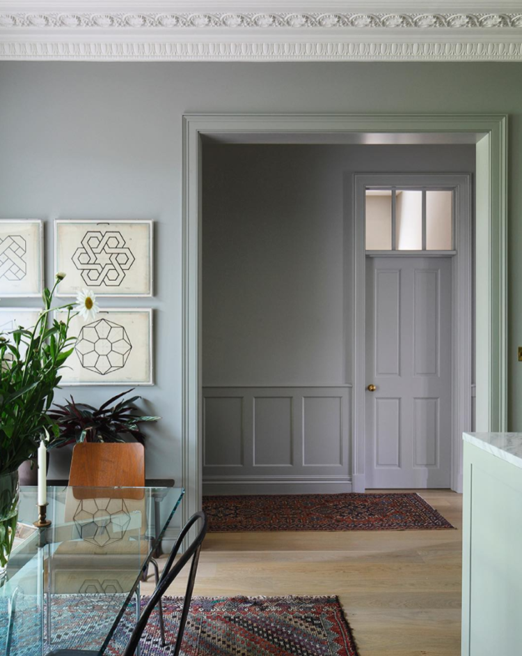
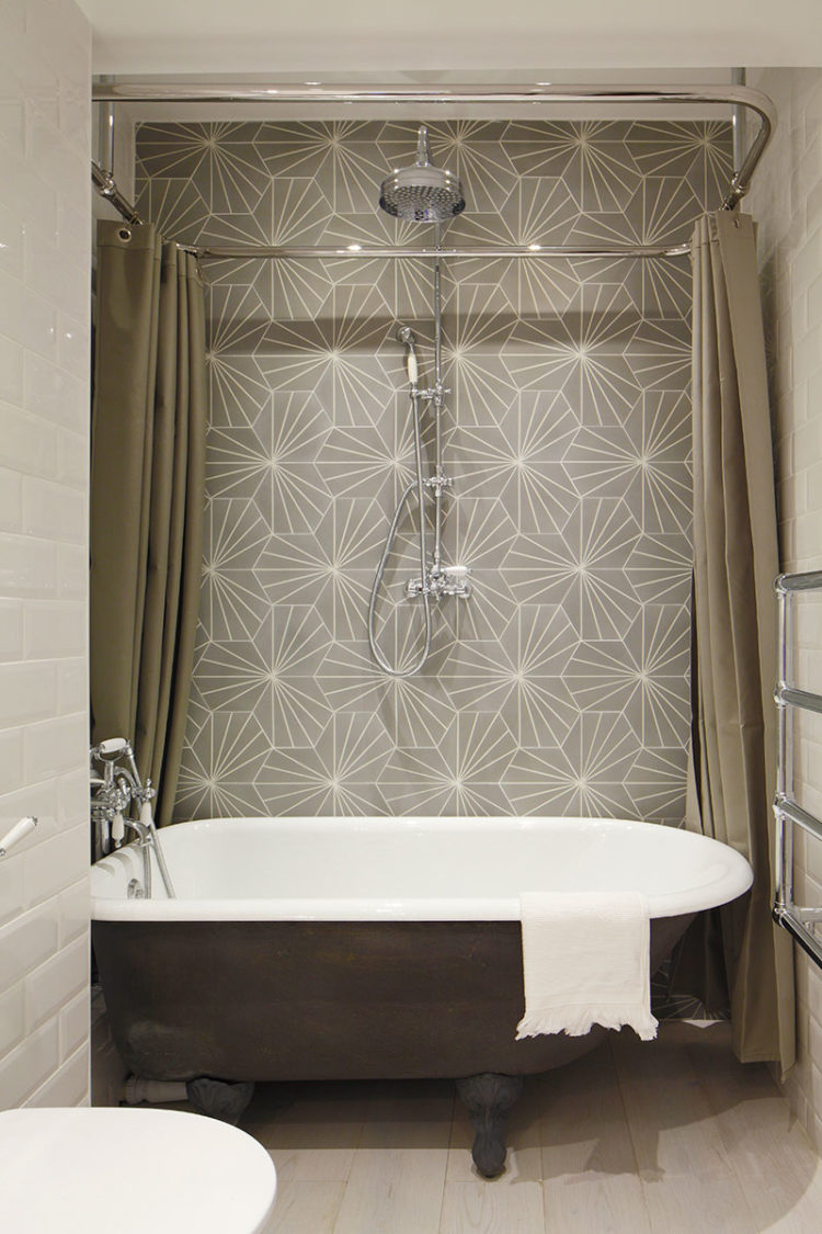
James Balston shared this image on instagram last week and invited his followers to see the rest of the project in his archives so I’m showing you here with the link so you can see the rest of the apartment. .I just love the soft blue walls with the vintage rugs. . Also there is this bathroom with its Dandelion tiles from Marrakech Design. If it was possible for a tile to have a moment then this pattern is having one. You see it everywhere and it always looks fabulous.
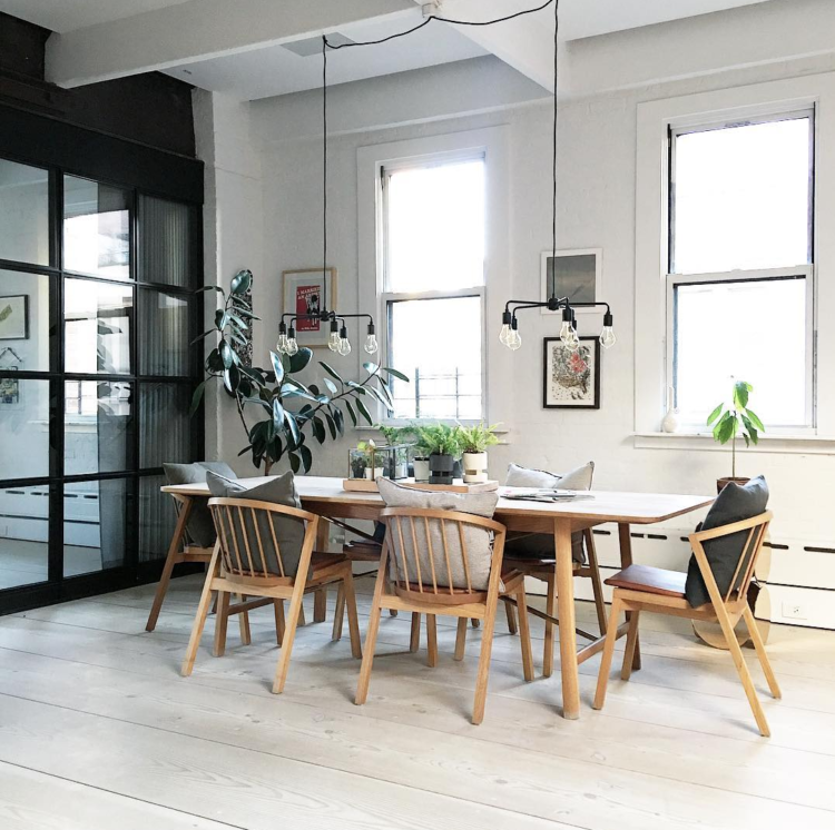
Next up are two images from the Manhattan loft apartment of Danish designer Soren Rose. I have one of his lights in my bedroom. You can just see it on my instagram today and I just love his whole home. It’s a sort of check list of lovely elements – black, white, wood, marble and plants. The exposed brick won’t work for all of us but the black window frames do and note how he has done them black in the kitchen area and left them white in the dining part – you don’t have to match everything.
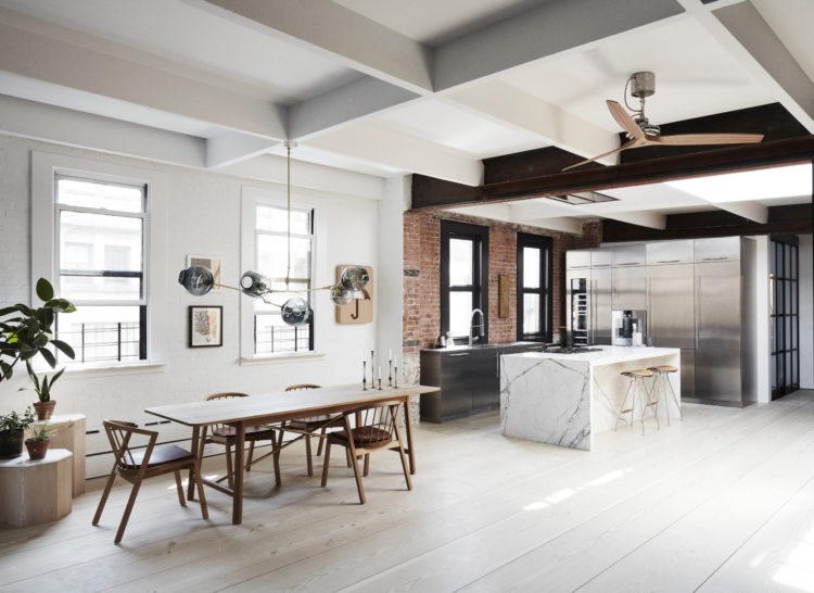
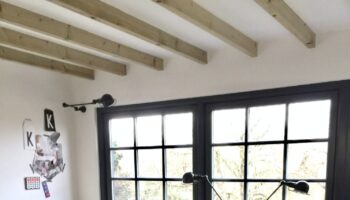
Oh and there’s a crittal window. I’d just love one of those but it’s never going to happen so I (and perhaps you too) will have to content yourselves with just admiring those belonging to other people.
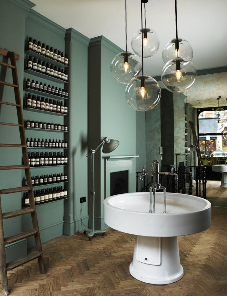
We’re going to finish where we started – with some heavenly greens. This is the Aesop store which was designed by Ilse Crawford. It’s definitely a great colour for a bathroom. Mine will stay grey for now as we’ve only just done it and it’s only just been photographed for a magazine – I’ll keep you posted when it’s out but this can go on the long, long, long list of colours for next time. I’m going to say five years….
This Devol kitchen has also used green although I think the Green Smoke might have been better. Mind you I wouldn’t complain if this was in my house. It’s a great room and I would happily cook you all a meal in here.
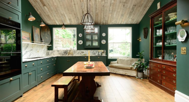
Last up what about this deep dark green? I love the mix of vintage furniture and oil paintings that have found their way into the room in a totally unexpected way. The owners even found room for a little sofa, something which I wish I had been able to do in my own kitchen but we chose more storage cupboards instead. And they’re all full so I guess we did the right thing.
What do you think about green? Have you got some? Do you fancy some? Olive green is quietly taking over my wardrobe so it’s only a matter of time before it hits my walls…..
Islington kitchen colours and floor tiles are very popular now.
Thank you for sharing the pictures…All rooms are so beautiful.I love modern rustic bosthlm.se.
Green smoke is one of those FB elusive colours. Used it on my front door when I lived near Manchester – wonderful deep green / grey. Used it on my front door in West Sussex – miserable and washed out. Used to love FB paints but the difference in light, particularly sunlight makes it difficult to judge the impact of their colours in different settings. Maybe that illusiveness was beguiling at first but now as a grumpy old woman I have moved on to Little Greene for a bit more consistency and really great application.
Bathroom? I meant the Aesop store. Eurggh.
Hmmmm
The green bathroom makes me want to kill myself. Yet the difference between that and the dark green kitchen is marginal and I really like that one.
But yep, the Soren Rose kitchen and dining space is delicious – definitely good enough to eat (in)! I love the marble wraparound/waterfall effect on the island. I love marble and I’m considering it in my own (minuscule) kitchen. I do worry that I’ll get sick of it, though.
Analysis please, Kate: for just how long WILL I love marble??
Hi Kate,
I am in the process of renovating a Victorian property, and am totally addicted to your blog despite the fact the house will probably look like a building site for many more months – fantasising about interior design keeps me going so thank you! I wondered whether you would mind me asking quite a practical question regarding the Crittal window which you mention in the above post, and previous posts? Inspired by your blog we have decided to splash out and put Crittals in our extension patio window – but there are four types, Berkley, Corporate W20, corporate 2000 and Homelight. I am after the slim-line dark grey ones like all the lovely pics you have posted but am in a complete quandary over which these are… I asked Crittal and I am now more confused! I don’t want to get it wrong as its a big chunk of our budget, could you possibly advise? Any light you can shed would be fantastic 🙂
Thanks,
Anna
I must revisit your post several more times today to properly process all the info. Right now, I am glued to the L-shaped, white coffee table at the Gare du Nord lounge. Love how it mimics the shape of the couch. That, and the round, 3-faucet sink at the Aesop boutique.
Happy Monday, Kate, and thank for a week’s worth of inspiration (sigh).
Fabulous post as usual Kate, love all but the heavy ceilinged last pic, which didn’t work for me on any level I’m afraid, but just leave me in the Soren Rose loft……mmm
SueLx
Olive green spare room in my house. It creeps in in other rooms – in patterned fabric on chairs, for example. I love it.
Kate: Brilliant Monday a.m. to you!
Olive green in my bedroom and bath – ala Barbara Barry of the ’90s, I suppose, but it is soothing, classic. Love all the rooms this week. thanks for always making my day start off well.
Beautiful rooms indeed today!