I suspect it’s a truth universally acknowledged that for every one thing you see at Milan Design Week there are 10 more that you missed. After 48 hours walking a total of 36km round the city last week, I went from delight at the things I did manage to visit to despair at all the ones I ran out of time for. One of those was the Villa Borsani, pictured below, which sadly I didn’t get to.
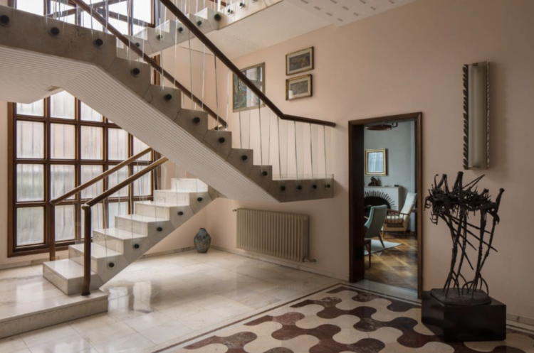
Designed by Osvaldo Borsani for his twin brother, Fulgenzio, in the 1950s it was opened for the first time ever last week. And it feels so current. The large patterned tiles, the natural wood and dark door frames and the pink. Oh that pink. Which has sent me off on another quest to find the perfect pink.
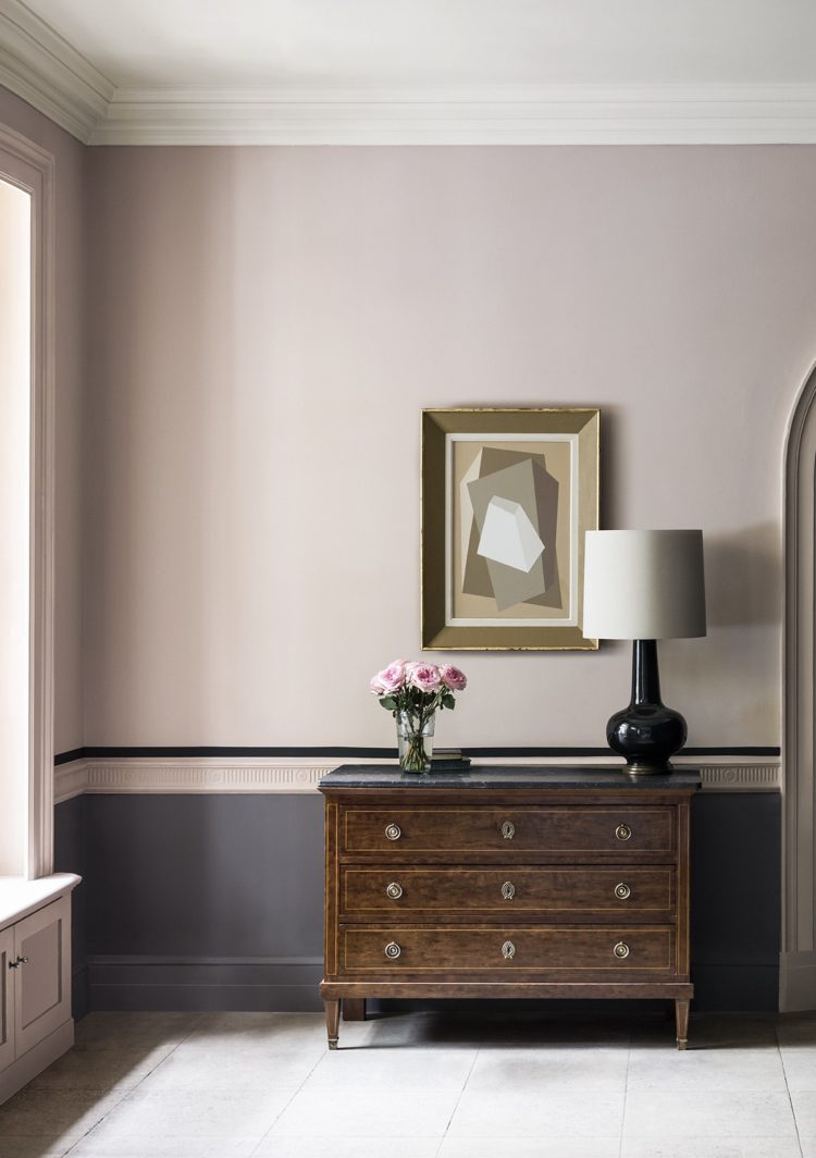
One contender is Temple by the Paint and Paper Library seen above. It’s darker than this in real life, by the way, and apart from admiring the colour (if indeed you are doing that) take a moment to look at the use of paint. A half-painted wall always works – with or without a dado rail to divide the two colours – but here the decorator has gone one step further and added a dark line above the rail for extra impact. I love that idea and it would, as I say, work if you didn’t have the rail as a natural divider. Now I’m on the hunt, not just for the right pink but a wall to paint it on.
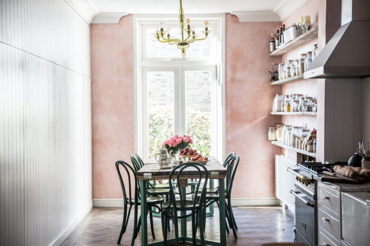
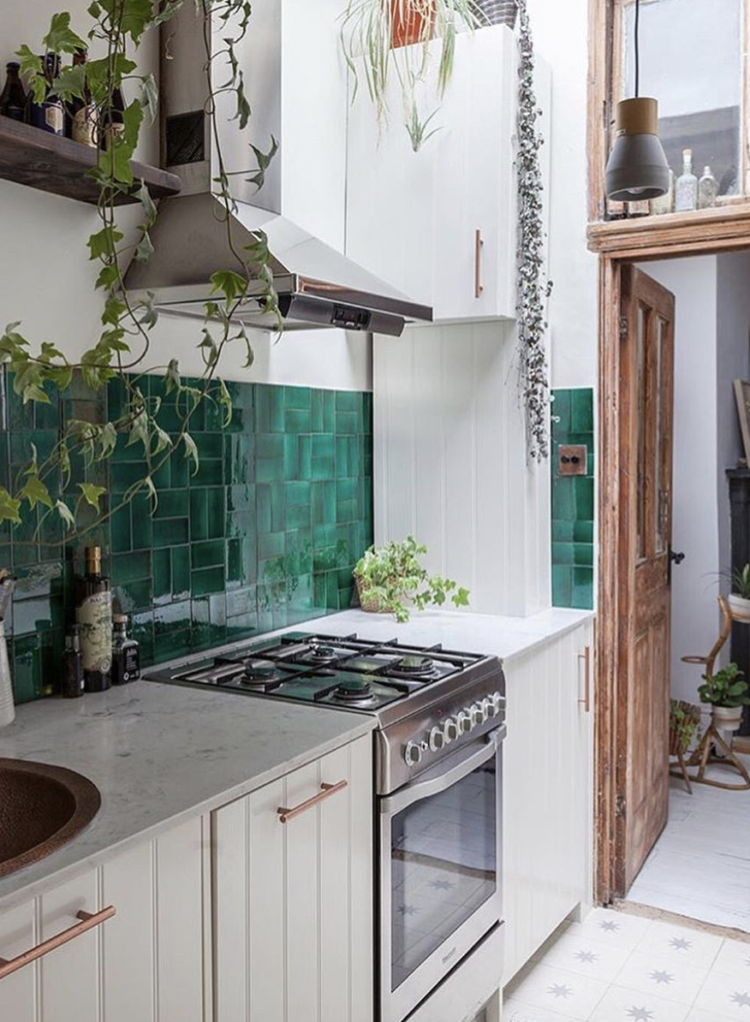
Before we leave pink let’s just pause for a moment to admire Skye McAlpine’s kitchen decorated by the wonder Jersey Ice Cream Co. Skye lives mostly in Venice and her new cookbook A Table in Venice came out a few weeks ago. Worth it for the pictures as much as the recipes I reckon.
Now I shall return to the looks and trends seen at Milan later this week but these two images from the Paint and Paper Library sum up the prevailing colours quite well. In addition to the pink – lots of that in all shades from brick to blush – there were lots of blues and dark wood and still a fair amount of brass.
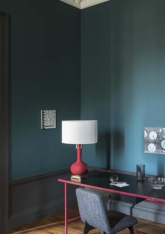
The colours all had a hefty dose of grey in them and felt natural and earthy such as this blue teamed with dark wood like the image below.
Another look was the stacked tile. This also features in this month’s Elle Decoration magazine as well as in the newly refurbished Greek Street outpost of Soho House. Now a newspaper editor will always tell you that two’s a coincidence and three’s a trend and those two, coupled with Milan and this newly decorated flat by HC Developments means that this look is now firmly on the map.
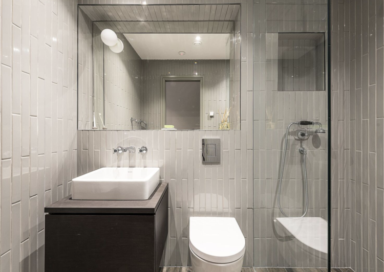
I’m still a huge fan of a herringbone pattern but if you care about trends then know that this vertical look is about to be the new brick pattern and will be everywhere soon.
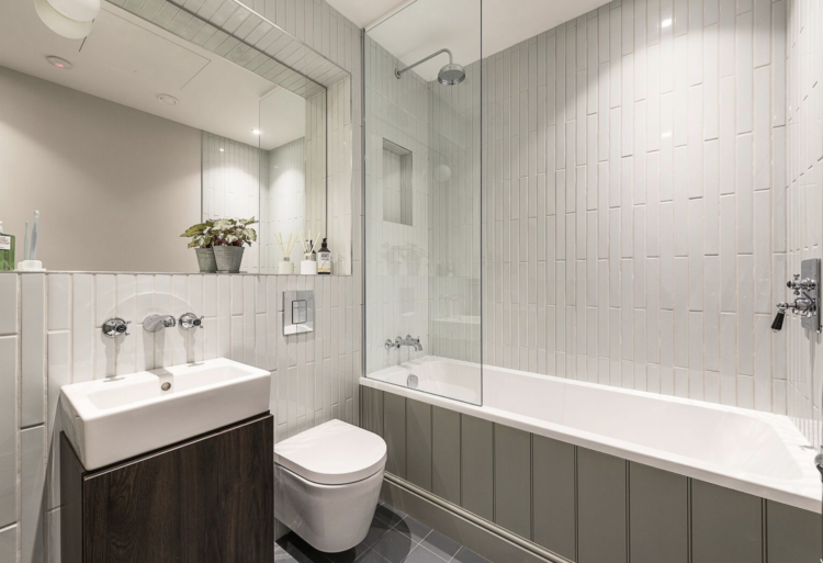
It’s true that we have seen nothing but brick formation subway tiles for about five years now and someone was bound to come up with something new and this is it. Herringbone is still fine, by the way, and as I always say, it’s about what you like and what works in your home so don’t feel I’m laying down any laws here – I’m merely reporting the facts as they were presented to me.
You can always hedge your bets with tiles laid in both directions like these by Emilie Fournet Interiors. Green, by the way, isn’t going anywhere. In fact, as is always the case, if you look hard enough you can find exactly what you want to see, which is another reason why trends are bunkum. But that doesn’t mean it’s not fun to read about them.
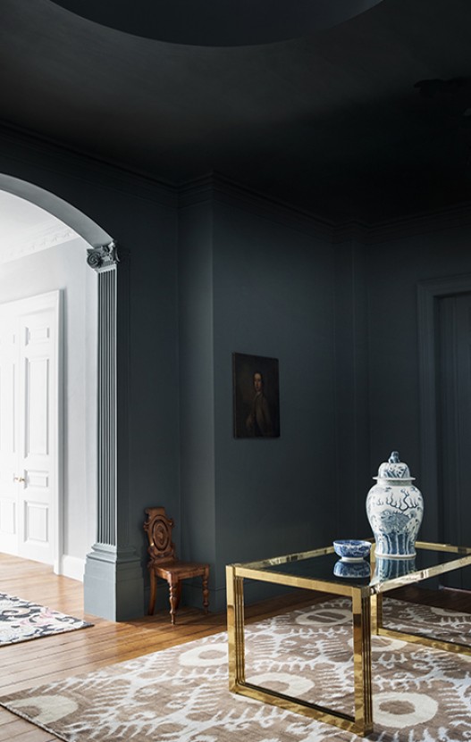
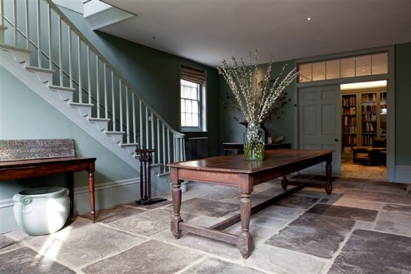
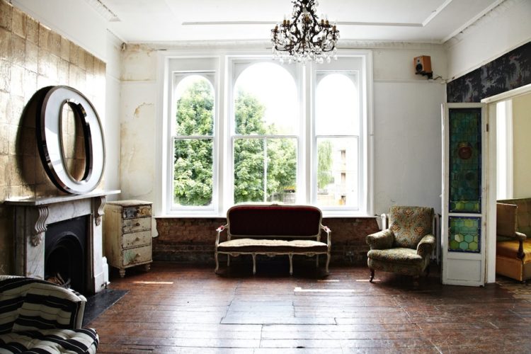
Finally, natural colours and textures will always be fashionable and this room, while appearing, at first glance, plain and classic could also – like the Villa Borsani – have been decorated at any time in the last 50 years and still look relevant today which brings us back to where we came in.


I painted a small north facing room Camisole pink by Craig and Rose and it’s the perfect pale pink – warm but with enough grey to stop it feeling sugary. I’d love to paint another room the same colour but sadly it’s no longer stocked locally 🙁
Hi, do you know that you can order C&R online?
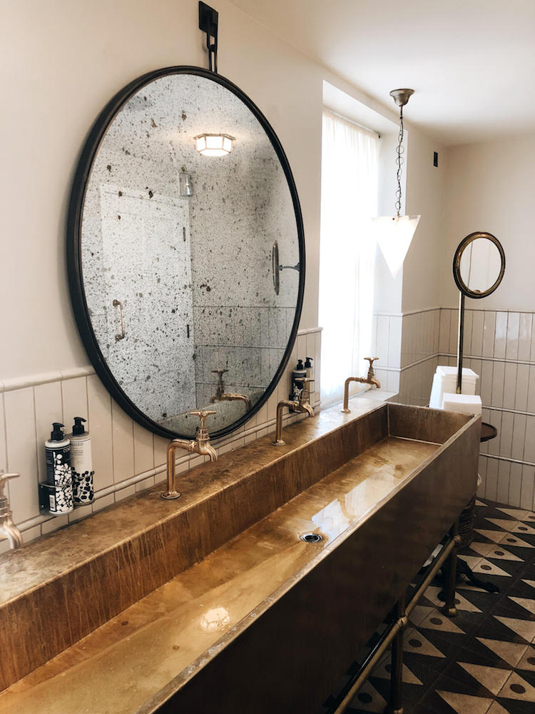
If you want that gorgeous round mirror then you can buy it from a shop in Islington who will arrange delivery. (We suggested buying it for a wedding gift but no!!!) islington@adventures in furniture.com
As for divine pink paint colours get the chart from Edward Bulmer Paint.
Thanks for yet another informative article to read. I’m so thrilled that at last my beautiful “unfashionable” mahogany antique furniture appears to be a new trend, but only if accompanied by pink or dark blue walls! I will have to get cracking on the re-decorating…..
Love these pictures!
How would you determine whether the ceiling should be painted the same colour as the walls, or if it should be kept white? The rooms above seem to have dealt with it differently.
E.g. In the Rochester location house, the blue-white wall-ceiling split seems to make the room appear shorter. But I don’t know if having the ceiling painted blue would make the room feel too oppressive.
It’s a tricky one – I think that picture may be the angle which is making it seem low. Having said that taking a dark colour right up to the ceiling does draw the eye to the boundaries of the room as it were which can, in turn, make it seem smaller. In a room with a picture rail I would suggest painting up to an including that in the dark colour and then bringing the white ceiling down over the top of the wall to meet it. That blurs the edges between wall and ceiling and can make it all appear larger. In a pale colour I would say keep walls and ceilings the same for the above reasons. In a dark colour – it’s up to you if you do the ceiling as well. In a dark sitting room which is used mainly at night in electric light then painting the ceiling dark can be very dramatic and effective. If it’s a room you use in the day then it might feel more oppressive. It’s back to the old who what and when questions of last week for that one I’m afraid.