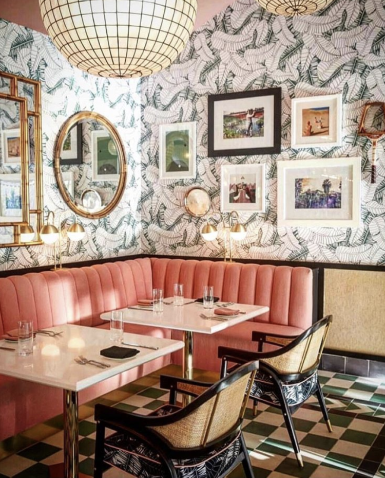
Morning and Happy Monday – or happy day depending on when you are reading this. A mixed bag of beautiful rooms for you this week, starting with the newly decorated Pink Cabana bar at the Sands Hotel and Spa in California’s Coachella Valley. This was designed by Martyn Laurence Bullard as a fresh take on the Palm Springs style of the 50s and 60s and it certainly feels fresh and modern.
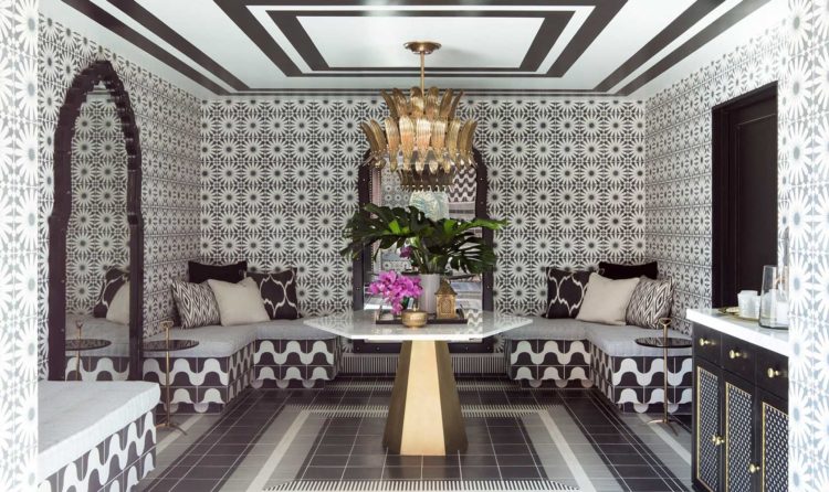
Below is the Spa and it’s a masterclass in clashing patterns. Basically black and white geometrics go with anything, as do stripes. This works as the colours are minimal and the patterns have been juxatoposed in a symmetrical way making it easier to look at. If you wanted to do something similar but were nervous of overdoing it, you could keep the floor plain black and the ceiling plain white to take it down a notch. Bear in mind that this is in a hotel though and people won’t be spending hours in this space so it an afford to be bolder.
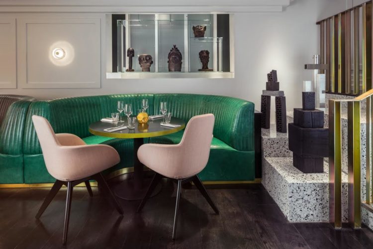
Returning to the pink and green combination that has been around for a while as this image of Bronte London, which was designed by Tom Dixon, shows. It’s a brave mix but you can soften both colours to create something more subtle if it feels a bit much – if the green was darker and more forest for example then you could play with the shades of pink to making something less dramatic but still pretty.
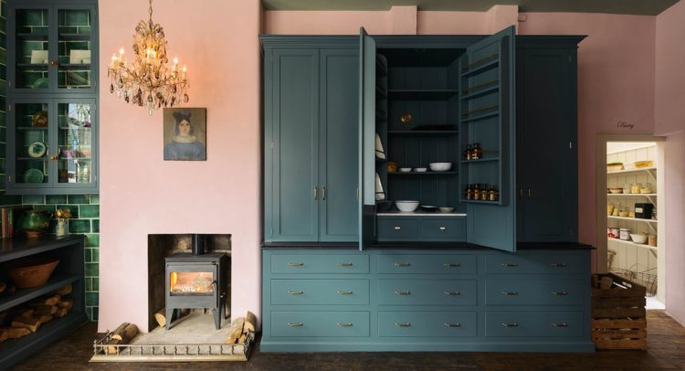
Here is another take on it in the Devol Kitchen Clerkewell showroom. As long as you pick a colour for the cupboards that you are confident of liking for a decent length of time you can be bolder with the walls as yes it’s a faff but it is changeable and will make you feel like you’ve redone the kitchen even if it’s only a tin or two of paint.
Most of us do still prefer white for our kitchens as a nation even if we “like” all the bolder colours on instagram we wouldn’t necessarily go out and buy them for our own homes but even if you pick a neutral colour for the cupboards you can then be brave with the walls.
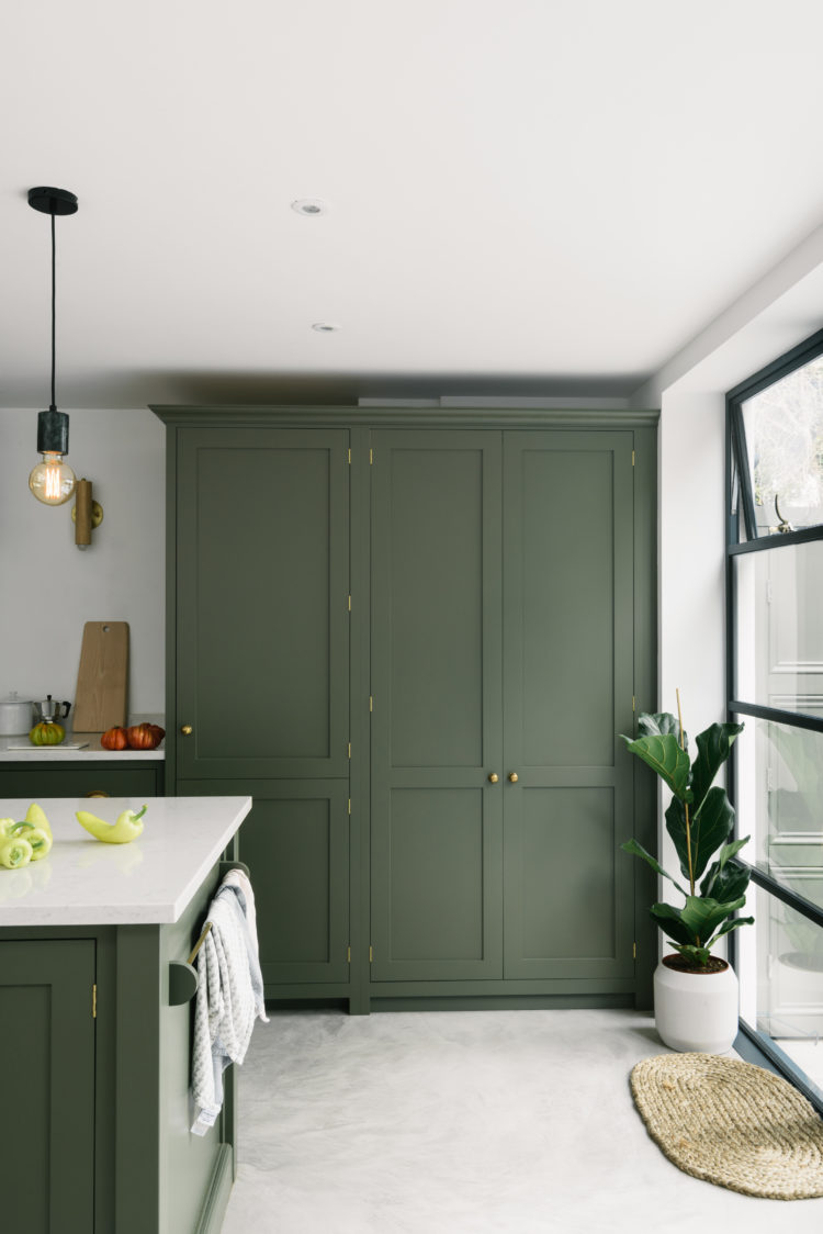
This kitchen above has reversed that decision and chosen a strong green for the cupboards but if you love green you are unlikely to go off it and, as demonstrated above, you can leave the walls white or add some colour to them.
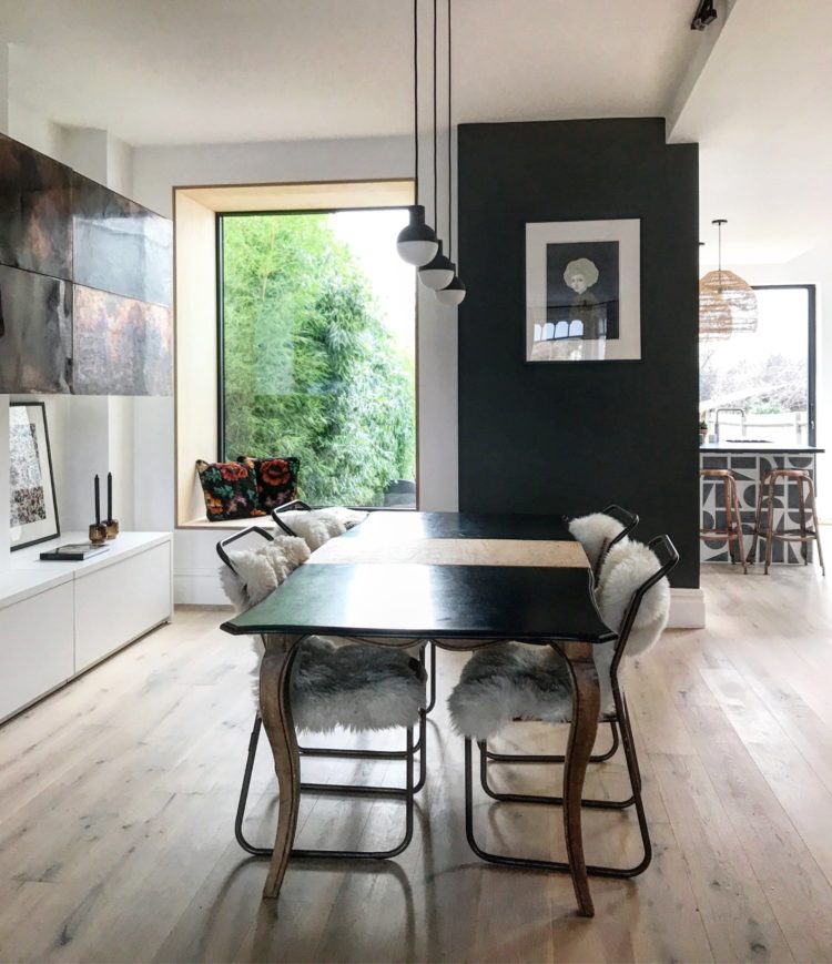
The other trick is that you don’t have to paint all the walls the same colour as this gorgeous dining room by Em Gurner, of Folds Inside shows. This isn’t so much a feature wall as a small wall painted in a dramatic colour which echoes the green outside the window and actually works to link the two large picture windows together.
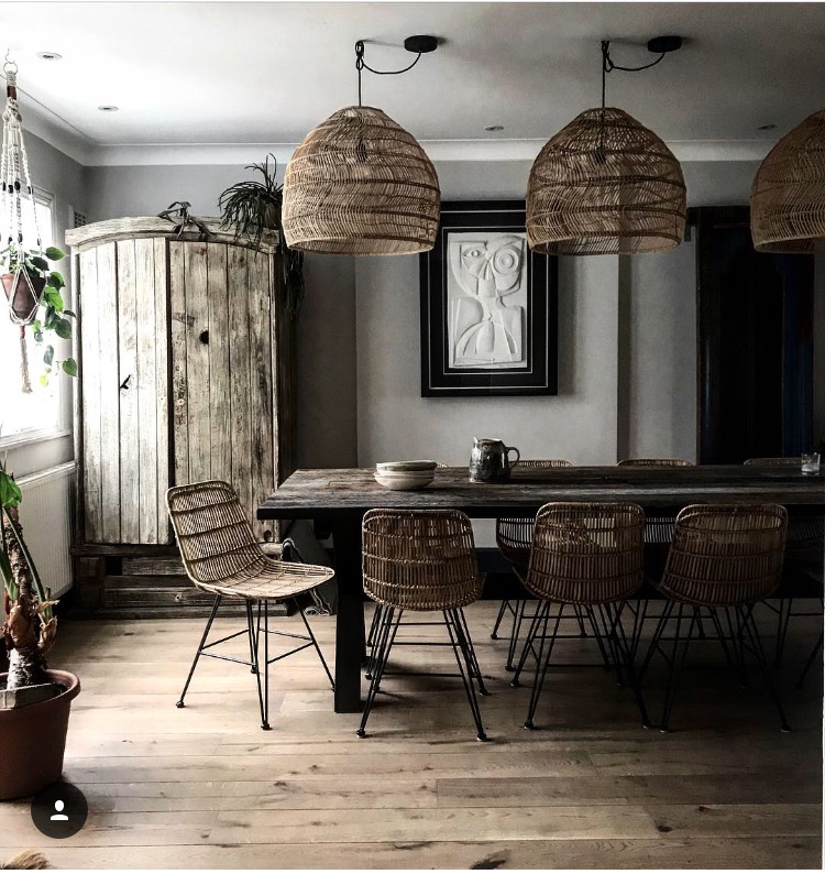
And, changing tack completely, I also love this natural and neutral dining room with its rattan lamps and chairs and all the different, but natural, textures. Even the picture on the wall is in relief bringing in even more texture and yet there is very little colour in this room.
Emma is a member of the Interior Design Collective, which I wrote about here and which aims to help you find the right interior designer for you in the area where you live. Their roster of designers is growing all the time so do check them out if you think you might need help with a project and aren’t sure of where to look near your home.
This room is by co-founder Karen Knox, who wrote a brilliant guest blog for me on how to plan your decorating budget which is always relevant so do have a look at that if you are in the process.
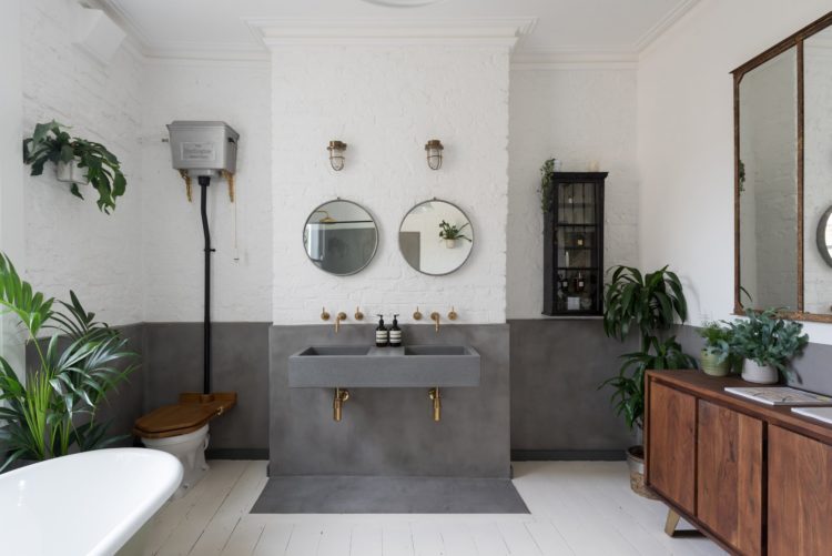
Finally these last two rooms are by London IDC members All and Nx Thing whose work I love. One of their bathrooms was featured in Living Etc recently but I like this one even more. I’m still a fan of a painted white brick and the polished concrete, or tadelakt walls are both practical and pretty – you could also create this look with micro cement, which my builder is currently completely obsessed with for showers and wet rooms.
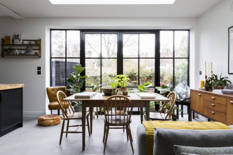
And finally, this dining space – how I wish I had a glass wall like this rather than my bifold doors which I hardly even open all the way across because ) weather and b) the fox that lives in next door’s garden. Note again how this is a very neutral colour scheme which has been warmed up with natural wood and plants and that single slug of yellow on the footstool.
I hope this has given you inspiration and food for thought and I wish you all a happy week.


