Well wasn’t that heaven? No not the wedding, although actually that was as well wasn’t it? I may have watched it twice (well three if you count the news and the highlights) and I may have shed a tear or two, but I was actually talking about the weather. In this corner of north London I actually had to put sun tan lotion on to sit outside for the first time in about ten years.
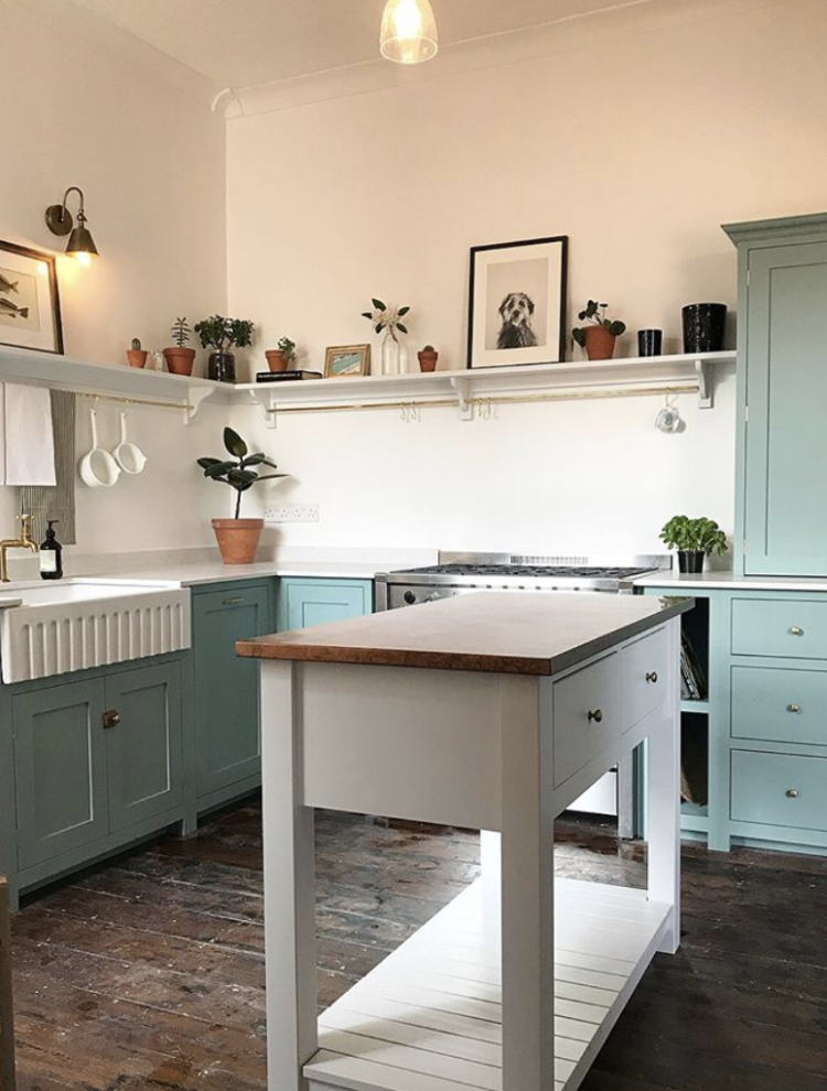
And so we must come inside – for that is the nature of 10 Beautiful Rooms, but it’s only for a few minutes and you can go back out as soon as you’ve had a wander. My eye was caught this week by the newly refurbished kitchen of A Prettier Interior on instagram.
I love the duck egg blue with the minimal shelving and open island – I predict that if you can find enough storage elsewhere in the room, the open island is going to become a thing. It’s no good for us as we need all the cupboard space we can get but if you have a large cupboard (see below) then an island like this will make the room feel larger and airier and less like you’ve parked a tanker in the middle of the space. Which is what I sometimes fear ours looks like.

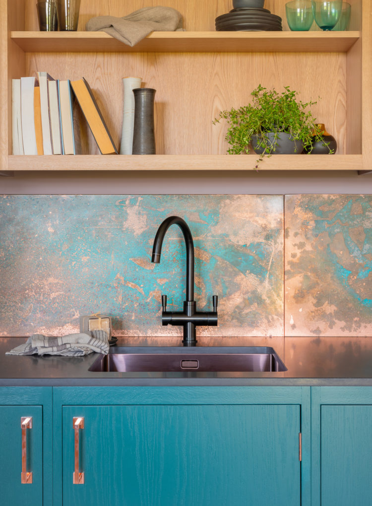
Sticking with blue kitchens, this is the latest offering from Naked Kitchens. Now you will remember the olive green one with the brass splashback? Now they have come up with this, the copper splashback. Isn’t it fabulous? I’m thankful I don’t have a splashback as I think I would be changing my mind every couple of years. Although if you choose a solid piece of material that you fix to the wall in a single slab then perhaps that’s easier than tiling which is messier to remove and replace.
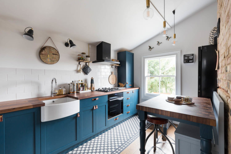
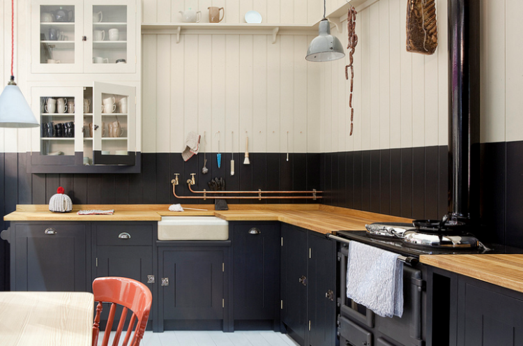
A final blue kitchen, this is also by Naked Kitchens and, like the first one, it’s the contrast of the blue with the dark wood – above floor, here table, which is so pleasing. If my floorboards had all been dark I might have left them natural rather than painting them. It’s the faint orange of antique pine which I don’t like and very often once you sand them to make them nice to walk on that’s what you get. This is the Brixton with its leather handles and absence of wall cupboards.
Moving on to a green kitchen and while we can’t all have a vaulted ceiling like this we can certainly paint the walls in this way. A friend of mine has done it in black and off-white in her house and it looks fabulous.
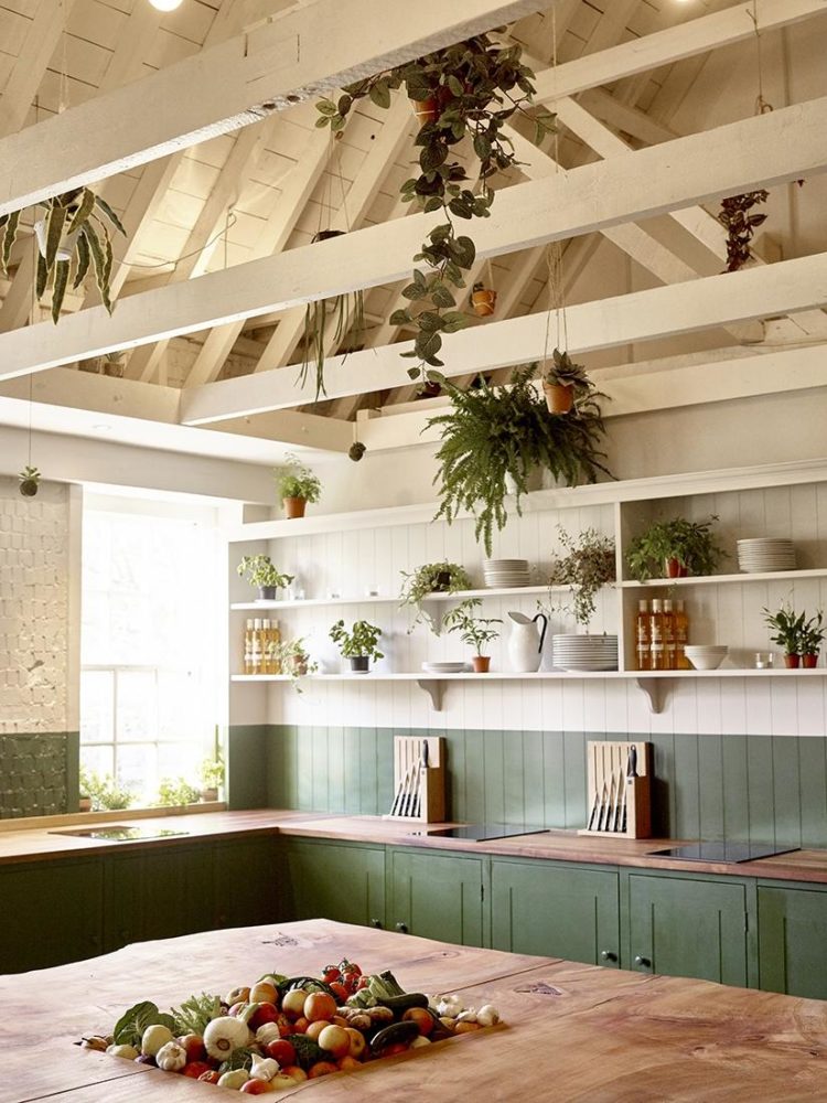
Here’s the Plain English kitchen which may have inspired the one above and cerrtainly inspired my friend and while I can’t see it on their site any more, there are plenty of other gorgeous rooms to give you inspiration. While we’re looking at this one, the key is in the detail – that red cord on the light and the single red chair. It’s the tiny bits like that that turn a room from great to gorgeous.
But perhaps it’s time for something a little more neutral now and this kitchen, by Amber Interiors, is both modern and classic at the same time. It’s also supremely calm which may be a key factor in your decision making. You mustn’t forget to factor in how you want to feel in a space, and if you hanker after a bright green kitchen but know that it’s a colour that makes you feel energised and busy then you need to also consider if that’s how you want to feel in that room before you make a big decision to slather it all over the walls.
But talking neutrals here’s another. And I offer this as a question to you. Does this room make you feel calm and relaxed or bored and antsy? Answer those questions when you look at colours and you will start to find the colours you need to use in your own home.
And don’t forget if you err towards a classic black and white scheme then you can always warm it up with lots of natural wood and textures. So below there is leather, marble, interesting light fittings and the black windows to frame the view and mirror the cupboards at the other end – this is open plan living after all. It has to be practical as well as pretty.
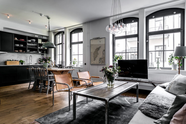
And finally the view from the other direction – because sometimes it’s useful to see the whole space.
And now, because if you’ve read this far: if you are anywhere near Heals on the Tottenham Court Road in London on Thursday I will be doing a talk about the book. Tickets cost £20 but that gets you a signed copy of the book if you fancy coming you can book a ticket here – it would be lovely to see you.


Kitchen by @amberinteriors looks really good for a small place, utilizes the available space well. B&H kitchen brings out that old school kind of unfinished feeling which works out well for homes in the countryside, would not recommend for city houses. All in all, the works into those kitchens are absolutely fabulous.
Kate
Plain English have done a cheaper range, called “British Standard Cupboards” and your featured picture is on that website now: it was their first shoot for the new range.
britishstandardcupboards.co.uk
Love these kitchens. Naked Kitchens are a real discovery. My kitchen was done when white was the thing, and though I still love it, I do sometimes yearn for a blue kitchen. (I’m not about to repaint very expensively lacquered and beautifully finished doors!). I also dream of an island with space under it. Mine is full of dishwasher and storage.
In first kitchen picture the hob has no extractor fan above. Is this okay to do ? Im having kitchen done and hate all extractor fans ( except pricey ones that rise up out of worktop but who can afford them?) I have asked builder to put a fan in ceiling although I doubt this will be effective.My kitchen is small but has two good sized windows near cooker so thinking I will just open them if needed? Any comments gratefully received as work a bout to commence next week. Thanks
I think it depends on whether you have had to involve building control. If you have, they won’t allow the kitchen to be without an extractor, but if you haven’t then it’s up to you. I have an extractor built into the cupboards above my cooker so it is invisible and there is no hood. It was not cheap, alas. I wouldn’t be without it because it is very efficient at getting rid of cooking smells from the open plan kitchen/family room.
Is your hob positioned on an external wall? If so, have you thought of a rear vented angled one like the Elica Ascent? Comes in a few widths. I’ve bought the 60cm white glass one, not got it fitted yet…
https://elica.com/GB-en/hoods/ascent
I really like the copper splash back, and while I understand why they went for that particular shade of blue. Im not loving it. I would definitely team the copper with a richer, deeper colour. However, I would definitely opt for the brass over the copper even though the oxidation has added lovely patina.
As to whether the Amber Interiors bore me. I would say yes, they do. I’m really taken with the Alexander White interiors but have to agree with Jane that it would need some warmth, as they’re too cold looking. Especially the last two images. I would add some more greenery and some subtle pops of colour – I’m thinking a deep, claret red. I really like the copper splashback, and while I understand why they went for that particular shade of blue, but I’m not loving it. I would team the copper with a richer, deeper colour. However, I would definitely opt for the original brass splashback over the copper even though the oxidation has added lovely patina.
As to whether the Amber Interiors bore me. I would say yes, they do. I’m really taken with the Alexander White interiors but have to agree with Jane that it would need some warmth, as they’re too cold looking, especially those last two images. I would have to add some more greenery and some subtle pops of colour – I’m thinking a deep, claret red.
Hi Kate – I really love the half painted walls here and in previous posts. I was just wondering if you have any tips for how to keep a straight line when painting across the joints on timber as in the pictures above? I want to try this myself in the stable we are currently converting but have visions of the paint running in the joints – any advice would be much appreciated! Thanks! Catherine
I think people use those laser measuring tools, or a more laborious way is to measure all the way round from the floor or skirting board with a ruler and mark the line and then put a line of tape.
Lovely kitchens- always my favourite room to see pictures of, even though mine is ‘done’( for the time being??) the Plain English kitchens with their painted splashbacks inspired my own scheme with Studio green on cupboards/ splashbacks and Peignoir for the rest of the room/no wall cupboards, just chunky black hanging rails with my collection of colourful ‘Mr Fox’ mugs and two small black metal shelves from Cox and Cox to hold my herbs etc. I definitely prefer the more colourful kitchens now, although I do like the Alexander White kitchen, esp the print of black tulips and the chair! We’re all different aren’t we??! And I would only change my painted splashbacks if I could have that Naked kitchens copper one… but then I’d prob get bored and want to change it again!!
I L O V E that green kitchen, with its equally heavenly vaulted ceiling! I wonder if they take it in turns to climb up and water those fabulous hanging plants ;D Annnd…. am loving the veg store in the middle of that handsome working table. Superb.
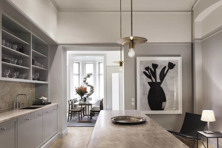
After your question about neutrals I flicked back and forth to try to decide why I liked amber interiors’ neutrals but not Alexander White’s. I think it came down to Amber’s grey being warm and Alexander’s being cold. Plus that very dominating black tulips picture put me off whereas the glimpse of the oriental carpet was appealing. All the Alexander White photos had a similar cold grey, or at least cold lighting – and since you only get the sun tan lotion out once every ten years, the natural light often is cold!
Plus Alexander White is a Swedish website so very much at the bluer end of natural daylight tones too.