Morning to you all – are you ready for a stroll through nine beautiful rooms and one garden? Seeing as it’s warm (understatement) outside I thought we’d finish up outside for a change. I’m not complaining, but I have taken to leaving the windows open and the blinds down all day to try and maximise the cool air. Although I read yesterday that the real key is to close the windows first thing in the morning and close the curtains which then traps the cooler night air in during the day. I suspect none of it makes much difference to be honest.
Mind you, in London at least, this heat is completely energy-sapping. I would definitely be less productive if I lived in a hot country. My brain feels half-melted and I can’t help thinking that a cold snap would galvanise me into action. Remind me I said that in November and let’s see if it’s true.
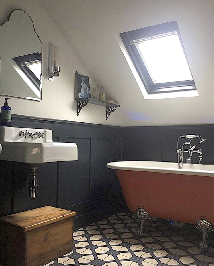
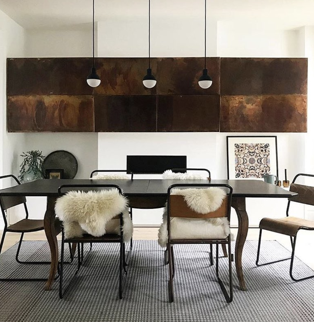
Anyway, rooms, love these two at the top by the ever-talented members of The Interior Design Collective. Copper wrapped kitchen cupboards anyone? I know I’ve raged about copper for the last few years but that’s the pink, shiny modern stuff. Here, in its natural form, it looks gorgeous. This bathroom is also fabulous – a patterned floor is always a great change from a patterned wall. The vintage wooden box adds character and the sober colour scheme will never go out of fashion. You could just repaint the bath if you tired of it. So swap to match the walls for monochrome, or go even brighter with emerald or neon pink. That’s a classic scheme with a twist.
Moving on to some pale and summery schemes from Farrow & Ball. This room above is billed as Pavilion Grey by the company although I can tell you it’s a lot darker than that in real life – I have it in my bedroom and it can be tricky to photograph. Having said that painting that alcove in a contrasting colour looks fabulous.
That’s another point about feature walls. I know we all keep saying we shouldn’t have them, but it is largely about the execution rather than the idea. Pairing one coloured wall with three white ones doesn’t really work – for all the same old reasons I have said before.
But when you pick two actual colours – as it were – it immediately looks better. Because it looks like you made a decision. So if you’re not brave enough to paint all four walls in a strong shade then do one and pick a complimentary colour for the rest – or perhaps use the strong one on a single wall and all the woodwork to tie it all together.
In the image above the walls are pale but the woodwork has been highlighted in dropcloth which is in the neutral family so it works with the white walls and panelling.
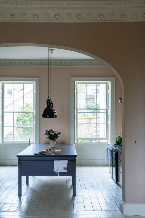
A couple of pink rooms to show you what a great neutral this colour can be. I have included some of this pale pink in my own kitchen (which is being photographed today so you will see it soon). In mine it’s paired with chocolate brown cupboards and off-white but it works well with navy blue or dark grey as well. And, of course, green if you’re feeling really bold. I’m worried I might find that tiring as a combination in the long term so am bringing in green with plants – both real and fake.
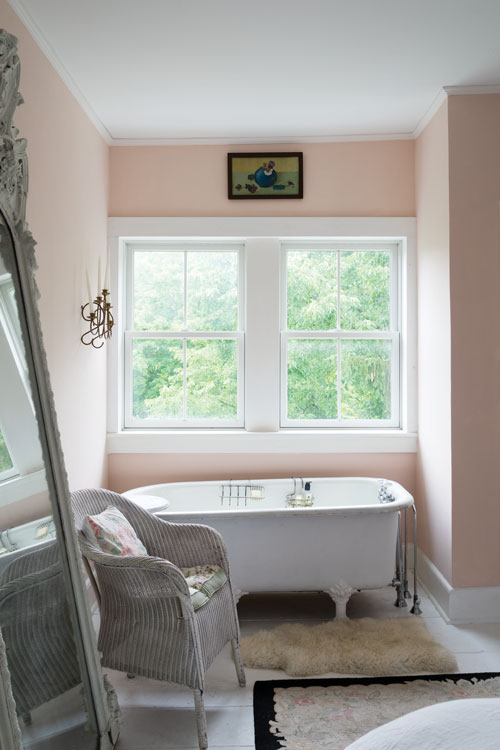
This bathroom is painted in Middleton pink, which is quite strong, but the white bath and floor tones it all down a bit. If you wanted to really make a statement you could paint the bath in charcoal, or burgundy – perhaps matching it to the skirting boards and window frames.
That is, after all the utter joy of paint. You can spend as much or as little as you want or need and it’s completely transformative while being relatively easy to change.
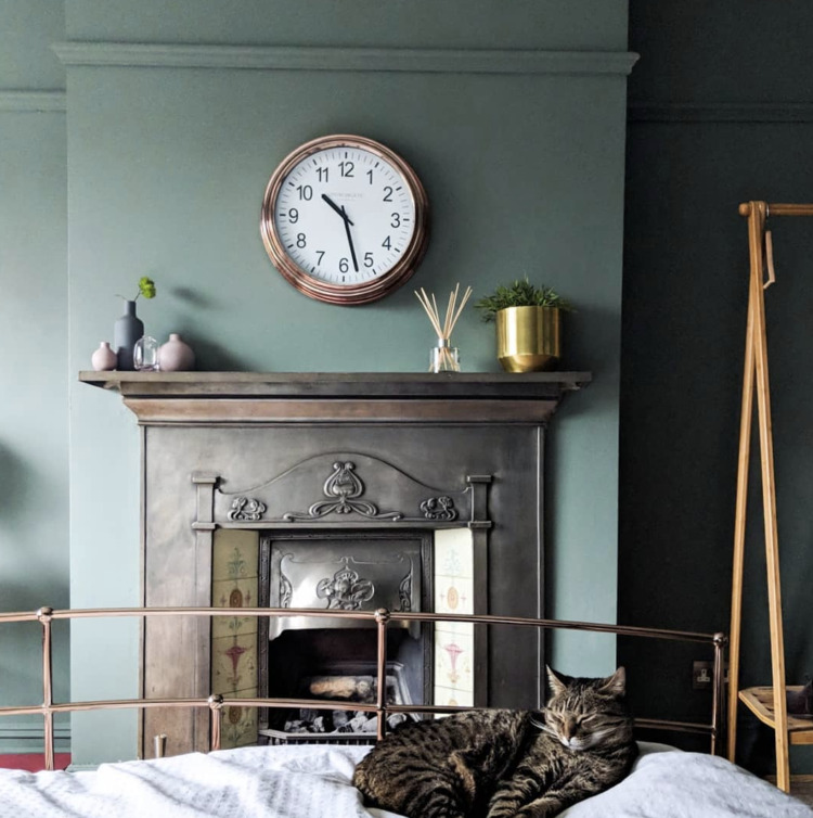
This is green smoke in the bedroom of My London Home, winner of the best sitting room in the recent Houzz/Evening Standard awards. It’s a lovely colour, which I tried in our bathroom but it didn’t work in there for some reason, which just goes to prove how you can’t tell until you’ve tried it. Been saying that to the 14yo about vegetables for ooh, 13-and-a-half years but he’s still having none of it. Raw carrot and broccoli is all he will touch. Ever.
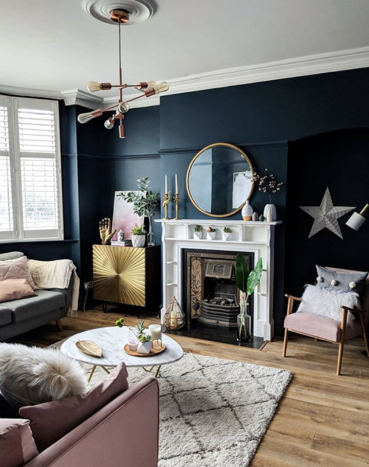
This is the winning sitting room (judged by the Houzz and Evening Standard and er, moi as guest judge. There’s quite a lot of stuff in here but I like that the furniture isn’t a matching three-piece suite, that the objets have been curated and collected with care and that it looks, above all as if someone actually lives here and might come and sit down and grab that throw on a chilly evening. What’s that? You wish? I know what you mean. Imagine soaking it in cold water and wrapping it round your head instead for now.
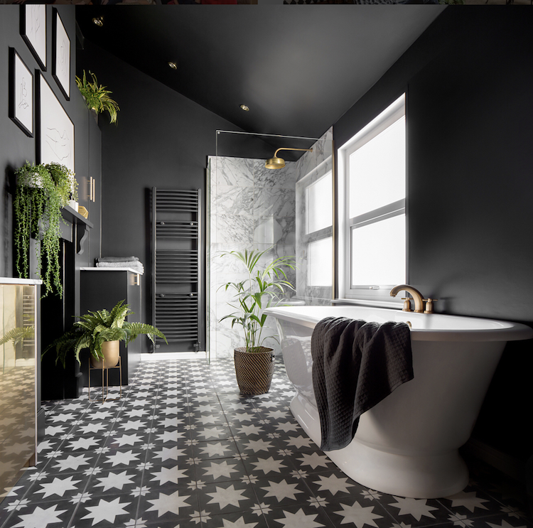
Here is the winning bathroom belonging to Jess of Gold is a Neutral. I love that she has used brass cupboards in here to really ramp up the glam factor. And, as above, the patterned floor brings all the x-factor. No need to bring in more by painting the bath as there’s enough going on with the cupboard and marble shower. If you read Jess’ blog on the subject you’ll understand what a huge transformation it has been and what an awkward room it was to work on.
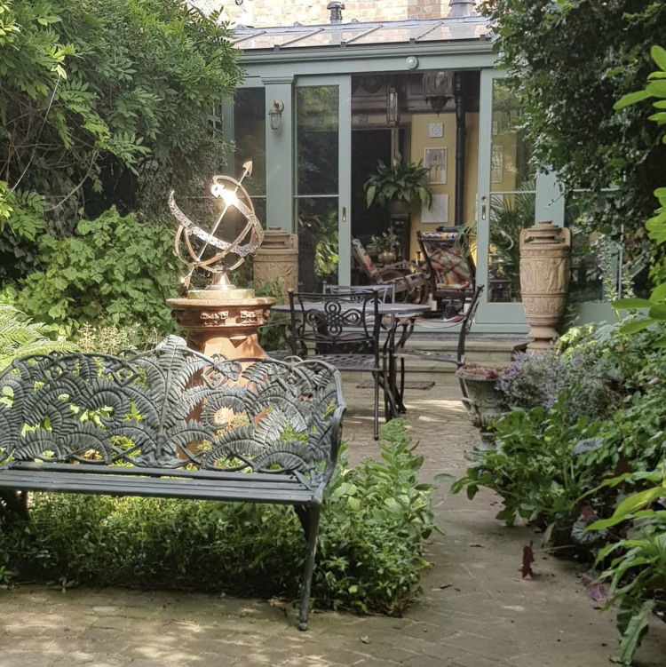
Finishing with a garden – because after this much warm weather mine certainly isn’t as green and lush as this award-winning one by Simon Hurst. I can’t get on with gardening. I love sitting in pretty ones but I can’t do the work to get, and crucially, maintain them that way. So I’ll just have to content myself with looking at this one and fantasising about earning enough money that paying a gardener rises to the top of the list of things to pay for…
Have a lovely day everyone.


All the ideas were amazing. I loved the black and white bathroom the most. Brass touch is enhancing its elegance.
That’s an enjoyable collection of rooms Kate.
You did right to drop all the blinds and leave windows open but just a tad.
Sash windows just a tad open top and bottom to let air circulate. Then as soon as evening comes open every window WIDE OPEN. If using fans then apparently they are best backed up to a window even if it is only just open a bit and the blind is down in the heat.
You could easily write in Italy in the hot weather, we have. All the shutters are tightly closed from breakfast time to supper time, when they are opened wide. Inside the dark house the fan whirls and it’s cool.
I used Middleton Pink in my bathroom because
Coco Chanel said it’s is the best colour to
reflect on the face. She was right! I always
enjoy your daily posting, thank you 😊