Good morning and welcome to the new season. The clocks have gone back, the leaves are turning and, in the UK, we all had an extra hour in bed. At least some of us did. Those with small children will have got up at the same time as usual despite what the clock said. As did I. I woke at 6am and while my brain and the clock told me it was 7, my body refused to go back to sleep. Still, it turned out to be quite a productive hour, as I lay there hoping I was going to nod off and actually having lots of useful thoughts about the next book.
Because Saturday morning’s post brought the contract for the next one – Mad About The House II. It’s not out until 2020 but it needs writing by the end of March. Eeeek. So I’m very thankful for that extra hour and all the planning it afforded me.
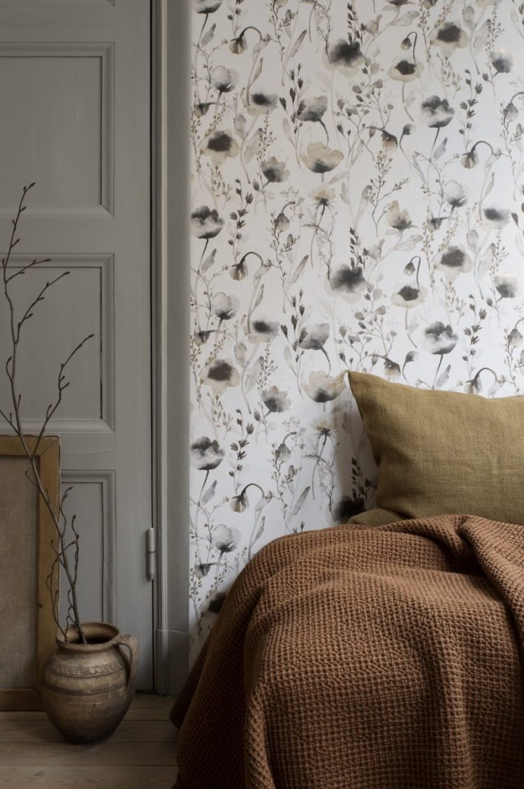
Anyway rooms. This week I was first struck by the one above. It’s a wallpaper by Sandberg and I love the colours. For those of you who still love grey but feels it needs warming up a little, this is a great way to do it. Grey is very easily influenced and adding some of these spice colours, which are currently on trend – and therefore easy to find – is a great way to to do it.
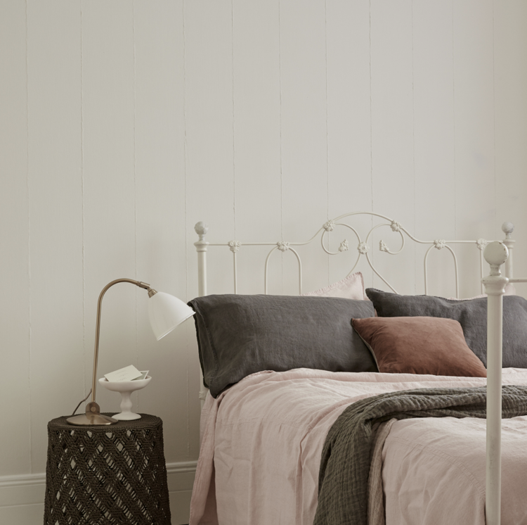
You can go with a mix of ochres and rusts or pinks and burgundies as the two images above show. Both have accessories that can easily be bought on the high street – such as throws and cushion covers and this is a lot less hassle than repainting the walls.
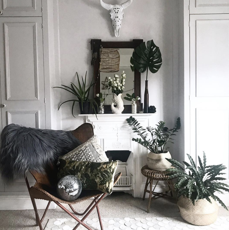
Another way to warm up a room is with plants. This bedroom below is white not grey, but the plants and accents of wood and leather bring layers of texture and interest to the space – you can do the same thing with grey. Grey loves green and natural wood, so if you don’t fancy the colours above you can create the same effect by bringing a bit of the outside in.
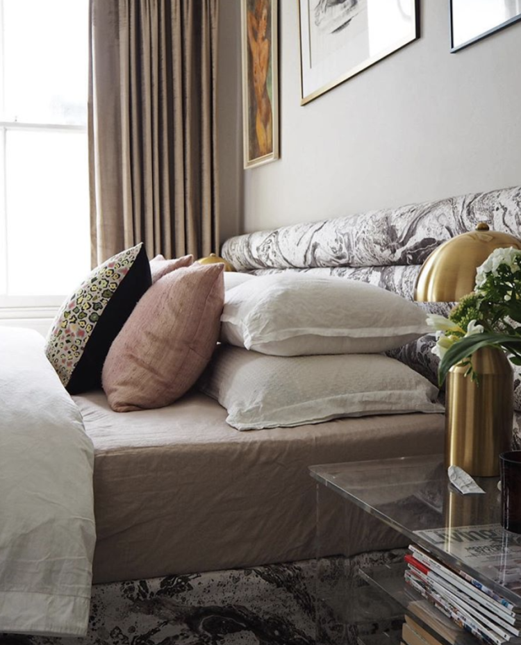
If you’re thinking of moving on from grey (and grey isn’t over it’s become a classic it’s just some people are now looking to new colours to freshen things up) then take a look at Bianca Hall, who is – for my money – always ahead of the curve – and is currently filling her home with accents of cream and beige. And for the record she did her sitting room blush pink about four years ago when the rest of us were just contemplating a soft grey, so if she says this is the colour then take heed.
Notice how the same shades of soft pink and yellow/brass work just as well with a cream shade as with pale grey so it’s a scheme that will last beyond a quick fad. Notice also, in both rooms, how a small touch of black stops it feeling like a melted Neopolitan ice cream where all the colours have run together and provides instead definition bringing a punch of clarity to the space.
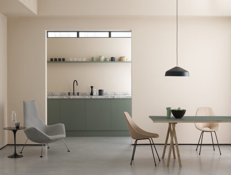
You will have heard it said that pink is the new neutral and this image from Earthborn paints below shows you how that might be true. This is Peach Baby (get a tester it will be different in your house from this photograph which will have been professionally retouched) and it works wonders with the soft green of the kitchen cabinets but they could just as easily be grey. Or even ochre to really warm the scheme up.
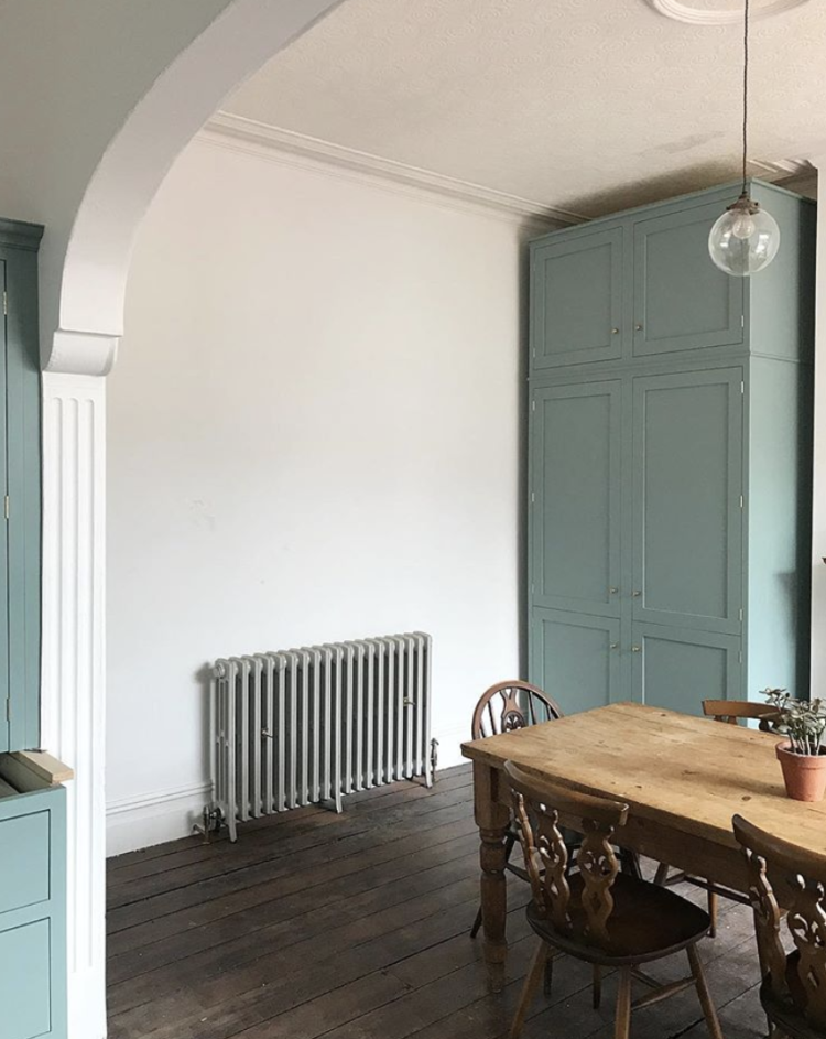
In this room below the owner has gone for a soft blue to contrast with the white but the white is warmed by the dark wooden floor and table giving it almost a delicate pink hue.
Never forget that you don’t use a colour in isolation. It will pick up on the other items in the room and the light through the windows as well. A cold white or grey can be warmed with soft furnishings and wooden floors and a warm grey can be toned down with a cool rug or north-facing light.
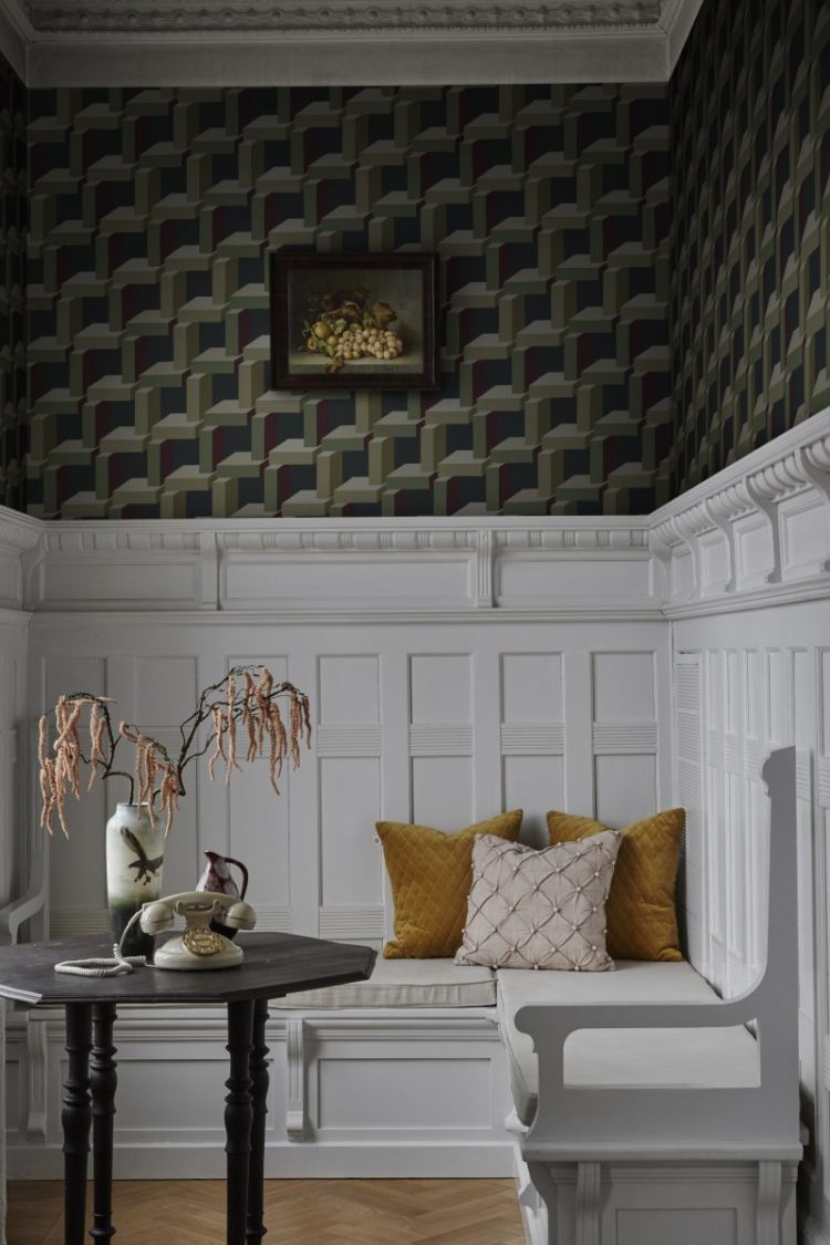
Back to wallpaper and I love this scheme of dark green, white and splashes of pink and gold. It’s timeless, it’s warm and it works in every season. Even if you don’t have this gorgeous panelling. Although there are plenty of tutorials showing you how to add it to your own walls if you wish you did have it.
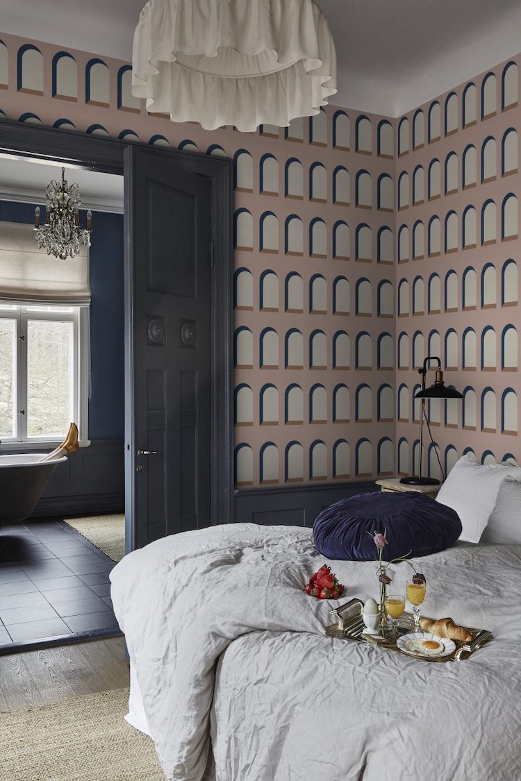
This image below is just to suggest why painting the woodwork in a strong colour can look great. After choosing a bold wallpaper, it might be tempting to leave the woodwork white, but highlighting it in navy blue looks great and really shows off the paper. If you were nervous of papering the whole room and wanted to stick to one wall then picking a strong colour for the others will make it less feature wall and more of a design decision, which is ultimately what we are all looking for.
It doesn’t matter what your personal taste is, whether its fashionable or not, nor what your mother/neighbour/instagram thinks – the key is that you made a decision about why your room looks the way it looks and that it makes you happy.
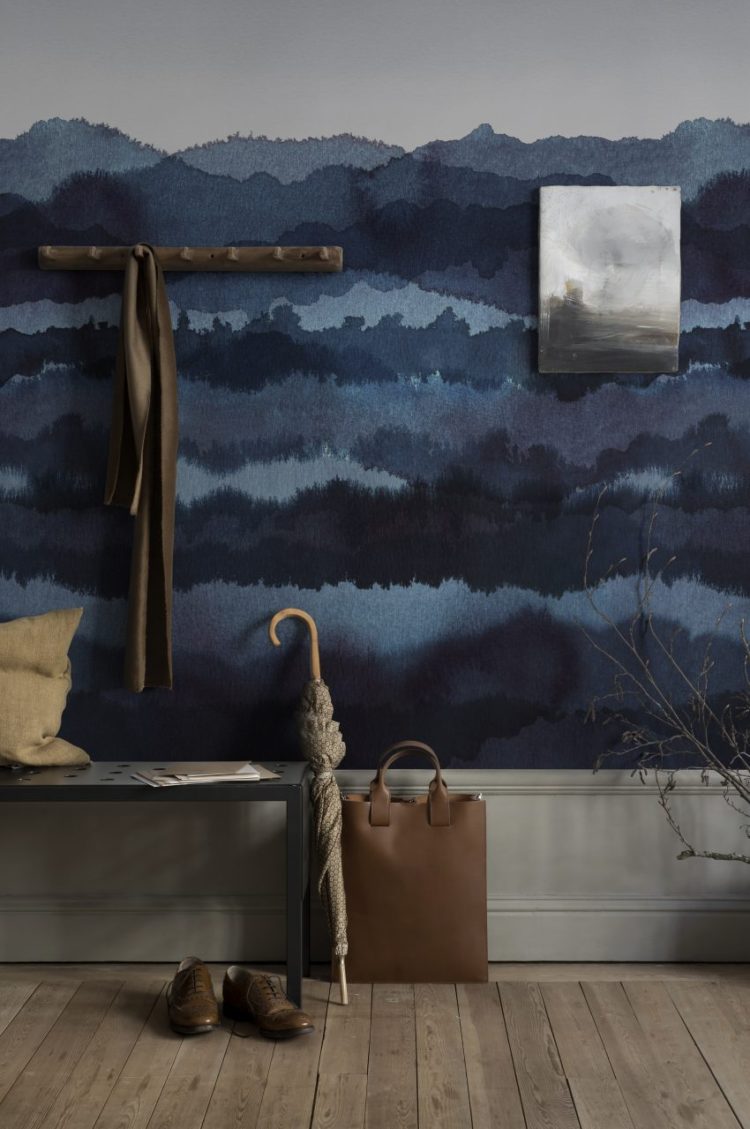
Finally, taking the dark blue from the woodwork onto the walls. Ombre has been in vogue for a couple of years now but it’s tricky to paint well. Now you can pick a wallpaper and get the job done for you – these inky shades are perfect for a hall where you don’t linger and they will make the rooms leading off it seem lighter. It would also work well in a bedroom as the pattern stops before the top and has the effect of a half-painted wall – ie it allows you to go dark but not all over.
And that concludes our stroll through 10 Beautiful Rooms today. I hope that has given you some inspiration for your own rooms.


Gosh, that inky ombre paper is GORGEOUS!! The kind of thing one might be tempted to DIY, if you are not me, having not a clue about how watercolours work.
Hilarious. I didn’t spot the weirdness of the breakfast and legs the first time round! Looking at that tableau more closely, the combination of dead drooping flowers, hard boiled egg plus fried egg plus croissant on the tray is totally sinister.
It’s a bit like those estate agent pics where they lay the table to provide an ambiance but don’t get it quite right!
I loved that ombre blue look done with the wallpaper. It’s definitely the kind I would choose for a bedroom.
I’m really loving the grey with the spice colours. I saw an image a year or so ago – charcoal and caramel – it’s still stuck in my head.
Thanks for sharing all of the images. Except the one where the lady in the bath has been taken out! Someone do something.
Thank you for the lovely photos, Kate, but I’m a tad worried. Why do we think there’s a lady in the bath, and why with gold socks?? And who eats fried eggs and croissants in bed? Can you imagine the potential mess??
Highly suspicious, particularly since the angle of the legs suggests her head is under water. Personally I think e’s dun ‘er in… strawberries on the duvet masking the bloodstain… and what happened to the second croissant, eh?
Oh my goodness I love this intrigue. It does look suspicious indeed doesn’t it.
That’s brilliant I only just spotted it…
I do. Hah! And yes, it akes a mess. Hello from Winnipeg.