And here we are again – Monday morning and ready to wander round this week’s selection of beautiful rooms. Now after last week’s pale and interesting look I thought I would explore a more saturated colour palette this week. So see what you think of these.
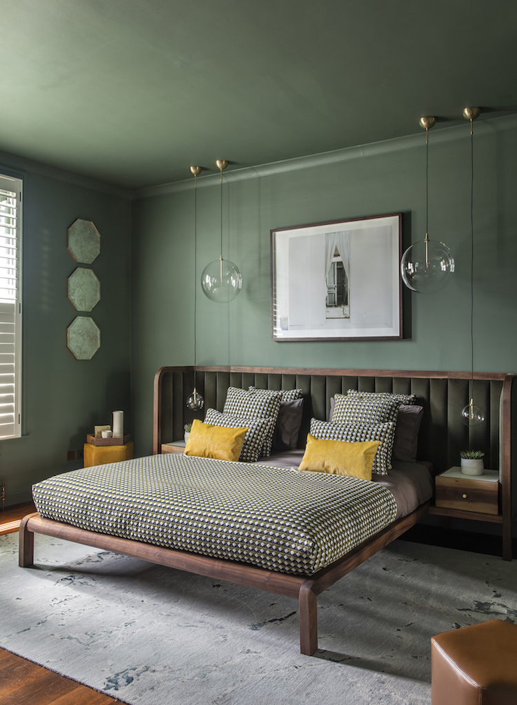
Sometimes we forget that a monochrome palette doesn’t just mean black and white but that’s it’s about using one predominant colour as these first images show. The first three are by the talented Brazilian designer João Botelho, who makes all the products as well as designing the rooms. And I have to say I think this bed is just stunning.
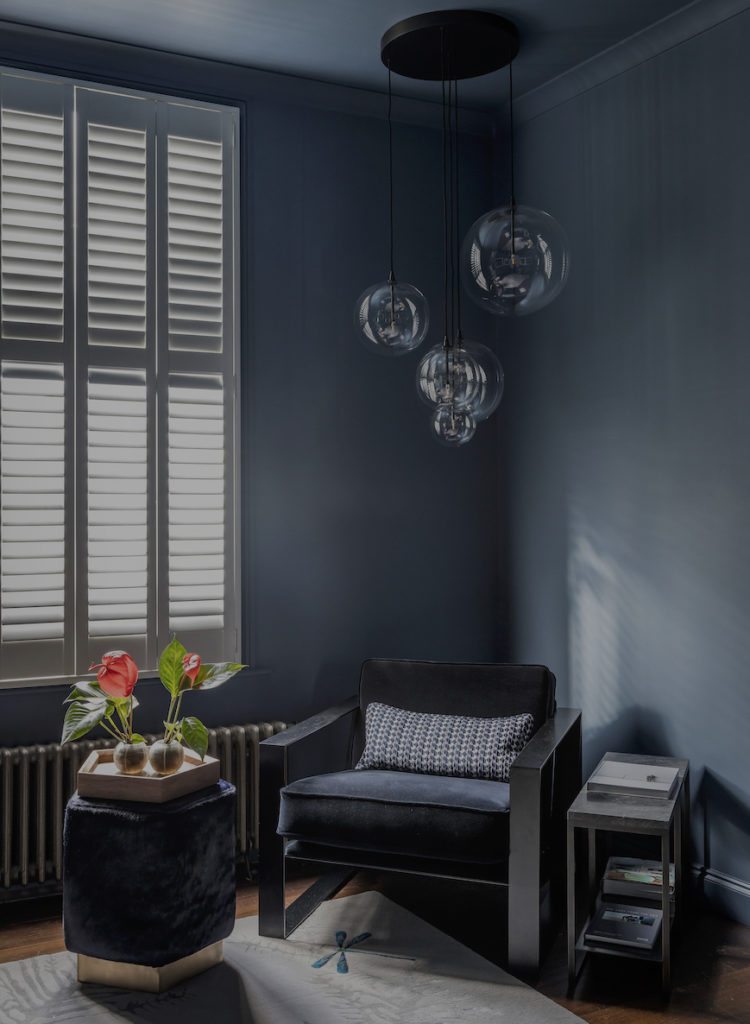
But look how he has layered the colours, first green, then blue and finally grey together. It’s not a look that we see very often and it takes a certain amount of discipline to restrict your palette that much but I’m a fan. What about you? I have to say I would inevitably add more to this base line but as an idea I’m intrigued.
I have played with this idea a little with a chocolate brown sofa matching the chocolate brown walls and a dark green bed against a dark green wall but I haven’t gone this far to create this completely saturated look although I could be tempted to try on looking at these.
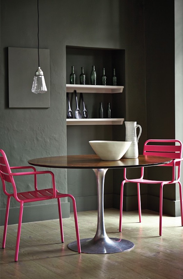
Here the dark (invisible green by Little Greene) walls have been thrown into sharp relief by the bright pink chairs and while it’s completely the opposite of the above it also works as the two colours are so strong. But if you want to try this you need to keep an eye on the proportions. This works because there isn’t too much pink. Think of adding a pair of statement earrings or a necklace to a dramatic – but black – dress. That’s the kind of thing you’re after.
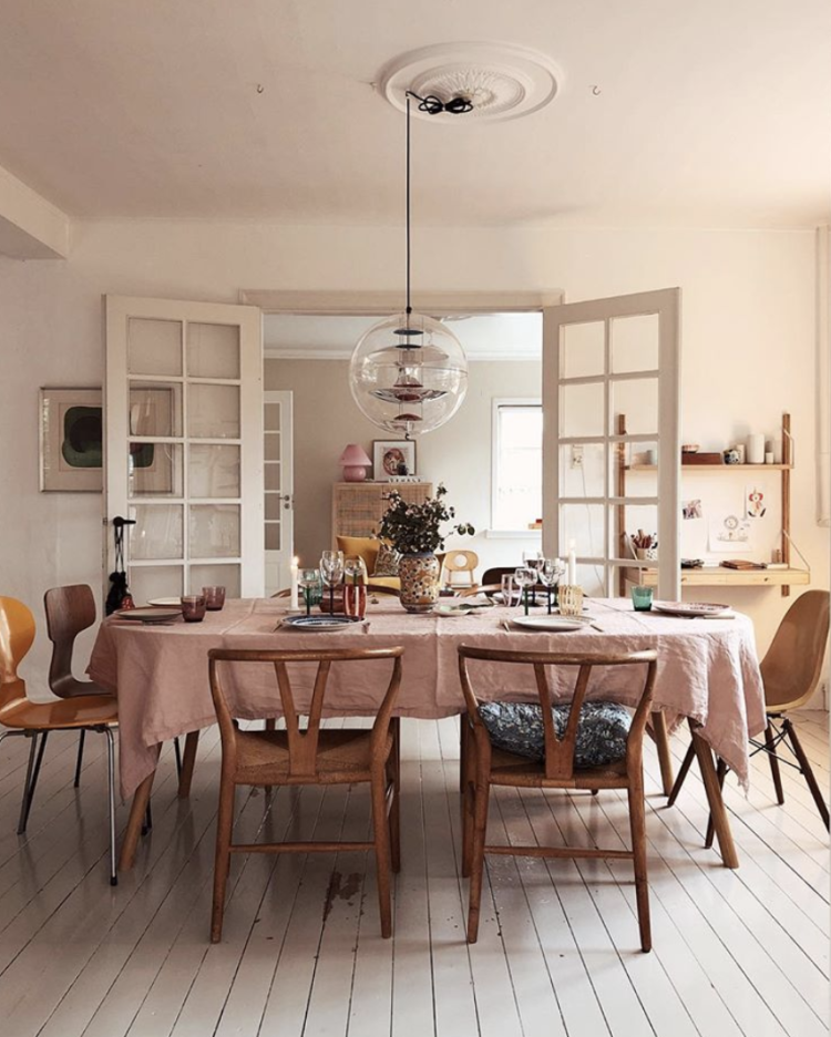
You can do the same thing with pale colours too. I suspect this room is actually white but the pink tablecloth, warm wood and possible filter make the whole room appear a very soft shade of pink although the colour appears to be radiating out from the tablecloth. This is another way to try the saturated look – start with something dark – bed, sofa, table – and take the colours gradually paler the further out you go.
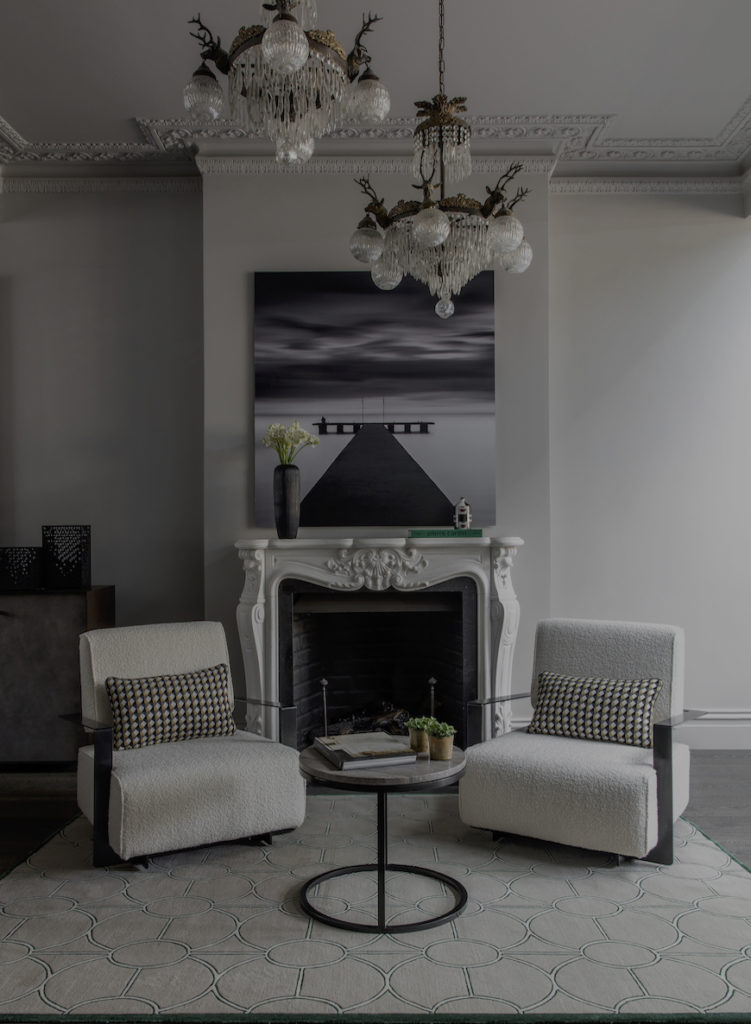
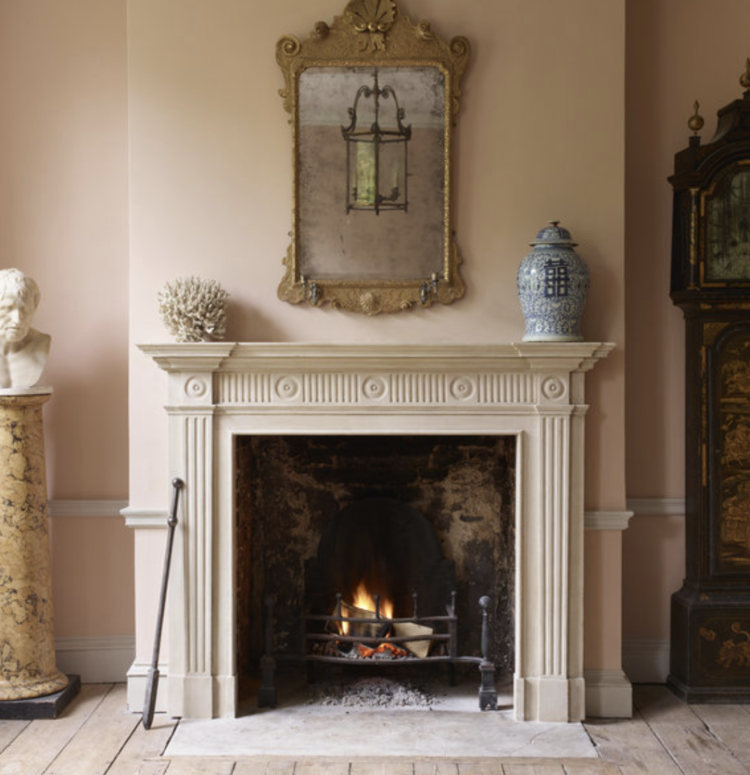
Sometimes it’s about keeping everything tonally similar which can create a very restful palette. The pale floorboards, stone fireplace and soft pink walls with gold highlights make this a very relaxing room while the antique clock (just seen) emphasises this without jarring.
I know I always say that you need a drop of black but it’s an idea rather than a hard and fast rule – it depends on your style and a dark wood antique will often do the trick just as well.
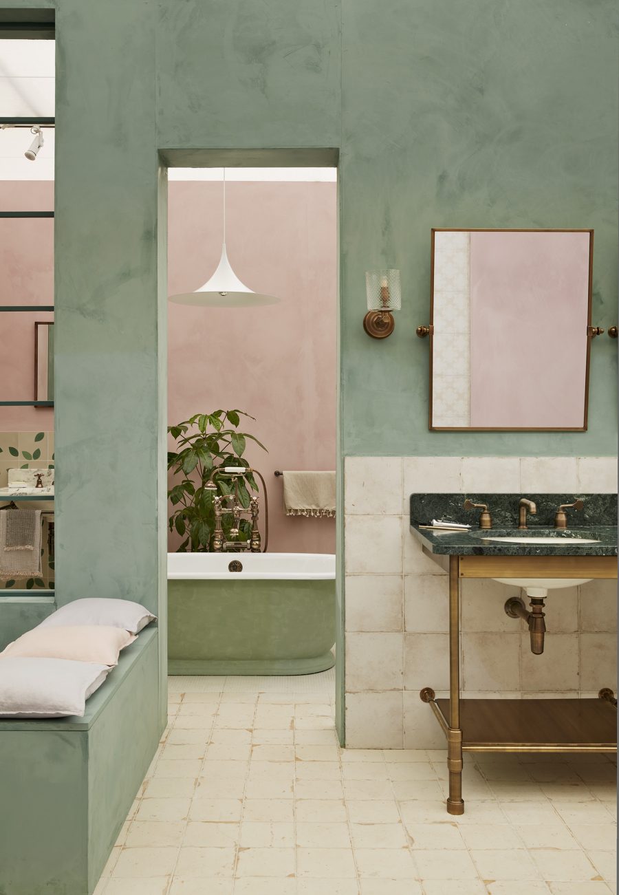
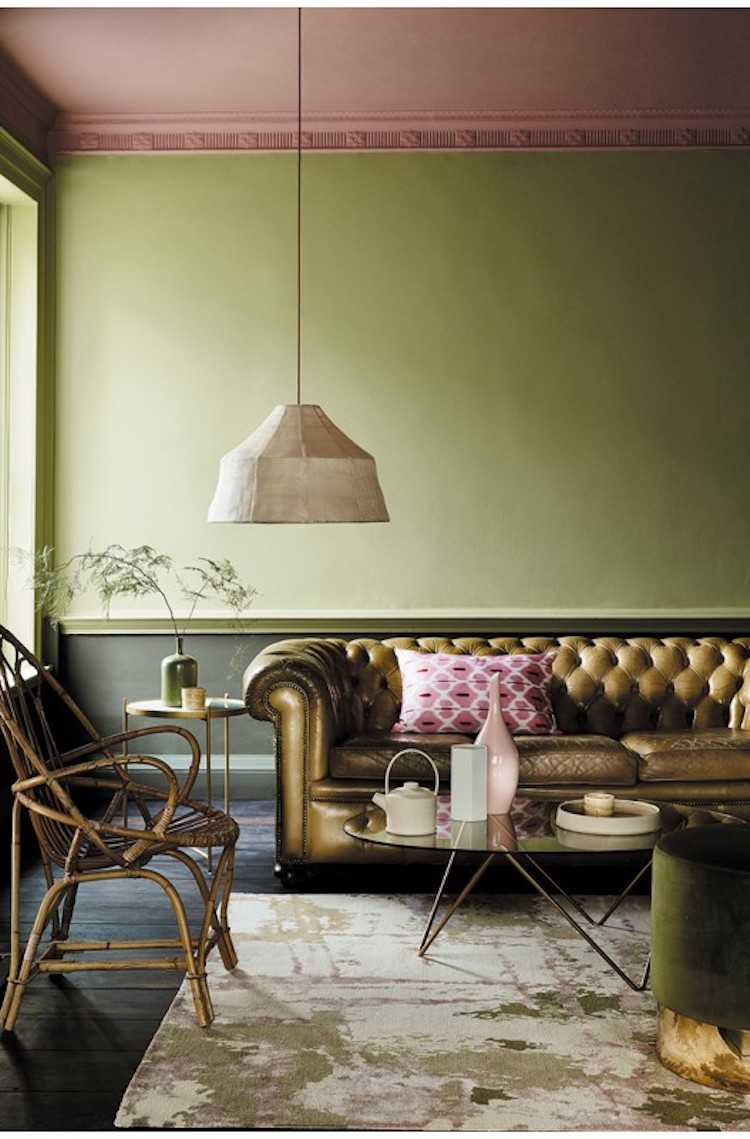
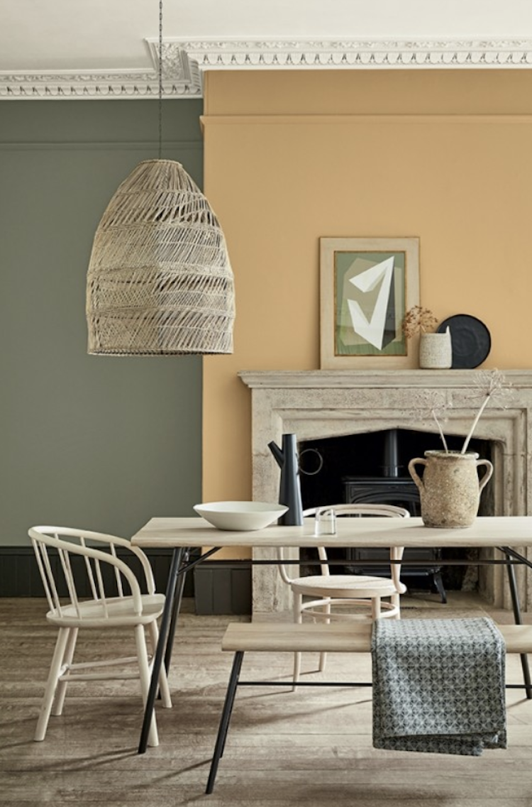
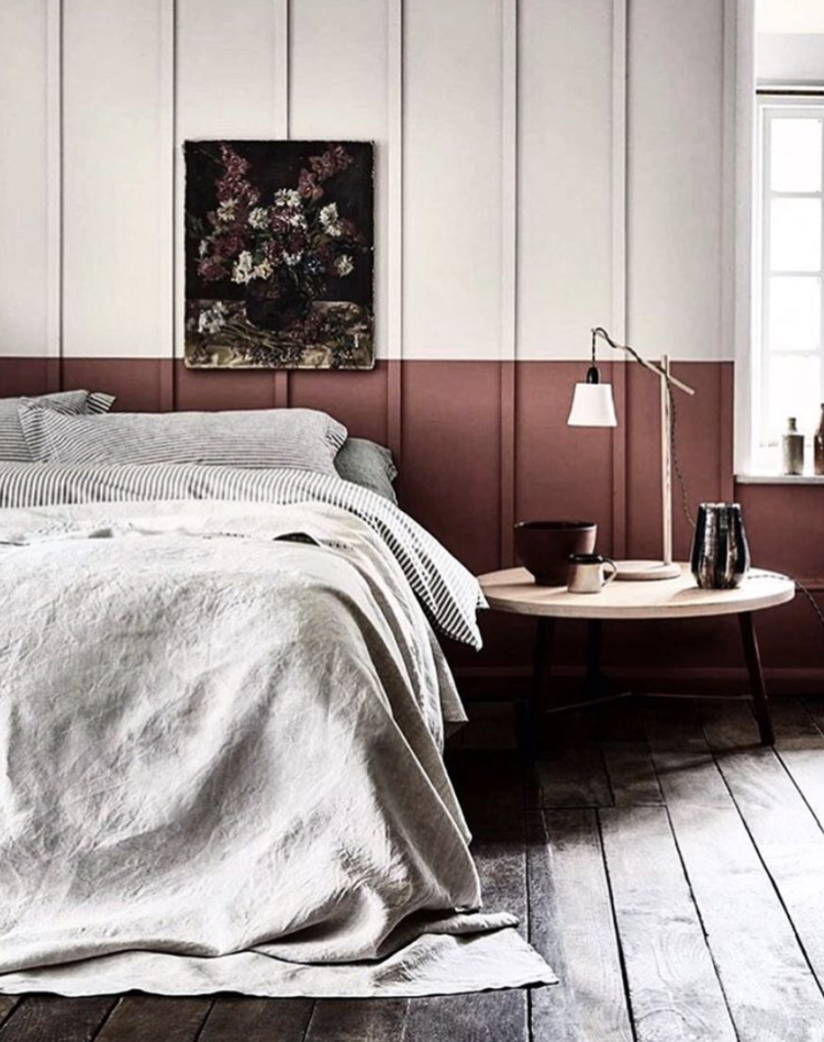
But sometimes you just want to contrast the colours as the following images have done and you can see the classic pink and green as well as pink and yellow all working beautifully together. And don’t forget the ceiling – it’s the fifth wall don’t forget.
While you look at these I wanted to mention that my new podcast with Sophie Robinson (DIYSOS and The Great Interior Design Challenge) launches this week. I do hope you will have a listen. If you follow this link The Great Indoors, you can hear the trailer and, in theory – if the tech works – it will automatically update with the first two episodes which are out on Thursday 18 October. If not you can follow your preferred link by clicking on one of the icons to be taken directly to it.
And if you listen please don’t forget to rate us, or leave a review and subscribe. That helps more people to find us and for it to be ranked, which is absolutely key. I hope you will like it.
I’m never quite sure how many of you follow me on instagram but for those who don’t I also wanted to give you all a big thank you this week. The blog has now been going for over six years and if it wasn’t for all of you reading and commenting and generally supporting it wouldn’t be where it is now. Which means that I wouldn’t have been included in this list of The Progress 1000 by The Evening Standard, which was announced last week. I was stunned, and slightly tearful, to be included in the Design section alongside such incredible people as Frieda Gormley and Javvy M Royle, aka The House of Hackney, John Sorrell, chair of The London Design Festival, Es Devlin, theatre designer – whose talking lion on the fourth plinth during LDF was such a hit as well as Tom Dixon, Sebastian Conran and Sheridan Coakley.
It’s a measure of how blogging has come to be accepted as a medium over the last few years and this is, in large part, down to all of you taking this blog to your hearts and reading it regularly and engaging with it. I’m never not grateful for your support. And now I’ll go before I turn into Gwyneth Paltrow, which was too much at the Oscars and certainly too much for a Monday morning. Although if you’re reading this on a Friday night after one too many glasses of wine it’s probably all fine.
Don’t forget to let me know what you think of these colour palettes and I hope you will listen to the podcast later in the week. Lots of love to you all XK


I loved the first image of the green bedroom. I think that’s the one that shows best how to do a tone-on-tone approach in a room. Some of the other images though include color blocking (one of my favorite techniques) that is gaining on popularity – or so it seems! Congratulations for the inclusion! That’s wonderful.
Fascinating, Kate!
Color combination is perfect. Beautiful images. Yep! João Botelho is a very talented interior designer. Keep posting. Thanks.
I ADORE the dusky pink, green & brass bathroom! I have 2 – a black & white, and a turquoise & white, so I can’t copy, alas. If only one of my 3 daughters could hurry up and buy a house, I could impose my taste on them!
Impressive designs & beautiful rooms. Just look at the interiors.
Congratulations Kate. Well deserved for the style and originality you bring to interiors 😎
I adore those green rooms. I just decorated my bedroom in Tracery II by Little Greene (all four walls and all woodwork, but we left the ceiling white), and it looks absolutely fantastic. So resftful and calming. In part thanks to this blog – it’s a much bolder shade than I would have gone for before I fell down the Internet rabbit hole of interiors blogs! But it’s now my favourite room in the house and we’re thinking of also going green in the kitchen.
Bravo, Kate! Follow you in many ways…. you are wonderful!
Well deserved inclusion