This week on the podcast Sophie interviews Russell Whitehead and Jordan Cluroe of the 2LG studio who are the new designers on that revamped 90s classic Changing Rooms. Do they take it seriously? Do they think it’s about design or entertainment? And what about that hair wall (google it)? Have a listen and see what you think. Even if you haven’t watched the show, either this time round or last time, they have some interesting thoughts on interior design and how to approach it.

Next up are two topics that I hope you will find both interesting and useful (the written equivalent of the William Morris saying) and that is wallpaper and zoning small spaces. We talk a lot of zoning large kitchen diners or knock through sitting rooms, but Janice got in touch from Northern Ireland to say her sitting room now had to accommodate two desks, her sewing machine and associated paraphernalia and still be a sitting room at the end of the day. That’s a lot for any room never mind one that’s averagely sized and I suspect it’s an issue that many of you are grappling with more than you were two years ago.
But first up wallpaper. Now of course everyone in interiors has been saying for years that pattern is back and this is a sort of no really it is moment. But we wanted to move the conversation on so we have looked into sustainability and wallpaper for renters. You can listen and I have summarised a few of the key points here.
Firstly – did you know that in the 16th century wallpaper was used only inside cupboards? So there we are thinking we’re being super trendy jazzing up our vintage shelves when the Elizabethans would have been thinking – yeah, yeah we get that but what are you doing putting this stuff on the WALLS?
By the 18th century it was so popular it was taxed! Then, of course came the fashion for all things Chinoiserie, currently also undergoing a revival with the likes of De Gournay’s handpainted papers and, of course, flock wallpaper which is great for adding texture to a room. This was originally made using waste from the wool industry – was it the first sustainable paper? – and was naturally moth repellent.
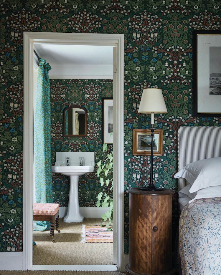
Now of course we have Ben Pentreath and House of Hackney, as well as singer turned designer Paloma Faith, taking inspiration from, and reworking the aforementioned William Morris whose designs never date.
Now some tips:
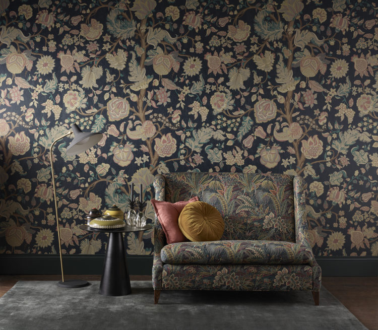
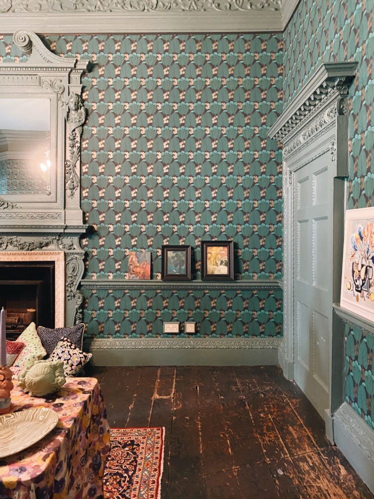
1 Like paint you must always order a sample to see the colours in real life but equally important is checking the scale. Most manufacturers will show a photograph or have a visualising tool so you can see a design either in your own room or on a set. This is key because you need to see how large the design is compared with the furniture in a room and often the sample you get will show only part of a flower or shape.
Seeing the pattern from a distance is also important as small designs which can be pretty and intricate close up can blur from a distance, while larger scale designs might clump into shapes that you don’t want. For this reason I have always preferred trailing florals rather than bunches of flowers which I don’t like from a distance.
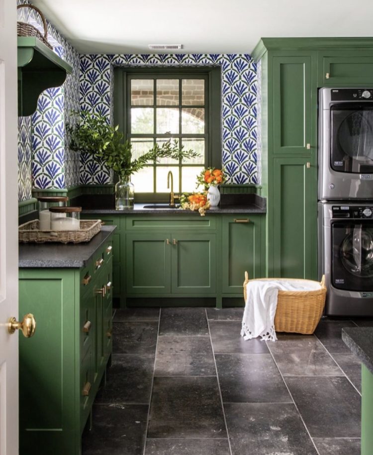
2 If you love a pattern but are worried it’s too much for all four walls you can either stick it halfway up and fix your own dado rail to cover the join.
Alternatively, if the pattern isn’t obviously going in one direction or another (walking leopards or growing flowers) you can use it on the ceiling where it won’t be so overwhelming – you can keep the walls neutral – and you might only see it when you look up or sit down.
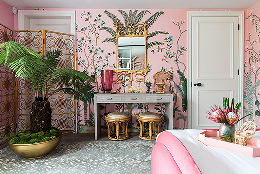
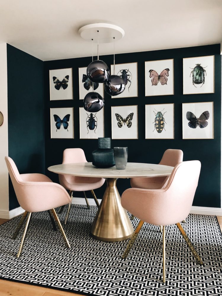
Lastly the feature wall. Now the issue with these is not that feature walls are bad, but that the vast majority of people don’t do them right. A wall of intense colour with all the others white will look random. It just will. Instead, you must welcome the wallpaper to the room and introduce it to the other three walls. This is done by painting the woodwork (skirting on all four walls) in a colour picked out from the paper. This immediately joins the room together. You can also do the door and even, if you fancy, the curtains or blinds on the window, if it’s on a different wall. But don’t invite wallpaper to the party and leave it alone and friendless.
3 If you have fallen for a really expensive paper and only want to use a little bit then try making a feature of it in a different way – using a large panel and framing it with architrave. This works really well if you have a divan bed with no headboard for example and can give the bed real presence.
If you have panelling you can add interest by papering between the panels too.
4 Don’t rule out plain textured wallpaper as a way of adding character to a room. If big bold patterns aren’t for you, or you worry you will go off a design, then Anaglypta is your friend. I have used this in two rooms in my house. The pattern is textured – there are dozens to choose from and you can paint it any colour you like. The one behind my bed is matte, in my son’s room it is gloss. Both bring different things to the space.
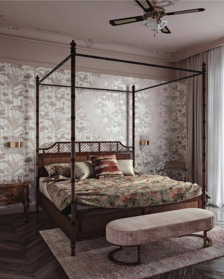
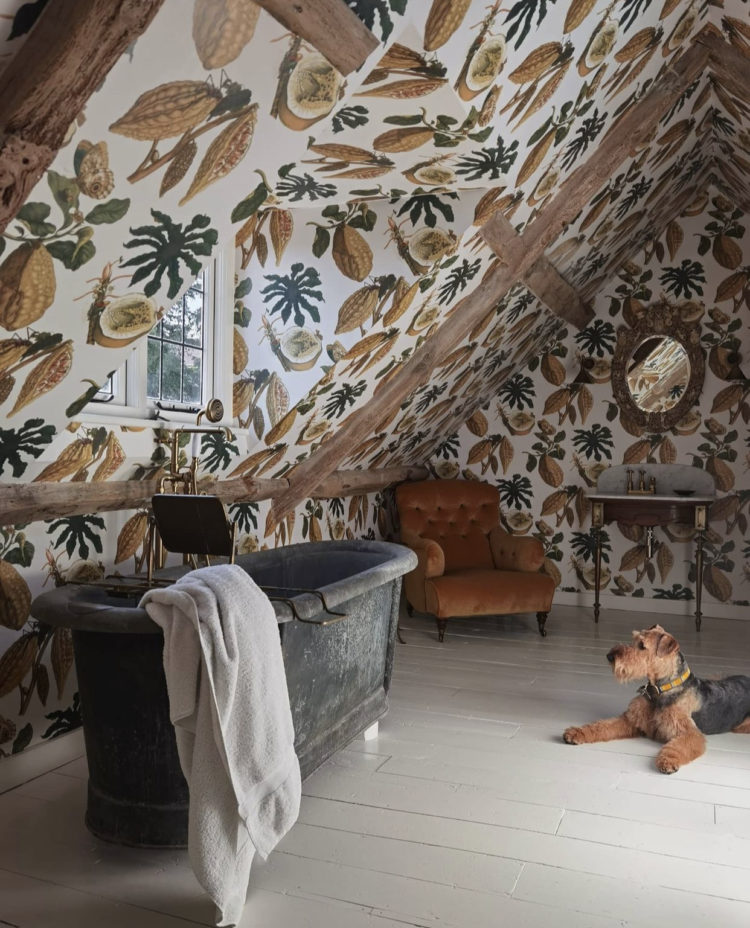
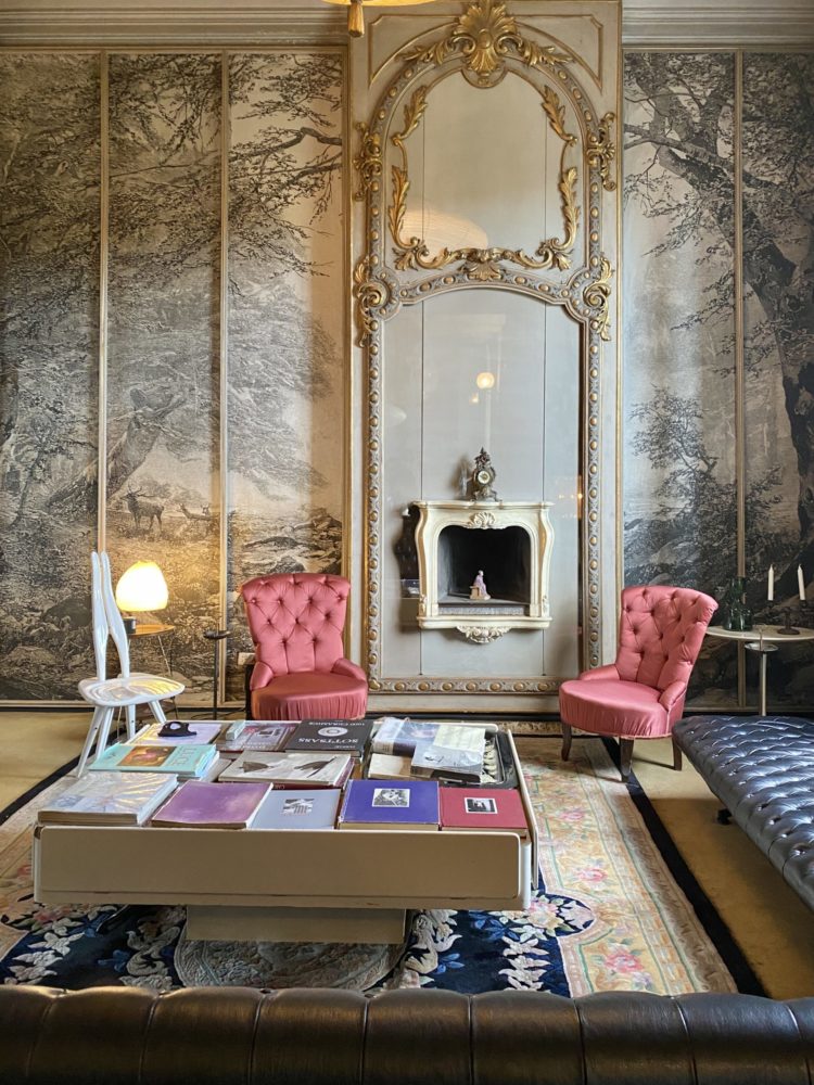
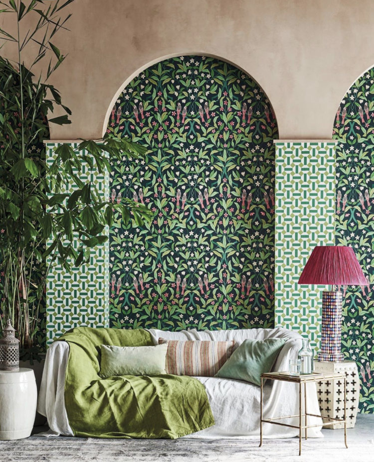
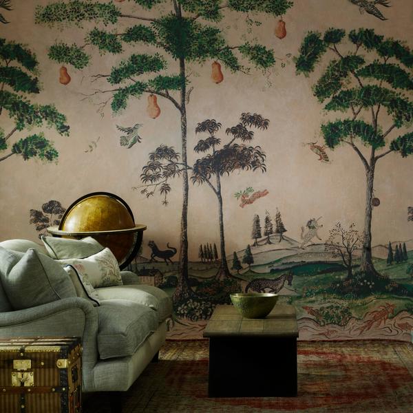
5 Murals are having a moment and don’t rule them out. They have a way of extending the room behind the hard edge of a flat wall and allow the eye to travel further into the middle distance which can be really restful. The Italian designer Carlo Mollino (more on which soon) whose house I visited in Turin this summer, used a black and white forest mural for exactly this reason. It made the room feel larger and visually extends the room.
6 If you want to know about decorating trends then pay attention to the adverts in glossy magazines. They may be advertising a chair or a rug but look at how the professional stylist has decorated the rest of the room as that is the key to what will be coming along soon. Currently there is a lot of wallpaper in panels and murals so expect to see that growing in popularity. It’s a sort of secret way to get ahead of the trend game if you like.
Some years ago when millennial pink was all the rage, it was always used as the background colour on adverts on the tube. Then gradually this changed to a minty green and sure enough the trend forecasters all started talking about neo-mint. Chicken and egg but either way you will be ahead of the mainstream if you pay attention to details like this.
7 Now let’s talk sustainability. Many papers are now sold as printed with eco inks and papers and low in VOCs all of which is good. Watch out, however, for the ones that are sold as good for kitchens and bathrooms – this is because they are more water and steamproof which tends to mean they have pvc or vinyl in them so if you want something for the bathroom but want to be sustainable you need to look for pvc-free versions. This doesn’t mean you can’t have wallpaper in the bathroom although it is better if it’s a well ventilated room with a window so there is less condensation.
Ferm Living, Farrow & Ball, MissPrint and Little Greene all sell PVC free wallpapers and remember check the paste that you are using too.
8 Renters listen up. Wallpaper has traditionally been tricky for renters as, even if you are allowed to use it, it’s a nightmare to strip and repair when you move out. Peel and stick wallpaper is big in the US but has never really taken off here for some reason. You can find it on Etsy and now it’s much easier to get it shipped to Europe but it’s not a mainstream product in the UK. Note also that many of the peel and sticks have vinyl in them – presumably as that allows them to be peeled away more easily in one strip. Spoonflower does vinyl-free peel and stick.
But Sophie has another great tip from her days as a magazine stylist where she might often need to wallpaper a set for a day’s photography and then remove it at the end of the day. For this you need Decorator’s Peel. Prep your wall as normal Paint a coat of this, paste up your wallpaper and then, at the end of the day (time period) you can simply peel it off the paper, wipe down the wall and cover with a coat of emulsion. So it’s not no work but if your rental is a sea of magnolia and you yearn for some colour then this is a good way to do it.
Moving on to Small Space Zoning. This is a packed post but if I don’t cover it now it might be weeks before I get back to it so do have a listen for the full details and in brief:
Janice in Northern Ireland contacted us with this issue but I suspect it’s relevant for so many as lots of us have a living room that now has to accommodate working from home for one or two people and even a hobby – in this case a sewing space.
We often talk about zoning large spaces like kitchen diners or fitting in a sofa to create a relaxing space in the kitchen but a small or average room sometimes has to do a lot than that in a lot less space.
It’s not easy – there isn’t room to add a screen or changing the flooring to create different zones so it’s hard to make it work.Also, as someone pointed out to me in comments some months back, not everyone can work from a laptop that they can fold away at the end of the day. Sometimes a desktop computer (or even two) is required for the day job.
So it comes down to the decoration and using that to create the impression of space and emptiness. Sometimes the furniture has to go round the edges – there’s no space for a sofa to turn its back on a desk or for a narrow console table behind a sofa that can double up as a desk.
Pick a pale paint colour and do the walls, ceiling, woodwork, and the door as well as any cupboards – to make them recede back into the walls. Buy a good primer so the paint will stick to the wooden cupboards. You need to reduce the clutter or hide stuff behind doors that have been painted to match the walls. This will have the effect of calming everything down and visually emptying it.
One large picture on the wall is better than a busy gallery wall and this can be your focal point.
Then take a really good look at all the functions you need in this space and see if everything is needed. A smaller chair rather than a big sofa – narrow arms will give more sitting space and look less dominant than a big fat sofa.
The old trick of steamlined furniture on legs so you see more floor will help add to the feeling of space. Add a big mirror opposite the window to bounce the light around and use the lighting carefully. Using lamps cleverly is how you will zone the space effectively.
So you have a desk lamp that is turned off when no-one is working there. Then you have a lamp by the sofa and the desks will fall into darkness. It’s a popular misconception that you need to light the whole room all at the same time. Allowing a dark corner will blur the edges and hide the perimeter and give a sense of the space softly falling away. Make sure you use lamps at different heights and have some that send light up and down and others that diffuse it out gently via a pale shade. This will add layers and interest to the room and give it more depth without filling it full of stuff.
I hope that helps any of you with similar issues.
Thank you so much to Geberit for sponsoring the series. And thank you all too for your lovely response to my online course which looks at so many of these issues that are regularly raised when it comes to problem solving in interior design.


Wallpaper was a huge turning point in my life!
Back in the early 90s, during the painful split from my first husband, I had to suffer the indignity of calling at his new girlfriend’s flat to demand the money he owed.
The lights were on and her decor was clearly visible from outside. The ghastly, wallpaper finally made me realise that I was better off without him and I turned around.
That was the start of better things.
A packed post indeed! I loved reading this article thank you.
We recently papered our living room ceiling, the challenge (aside from the beams) was the slightly stippled finish that was already there, not full on Artex swirls, but you get the picture.
‘We’ (my husband’s a decorator) put a really heavy lining paper up first before the wall (ceiling) paper to try and smooth the surface as much as possible. The wallpaper is a Morris print so quite busy, but this does disguise any minor blemishes that the lining paper didn’t hide.
Definitely agree that papering the ceiling is great option and does draw the eye up if you have low ceilings.