A little bit of light-hearted fun today. What with launching an online course and a sofa and working two huge interior design projects (I’ll keep you posted but as you read this I will by flying back from Mallorca – scene of one of them) I thought I would just drop this in today as it landed in my inbox and I thought it was quite fun.
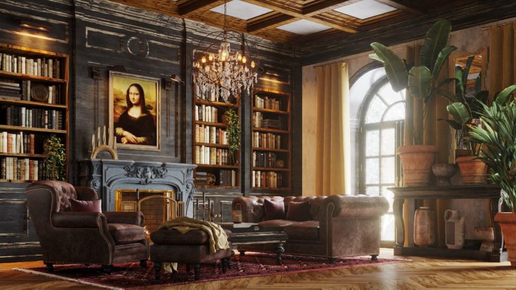
Basically, it’s a re-imagining of the homes of four famous artists – Da Vinci, Van Gogh, Dali and Munch – using the colours from their most famous paintings and translating them into interior design schemes. Now, this might feel a bit silly because of course, their houses wouldn’t look like this, but it’s not uncommon to start with a favourite painting when putting a room together to find your colour palette. And while we’re not going to get too bogged down on whether Da Vinci would have hung the Mona Lisa over his own fireplace, although given his inventive nature I’m going to say yes he might if it was actually a TV that she was hiding hence her enigmatic smile, we can take this as inspiration for using our own favourite paintings as decor inspiration.
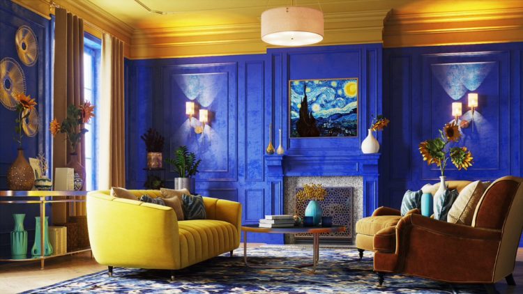
So above we have Van Gogh’s Starry Night and cobalt blue is an enduringly popular shade while yellow as an accent is screamingly on trend at the moment. The blue is a close match to the Pantone Shade 293 C, a medium-dark shade of azure blue. Now, of course this is just for fun but that said, blue and yellow is a classic combination and I have spoken before about how white can be too much of a strong contrast with a deep wall colour so why not consider a yellow ceiling (it doesn’t have to be this bright)? It would definitely make a cold room feel warmer. Alternatively bring in brass lamp stands or a bar cart to bounce the light around if yellow paint feels a little too much.
As for a yellow sofa? Well a few years ago I did a styling job with DFS and while I chose a pale pink sofa and chocolate brown walls, Sophie Robinson (my podcasting co-host) went for cobalt blue walls and a matching blue sofa to make the space feel bigger, but I remember the DFS team telling us that their most popular sofa was a yellow velvet number so don’t feel you have to be sensible and stick to shades of grey when it comes to big pieces of furniture. A sofa is something you are going to live with for a long time so you need a pick a colour that makes you happy and these days many textiles are tough, stain and fade resistant. Also spilling a glass of wine of a grey sofa isn’t going to look any better than spilling it on a pink one.
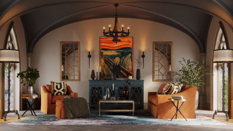
Above is perhaps my favourite room belonging to my least favourite painting – The Scream by Edvard Munch, although there was a new story floating around last year that the person wasn’t screaming in horror but was instead displaying a feeling of awe and wonder which puts an entirely different complexion on this doesn’t it? And with that in mind this is a gorgeous palette of creams and toffees with black accents to punctuate and a little splash of red. A dash of red – like cayenne pepper can work wonders in a softly tonal scheme. Of course you can push it towards burgundy or, moving away from this painting, add a little cobalt blue just to wake it all up a little.
To save the scroll I’m repeating Da Vinci here and this room is all about brown, earthy shades which can be cosy and warm in any room. Here it has been teamed with soft oranges and vintage leather on a Persian rug and wooden floor. My own chocolate brown sitting room also has a Persian rug but I have chosen to highlight the various shades of deep red and pink rather than the more orange and rust shades. You, as they say, do you! This is a very classic room but the giant plants stop it being too gentleman’s club and bring a hint of modernity to this very traditional space.
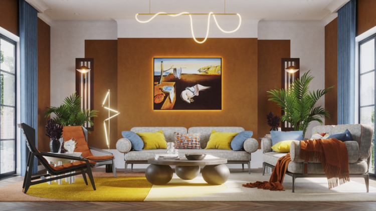
The final image is Salvador Dali’s The Persistance of Time and this is my least favourite room although you can see how it has been based on the painting and, of course, you could use exactly the same colours and different furniture and change it completely.
So there’s a bit of water cooler Wednesday and do let me know if you have based any of your room schemes on a painting that you love. These rooms were put together by Angi, an American app that puts you in touch with tradespeople in your area.


Hi Kate,
Thanks for this post, it’s obvious you’d have liked the Munch-room more! It’s rather gorgeous really.
This post reminded of the fashion helper (sorry, I can’t remember the actual name of what we does!) of Daria Andronescu, when she creates outfits inspired by art work, take a look:
Neat!
Bright colours always scream at me, yet the Van Gogh could almost make me change my mind. But no, it is the Munch, an absolute delight! Cheers from Canada!