This post comes to you from deep in a pile of paint charts. Although we never really believed this sale would happen until the week it did, I had booked the decorator and joiner way back in March on the off-chance that we might need him towards the end of the year. He told us he would be ready in November (he has a wall planner and just writes people down in the order they approach him) then rang last week to say one client had dropped out and we were next. And so he arrives in a couple of weeks. And while I have all the joinery for the bedrooms planned and accurately plotted on graph paper I haven’t quite thought through the colour schemes.
It also turns out that the windows and radiators all need replacing. And the silver grey carpet (in that particular shade known as renters’ delight) also needs to go. So while there’s a lot to do before we get to painting walls I don’t want to let him go now and fall to the back of his six month waiting list. So we will be trying to juggle the jobs and make it work as best we can. At least if every bedroom can have painted and usable storage before Christmas that’s a start. The bedrooms are fairly straightforward in terms of materials as they need only wood, paint and flooring none of which are on particularly long lead times. The windows may take a year and they will have to be phase two – and I agree it’s not ideal to put new windows into a decorated bedroom but neither is living out of boxes in unheated rooms with stained carpet so it’s going to have to be the way it is.
The downstairs quotes are coming in and that will start at some point in the new year along with the upstairs bathroom. So we have a plan – mostly. We have a budget – mostly fine until the windows turned out to be made of paper – and we have a pile of paint and wallpaper charts. I might even have to start a digital moodboard or three. I already have a growing box of samples. I have the overall mood, if you like, I just haven’t refined it to the actual colours and fabrics yet although the flooring is all chosen and will be ordered in the next few weeks. And you should always start with the floor and work up.

In the meantime I was drawn to these images this week. It’s a particularly lovely shade of green and while I don’t think it will be appearing in this house, I do find I always stop and look harder when I come across it and I also have a wallpaper sample on my desk as I type this which is a fairly bright green. It’s the Sarkozi from Mind The Gap, it’s a gorgeous pattern but I think the green is too much for a full room so we are thinking about the taupe but I haven’t quite committed yet. It would be for our bedroom.
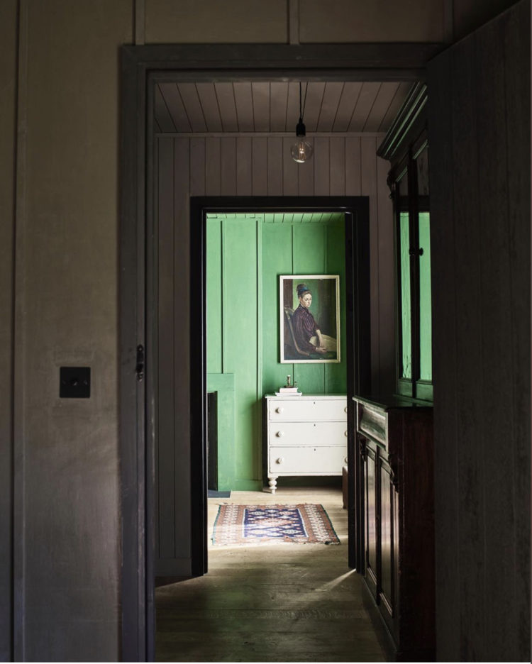
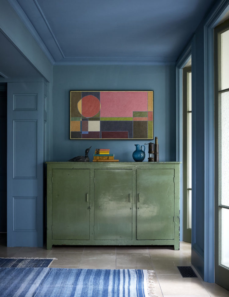
In the image above you can see the importance of the transition between rooms. This green draws you in. While I’m still in the planning stage of this house I’m starting to take note of all the views to ensure that colours, pictures and views enhance the space as you walk past. To this end we will be moving the loo in the bathroom as it’s right opposite the door and I refuse to look at that every time I walk past so for us that’s a non negotiable cost. Not that I know what it will be yet as I haven’t told the builder!
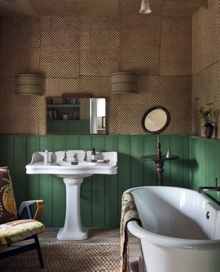
I mentioned last week that The Mad Husband didn’t veto much (sink curtains being one thing) and this image above reminds me of the other – wainscotting in bathrooms. Which is a pretty big ban if you ask me. Still doesn’t mean I can’t look and love and does also give us the chance to choose from the many, many lovely tiles around. In fact, for our bathroom I have found a rather lovely wallpaper which he likes so we will be wallpaper and tiles rather than wainscotting. I’ll take that as a win.
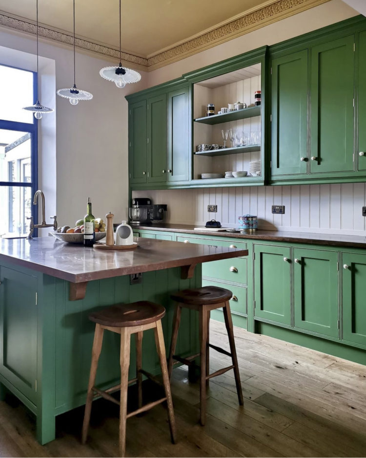
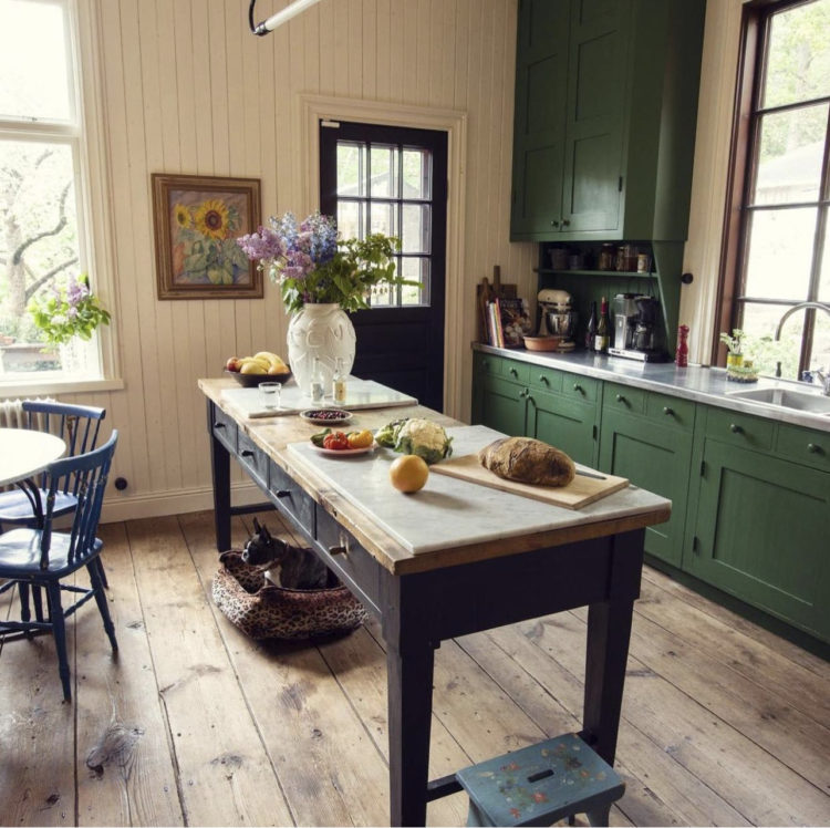
The thing about this shade of green is that it’s more versatile than you might think. Seen in these images with shades of pink, yellow and natural wood, it provides a focal point that isn’t too high energy. If you like stronger, more saturated schemes then pair it, as Nicola Harding as done, with a strong blue. You can use it on the woodwork with pale walls, or on the walls with contrasting wood.


I’m seriously curious about the ban of wainscoting in the bathroom. What doesn’t he like about it? Not judging but I’d love to know if I’m missing something.
I think it’s a childhood thing – orange pine, tricky memories etc. Once you come up against an emotional dislike it’s best to leave it where it is – I wrote about this in the pink book – there are other options so we don’t need to have it.
Lovely. There’s also a blue disruptor shade in several of these pictures that I’ve been seeing around but less commonly on objects and furnishing options in real life. I don’t even know what to call it…
Wallpaper in the bathroom? If I tried that it would flop off the wall or go mouldy…I just know it.
I’m slightly obsessed with this shade of green and have painted my kitchen units (in F&B Dyrehaven) and downstairs loo (LG Hopper, which I think is the shade Karen Knox used in the kitchen in the first pic) in it. In our house it’s combined with plaster pink, blue and (in the) loo a very vibrant Marimekko botanical wallpaper. Adore the Mind the Gap one you’re looking at, I would totally have that in a bedroom myself. There’s an amazing green wallpapered bedroom by Beth Dadswell/ Imperfect Interiors which still haunts me…
The Rodini kitchen has strong colours against a neutral base. That works for me. You go gal! Cheers from Canada!
Beautiful shades of rich green: lifted my spirits on a grey, wet Monday. I’m both jealous and in awe of the degree of planning which you have in hand – practical and creative. I never thought about the views around the house till after I had made some mistakes but…
And my confession: I chose and still love my silver-grey velvet bedroom carpet: Great White walls with Eartborn’s Eiderdown. Ahhhhh.
Good luck with the new house, Kate. How exciting to be at the beginning of a project. I agree with the Mad Husband on bathroom wainscoting – our bathrooms, at least, generate hairy dust like nowhere else in the house and while I might looking at a picture of panelled walls, I don’t want to be cleaning the bastards.
We have lots of green in the house, and will be getting more. I love that Nicola Harding picture as well – the choice of books for their colour (who puts books on a hallway chest – who is stopping to read while standing up in a hallway?) makes me laugh.