As regular readers will know blue is not a colour I feature very often but this week, for some reason, I found myself drawn to it on several occasions so let’s see where it takes us. Looking at what I chose I think it’s the opposite of cold and yet, if you did stray into a cooler shade by accident – in a north-facing room for example – it’s a colour that, like grey is easy to warm up. I have included the full range here from dark to light and veering into green so you can see what it likes and how you might be incorporate it into your own home. This is not an exhaustive suggestion list – pale blue also likes a bit of red ochre, which I have written about before but not included here today.
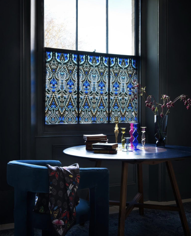
Always tricky to know which order to go in and I tend to work my way round an imaginary house room by room but this time I think we’ll take it by shade starting with the darkest. I have never been a fan of window film as, for the most part, I like to see out, but I have to say this new styling work by the brilliant Sarita Sharma for Purlfrost stopped me in my tracks. If you have a period home and stained glass wouldn’t be out of place then this works brilliantly. Of course you have to plan where to put it with a dark design but, for example, in my terrace house the light comes over the top of the houses opposite so putting something dark on the bottom half of the window won’t make much difference to the overall light of the room. It is, of course, also brilliant for front doors.
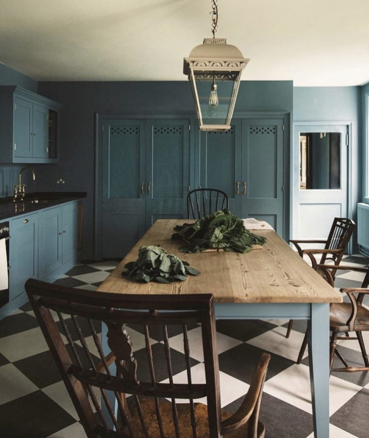
A dark blue kitchen now and this is by Plain English for The Museum of Home. If you are using a dark colour and are worried that it will make the room look smaller, the key is to paint the walls to match. We have discussed this before with sofas and it’s the same principle. The overall effect is less cluttered and more streamlined but you can still see the decorative features on the cupboards. If the walls were white or cream the cupboards would shout much louder and the room would feel busier and more cluttered. So don’t be scared of a strong colour – just know how to use it to best effect.
The pale ceiling and black and white floor bring in more light too and while I know I have railed against white ceilings, the point here is that a) it’s cream and softer and b) it’s picked up on the floor so it looks like a design decision and not like you painted it white because that’s what everyone does.
Now if you wanted to bring in another colour the table legs are the perfect spot for a bit of a disrupter- yellow, pink, emerald – anything you like that you love – even a paler version of the blue. Or, keeping them matching is a more elegant and refined look. Only you can decide if you are refined elegance or disruptive influence.
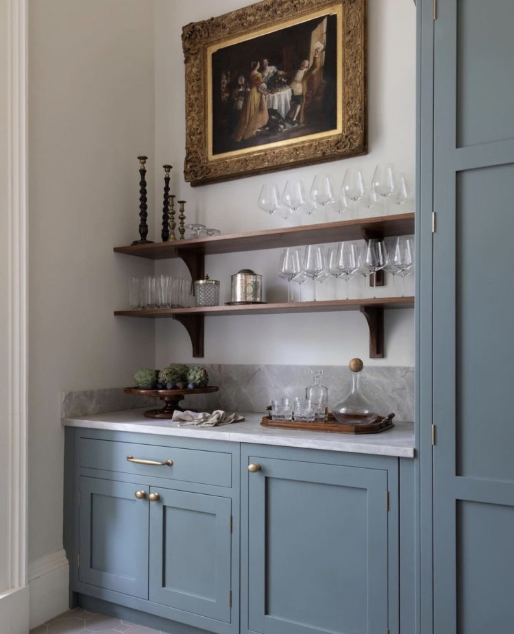
Staying with kitchens and this paler blue (Livid by Little Greene) also uses natural wood to warm the scheme and bring in character. Vintage wood is always a good idea in what can be very modern rooms by design – so kitchens and bathrooms will always benefit. In the top picture it’s a rustic farmhouse table with painted legs, here, the shelves warm the sleek marble and brass and stop it feeling sterile. The old painting does the same trick. You can buy an old frame and, if you don’t like the picture it is holding, you can replace it with mirror – perhaps aged to keep the antique feel. This will always contrast beautifully with a more modern industrial interior too – think Persian rugs on concrete floors and old frames in modern bathrooms.
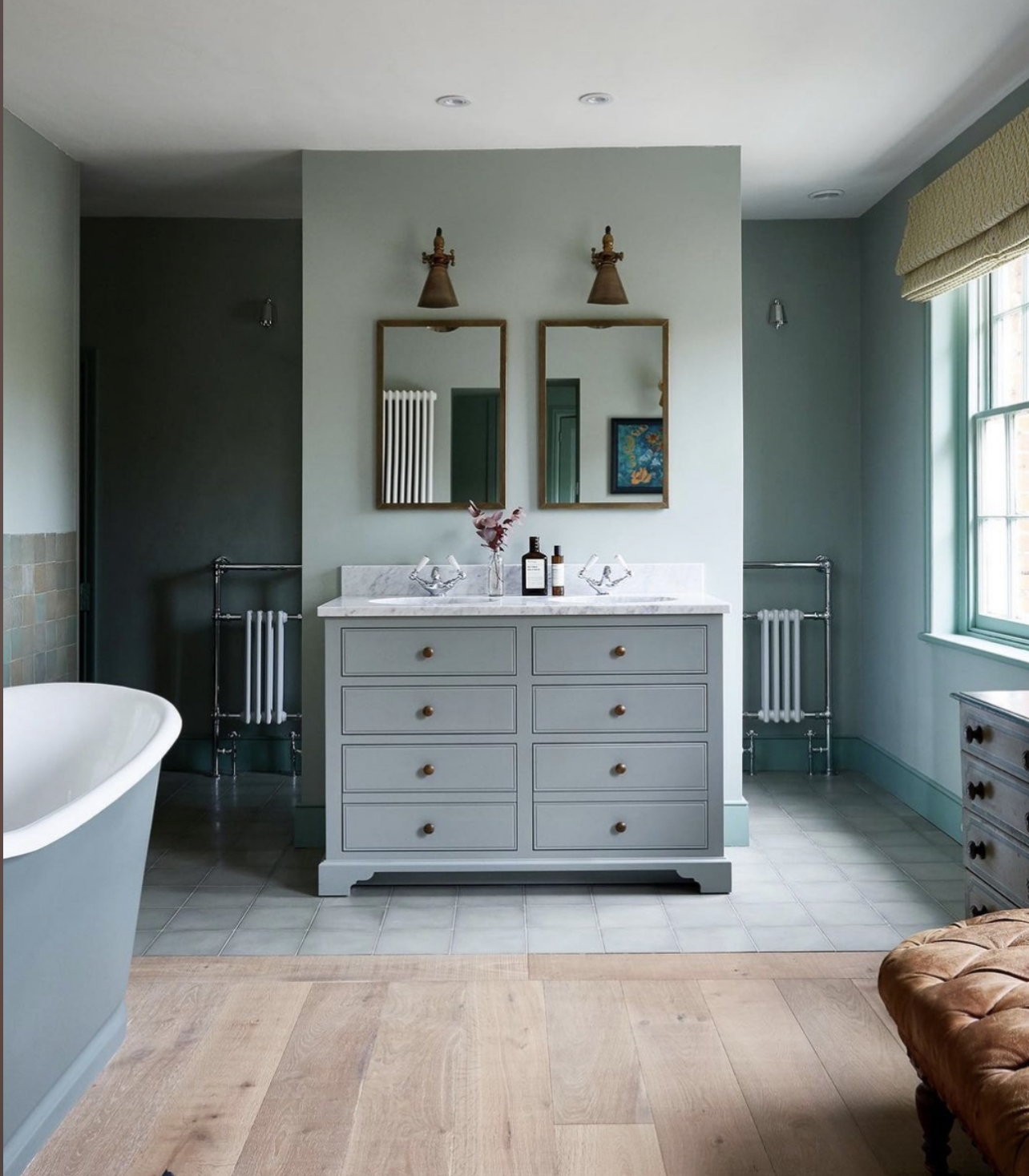
Talking of bathrooms – three very different ones here and all in similar shades of blue – starting with refined hotel elegance, to fun and finishing with a more industrial look. Yet all three are the same colour so it can be instructive to see how the different results were achieved.
Above, one of my design heroes, Nicola Harding, whose use of colour and knowledge of architectural history brings so much to her work. If you have a big room you can play with the layout and, rather than sticking a shower in a corner and having a large amount of wasted space in the middle, you can use it more productively. I did a similar thing in my bedroom by putting a wardrobe behind a false wall. Behind there is either a shower or a loo – it doesn’t matter which, the point is that by adding this false wall you immediately create space for two basins and a huge amount of storage below, which you would’t have if you were putting all the furniture round the edges. I appreciate this is big bathrooms only but some of you will have them.
The sink unit matches the walls, as does the bath and the different flooring distinguishes the wet area. Now the brain likes symmetry – we’ve all read those features about how people with symmetrical features are reckoned to be more attractive than those without (it’s a scientific brain thing, I’m not saying we all agree) and it’s a similar thing with interiors. The brain likes symmetry so it likes things in pairs, which it finds more relaxing. It’s also very elegant, so, once again, the use of a pair of heated towel rails, two basins and matching mirrors makes for a calming, orderly space. You feel instinctively that the person who uses this bathroom can probably lay their hands on a matching pair of socks. And, if you are not that person, the question is would this bathroom help you to be?
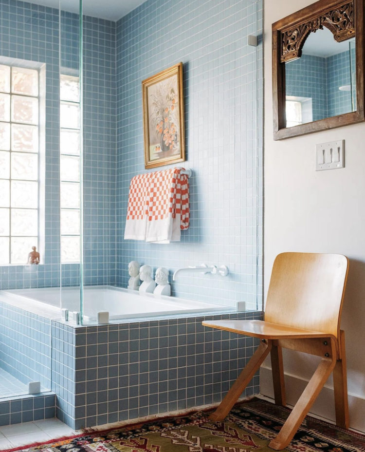
Now, this one above is wittier and more fun. How have they done that? Firstly square tiles are currently both fashionable and retro – they are not classic so that’s the first thing. Using them on the side of the bath and right up to the ceiling will make the room feel taller too. Then there’s the orange checked towel and the vintage picture irreverently hung over the tiles. It’s small details but it feels fun and different. I feel like the owner of this bathroom would probably pride themselves on never wearing matching socks but they would clash them artistically chunky boots or sandals rather than in an absent-minded way.
This bathroom still has vintage – the rug and the chair as well as the old mirror but there are no pairs and the colours are stronger. Blue and orange are opposite each other on the colour wheel so you can use them as a very happy contrast. And if you can find patterned towels then do – it’s a great way to bring in textiles to a room that may not otherwise have any. This one has no curtains for example and not everyone will want a rug on their floor.
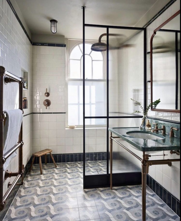
Finally, this is a more industrial design with the blue brought in via patterned floor tiles. The black crittallesque shower screen, by Drummonds, is very fashionable, the reeded glass likewise although it might add a scintilla of privacy to this open wet room style bathroom. Once again the tiles are square with rectangle ones used for the skirting and the bulkhead light fitting echoes the arch of the window. There are more curves with the basin and shower head and even the floor pattern is undulating. The vintage stool in the corner brings warmth and the marble basin surround adds more colour. This is a sort of elegant industrial look.
If you have a small bathroom and fear that too much colour on the walls will overwhelm then don’t forget the floor. As you can see from this you don’t have to match your tiles – there are three different shapes on the wall along and then the floor but the colours are tight – grey, white, blue and the brass fittings warm it all up.
So the question is which one are you?
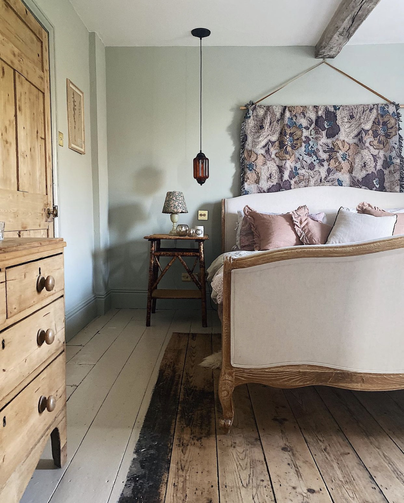
Finishing with lean into the pale green camp as the same principles apply. As you can see the walls are very pale but the wooden chest of drawers and vintage bedside tables all warm it up. Hanging a throw (in this case a very pretty one from Print Sisters Archive) over a baton behind the bed is a great way to bring in more colour to a room and something you can do on a rotating basis as well. If space on the bedside table is tight then hanging a light works well (there are lamps as well here obviously but I’m highlighting the idea) and this principle applies to sofas in tight spaces as well.
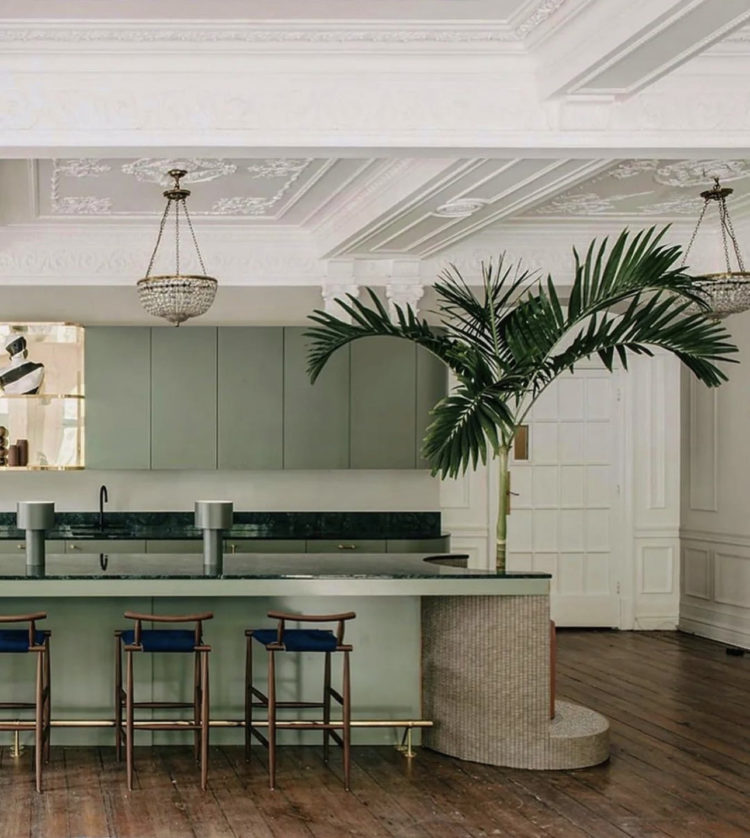
Then there’s this kitchen and while this is a pretty green, with a lovely plasterwork ceiling – the like of which I’m guessing very few of us have – I have to say I’m more bothered about whether I can make room at the end of my island for a fabulous palm tree. Cutting out a shape to house the plant is taking a gamble that it will thrive forever – don’t, whatver you do, do the same thing for a sulky fiddle leaf fig, but having room to stand a plant next to your island, particular if you have a view of the garden is a great way to unite inside and outside. And I’ve seen just the kitchen it might work in so am off to persuade the owner of the brilliance of this idea.
As ever, I hope that has given you some inspiration for your own places and spaces, either in colour or style – refined elegance or disruptive influence – which one are you?


I have never been a fan of blue in decorating, but all these rooms could make a convert of me. That window film, oh, my, god! The giant palm cut-out, how clever! Reminds me of a ’50’s bar. Cheers from Canada!
I have a warm duck egg blue sitting room paired with pale woods. In winter I accessorise with navy, teal, grey or burgundy cushions, throws and flowers and in the spring and summer do so with fresh greens, bright pinks and ochres
Love the shower with the levers positioned away from the showerhead! It’s a minor issue, but always getting sprayed on arms and sleeves when turning the lever under the showerhead is really annoying. I’ll be incorporating this into my bathroom remodel. Thanks Kate!
Well spotted, that is a good idea that I will also file away.
Clearly I am a disruptive influence because I adore the blue tiled bathroom with orange towels.