I wrote a post on How to choose the right shade of grey paint about four years ago now. It led to a book which, in turn, led to a second book (currently writing it) and that post is still the most visited on the blog today. Now grey is no longer a fashionable colour. It has transcended fashion and become a classic. There’s no longer any need to make a song and dance about the fact that you are choosing grey paint for your walls but the fact does remain that, in its paler forms, it is still one of the hardest colours to get right. In my original post you can read about finding the right shade based on which way your room faces and how the light will change (or you can buy the book). This post is about helping you group different shades of grey together correctly as they can so often fight. And when you have chosen your grey family, there are some thoughts on how to use them for maximum effect.
Farrow & Ball have grouped their greys into different families of neutrals and these range from the classics, which are hardly grey, to the colder, more architectural shades. Once you have found your family, you can then choose how dark or light you want to go and also vary the shades between woodwork and wall and know that they will go. On the paint chart you can randomly pick a dark and a pale grey but once they are on the walls you mysteriously find that one is blue and one is beige and they don’t get on at all. These colour cards should help – although on a computer read the names because they will look entirely different on your screen to how they look on mine and both will be a long way from how they will look on a wall.
After last week’s post on the new paint trends I thought it might be helpful for you to see how these greys are grouped which should at least cut down on some of the decisions.
THE CONTEMPORARY GREYS
These have a more urban feel to them and do in most cases appear grey. Except when they don’t. And that is where grey is so hard. I have a friend whose entire downstairs is painted in Elephant’s Breath. It’s a gorgeous soft grey that is indeed reminiscent of a (pale) elephant. Except that in my house it’s beige. That’s why you have to try them on the wall and look at them at different times of day. But if it’s the right shade for you then mix it with Strong White and Skimming Stone if you want a change for the woodwork and floors. If you want a strong accent colour look at the aubergine tones of Pelt and Card Room Green.
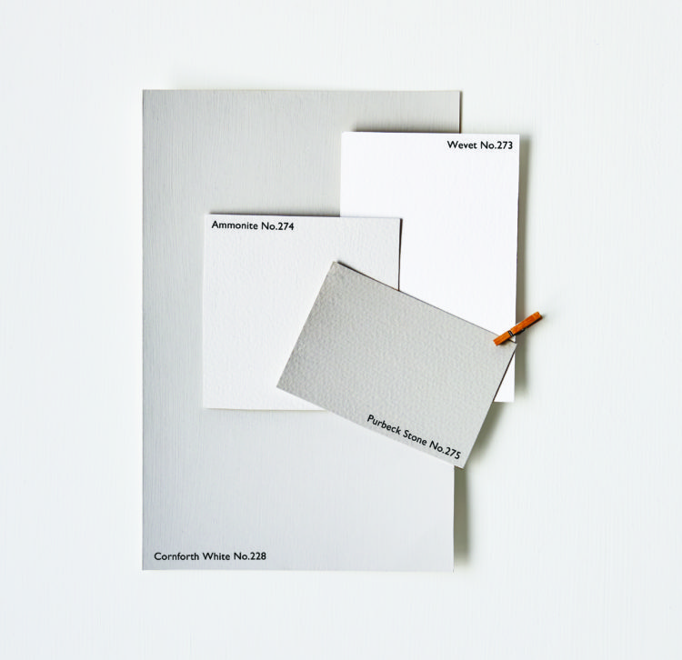
THE EASY GREYS
This is the group I am drawn to although my house more accurately falls into the next one. This is the Scandinavian palette. It’s calm and easy to live with and not too dark. It makes a great backdrop for your furniture and will sit happily with strong colours. This group includes Cornforth White, Wevet. Ammonite and Purbeck Stone. For a more daring finish add Railings or Mole’s Breath for drama.
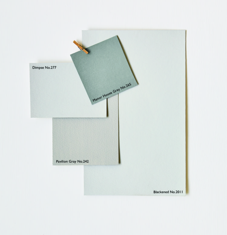
THE ARCHITECTURAL GREYS
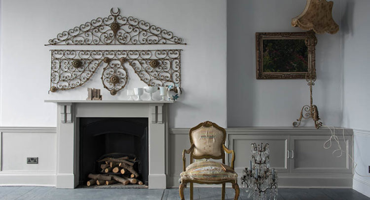
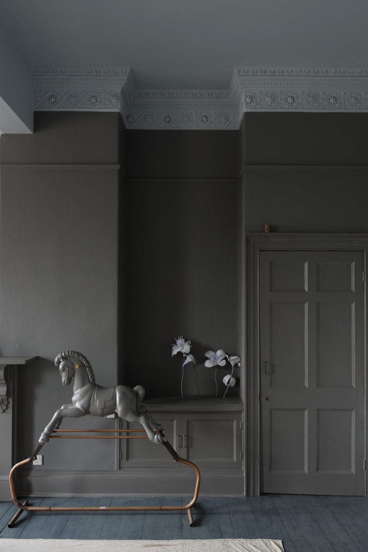
These are bluer than the others and will have a grittier feel that is suited to minimal living. Which isn’t me but this group includes Railings, Down Pipe and Pavilion Grey all of which feature strongly in my house.
Now, as I said earlier, it does make a different where you put these colours but as Joa Studholme, creative director of Farrow and Ball, says, you will be naturally drawn to one of these groups. That will dramatically cut down the choices you have to make as there are several shades in each so you can find the two or three that work for you.
NOW HOW TO USE THEM
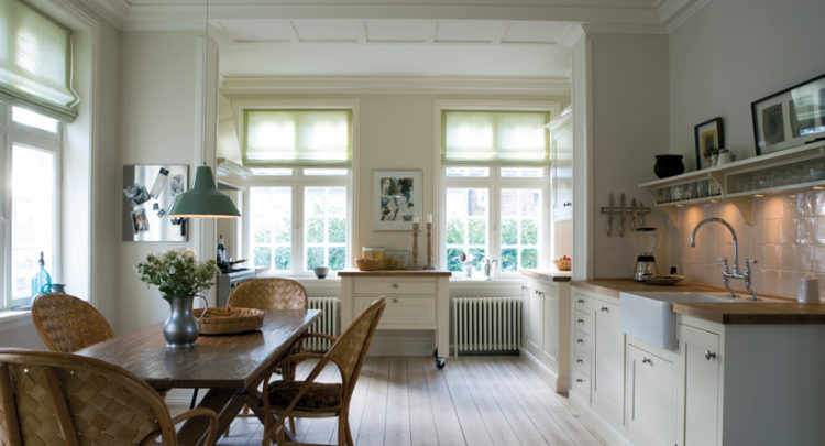
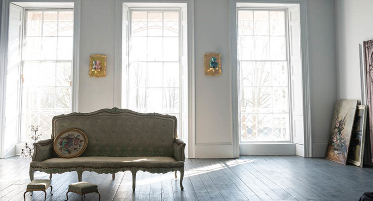
The next question is how to use them. The easy way, especially with the paler shades, is to take the gallery route. That is do the lot. Everything. Walls, woodwork and ceilings all in the same shade. It will blur the edges of the room, make it look bigger and, crucially, show of your furnishings really well. That’s why galleries do it. It’s the way the Georgians did it – but you don’t have to have a Georgian house for this look. It’s also really calming because you’re not distracting the eye. Think about painting a small room and how the wall are one colour and the door frames another, then you break for the window frames and the door. It all breaks up the uniform feel whereas if you do the whole thing it’s instantly calmer and larger.
There is of course the traditional route of painting the ceiling and woodwork white and there’s really nothing wrong with that. It’s a tried and tested system that works. But how about subverting that? If you are worried that using a strong colour on the walls will make the room darker so you have decided to paint the wood white to lighten it up again why no do it the other way round?
Keep the walls and ceiling in a lighter colour to make the most of the pale colour and bring in a a little definition by painting the skirting boards and door frames darker. This can be a really contemporary look and is much more considered. In other words, it shows that you have really thought about what you were doing and have made a decision about how you want your home to look which, as you’re reading this blog, I am going to assume is the case.
Just be aware – be very aware – that while all these colours are correctly named and put together in the right order the chances are that on a computer they bear only a vague resemblance to what is in the pot. GET A TESTER. You just can’t cheat on that step I’m afraid.


Do wish you could throw in the odd reference to Benjamin Moore colours from time to time….F&B, while lovely I agree are very hard to come by in the area I live in in Canada, and I don’t wish to drive a few hours for paint (especially if it were to turn out I needed an extra can, say). BM is excellent quality too and has some beautiful colours as well and I would love to hear your opinions on some of their more popular greys… (I have a house full of them).
To Colleen, I live in Canada too and while I do have a relatively nearby source of F&B, it is SO expensive here. I have found that my local Home Hardware can mix up the F&B shades. You do not have the benefit of the lovely depth of pigment but it still works very well–they have the formulae on their computer. And there are online articles that give more direct comparisons between the Benjamin Moore colours and the Farrow and Ball shades–some are very close. Good luck.
Hi Kate,
Great post.
Hoping you can help please? I’ve just painted my skirting boards and door frames dark too, in Downpipe, with the walls in Cornforth White. It looks great but there’s a connecting door to the kitchen and I’ve no idea what colour to paint it – dark frame and door didn’t look right but should I go white door and white frame to match the windows or maybe even the same colour as the walls?
Thanks!
It does sound great. Slightly hard to visualise and I guess it depends if the door is mostly open or closed. If the dark wasn’t right then match it to the walls – that way it will sort of disappear. x
I have Elephant’s Breath on the exterior of a south facing house. It looks very pale and a soft lilacy pink. It is a feature colour in a F&B wallpaper in a north facing bedroom and I thought about using it on the woodwork. No chance. It looked almost brown. You would never believe they are the same colour.
Purely by coincidence I had the chance to buy to tins of Wimborne White. I wanted to paint my walls and I didn’t want to spend too much money. I turned out to be the perfect color for my living room. In fact.. I love it so much I painted the doors in the exact same color. The hallway however, is a different story. I painted my staircase in Brinjal (which I still love) and I thought Peignoir would be the perfect color. But it’s not. It’s far too dark… and since I can’t choose it’s probably take a while before I make up my mind. Sigh…
Now this post is just so timely for me. I painted my living room in Wimborne White last year and it was such a success that I want all of my apartment to be in F&B neutrals now. I do struggle choosing between these groups as they all have something fabulous to offer. BTW, I absolutely love the photos of your living room – it is my fantasy living room really. I have to work Down Pipe into my apartment somehow.
So true about the necessity of sample pots. Blackened, for instance, looks nothing like it does on my Mac – much bluer in reality.
What approach would you take with a double length sitting room with a south facing large bay window at one end and a much smaller north facing window at the other? The quality of light at each end of the room is hugely different. Should I treat it as south facing given that that is where the majority of light is coming from?
Matt
I had a very open eco-home which had north and south facing aspects which had to be painted in the same colour.
I used Ammonite: it came out as a soft, true grey in both aspects, but it has a tiny amount of red in it, which stopped it from looking or feeling cold in the north-facing kitchen with a low ceiling.
By contrast, I painted a south-facing bedroom with Blackened, and it looked like a shade of white, but in a north-facing bedroom, it looked a pale, washed-out blue. I liked it both ways, but the north-facing room was very bright.
I am waiting for Kate to rescue me from my east-facing hell at present.
One thing I’ve noticed, from my £200+ array of samples on my walls: I’ve got two Dulux samples up (Night Jewels 4 & 5).
All the other samples come from various paint companies (F&B, Benjamin Moore- gorgeous paint, by the way – Earthborn, Paint & Paper Library, Zoffany, Neptune and Conrad Paints).
The Dulux colours don’t really change shade in bright morning sun or in afternoon dinge. Is this a good thing or not???
Conran not Conrad. Bloody auto correct!
Thanks Denise. We tested a few paints a while ago in the room and I think ammonite was our favourite! I’m feeling inspired to get it done now 🙂
I have just selected a couple of new F&B colours for our next decorating project. For anyone like me that can’t decide the F&B staff are excellent, I attended a freebie F&B session at Sally Bourne Interiors Shop in Muswell Hill N10 a few weeks ago. With the guidance of Lucy – F&B consultant, we agreed on Drop Cloth with Pointing ceiling for the sitting room – north facing with big windows. Then Shadow White for the hallway with Pointing ceiling. We have 12 inch skirting boards, dado and picture rails but taking the colour right up to the edges of the cornicing will look great. Kate – you are spot on – the colour tested in our home with the light etc looks completely different to the small tester card/PC.
This is such as helpful post Kate. I appreciate that colour can’t be an exact science (especially when looking on the screen where every colour can look different to every other screen). But you’ve brought some order to chaos. Much appreciated.
Hi Kate,
Thanks for this. I am apprehending the choice of paint for my living and dining room which were painted a standard white thirteen years ago and of course look B-O-R-I-N-G. One of my concerns is that the new color marry well with the two (large) sofas upholstered in greyish green linen. I live in the countryside which is quite visible from the inside, including the pink hydrangea in front of one window. Given the natural setting, the greenish sofas and wood furniture, is it safe to assume that the gorgeous greys might not be the best choice? Easy or traditional neutrals better? Thanks!
Monica
Have you looked at Hardwick White by F&B or their Mizzle?
Hardwick looks greenish-grey in certain lights and Mizzle has a soft green tone.