This week we’re taking a different approach as New London Architecture (NLA) has just announced its shortlist for this prestigious design award to find the best home extensions in the capital, and I thought you might like to see some of the entrants as it could give you ideas for your own work. There are 37 projects on the list – which makes it possibly the longest shortlist I have seen – so I can’t include them all but here are some of my favourites.
More than 200 homes were submitted for this year’s competition to be chosen as one of the capital’s most innovative home improvement projects and designed to promote the work of emerging architecture practices who encourage the best use of design in everyday life.
Now I don’t know about you, but when we extended this house – to create the dining end of the kitchen – there wasn’t enough money to think artistically or architecturally about what we wanted to do. It was about getting the maximum amount of floor space for the budget we had. Which, I imagine, is the priority for most of us.
But that doesn’t mean we can’t admire what other people have done. And dream. And it also doesn’t mean that if you are planning to extend, or – as they say – improve rather than move, that you shouldn’t look around for a little inspiration first.
The other thing I find, particularly on programmes like Grand Designs, is that I love the outside but am invariably disappointed by what has happened inside. And I get that too – if you’ve spent all the money on the bricks then there often isn’t much left over for the bedding. But I have included some great interior shots here for you too as Friday’s post is all about house tours so we get to look inside and out. You can, see the full list of 37 projects here for more details.
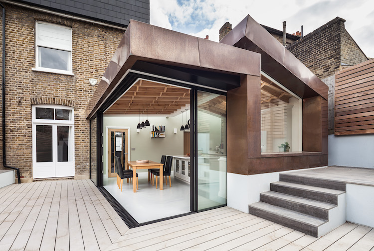
Above is one of my favourites. We, too, have filled in our side return but not like this. If only. Planning departments will often let you go higher than you might have thought about and when it doesn’t create extra floor space, you might wonder why you would bother, but this would also flood the space with light and, of course, it looks spectacular.
You won’t all be allowed to do this – it will depend on the next door neighbour’s right to light but, in this case, as there was already a high wall in place that didn’t cause any adverse effects on anyone. I’m rather wishing my neighbours had built a high wall now then I would have had an excuse to do this.
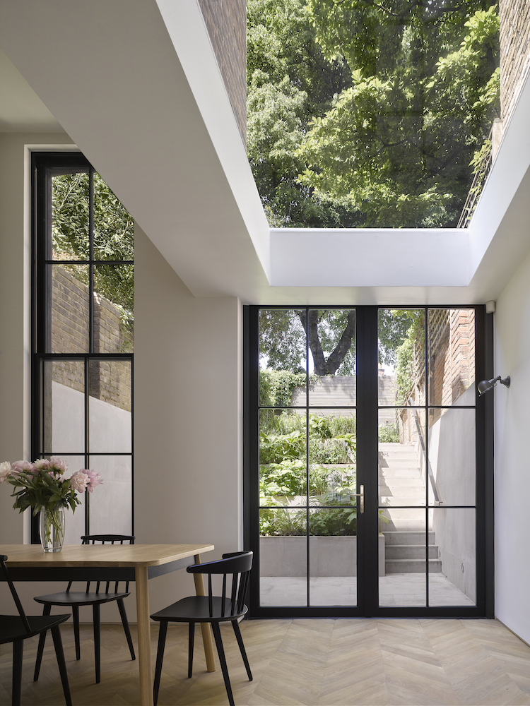
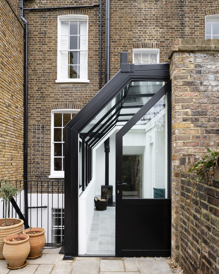
Above is a more common extension – built from frameless glass without a supporting pillar at the corner which means you can really open up the space and make it feel part of the garden. Yes it costs more as you have to find other ways of supporting the structure, but the whole thing looks weightless and light. And don’t forget to look at the other side of the extension where the roof shape echoes the pitch of the one on top of the house.
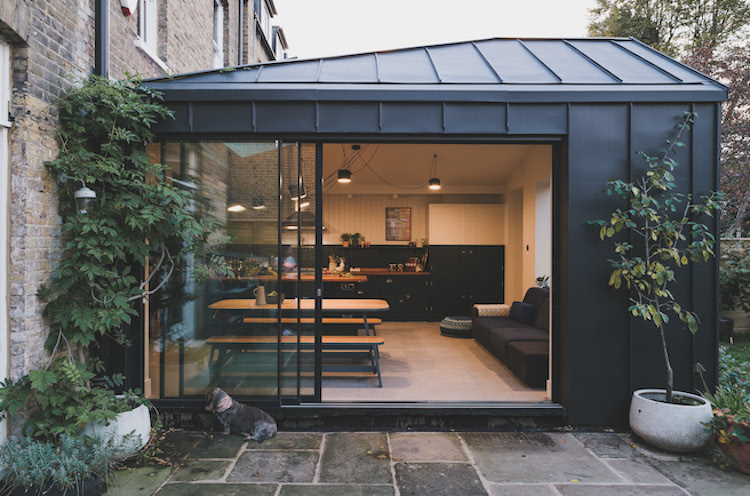
I particularly like this extension above where the owners have built into the side return. The first flat we bought had an extension like this with two steps down from the kitchen and we used it as a tiny dining room, although one friend, who was about 6t 2ins often felt that he basically had to have his chair in the garden in order to get his feet under the table.
There is, as you can see, a woodburning stove in there but – so far – no chairs. I would be interested to see how this space is used in real life but if you had a two bedroom garden flat – as we did – then this is an invaluable addition to the available space. And if you are thinking this one through – in our flat – where there looks to be a radiator above – was the window into the second bedroom. We used this first as an office/space room and then for the 17yo when he was born so the room stayed light although it became an internal window.
This is, perhaps a more classic addition to the back of the house but look at the finish. Again, ours is rendered concrete although we painted it black a couple of years ago to try and pretty it up a bit and it worked – especially with the greenery around the sides.
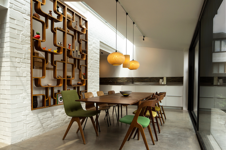
Moving back inside and how about that for a feature wall? This is such a clever way of dividing an open plan space or even allowing more light into a dark room by knocking a hole in the wall. As many of you know I have always loved an internal window but this is more than that as it lets in the light, allows for storage and display and gives an element of privacy between the two spaces. It also warms up what is quite an industrial space with the poured concrete floor and brick walls.
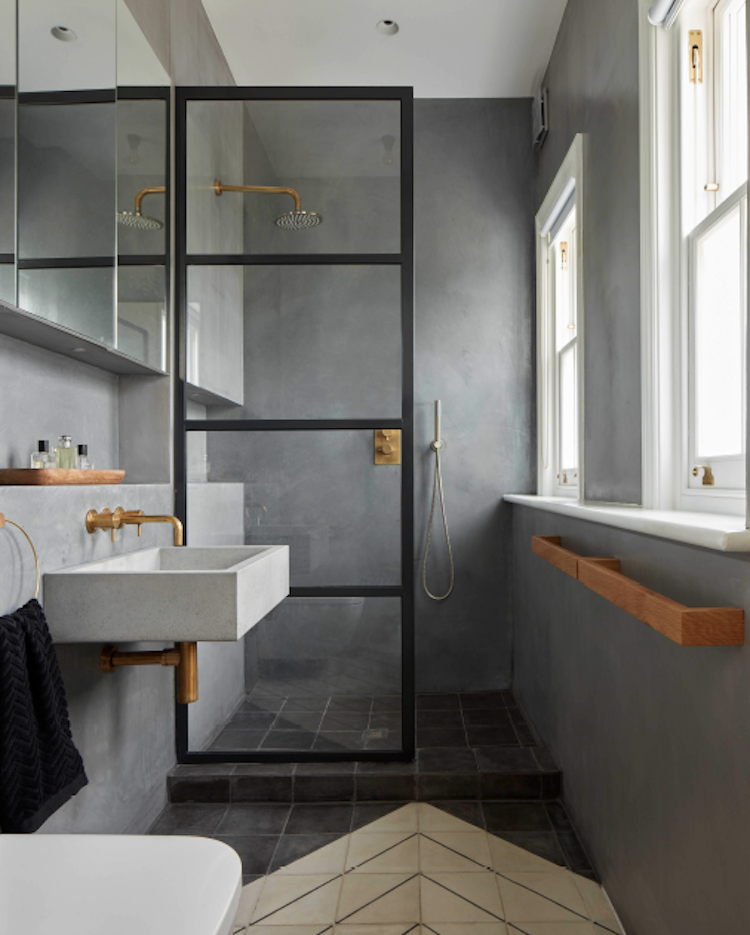
Here the concrete has been taken all over the walls and I just love this bathroom. The brass really warms up the concrete and the wooden box shelves also soften the edges. If you can’t find a brass bottle trap – the fitting below the sink – which we couldn’t a few years ago, then you can spray a chrome one to match your taps. And I found this tutorial on how you can even spray your taps inside the shower.
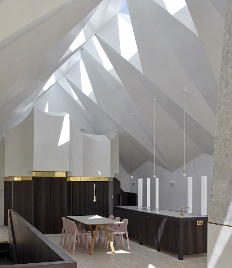
The last few images are all about the roof. This is a converted chapel and just look at those windows – it’s like origami – and the shadows they create. That structure at the end is also reminiscent of the organ pipes isn’t it? It’s probably a cupboard for the ironing board now.
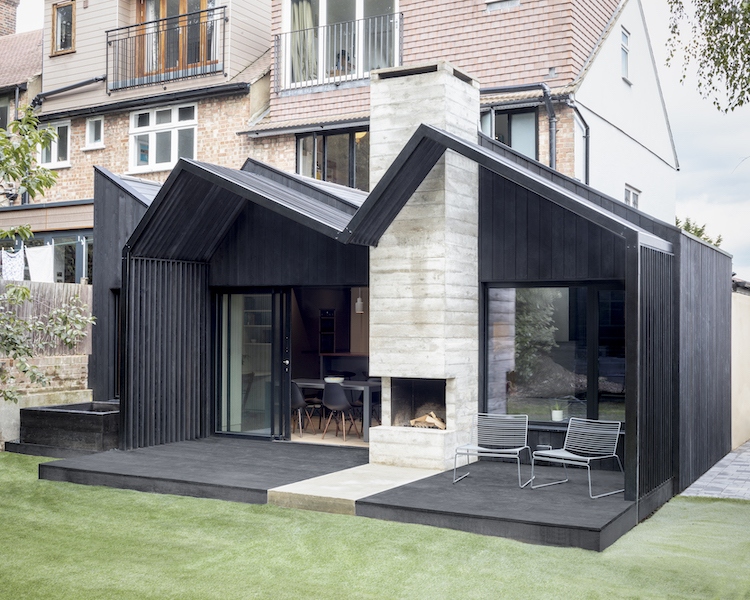
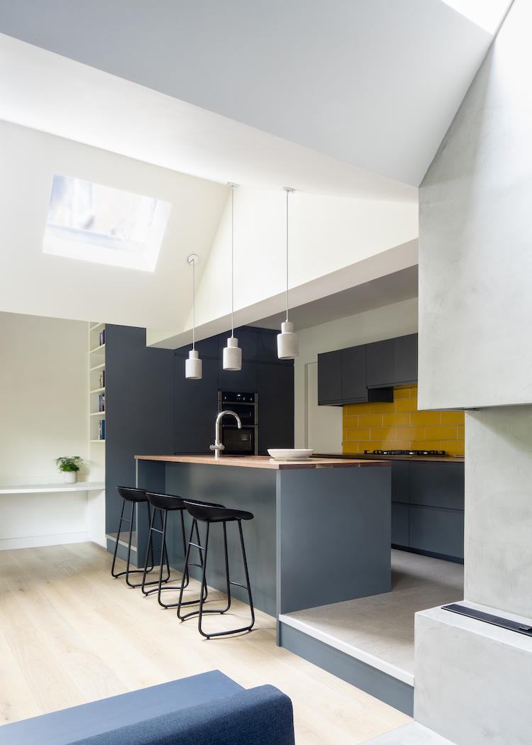
And this black painted wooden extension is wonderful with that outside fireplace. That’s such a good idea. And below is an image from the inside which shows you that tricky roof lines don’t have to be a problem. Here the ceiling works to zone the open plan kitchen and I think, if it were mine, I might paint that triangle to match the cupboards below and zone it still further. If you have lots of odd ceiling angles you don’t have to paint it all white because you’re not sure where the wall ends and the roof begins. Pick a colour and paint the bits you fancy. Think of them as horizontal walls and use them to define a space or change the mood from one end of the room to the other.
So there are some of the entrants to this year’s Don’t Move Improve shortlist. The winner will be announced on 22 January. These images may not include that winner as I didn’t have space to post them all but do let me know what you think of the ones I have used, or even if there was another that you think I should have included.
Have a great weekend and don’t forget the podcast. Thank you all so much for listening and rating and reviewing. I’m thrilled to say that while the last episode of this series is out in two weeks (13 December 2018) we will be recording a second series that will start in January so I hope you will tune in for that.
And before I go – if you fancy reading this month’s newletter which includes my highlights of Helsinki, this month’s book list and how I met Trinny then you can sign up here – tick the monthly box. It’s all the stuff that isn’t interiors.


I do wonder with all these gorgeous glass extensions, especially glass in the roof, what happens about room temperature?
We are experiencing very hot summers, so is heat resistant glass used?
Does it work and does it cost a great deal more?
yet another great, thanks mama.
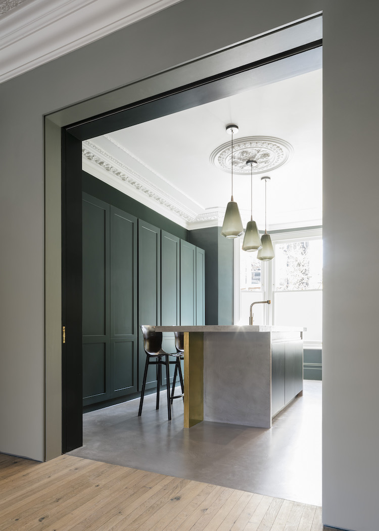
Beautiful Chevron floor in Tower House, it really adds impact to the room!
The chapel ceiling is absolutely wonderful, and presumably – being a chapel – it works from the outside too, which I don’t think the following example does. I mean, it doesn’t look as if it belongs to the building. I do feel that extensions should relate to what they’re extending.
I’m a bit in two minds about the vast expanses of glass, too. I built a house with a 2-storey window about twenty years ago and then realised I had no idea how I was going to clean it, and the dividing bars became bluebottle graveyards which then encouraged the spiders to move in and the whole thing became a bit Gothick, which wasn’t the original idea at all.