I was going to show you a very beautiful, very expensive, somewhat neutral house this week but given the reaction to the calming neutrals the other day, I decided against it and we shall look at this charming four bedroom maisonette which, as is so often the case, ties up a few of the themes we have looked at recently.
It’s in north London and is on the market for £995,000 with The Modern House and while it’s a maisonette it is around £1500 sq ft (which is big – I had a whole four bedroom house that was that size) and it has a small south-facing courtyard garden. Entrance is via a porch which takes you to your own front door.
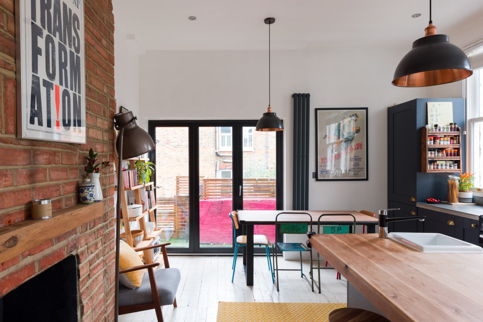
You head straight upstairs to the first floor where you will find this large kitchen diner with doors leading to steps down to the garden, as well as a bathroom, reception, large bedroom and a small one (probably home office these days). Upstairs, under the eaves there are two more bedrooms, one of which has a crawl hole through into a playroom while the other has an ensuite shower room.
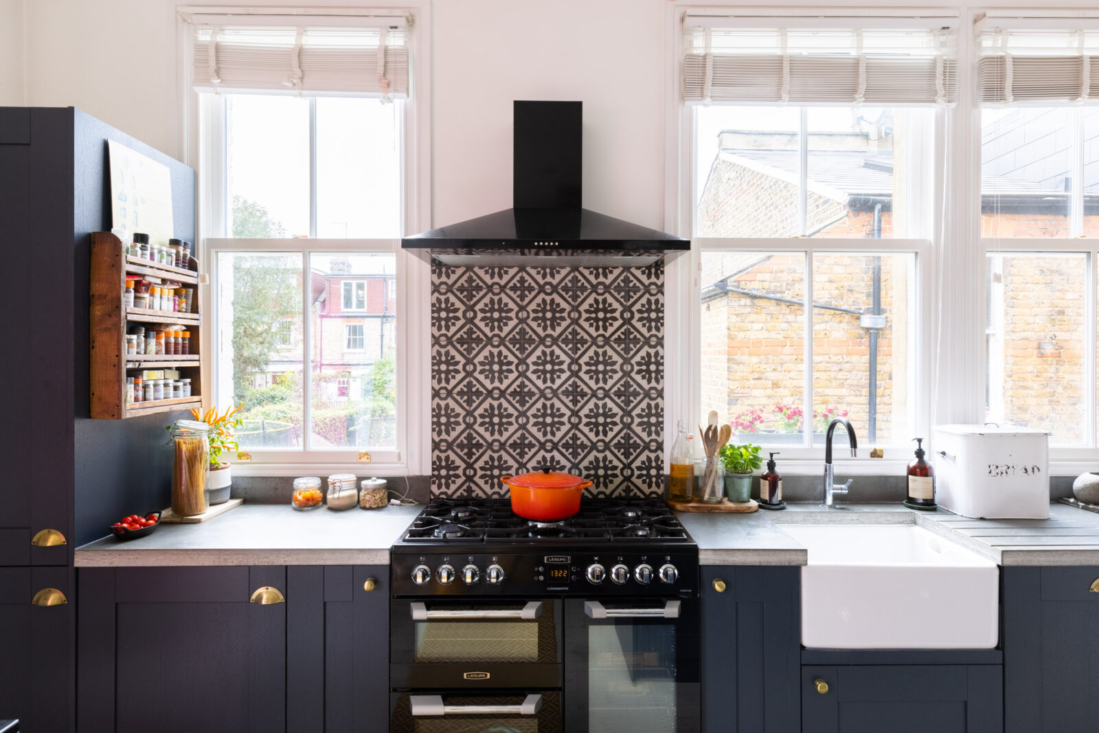
As you can see the kitchen is lovely and light and the lack of wall cupboards instantly gives you that feel of a room in which you cook and do kitcheny stuff rather than those sleek fitted rooms which can be more sterile. This is a bit rustic, a bit vintage and full of character. The patterned splashback brings some pattern – often neglected in a kitchen – while the brick wall brings warmth.
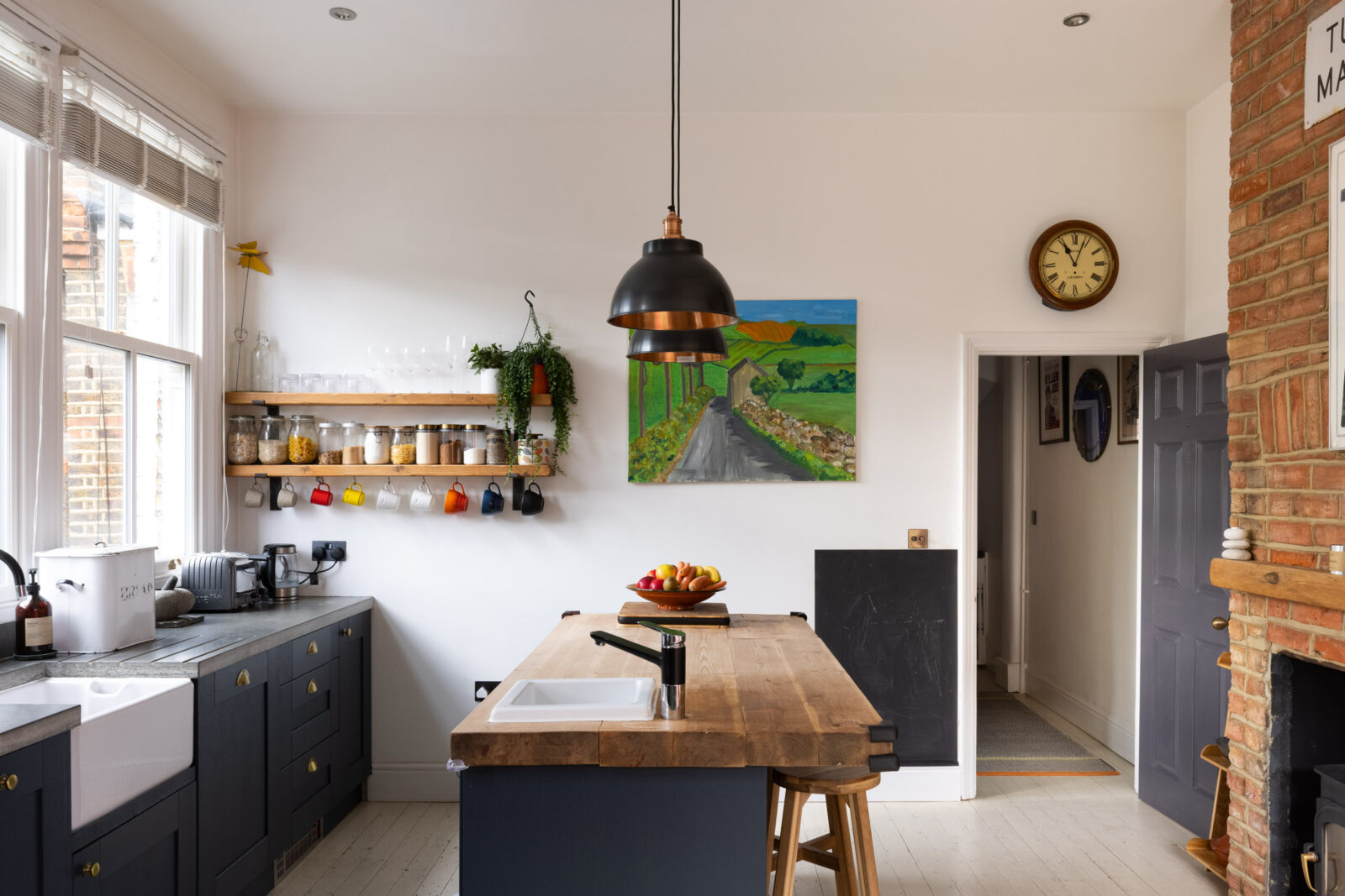
Also worth pointing out that you don’t have to use the same worktop throughout. The island, which doubles up as a breakfast bar, has wood, which is warm and nice to lean on, while the area by the cooker and sink has what looks like concrete, or perhaps a quartz surface that looks like concrete, and will be better equipped to deal with water and burns than wood. Note also that the two worktops are different widths with the island thicker and more like a chunky table than the thinner, standard worktop on the other side.
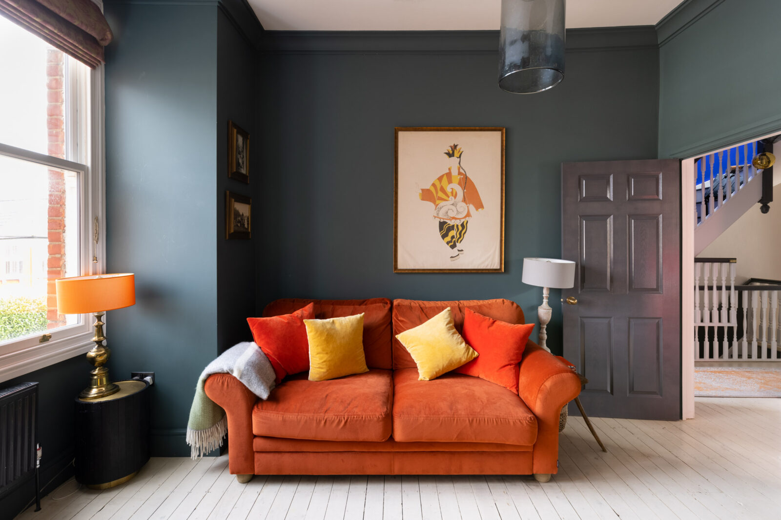
Into the sitting room and the blue cupboards are echoed on the blue walls and, arguably the red brick of the kitchen is picked up in the orange sofa in here. Now the floor is painted white so you could have gone with white skirting boards, which might have made the floor feel larger, or, as they have done here, matched them to the walls which makes the walls look taller and the ceiling, in turn, further away.
What wouldn’t have worked is a carpet or wooden floor separated from the walls with a white skirting board and then split again from the ceiling with a blue wall. That literally outlines the space and draws your attention to the edges and, therefore, to the size of the room. Sticking to two colours – one for floor and ceiling and one for the walls and everything else on a vertical plane keeps it calmer and makes it more restful as well as giving the illusion of being larger.
And to the reader whose husband won’t allow anything other than white woodwork, that is what I would say, while being aware that he may have his very good reasons for wanting white. And it may be a big room that can take it and doesn’t need to look bigger, but if it’s an irrational sense of “it’s traditional” then Imma need more justification for that refusal to entertain anything other than white.
Now, how about this for a feature wall? We spoke about this earlier in the week in my Key Decor Alert (I really miss CNN now I’ve had to stop watching all the time) How To Get A Feature Wall Right. Once again the answer lies in (probably) not using white. There is no white in this wallpaper (Ardmore leopard by Cole & Son so why would you add it to a white room?
As design consultant Ann Kosen said in a comment: “I see this so often as a design consultant. People leaving everything stark white and just painting one wall. Or having a medium to dark colour on the wall or walls and leaving the ceiling stark white. If for some reason (usually fear) people would like to leave the ceiling lighter, then at least make it a tone or shade of a lighter colour that softly blends with the overall scheme.”
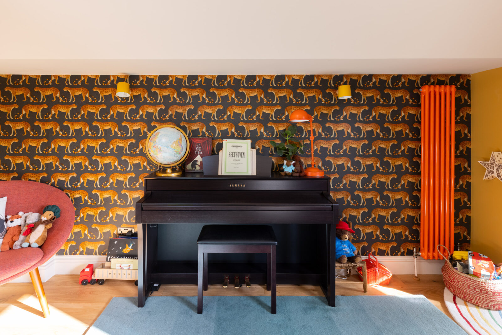
So we’ll skate over the skirting board and applaud the ochre wall and, even more, look at that radiator. Who says a good looking radiator can’t be treated the same as any other accessory and painted in a contrasting or toning colour? How much better is that than a plain white one? And then you spot the lamp on the piano and remember the sofa from the other room and you start to see a warm red thread running through this house.
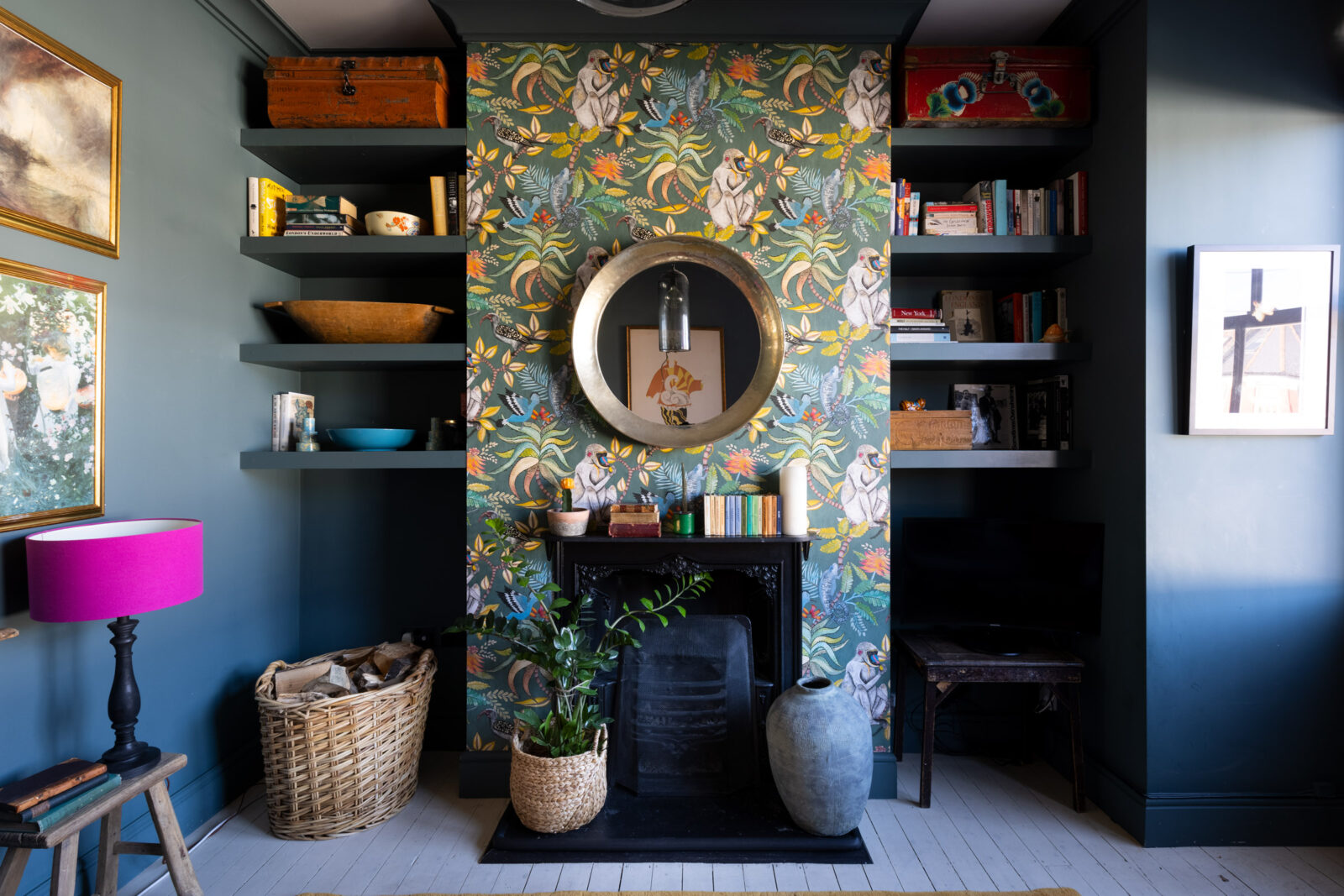
Below there is also a feature wall, in this case the chimney breast and that’s another feature that is often picked out in wallpaper or paint and left to fend for itself in a sea of white. But the blue walls work beautifully with it and you can see how the orange sofa, which sits facing it, would bring out the orange flashes of colour in the pattern.
Now behind the kitchen on the first floor is this sweet little bathroom which is such an awkward shape. I can’t imagine why a fireplace was stuck across a corner like that but can only assume that the floorplan in the flat below would make sense of it – that’s perhaps a chimney in the original kitchen. Anyway, be that as it may, there it is. And while I would have had no problem with taking it out ( I don’t hold with keeping original features if they interfere with how you live – although they usually don’t) you wouldn’t gain much if you did as it’s still an angled wall so you wouldn’t get enough space to add a shower or meaningful storage.
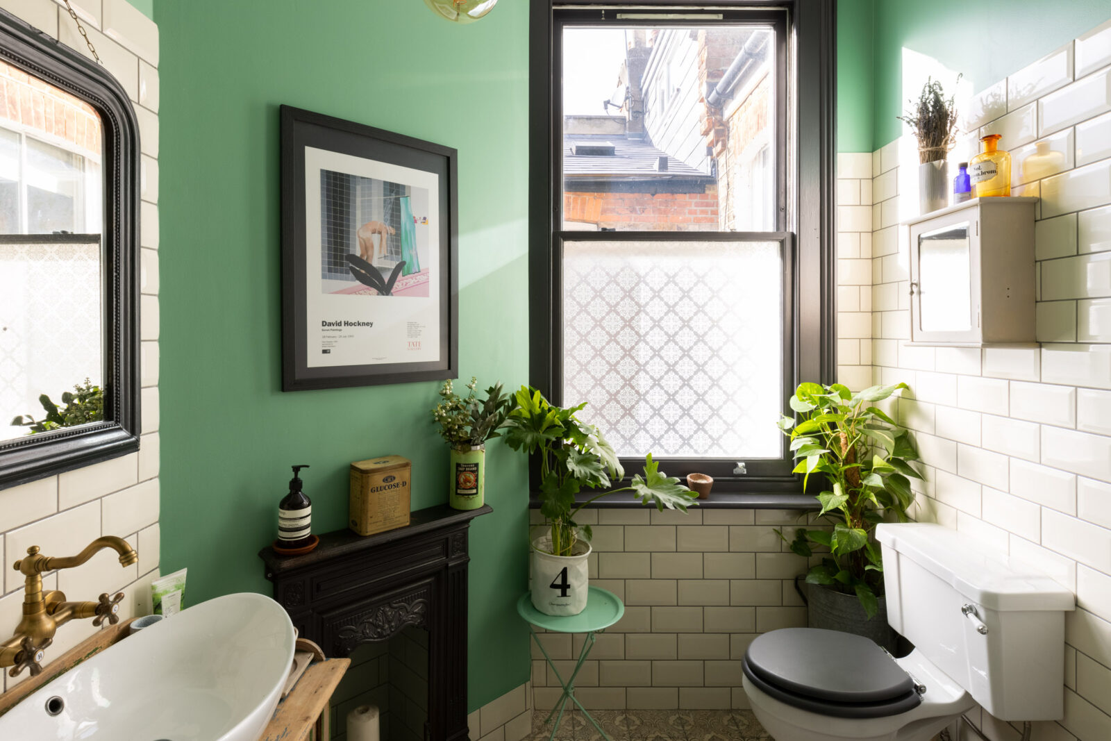
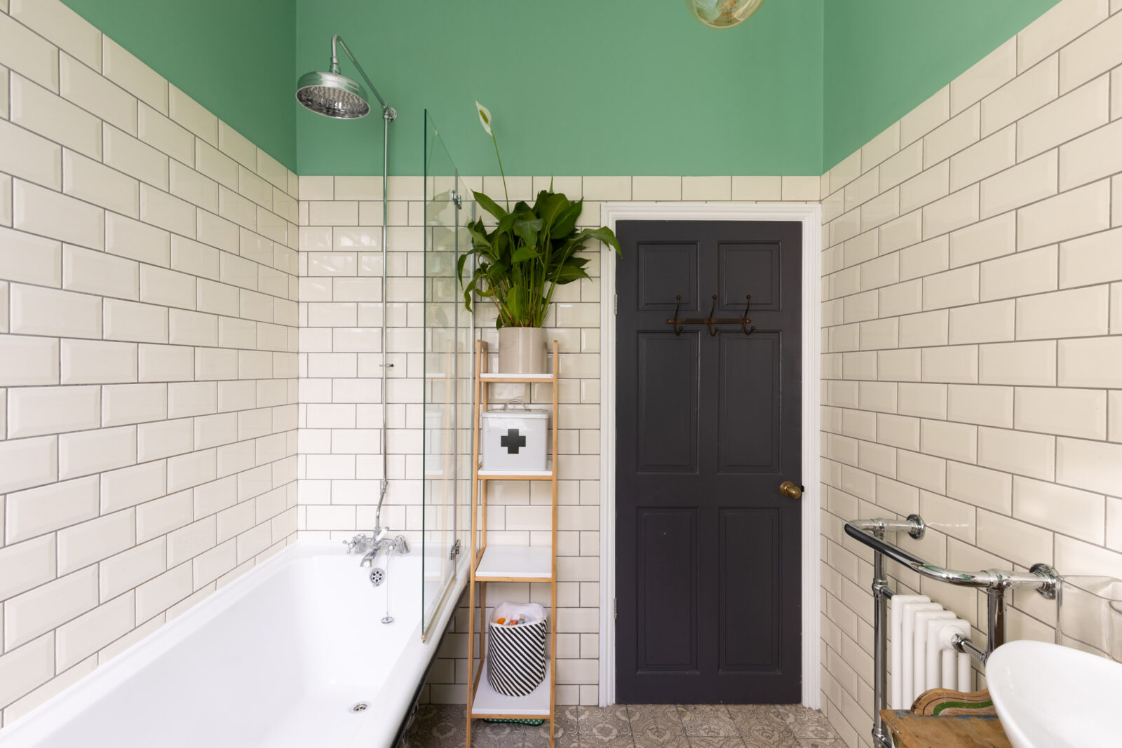
So it gets to stay and brings real character to this bathroom – rooms which can often lack personality. I love the tiles going two thirds of the way up the walls and the contrasting mint green with the black accessories – window frames echoing the mirror and the picture frame and even the loo seat all tie in with the immoveable fireplace. This is how to take a feature and make it work. If you can’t move it then you have to make it belong. And if you go to the original listing, you will see how the bathroom in the ensuite has picked up on this colour (possibly left over paint but used in a considered way) by decorating the room in white and painting a vintage table and a cupboard in this same mint green.
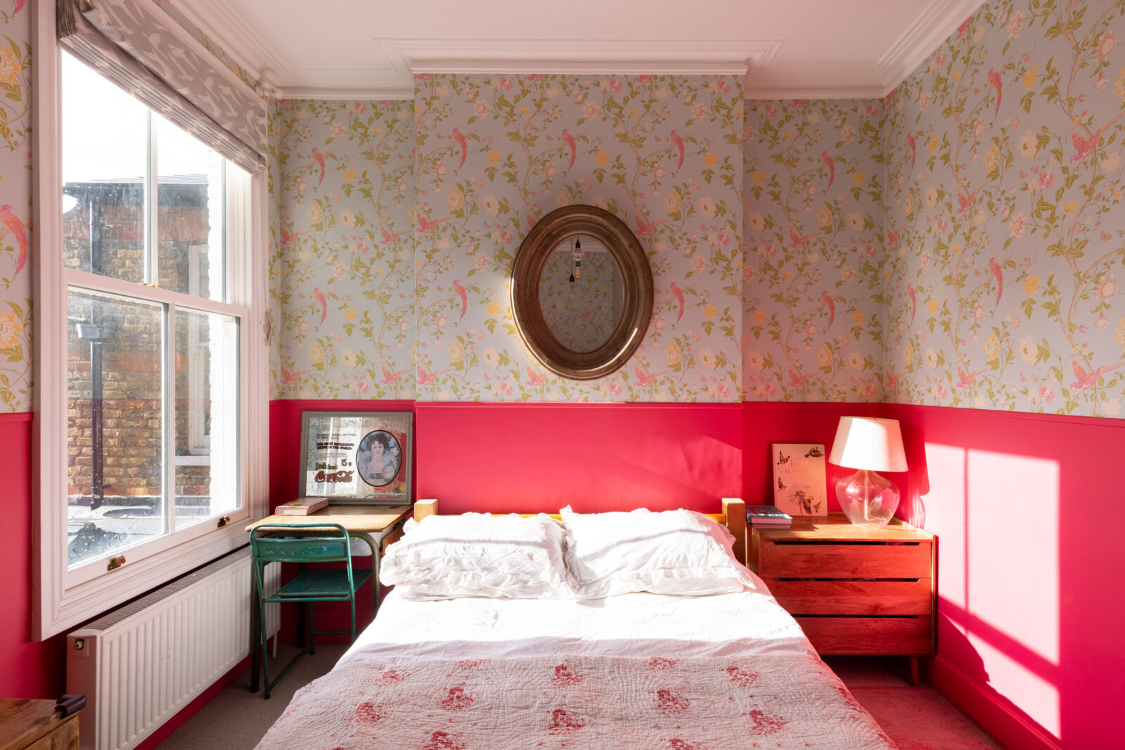
Finally, you can see the other bedrooms if you go to that listing, but I just wanted to show you this one. Again a mix of pattern and paint and you can see that while I suspect the ceiling is actually white, it is reflecting off the pink below which is making it seem warmer and softer. And yes I probably would paint this radiator pink to make it disappear as, unlike the orange one, it’s not a feature to be celebrated. But it’s a good example as this property has one as a feature and one as a function.
So there you have it. Lots of things to discuss and perhaps some inspiration for your own homes. Have a lovely weekend everyone.


I have the same colour kitchen cabinets and also no wall cupboards so definitely pinching the spice rack idea on the side of the tall units. A real home with more flair than most. Don’t think I would ever tire of the lovely green with black bathroom (although would replace bath with shower).
Good Morning Kate,
The elements of warmth are numerous in this house; it reflects the imprint of human living and of love for its rooms. Each living space has been thoughtfully considered both for function and for design. These elements are absent in the beautiful but edited house of last week. Perhaps the renovation of that house was intentionally stark for resale turnover, as it held no connection with its historic past.
How lovely is that. I could move in tomorrow.
I’d like to be friends with the people who own this house. I bet they are fun. I’d like to go round to their house for a lovely boozy long lunch and then go home to the beautiful, expensive, neutral house you were going to show us.
I don’t know what a maisonette is, but this one is full of personality and I really like it, especially the kitchen.
Yes but what about the beautiful, expensive, neutral place?
next week?