And just like that it’s Friday again. The year seems to start slowly, gather pace around April and then gradually speed up until November when you blink and it’s January again. So this is nearly the end of Househunter for the year as, while I have often moved in December, I’m not sure I’ve ever actually bought in December and there are fewer houses on the market. But then again it might be the right time to snap up something when everyone else is looking the other way.
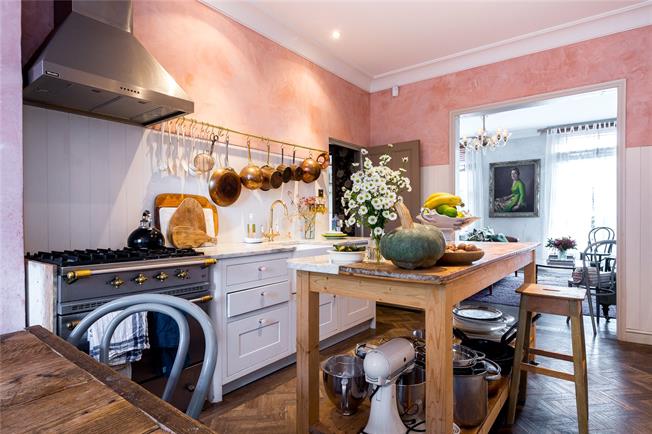
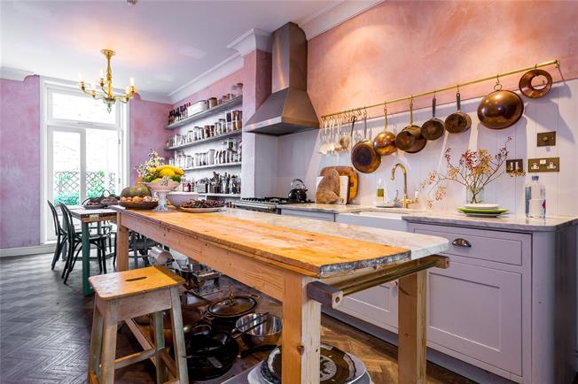
First up is the delicious flat belonging to food writer and author Skye MacAlpine, which, if you follow me on instagram, you will know I visited last week. I have known about her wonderful plaster pink kitchen for a while – it was created, in part by The Jersey Ice Cream Co, which must be one of my favourite design companies – and you will see some very beautiful pictures if you follow that link.
Now Skye’s flat, which has three bedrooms and two bathrooms and is in SW11, is on with Hamptons for £775,000 and it also has a little roof terrace off the kitchen so it’s a really good buy for London at that price with over 1200sq ft of space.
It has also, should you be interested, featured in Grazia and on Remodelista, where you will find more fabulous images.
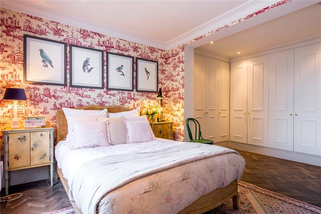
So shall we have a little look around? Above is the master bedroom, and you’ll have to look at the floorplan to properly understand how the space has been created but, essentially, there is a huge storage area of wardrobes as you can see above and an en suite bathroom leading off the foreground of this image.
This bedroom is 18ft long (5.5m) which is a little longer than mine but instead of creating a false wall to act as a wardrobe as I done at the Mad House, Skye has created an alcove of wardrobes. It depends on where your doors and windows are but either way you can add a huge amount of storage by doing this and, let’s be honest, building a cupboard either side of the fireplace is rarely enough. Skye’s bedroom is quite minimalist but, if you had sliding wardrobe doors, you could add a haberdasher’s unit in the middle of that space above or even a butcher’s block with a marble top to act as a dressing table. Or just an ottoman for draping all the clothes that you can’t be bothered to hang up again – the ones that are midway between wash and wear again.
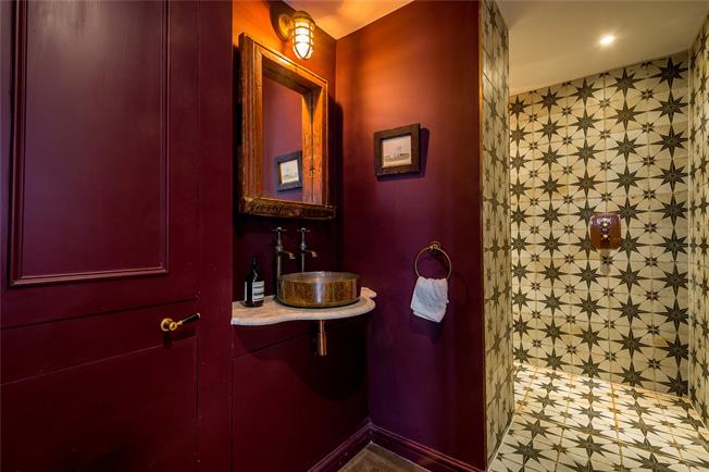
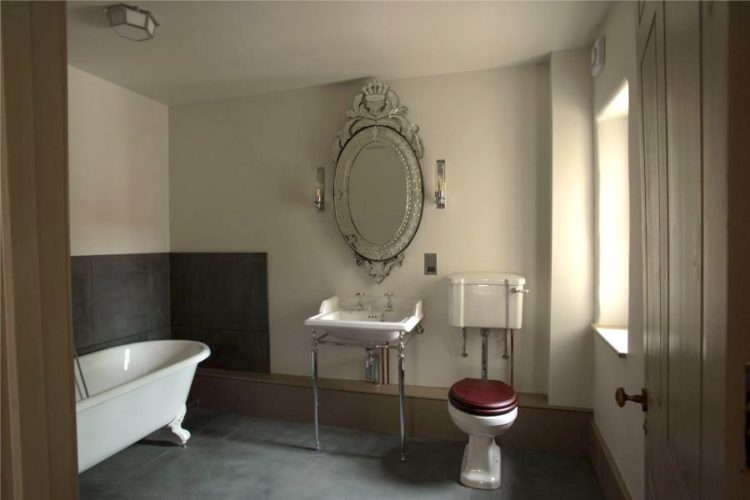
This is the main bathroom of the flat which is an argument for going dark in a small space if ever I saw one. There are no internal windows, which is often the case in flats, but there is a generous shower space and those dramatic walls make it so luxurious and grown up. Those tiles have been everywhere this year and here’s a link if you fancy them. It’s around £33 a square metre but prices will vary.
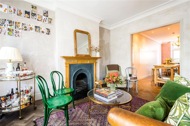
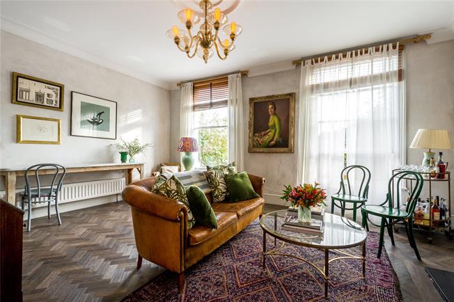
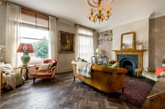
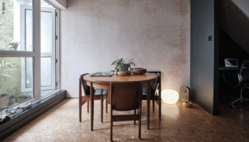
Back to the main living room which has high ceilings and generous windows making it light and bright. You can see, from the image below, that Skye has increased the sense of space by putting the sofa across the middle of the room.
So often it’s tempting to put it round the edge but that often just leaves a big space in the middle and it looks like you’re waiting for the games to begin. This way there is a cosy seating area around the fire – helpfully zoned by the rug, and generous space behind where you could have a desk, or as you can see above – a second seating area that is all about conversation as there are two chairs facing each other.
Back now to that wonderful kitchen. What you can’t see in these images is that the wall on the left of the picture is an entire row of floor to ceiling cupboards. They are panelled from top to bottom and have no handles so you can’t even tell they are there but they create a vast amount of clever storage and they don’t need to be very deep. You could probably do the same thing with about 30cm of depth – but you have to do the whole wall to achieve the same effect.
She has also created all that open shelving at the far end which is basically as deep as a storage jar and again is the full depth of the wall.
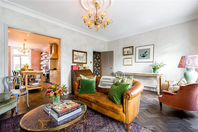
It’s a very clever flat and actually, if I needed a three bedroom flat and had some budget this would definitely be on the list to consider. At the very least take note of the design decisions that have been made to maximise not only the available actual space but the feeling of space as well.
Right, where shall we go now? To Kent that’s where. To a newly converted brewery which has several flats in it, all of which are unfurnished but I just wanted to show you the colour scheme to see what you think.
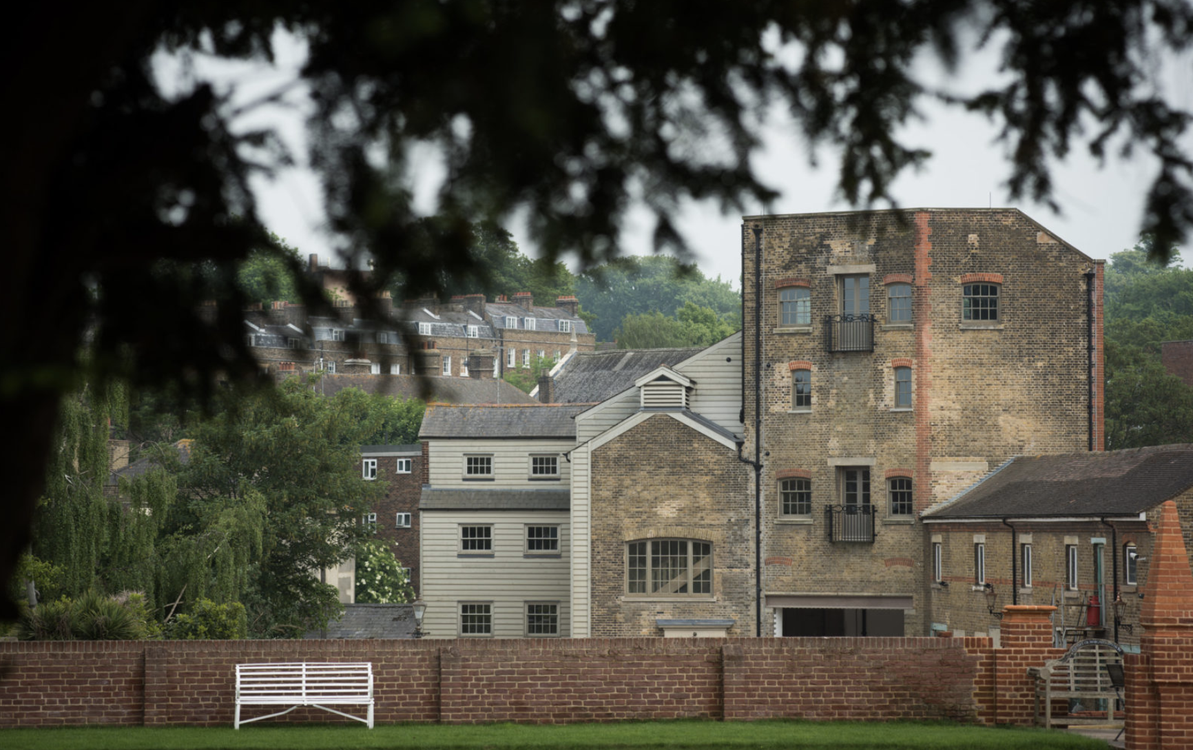
This is the former Woodhams Brewery in Rochester, Kent, which is on the market with Aucoot with prices ranging from £375,000 to £975,000 depending on how many bedrooms you want.
Now clearly all the flats are similar as they have been done by the same team but there are simple decorative ideas that look really modern and fresh.
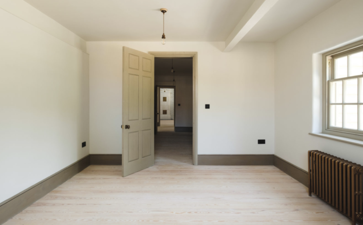
So the walls are light – not quite white but a more creamy shade – try the new Farrow & Ball Schoolhouse White – but the woodwork has been painted in a soft greeny brown shade that is both warm and characterful. You could also do the ceiling to match if you were thinking of adopting this technique, which allows for pale walls but still adds personality. Obviously this works with any colour but I’m particularly taken with this warm shade. Note also the radiators which appear to be a sort of warm bronze.
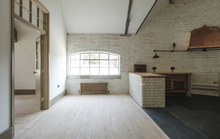
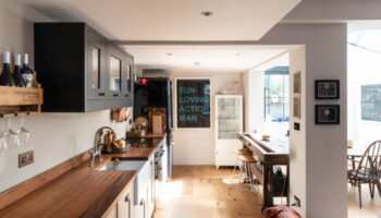
And this is a bold move in the kitchen – tiling the whole space – which can appear a little public loo – but done here with all that natural wood and black lighting looks really effective. I might have continued the black floor along in front of the island so that it wasn’t such a dead hard line but I could definitely get on board with the tiles arranged like that in an open plan space.
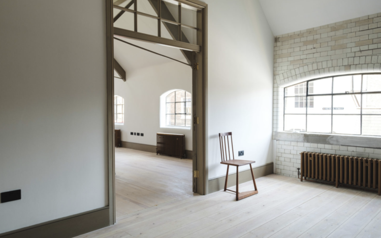
Clearly we can’t all live in huge warehouse spaces with rafters in our vaulted ceilings but there’s nothing to stop you adopting this idea for the paintwork. Below is the bathroom which came via Strutt & Parker, where the building is also for sale. It’s always good to see the bathroom as alongside the kitchen it can often be the room that sells the house. Although surveys have also shown that it’s the room that people are most likely to change when they move in. Go figure.
So I’ll leave you with that. I’m off to spend the weekend pondering if I can persuade The Mad Husband that we should paint the woodwork in our, mostly off-white, hall in burgundy to match the stair runner and back of the front door. I’m rating my chances somewhere around zero to 0.1 so I shall have to live through you and your plans. Let me know….
Skye’s book A Table in Venice: Recipes from my Home is published by Bloomsbury
The first link is just the worst I’ve seen on this blog. The bathroom, if anything, proves against using this colour in a small spaces, and the maroon clashes with the brown shade in a very annoying and claustrophobia-inducing way. The kitchen has a similarly annoying, just not as claustrophobic clash of pinks against the yellow-browns of the wood (just looks more spacious probably because the shades are lighter). Sorry, but ughhhh.
I’d love to move to Kent, thank you!
I have been a fan of the Jersey Ice cream Co for a while and I remember reading they were pretty miffed when the lady who owns this flat implied in an article on a blog that she had made all the design choices herself when in fact their selling point is that they offer a complete design solution to the client and do all the work.
I have just visited the Jersey Ice Cream Co site – wow, I can see why you rate them so highly!
The before and after pics are particularly inspiring, although the homes they are working with are obviously full of potential, they really go the extra mile in realising it.
I’ve never been interested in the idea of using an interior designer, I’m happy to do it myself, often repeatedly!
However for these guys I might make an exception…
I don’t normally go for much pattern but skye’s House is so beautiful! I’d move in and take the furniture too. The pink plaster in the kitchen is absolutely perfect. It looks so soft and textured.