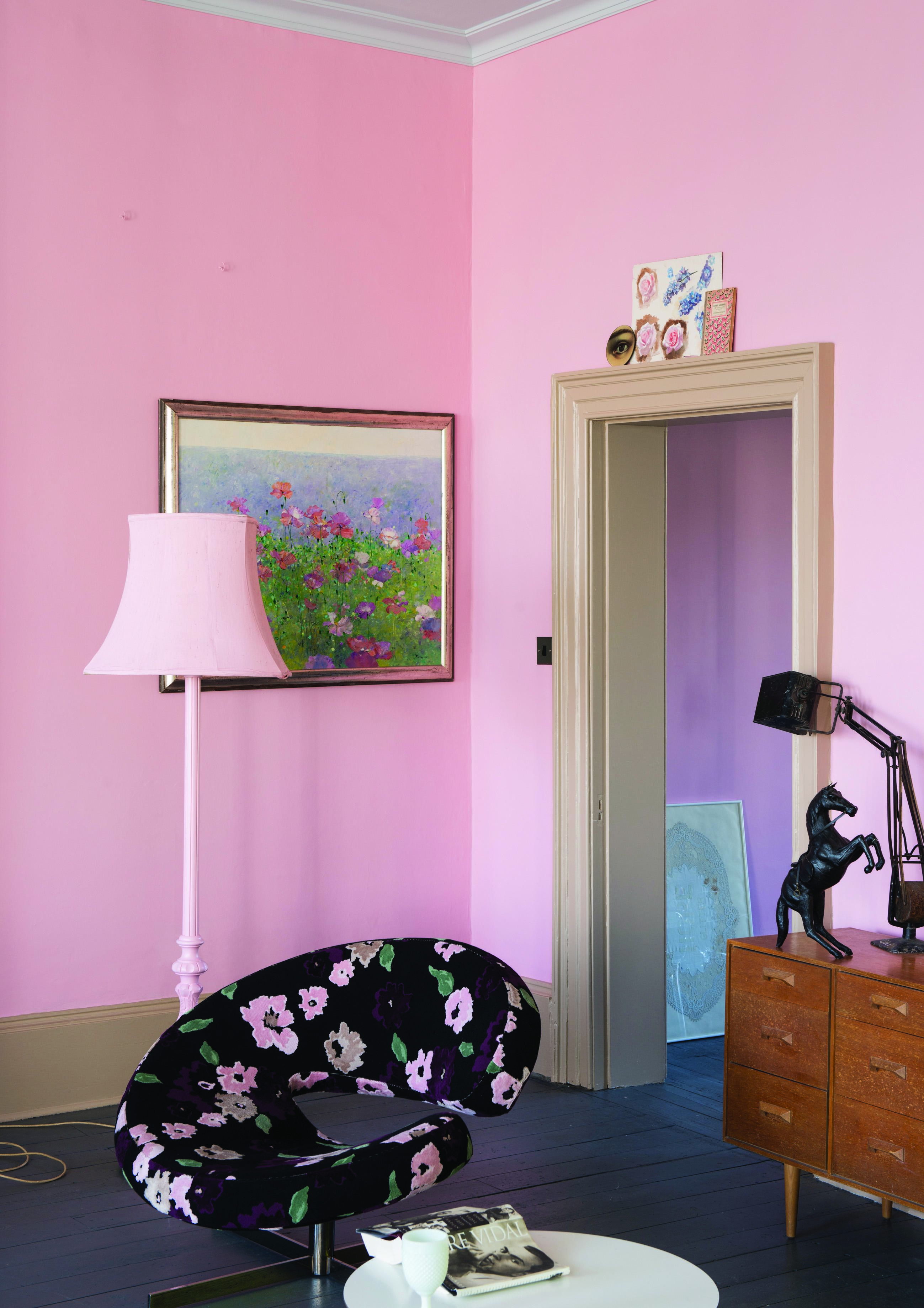
It’s been three years but finally they’re here. Yes, three years since Charlotte’s Locks, Plummet and Mizzle first appeared and now the new boys are in town. Yes, Farrow & Ball launches its new paint colours today. And Mad is proud to introduce you. Say hello to Nancy’s Blushes, Mole’s Breath, Dimpse and Ammonite to name but a few.
There are lots more shades of grey paint, for those who are still in love with a Gustavian or Scandinavian palette (for advice on how to choose the right shade of grey click here) as well as a few surprises like the gorgeous pink of Nancy’s Blushes.
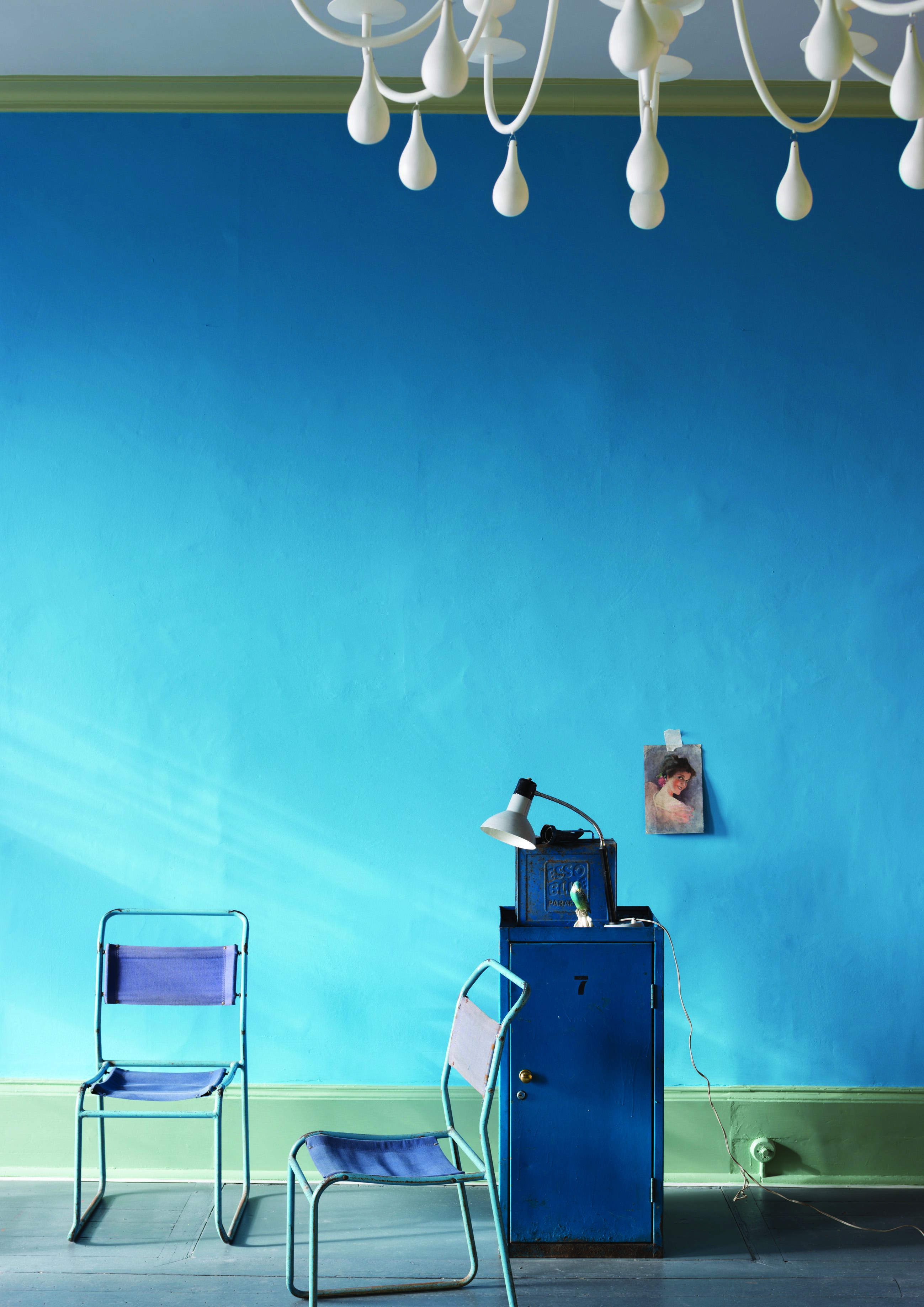
And, of course, it wouldn’t be Farrow & Ball if there weren’t some new fabulous names. At the time of writing, the sky is a definite Mizzle (from the last launch – a mix of mist and drizzle) but what about Wevet, a more contemporary version of our old favourite Pointing, whose name is an old Dorset word for spider’s web.
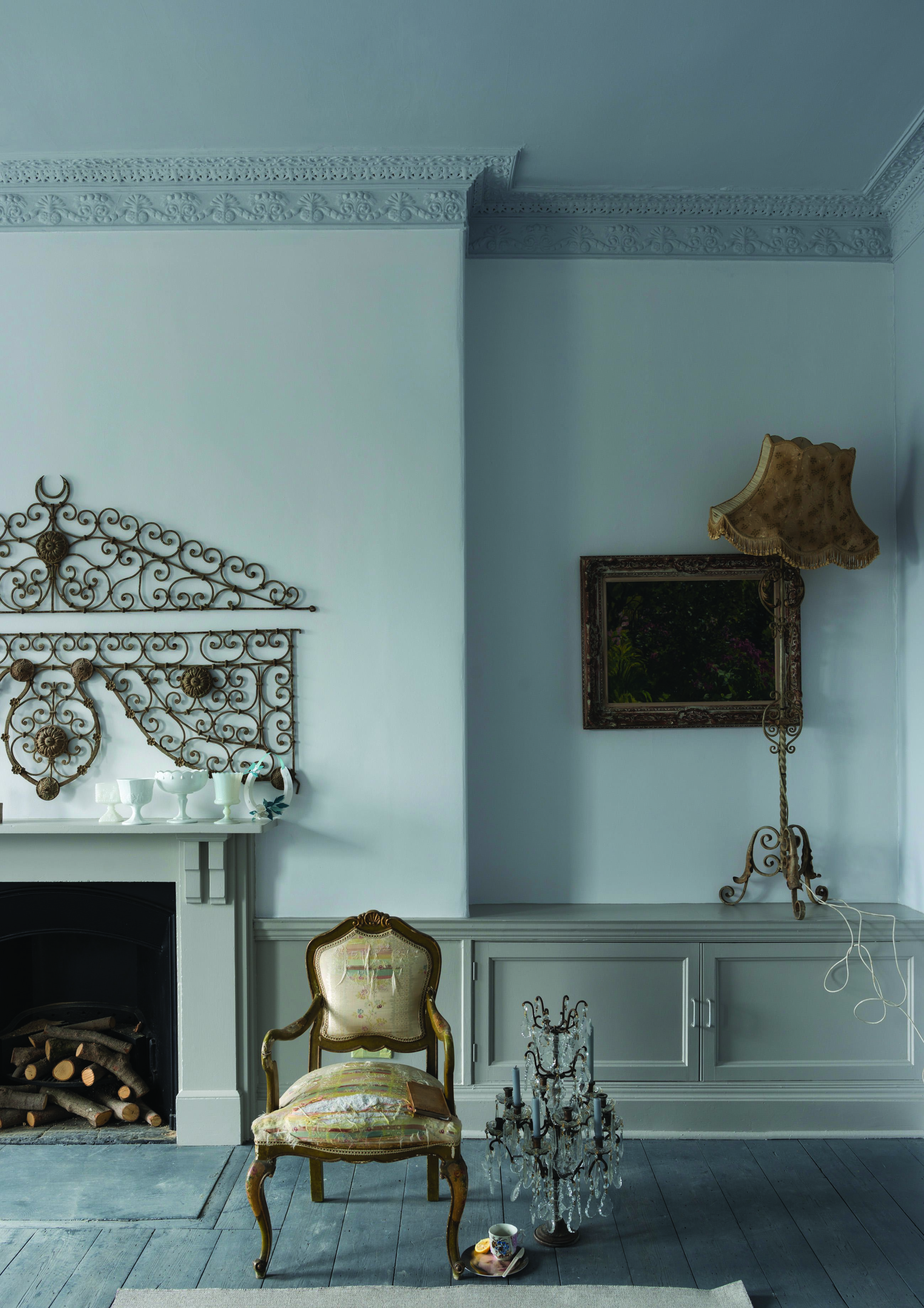
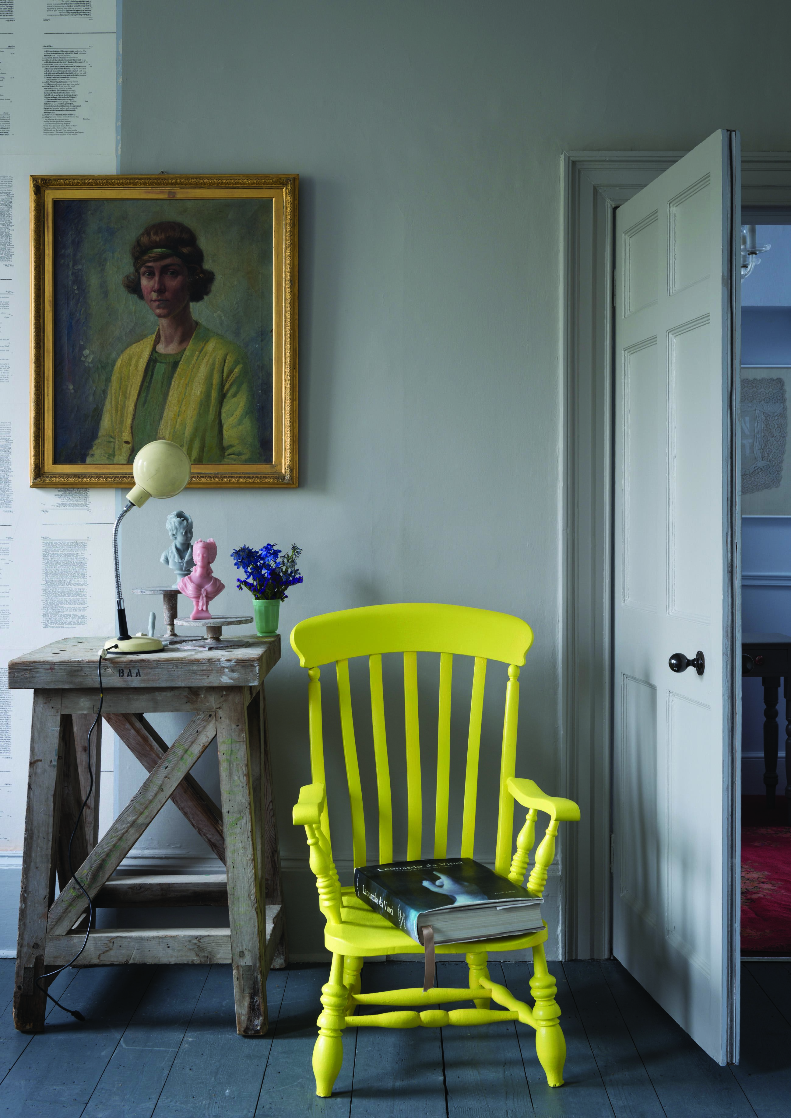
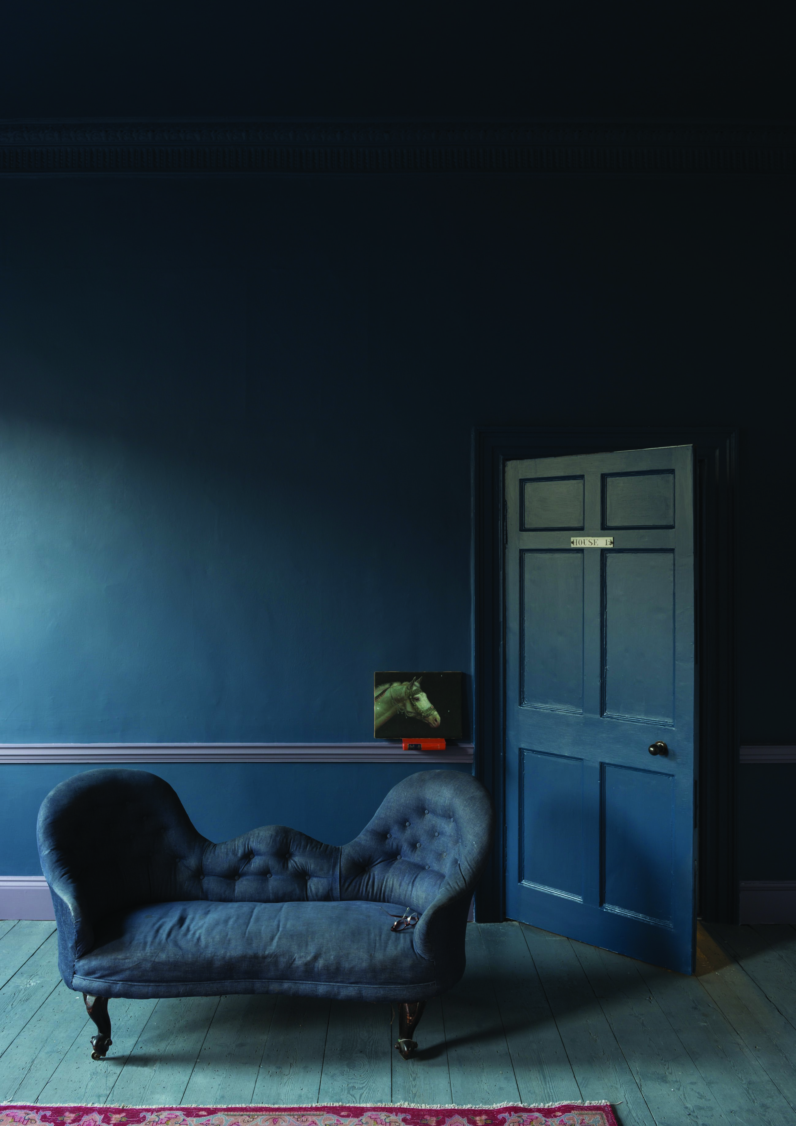
Or Dimpse, pictured above, which is West Country dialect for the fading light at twilight and which goes perfectly with Blackened and Pavilion Grey.
Mole’s Breath (above) is a fabulous shade of grey and my paint brush is itching to try it out somewhere. Or what about the new Purbeck as seen on the walls below?
There are nine new colours in all and I’m sure they’ll be just as popular as their siblings in no time. I can already hear the mutterings of the chattering classes at their dinner parties as they discuss whether Dimpse or Purbeck is right for the hall and little girls all over the country will be waking up to find Nancy has moved in to share the walls with them.
The paint names are an iconic part of the brand, often chosen with some historical reference to them. Dead Salmon comes from a painting bill dated 1805 and found at Kedleston Hall and the dead refers to the finish that was used. Nancy, of the blushes, is, according to Farrow & Ball, a mystery (or perhaps a secret) but Charlotte’s Locks was named after a highly valued member of the team.
So, which colours will you be using?


I’ve just come across your blog via made.com. I am enjoying the chat about Farrow and Ball colours. We have recently painted our south facing kitchen diner in Wevet with one wall of down pipe, in the sunny daytime it’s a really bright white and in the evening has a lot of tone. Definitely better for sunny rooms, our north facing rooms have a Wimborne White base instead. Katharine x
That sounds gorgeous and really helpful for anyone reading this to bear in mind. I’m a huge fan of wimborne white but have recently begun looking at Wevet too so I shall give it a try. x
Thinking of using Nancy’s Blushes as the colour of our living room ceiling with a variation of white walls with grey furniture. Does this all go to you?? I’m just not sure about a pink ceiling.
I love the idea of a painted ceiling. It’s often neglected as an area for decoration. It probably will make it look lower though, so do bear that in mind. I’d say go for it. What makes you nervous about a pink ceiling? You could always paint it in a strong grey, with one pink wall and the others in a chalky white like wimborne.
I am with you on the dimpse and mole breath. I am just pleased that studio green didn’t bite the dust.
Ooooh, lovely! Nothing better than a bit of Farrow and Ball. St Giles Blue – gorgeous x
Hi, yes it is very exciting…I’ve just ordered a sample pot of Purbeck Stone…always looking for the perfect grey! Think this might be it!! ha ha
Well be sure to come back and let us all know if it is…
Yes I will!