It is a measure of how slowly interior trends move that I first started saying about three years ago that the the so-called millennial pink would deepen and darken to a more brick or terracotta shade as the 70s revival gathered pace. And suddenly this week it felt as if that colour was jumping out at me everywhere I looked. I mention this also as a reassurance – while you may feel nervous about spending money on a fashionable item that might only last one season (I’m aware that that train of thought won’t apply to everyone) you can can relax a little when it comes to interiors. It seems that the god of interior trends understands that sofas cost more than sandals and is prepared to be appeased with fewer offerings spread over a longer period of time.
I will also caveat this with the oft-repeated assurance that you don’t have to follow trends and it’s far better to buy an item you love and with which you are prepared to commit to a long-term relationship – for sustainability if nothing else – than buying lots of high fashion items which you want to chuck out a short while later.
But trends aren’t all bad. After all, no-one is forcing you to buy into them and they can help you to look at things with fresh eyes. If you were there the first time round you’re probably not leaping platform sandals first back into a look, but it will have been freshened up since the last time. There might be a new textile or colour combination that makes it seem new and more interesting. Of course, it’s designed to make you spend more money, but if you’re able to resist that it might also help you to see your space with fresh eyes. To create a new take on what you have already simply with the addition of a new colour or material.
In short, there are no right or wrong answers here. You like a trend you take it, you hate it you leave it. But, as I said, I have been drawn to terracotta this week. Perhaps because I have painted my own brick wall in a brick red shade and I’m still squinting at it through half-closed eyes wondering if it was the right thing for me. I like the colour. I like the idea. Maybe it’s the right colour in the wrong place. It may be the other way round – we have some leftover navy blue from the bathroom up and and I’m also squinting at that and wondering if that would be better….
I have also included a range of colours from burgundy to brick here all of which are related to the aforementioned millennial, or blush, pink but which have been paired with different colours which may make them feel more modern to you depending on your era! You can see also how this colour has been used in not just different colour combinations but in different materials too.
I cannot stop gazing at the top image where the brick red and burgundy have been teamed with sludgy mud colour – let’s call it clay – which knocks back the high contrast vibrancy of both shades and creates a space that is rich and intense but also tonal and, for me relaxing. This is the picture that makes me want to redecorate.
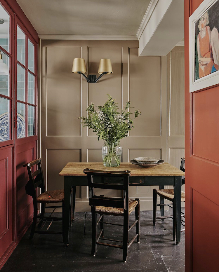
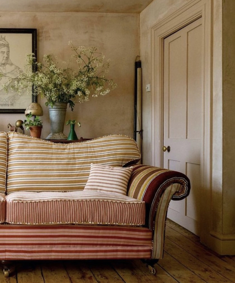
But in the image below Sophie Rowell, of the wonderful interiors consultancy Côte De Folk, has used seven different fabrics to create this wonderful sofa blending a mix of stripes in different widths and shades but always within a tight colour palette. She has set it against plaster pink walls which draws out the deeper shades and provides the perfect backdrop – trust me that this would have much less impact against an off-white wall. And now I want to reupholster my sofa as well as repaint the room.
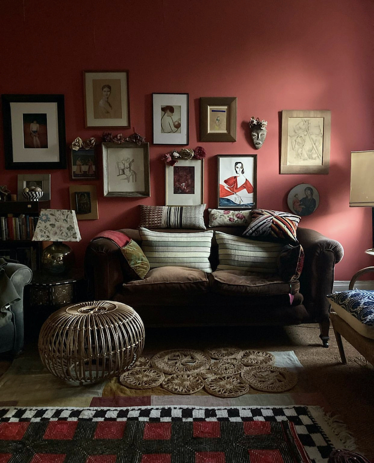
In the next picture Lucinda Chambers, former fashion director at Vogue, now designer, consultant and co-owner of Collagerie, has coated her walls in a rich shade of red, accented again with brown but this time more of a chocolate than a clay, against which the mint green cushions really stand out.
Now, creating a palette of red, brown and green might not feel immediately obvious, or even appealing come to that, but imagine those mixing machines you see in music studios (or, like me have seen on the telly) and imagine sliding the red up to the blue end to create a pinkier shade while the brown goes in the same direction and the green moves away from a yellow based olive to become more minty and you can see that all of those colours – while different – have a similar underlying blue tone to them so they work as a team. Taking it in the other direction you might have had a more brick shade of terracotta, an olive green and more of a mud/clay shade. Would still have worked, would have looked completely different. So if you’re wondering about mixing colours do try and work out what the base shade is and pick colours that share it – some paint charts will explain this for you.
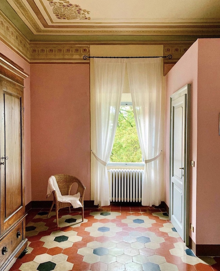
This is sort what you get in the image under that with the peachy pink walls and orange flower tiles. The wood is a paler and warmer colour (think honey) while the green has been replaced with a warm cream shade. If you wanted to add green in here you could replace that white with an olive green and you would have a similar basic palette to Lucinda’s sitting room – red, green and brown but simply by changing the base shade from blue to yellow the overall effect is completely different. And while colour experts would say it’s more nuanced than this – it is – but I hope this gives you a rough sense of how it works and explains why you may have picked a colour palette that didn’t work and you couldn’t see why.
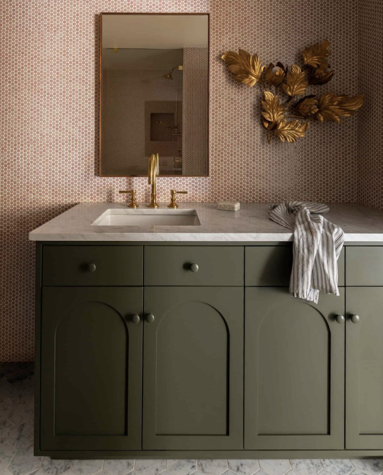
In the bathroom above the pink mosaic tiles take on a stronger hue when used over a large area like that and proves once again, if it needed proving, that pink is a friend of all greens from forest to mint via olive and emerald. The latter feels very Wes Anderson and you may feel that that that, as a combination has reached its peak although Dorothy Draper (1889-1969), the doyenne of Hollywood Regency style might take issue with you as a) she was using those colours together long before Wes and b) it’s still going strong. I have tended towards more foresty shades with the many pinks in my home but feel it’s only a matter of time before an olive makes an appearance…. basically I need it to be a bit less hot and I need to have a little more energy, so don’t necessarily hold your breath to see it, but in my head my bathroom is now painted in a similar shade to the bathroom cupboards above.
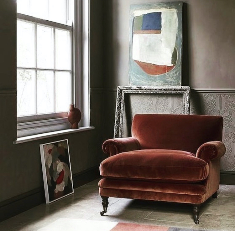
Moving to furniture and the rust red velvet armchair would be surprisingly versatile – above it sits with a soft pink and a pale clay but it would like charcoal and navy, or you could go full saturation and use orange or a matching terracotta shade. And don’t forget the greens. You could also put it against a cream wall and add a sofa in a paler version of the chair and another chair in a pattern that combined both shades.
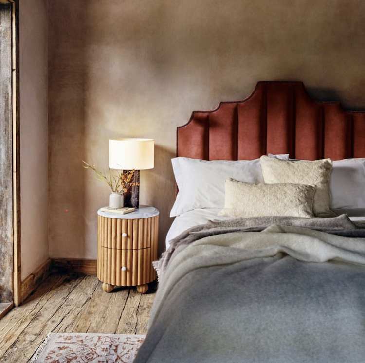
In the bedroom above it has been cooled down with a chalky blue blanket and, just seen, a patterned rug that mixes both colours together. This time it’s pale wood instead of dark. Below, this is actually red and white stripes but, viewed from a distance, the effect is pink and the stripes contrast beautifully with pale green leafy wallpaper.

There are so many ways to mix colour and pattern that as long as you understand a few basics (and insist on using only colours and patterns that you love) you won’t go wrong. I hope this post inspires rather than scares and shows you that there are myriad options out there and with a little bit of bravery, experimentation and willingness to try you will find the right one for you.
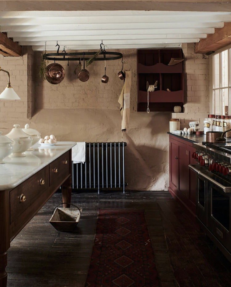
We’ll finish with this burgundy kitchen by Devol. I’m adding it as a marker really – we haven’t seen many burgundy kitchens as yet but I’m going to remind you of this in a couple of years when there are lots of them and add that if you’re doing your kitchen now you would be ahead of the curve if you went with this colour. I’m also going to add that mixing it with white walls would be too high contrast and a soft plastery pink with a dollop of brown will create a much richer, tonal colour palette.
All of which leads me back to my own brick wall where I know the issue is that the red is too much of a contrast with the walls but this is The Mad Husband’s domain and he ain’t going to want it all pink…I would also add that it’s a little paler than this IRL (as they say).


I love terracotta and I’m so glad it is having a moment. I think that Zoffany Muddy Amber is the most beautiful colour, might be worth a try behind your sofa. That or Mouses Back (F&B).
A well thought out piece and of value to us readers Kate. I’m bowled over by the combined colours of the first photograph. Genius combination that would not have been possible many years ago because you couldn’t easily buy paint in those subtle colours. Lucinda Chambers is my generation and I too have had a sitting room that shade of red back in 1971. We mixed it with chocolate brown furnishings and white paintwork. The up to date version of this deep red shade can even be seen painted on Mary Beard’s bookshelves!
Wonderful colours for a serenity hound like me. Don’t change a thing in the office. Perfect! Cheers from Canada!
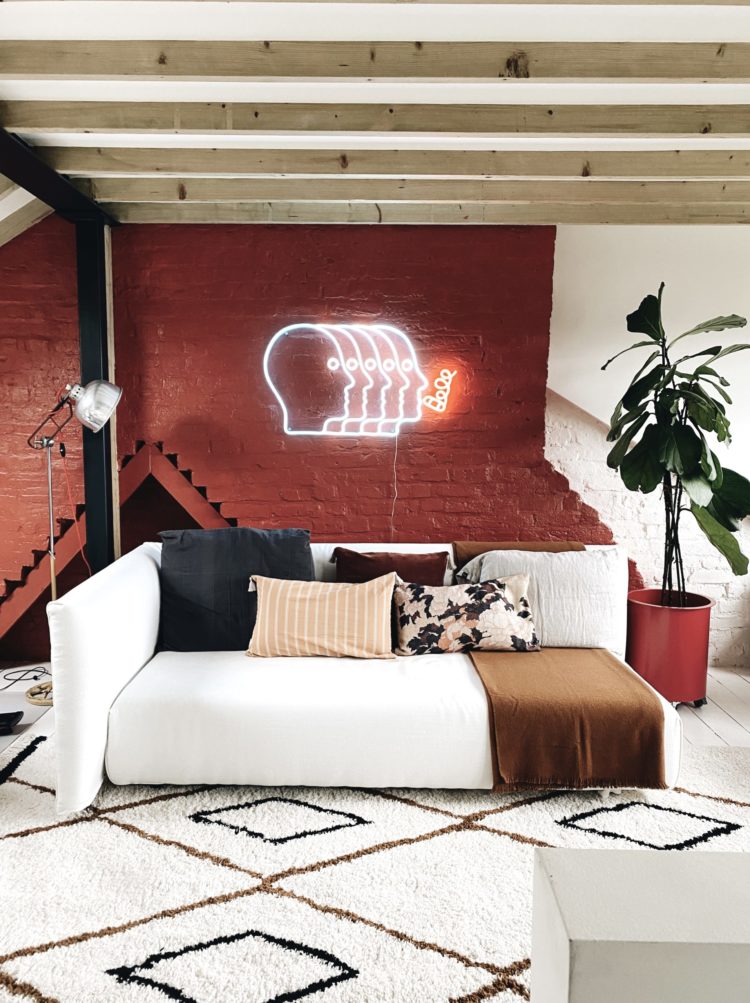
Seeing the terracotta velvet agatha chair, I am ten years old, inside my father’s home, curled up in that chair with a book. While mostly drawn to a cooler palette, I love the colour and texture and that chair! In the mitre hotel bedroom designed by Nicola Harding, the red and white striped canopy is toned down by soft shades of green and blue as well as lots of contrasting pattern. I think the setting in the Mad husband’s office is architecturally appropriate to carry a bold colour, in that it is a loft space, the pop light is standout, and the varied arrangement of the bricks adds a visual interest.. I might just add some modernist abstract patterned cushions to the sofa to absorb some of the heat from the colour.
Great interest for my puzzling out combinations of colourways. In the 70s we had Edwardian house with an orange/rust/grey “Egyptian” (as I thought of the ziggurat pattern) wallpaper in the hall and up the staircase, and a burnt orange shade sofa in a living room with Morris curtaining of a deep purple!
Now I’m mixing the trad. hall mat in orange/red Axminster style from then, but now laid on a slate tiled floor, with 30s oak dining chairs, occupying a contemporary-styled, roof-glazed all-white space with lots of yellow and red brown stained timbe. These schemes you show are really helpful for incorporating all the bits and pieces from past eras in a vastly different setting.
I painted the bedroom of my first flat in a terracotta shade, under the dado rail, complete with sponging! In my defence, it was 1993!
Thanks Kate. These images are lovely!
My bedroom in my first flat also had a terracotta wall, which came with the flat – a massive top floor Glasgow tenement. The other two walls were a different shade of terracotta which I painted white. The 4th wall – opposite the terracotta wall I kept – was a wall of windows looking west into Glasgow Botanic Gardens. The floors were green painted floorboards and I have had a love of warm reds and greens together ever since!
Hi Kate. I love your blogs but please please can you match photos with text. I am constantly scrolling up and down to look at the image i am reading about. Other than that perfect way to start the day
Thank you from Hot in Hampshire
Same!
Thought that many times. Love,Love Love this Blog! Yet every time I hunker down to enjoy these Posts, I gird my loins to chatter back and forth between upper text and lower text, trying to locate the photo in discussion. First world problem I know, but a small tweak in organizing the presentation would offer better reader ease and flow. Just as in Interiors, helping the eye travel easily is important, Right?
Yep I came here to say that too
I remember painting my living room in terracotta in the early 2000’s. That was definitely the fashion choice of the time (think Euro Disney Santa Fe!).
I’m so glad to see that the shades available now are much more considered and less brash. For me, one of the best ‘modern’ developments is that we are using combinations of colours across textiles and on walls – some lovely examples featured today.
I just redid our miniature shower room with terracotta walls (F&B Red Earth) and warm pale grey tiles. Who knew I was so on trend… it works well for a tiny, dark space as it has so much warmth.
A year and a half ago, we purchased new sofas in a Terracotta velvet – because I went with my heart and chose the colour I loved, not because of fashion. I have since noticed terracotta colour sofas in many editorials and articles. I chose to paint the room in Little Greene’s China Clark Deep, a greyish blush colour (which changes a lot, dependent on time of day and light). I love the warmth of the shades together. Unfortunately, like you, Kate, I have a husband who has opinions (damn him!) In choosing a scheme, I had to please him, as well as me. His desire for ‘cosy, warm and inviting’ was translated into this scheme and, I’m glad to say, we both love it! It’s a south east facing room, so much like in your bedroom, I had to avoid pinks that would turn peach with the sunlight.