Anyone there? I’m fully expecting that the UK sun will have gone to everyone’s heads on this bank holiday Monday and that I will be shouting into the void. But I shall just carry on and when you stagger in from the garden three sheets to the wind with sunburnt shoulders, you can take a quiet stroll through these beautiful rooms and feed your mind. Also this first room isn’t a million miles away from Calamine lotion which is very soothing both pysically and visually.
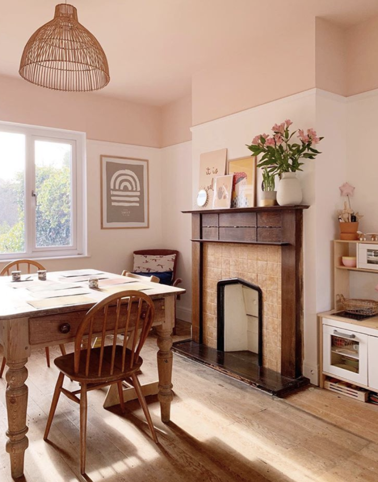
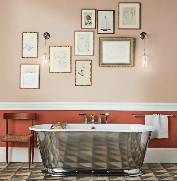
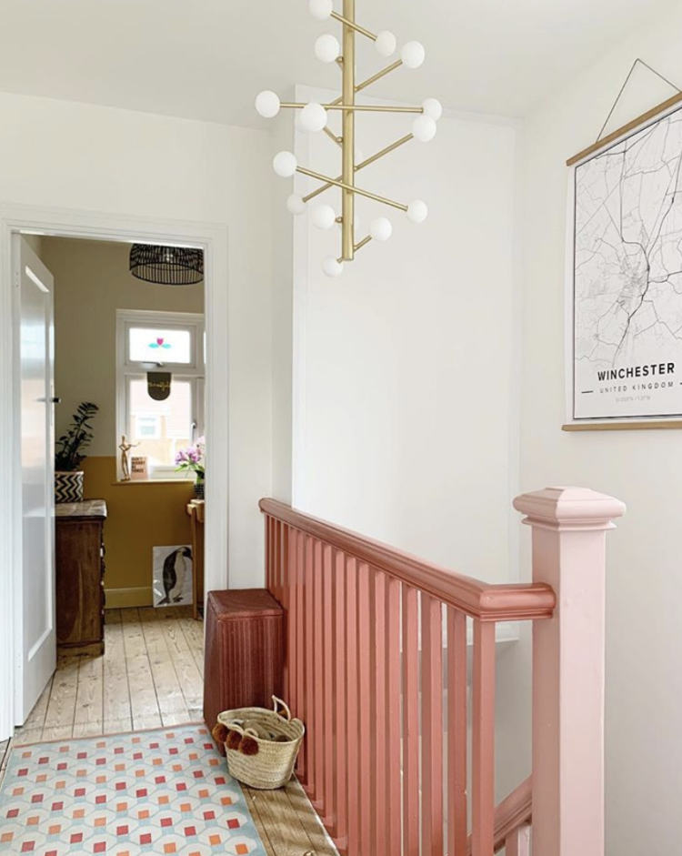
I love how Hannah @theottohouse has used a darker shade of pink on the ceiling. It’s a really good way to use a colour scheme in a gentle way. You can see below how Farrow & Ball have mixed this pink with a stronger red, which is also gorgeous, but this pale version is perfect for anyone who is experimenting with painting the ceiling something other than white.
You could also have done this other way round with darker walls and a paler ceiling. This way works if you have a high ceiling and always take it down over the top of the walls to the picture rail.
Another trick is to change the type of paint. I have often talked about painting the lower half of a hall wall in gloss which is so practical for this part of the house as it’s tough and wipes clean and so is perfect for dirty hands and scuff marks from bikes and bags. Yes, if you have a dado rail that’s a good dividing line but actually it’s more modern if you don’t.
And you can reverse this trick on the walls and ceiling. Painting a ceiling in gloss paint will reflect the light and draw it in from the window to bounce it around the room. So you can use the same colour over the walls and ceiling in matt and gloss, or you can choose a contrasting or darker/lighter shade of the same. Endless possibilities.
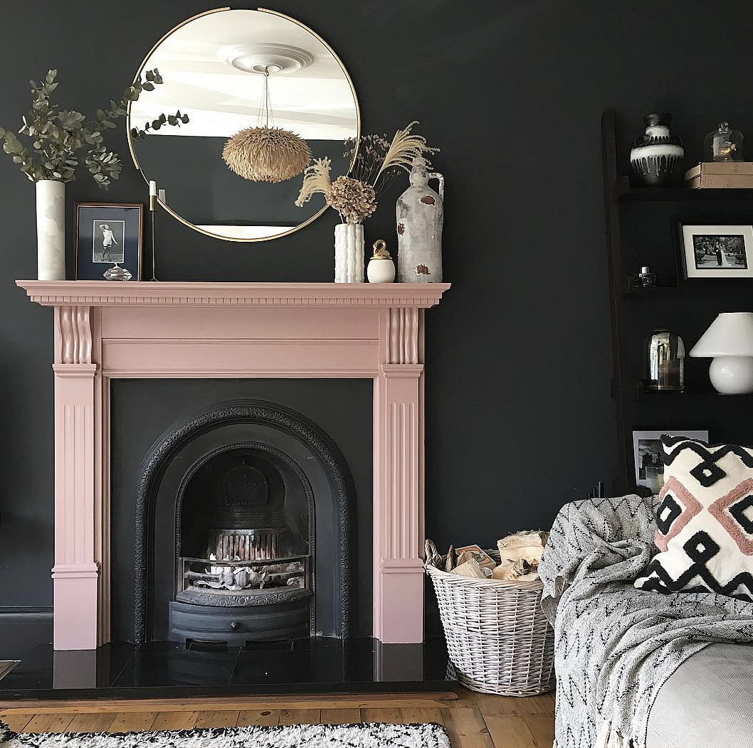
Another paint trick is to use the colours in a more unexpected way. Here, instead of a traditional black fireplace and, potentially, a feature colour on the chimney breast it’s the other way round. The fireplace is sulking room pink by Farrow & Ball and the walls are dark. That cushion on the sofa is just the perfect foil to this scheme.
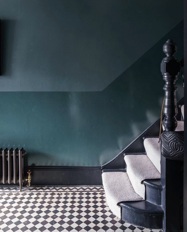
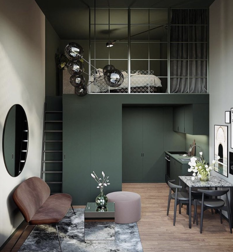
Returning to an old favourite of pink and green, and you will note that there is no white in this room at all. The paler wall is a sort of stone colour and the whole room is so much warmer and dramatic for that. Look closely and you will see that the green paint stops at the top of the stairs so although the bedroom is quite open plan to the whole space, the paint acts as a divider between the two spaces.
Don’t ever feel that you have to paint the whole of one wall or go to the edges. You can stop wherever you like and also wherever it might make sense depending on how the space is used.
Back to Hannah’s house and see, once again, how she has used two versions of the same colour on her bannisters. There’s nothing more to be said apart from – looks great give it a go.
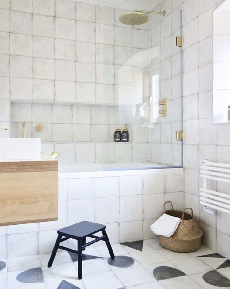
And finally, I love this calm white bathroom by Karen Knox of Making Spaces. It’s simple and really effective and now that the trade shows have been all about black taps imagine doing the same thing with black to accentuate the tiles. Mind you the brass is also a warm contrast so don’t give up on that either. I foresee a time, in the not too distant, when coloured taps, which already exist, become more mainstream.
Finally, on the way out as it were. How about this gold door? I already have a gold ceiling but I also have some leftover paint….. I’ll never get it past The Mad Husband and I fear it’s a trick that can only be used once but I reserve the right to ponder it. And remember – you don’t have to have the door the same colour on both sides so it could just be on the inside of the room so that you only see it when you’re in there and the door is shut. It’s possible I’m saying that just to him by the way….


i love this, Thank you so much Kate, lots of amazing ideas. Painter and decorators in Gloucester
Great Post and I’m pleased to see that I’m “in the Pink” Club with my new Dusky Pink walls. I wasn’t sure initially but ploughed ahead on the basis that I could paint over it “at some stage”. However it’s a really lovely restful colour, liking it more as the days go on. After ur Post Kate I’m now pondering painting the fireplace in a nice rich Green… we’ll see!!
Excellent post Kate…thanks for making the effort when most are out in the sunshine! Worth repeating at a later date to my mind.
Ooh, these are all gorgeous schemes Kate. Thanks for the door mention too x
Thank you so much for featuring our home! So many wonderful ideas here – I love the effect of the gloss and matt paint together!
Thank you so much for featuring our home Kate!! Lots of amazing ideas here, I’m feeling very inspired – the gloss and the matt paint works so well! I think I’m gonna have to try that somewhere…