Good Morning and Happy New Year. Again, for those who weren’t back at it last week. I hope you’re all rested and refreshed and ready to put the nose back to the grindstone… no me neither, but I have found five rather lovely rooms that might inspire you a little on this first working Monday of the new decade.
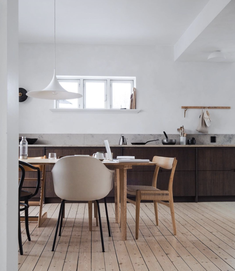
I was attracted to lots of strong saturated colours this week but thought I would start with this beautiful kitchen in shades of brown – which sounds much less exciting than it looks. I love the dark wooden cupboards and the mismatched chairs in shades of different woods and cream. This is how you do mismatched chairs – pick a colour and use different shades of it. Then the shapes won’t matter. And it means if you only find one vintage wishbone on eBay or the budget will only stretch to a pair of Thonets then it doesn’t matter.
This is not dissimilar in colour to my own kitchen, which is painted chocolate brown rather than natural wood, and this is the first image I have seen where I have thought … ooh shall I strip and sand the floor… I won’t because well – CBA – but this pared back colour scheme is very pretty and restful.
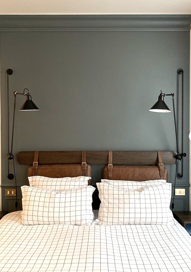
Moving along to this bedroom at the Hoxton Hotel in Paris taken by Emma Jane Palin. The Hoxton has long been one of the most photographed hotels in Paris and after I stayed there once a couple of years ago I spent a while searching for similar bedlinen (still no luck so let me know if you find any) but today I’m looking at the deep greeny grey paint colour on the wall. It’s saturated but restful and looks perfect with simple white bedding and the natural wood and leather of the headboard. For similar shades try Green Smoke and Pigeon by Farrow & Ball and Ambleside or Windmill Lane by Little Greene.
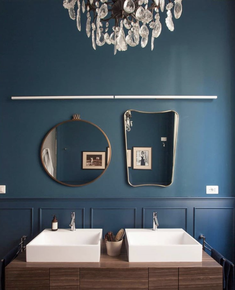
Moving to a dark navy blue which is Pantone’s colour of the year and this always works with dark wood and white although when it comes to the ceiling, a strong white might be too much for it so choose something more off white or chalky. However, what I want to point out was the mirrors. Now these are by Gio Ponti for Gubi and will cost squillions of pounds but it’s more about using two different shapes. The basins twin and there is a shared vanity unit but using two different mirrors just adds a little touch of something interesting to the space. It would look great with two matching round or oval ones (to contrast with the basins too so don’t worry if asymmetry is something that makes you feel edgy) but it’s an idea to keep in your back pocket if you’re decorating.
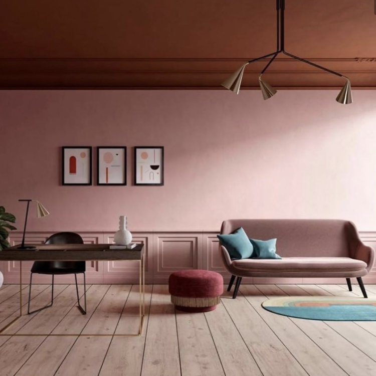
From classic blue to the pink, which shows no sign of abating. Again, this room has shades and layers of one colour with a little blue thrown in to stop it being sickly. But take note of the ceiling; in white it would have been a pretty pink room. But this wet plaster shade makes a statement and pulls the whole room together in a much more dramatic way. You don’ t have to be this bold if you don’t want to but a very very pale pink would look great and just a little more considered that white.
Finally, let’s dive into a deep dark green – try Brompton Road by Mylands or Spruce Things Up by Dowsing and Reynolds. Here the owners have left the floor and ceiling white which mirror each other and also works to lighten the room a little. Again I would counsel against a bright white, and if you have a wooden floor then choose a soft toning colour for the ceiling. The white ceiling makes sense with a white floor to bounce off and it’s the formula I have used in my house. This is, if I’m honest, because we painted the floors when we moved in 10 years ago and changing them feels like a massive upheaval so I haven’t.
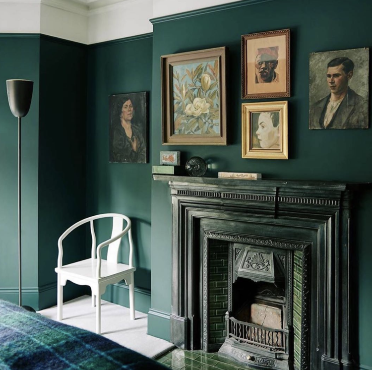
But it was the picture arrangement that I wanted to draw your attention to. Most of us put one large thing over the fireplace and leave it at that, but this arrangement of different sized pieces in toning colours works brilliantly. I think it’s partly because the rich oils complement the dark walls and partly because they look like vintage pieces rather than modern framed posters which would be an entirely different feel. It’s not symmetrical which, again, won’t work for everyone but if you have a painting you love that isn’t big enough for the space you wanted to put it in then think laterally about other ways to make it work.
Talking of which later this week I will be talking about how to buy and choose art, budget tips for revamping your interiors room by room and, tomorrow the flip side of the interior design trend for 2020 that I first spoke about last week. I hope you will be back.


Also check out “Tiiliskivi” duvet cover by Marimekko.
Charcoal grid from Magic Linen is what you’re after!
The La Redoute Basille check is similar. I copied French for Pineapple for my sons room who informed me when he came back from uni that it looks like a tea towel!
My kitchen units are painted in f&b Pigeon and they look fabulous. It’s a great colour and incredibly versatile
Would you (or any reader) please recommend me a book about how to use colour at home? I see loads of them online, but would like to pick one that is really practical, like your Mad About the House. I’m currenly reading The Little Book of Colour, but I’d like something more focused on interiors. Any ideas? Thank you so much.
I really like Kevin McCloud’s books on colour.
Seconding the la redoute windowpane bed linen, I bought it for my son and it looks very much like the bedding in the photo.
Zara Home do a checked bedlinen
Interesting article, as always, with plenty of food for thought. La Redoute has windowpane check bedlinen too …..
Bed linen by linenfabrics.co.uk, called Grid. It is a limited edition, so not much left, but it’s on offer. I have it and love it.
For the bed linen try putting “windowpane” bed linen in google. There is one on Etsy that might be of interest.