Come on in. Let’s go for a calm and quiet stroll through a collection of beautiful rooms and take a moment to look at what appeals (or doesn’t in each room). We have the time to plan so we might as well really look at what works for us in each of these and see if there is something we can learn for our own spaces. I have also included a drop of pink in each one as, research has found, that pink is a calming colour and has been used in Swedish prisons to calm inmates during riots. Of course there’s debate around this but I will say this – there’s no such thing as the wrong colour just the wrong shade. So if you think you hate pink it may well be that you haven’t found the right shade for you. I always say I hate yellow but actually I’m partial to a little ochre and old gold.
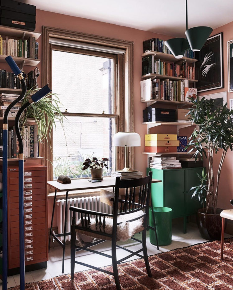
And if I repeat myself forgive me. I’ve done several interviews for newspapers, magazines and instagram in recent days and I’m no longer entirely sure what I’ve said to whom. Anyway, let’s look first at this pink workspace by the incredibly talented Laura Fulmine. Not all of you will want a pink study, I have one but it’s a lot paler than this. And remember you can even go as pale as mushroom which has nothing more than a hint. I love how the terracotta filing cabinet is a darker shade than the walls and the green cupboard provides a glorious jolt of contrast. Even the yellow box file appears to have a purpose.
On another note, if you are trying to find a space to work from home it’s worth seeing if you can move something out of the way to put a desk or table by the window. Even moving a sofa forward – if you can – and sliding a narrow table behind it works. And also allows you to turn you back on the work space at the end of the say when you move to said sofa. Console tables make great desks if you work on a lap top as they don’t take up much space and can be repurposed back to hall tables or dressing tables later.
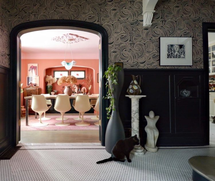
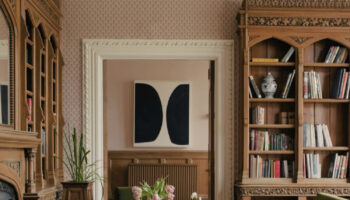
Always love this image into a pink dining room by Kim of Desire to Inspire and, in fact, if you visit this image on her instagram, you will see how we used it in my new book (fully credited of course). Kim has used layered several shades of pink from the rug to the walls to the ceiling. Look at the darker shade at the back of the alcove which adds depth to the space and the whole room draws you in from the darker hallway.
I really feel that we don’t play with paint as much as we could. It’s the most transformative thing you can do to a room and the easiest thing to change back or alter if you don’t get it right. Tradition says you have to paint the whole wall from corner to corner but that’s absolutely not true. With a roll of frog tape you can paint as much or as little as you like and use paint to create zones in rooms – might be particularly useful at the moment. And then, after, you can paint it all back again or just change the look as I imagine many of us may wish to do after spending so long in one place.
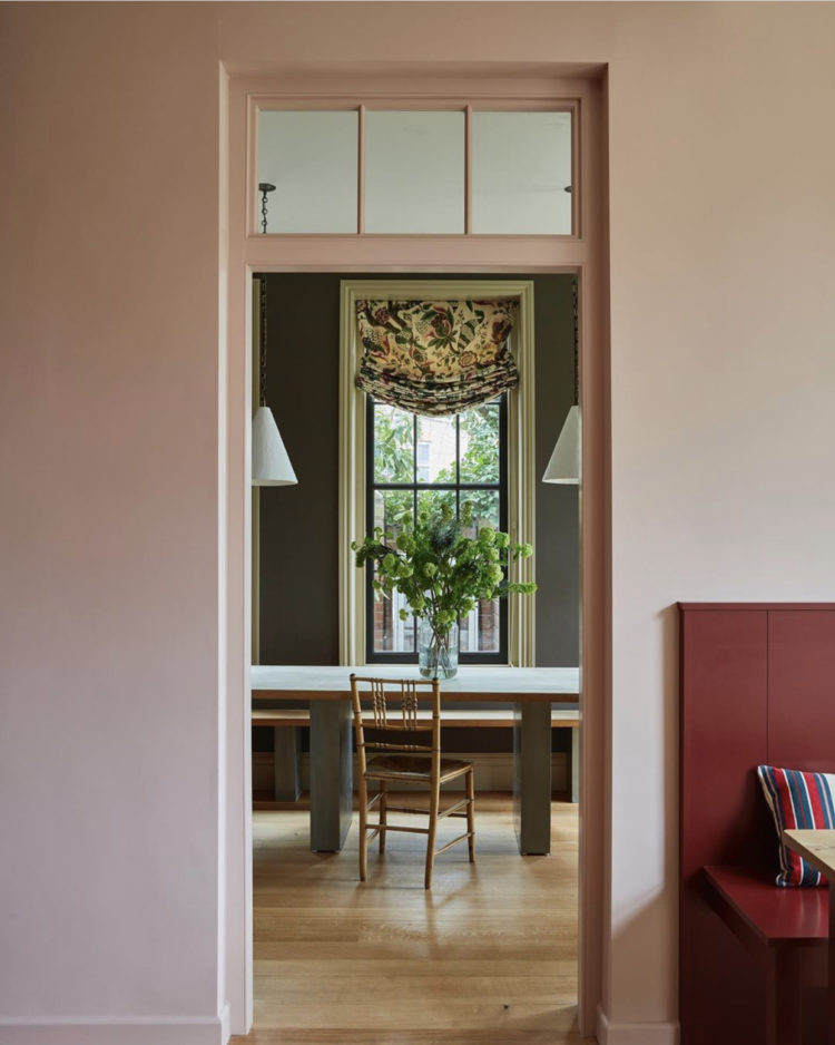
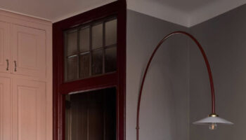
Another view through a doorway and this time going from light to dark but the door frame frames the window frame and pulls your eye through to the view outside. Or vice versa – coming in from the garden view you see the greenery on the table and the flowers on the blinds. And, once again, like Laura at the top, a punch of a strong version of the pink, a deeper darker red, has been added to the banquette seating in the foreground.
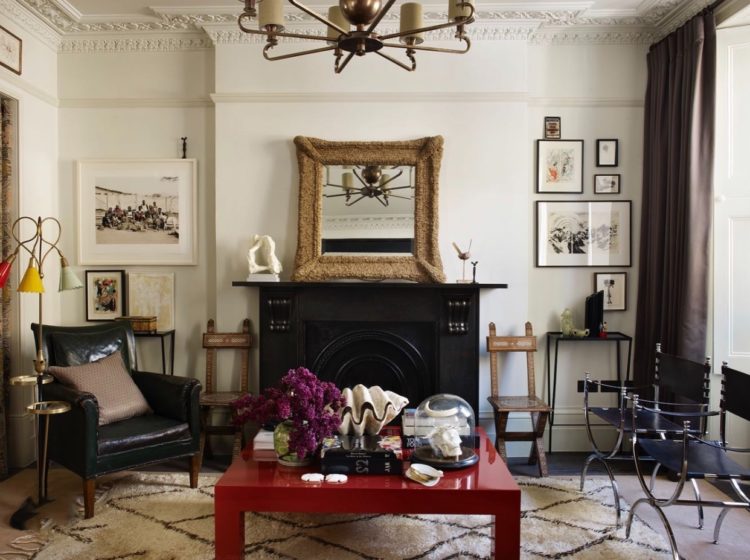
This room has also used the same trick as Sarah above only this time with a table. And it’s by an interior designer so it might be a very expensive lacquered table but I’ve also seen a similar tables in Ikea (is it the Lack or the Hemnes) and you could paint one in chalk paint (Annie Sloane is delivering) and varnish it in high gloss or paint it in gloss (harder to do but probably more glossy). It makes a great contrast to the traditional furniture and monochrome colour scheme in this room and it’s such a simple kick of colour. I’d really like to paint a low coffee table in the library in a shade of dark green but I have yet to mention this to The Mad Husband who had opinions before all this and now that’s he’s at home all the time in the same rooms I fear his opinions may become even more forceful… I’m going to invoke two cliches and once and say watch this space but don’t hold your breathe. I will also say that I know it would look great so if you don’t have your own Mad Husband/partner/parent/flatmate then give it a go. As I say, it’s a small thing to paint, quicker than a wall, takes less paint and could have huge impact.
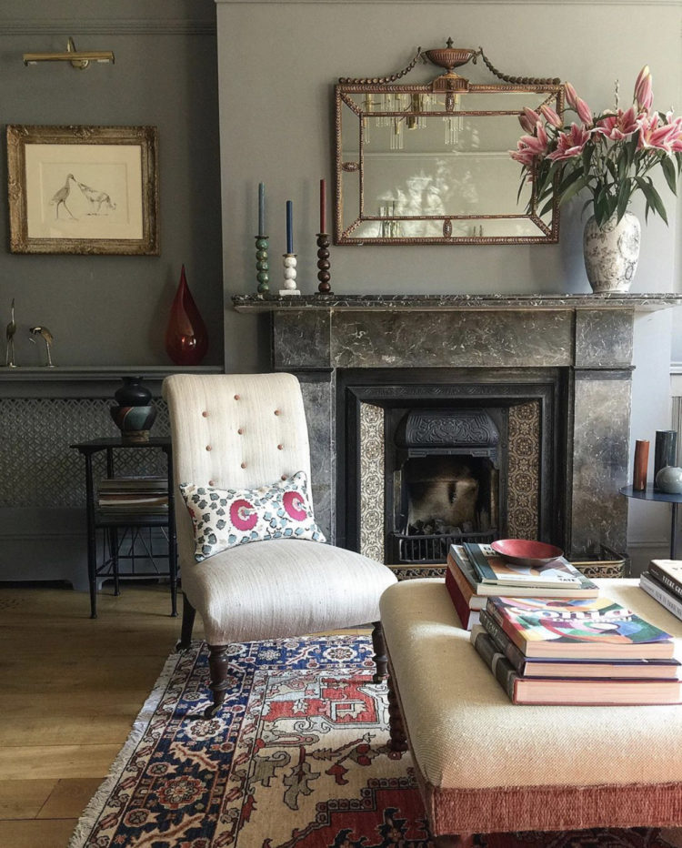
And in this room below the flowers on the mantelpiece work to pull out the small details in the cushion and rugs. The point, if this seems random, is to show you how you can take one base colour, in this case a pink, and use it in small and large and varying amounts to pull a room together and also how you can make that single colour the red thread of the whole home as it will bring a cohesive look and link everything together without you feeling that you have to paint every room in the same colour.
So, if you want something to do, and I’m well aware that those with small children barely have time to do to the loo much less wander round the house just looking at stuff, but this also works as a way to switch off your mind (and by extension the news) have a mental, or real, wander round your rooms and look at the colours you have and how much of each you have used?
Is there a pattern? Might it work better if you swapped the odd thing around? Do you think that you might want a paint a wall or two?

I am a big fan of pink, personally. I prefer softer hues generally, although I don’t mind a touch of fuchsia or magenta. That being said, I love the pink office, and this emerald green looks fab against the blush pink of the walls. I wish we would see this combination more!
Have a good day, and stay safe.
Renaud
http://blogbyrenaud.wordpress.com/
Loving some maximalism! Seeing colleagues homes over their shoulders reveals a lot of cool colours and bare walls/empty surfaces. I live in a small cottage with little storage so I have little choice but to have my stuff ‘out’. Glad to know I’m not alone!
Thank you Kate for another enjoyable post. You made me laugh about parents of small children not having time to go to the loo let alone do any decorating, so true! My 4 year old now occupies every moment of the day. That doesn’t stop me from planning and dreaming about what we might do to the house when this is all over!
Lovely round-up Kate ! Thank you.
In our sitting room, which is primarily ochres and terracottas, we have deep green window frames looking onto the garden, some velvet cushions also deep green – and the legs of the coffee table in deep, bright green ! Add to this the indoor plants, and it’s really cosy and homely.
I think my red thread is green !
I think I could get a lot of work done in that pink study. It looks cosy and with the desk at the window the light would re-charge my batteries.
Favourite is the final room with the pink flowers , the two gold framed mirrors and gorgeous fire surround. Agree with you Kate on how useful paint is. A few years back painted my hallway and stair walls a farrow and ball green ( smoke green?) and still love it . On a dull day I sometimes think I should paint it something brighter and probably will do eventually but what stops me now is how many visitors notice and compliment the colour choice in my hall. I’ve never had compliments about a hallway before which proves what a bit of paint can do.