Happy Monday to you all and first up I would like to thank so many of you for engaging and responding to the posting schedule dilemma of last week. Looks like we’ll be staying at daily posts for the time being – that’s four a week (with a fifth on Wednesday if there’s a sponsored Ad break post). However, I hinted last week at a new project which will be launching January, and that will come with a weekly newsletter and a link back to here so if you do prefer weekly updates you will be able to sign up to that and still have a reminder that the blog exists and you will be able to check in that way. Some of you may sign up to both which will give you an extra day of content….
Now for today’s rooms. I must first apologise to my green-loathing reader (although I live in hope that one of these very different shades might convert you) there was going to be more green as I am so drawn to it at the moment I can’t help myself, but I thought of you and held back.
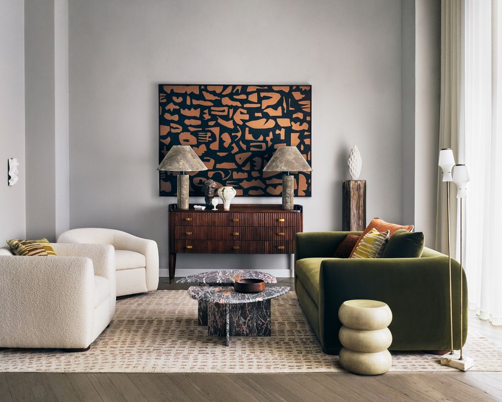
So the first is an apartment by developers London Newcastle stylist Laura Fulmine (modern art hire) in partnership with Elle Decoration (a year’s subscription to this is a great Christmas present and currently comes with a free Moleskine notebook).
It’s all very neutral and restful (note the boucle cream chairs; boucle is HUGE atm and growing) and the olive green rounded sofa just punches though all the layers of cream and wood. Find all the details in the current (January) issue.
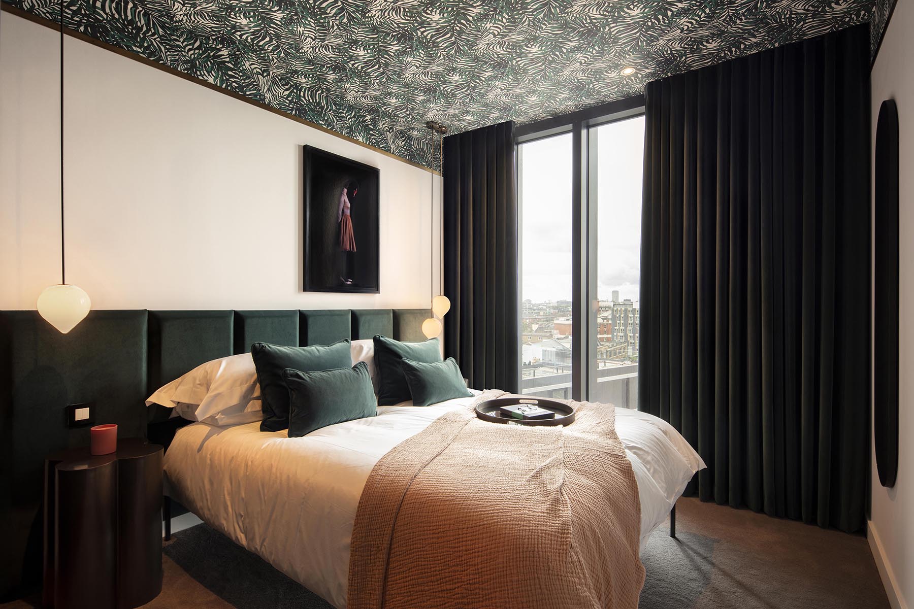
A different green for you here with this foresty upholstered headboard that takes up the whole wall for a real sense of luxury and the tropical wallpaper ceiling. I wrote about the fifth wall (this link will take to to all the times I have written about it dating back to 2013) the other day and pointed out that ceilings are a great place to add some strong colour or pattern as you only see them when you look up. Or lie down. And as you will be mostly closing your eyes when you lie down in a bedroom, you can stick to a soft, restful colour palette for the parts you see when you are upright and let rip on the ceiling. Although the same applies to the headboard as you mostly have your back to that. Hanging bedside lights will also free up space on bedside tables, but if you don’t want to involve an electrician and be making good the plaster afterwards look for plug in wall lights and, if necessary, change the cable to cord in a pretty colour so it’s not just white plastic.
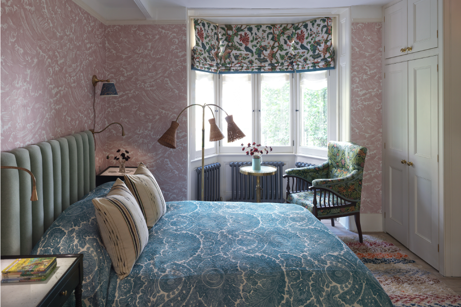
This is so barely green you may hardly notice in this bedroom that once belonged to JM Barrie, author of Peter Pan, which has been redone by Studio Ashby with Giles Quarme Architects. There’s quite a lot of pattern going on here but the shapes all echo each other and the colours are soft so the effect is less overwhelming. Perhaps. I suspect it might draw opinions.
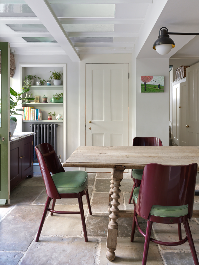
In which case come downstairs to the kitchen (I do love a flagstone floor) where these chairs in burgundy and green are a great way to disrupt a traditional cream and wooden scheme. And, for my green friend, we have left the olive, bypassed the forest and land now on a soft shade of mint. That work? Personally I’m all for the foresty shades and hold olive in reserve as it can be too yellow for my palette.
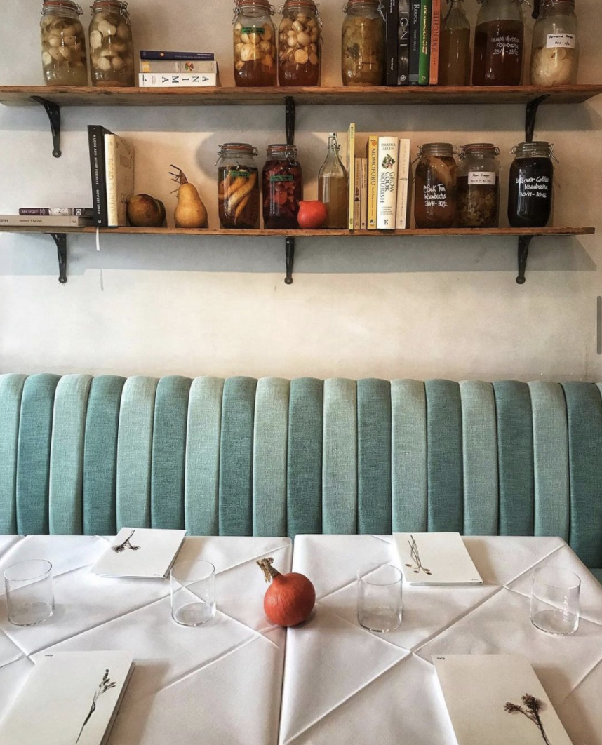
Finally, we are heading towards turquoise territory and, while this is a restaurant it has a sort of still life feel to it that I think could spark many an interior scheme. Firstly, if you have a dining bench to save space then do consider upholstering the wall to make it more comfortable. I wrote about this once before when I saw Medina Grillo use a headboard in her dining area, which is a clever idea. And the differing shades of tonal blue look less like the harsh contrast of stripes and more like a play of light and shadow and frankly if you don’t have a complementary pomegranate on your table to enhance your colour scheme at all times who even are you? *Ducks for cover* (from flying pomegranates).
I hope you have enjoyed wondering through these beautiful rooms with me and, as ever, that they have inspired your own places and spaces.


Have just had my kitchen cupboards re-painted in a forest green colour – Duck Green by F&B. I’m going to have a quartz worktop fitted. The walls have been done in Wevet F&B which has a very slight pink tinge. I’m mad about green and try to have it in every room. Keep it coming! A post about accessories to go in a green kitchen would be very helpful!
Great selection of eye candy – and I love green.
The first room has very odd decor – agree with other commenters about the mushroom lamps: I think they’d balance the room better as floor lamps, at an appropriate height. Take them off the chest of drawers where they spoil that fabulous artwork! and make the chest look too teensy.
The skinny little floor lamps are too fragile for the furniture, as is the white pointy sculpture on the wonderful seasoned solid pedestal of wood, ditto the scrap of something white on the left wall . . . I mean, really ?
And the marble table … not big enough (and I really dislike that particular marble, personally) and also don’t really see how it adds to the scheme ?
On the other hand, the bedroom by the same stylist is brilliant !
The Peter Pan bedroom is wonderful – soft and cosy. Tho’ I’d get rid of the pillows on the bed and that random Tiki raffia floor lamp.
Can’t wait to see what your new project in January might be … !
Remind me to never show you pics of our home! LOL!
As a huge lover of all shades of green, keep it coming.
Is it just me, or does the Peter Pan bedroom have way too many lamps?? I love the kitchen though! And Kate, your comment about the pomegranate cracked me up quite a bit!!! 😀
As these are ‘styled’ interiors rather than lived-in ones, here’s a few more quibbles.
In the top photo, the shape or texture of the lamps look fine to me, but they *are* far too large for that poor little sideboard, which looks like it’s being driven into the floor.
As for the kitchen in the Peter Pan house, the aubergine colour doesn’t quite work — a red-brown would be better than the purple-brown. And the green and pink painting matchy-matching the rest of the colour scheme looks too deliberate (and not very good). And the photo doesn’t do that table any favours: it looks like it’s running downhill on its splayed legs.
Hi Kate.
Just enjoying a peaceful cup of tea, breathing deeply and reading your post, after a day looking after my two year old Granddaughter. Two very different experiences, but both are a joy!
I like all of today’s rooms and love the deep forest greens, although I have only tiny hints of green in my own house, having been drawn more to deep reds and deep blues. All of today’s rooms look peaceful, which is much needed in the current climate.
Very excited to hear about the newsletter. I shall be signing up!
Congratulations on your new project of a weekly newsletter. Super exciting! So happy you will still send a 4 days +sometimes Wednesday post! It’s such a joy to start the day reading about beautiful spaces. I will sign up for the newsletter as well! Yay!!!
The more I look at your blog the more I think I need to wallpaper a room. Even better if I could use the wallpaper from the Peter Pan bedroom.
I love green, but know what you mean about some being ‘too yellow’. In my front room (very bright and sunny room), I used to have Churlish Green by F&B, with teal accents here and there. I loved how the colours enlivened the other, but then I found I was not finding it very restful – especially in the evening. So now I think I’ve found the perfect not-yellow olive in Zoffany’s ‘Spanish Olive’ (there’s a coolness to it which stops it going yellow in the sun) and gone ‘Abigail Aherne’ up and over – and got to say – I’m loving it!
Upholstering the wall behind a bench is a good idea but mainly drawn to that photo because we’ve been to the restaurant – the food was amazing!
Sludgy but warm greens are my favourite. Hate Mint… too cool! Peter Pan Bedroom would do my head in (too many patterns) but the kitchen is quite nice.
I think those “mushroom” Lamps in the Elle Newcastle pic are too “heavy” looking… the proportion is “off”. A slimmer tall more elegant lamp would look better imo.
Hello from your white loving reader. I am drawn to green as an accent and and love the Peter Pan bedroom. Just enough colour to add interest without overwhelming me. Lovely.
Just painted Neptune Olive in our dining room and I’m loving it ! X
I think the Peter Pan bedroom, while not how I would decorate myself, is lovely and restful. I’m assuming there’s a beautiful garden outside and the smell of honeysuckle is wafting in the open window.
On the other hand there is nothing restful at all about those two too large (and very ugly!) lamps on the sideboard in the first Newcastle London image.
And I’m increasingly thinking I want to paint a ceiling green!