Last week I visited a hotel to do some filming for an upcoming project (all will be revealed in September) and I can’t quite believe how much it lifted my spirits to sit in a beautiful room and soak up all the well thought-out decor. I mean I know I always say how much I want these rooms to inspire you as you take a virtual stroll, and it’s true there’s no substitute for the real thing, but having fed my soul a little the other day I truly hope you will enjoy today’s selection.
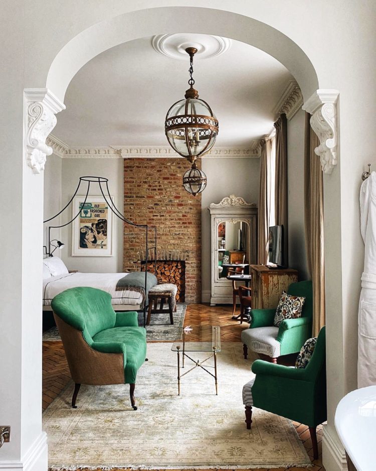
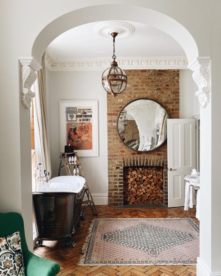
This is where I was – the Grand Suite of The Artist Residence Hotel in Pimlico, London. I was there for two hours and it was amazing. I didn’t even need to spend the night or have a bath in that amazing bathroom to feel restored. And that is the power of good interior design. And I know we haven’t all got architecture like this, but I’m pretty sure this arch was created rather than being built that way and now I thinking of all those knock-through sitting rooms (including mine) where we just took out the wall and left a square hole and we could have, maybe, at least worked out the cost of curving the edges and adding a bit of fancy plasterwork to elevate it a little.
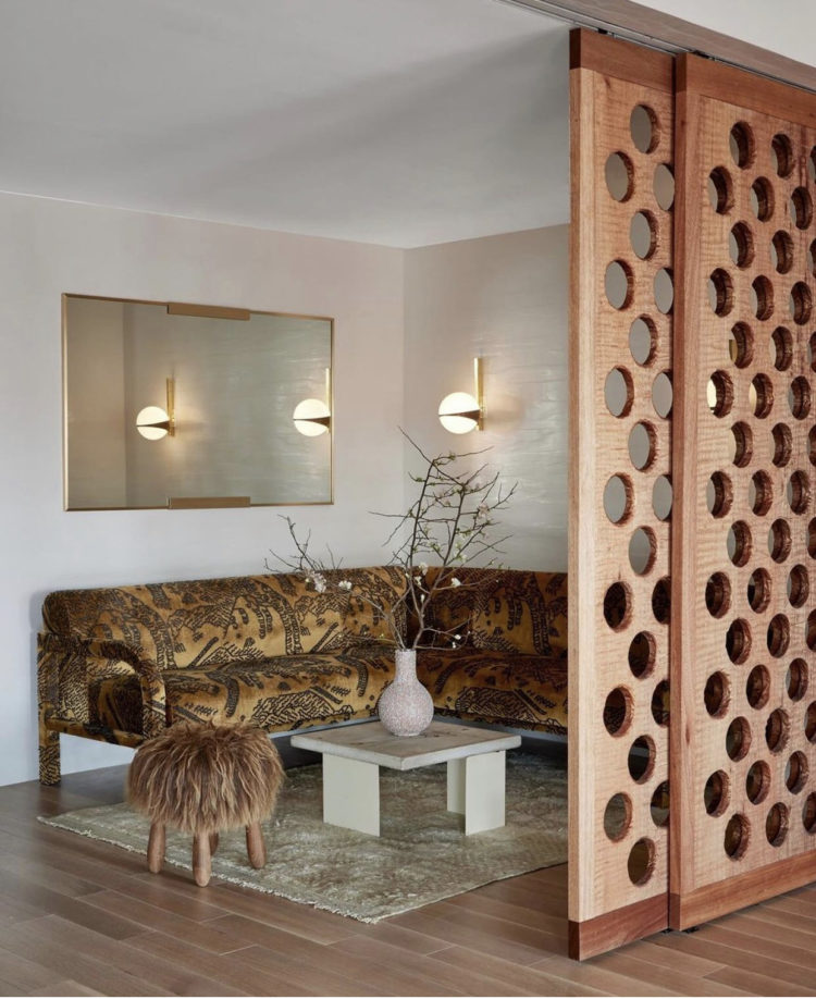
Anyway, moving on, to the designer Ulla Johnson’s New York showroom and I saw this sliding door/wall partition and thought this was also a brilliant idea for anyone who wants to create a WFH space in a corner of an existing room. You may not want to work with it closed but it’s a great way to screen off a desk or work storage(filing cabinet/printer/desk with large computer) at the end of the day. This has been attached at the ceiling only and there’s no floor track so when open you don’t see anything on the floor and it still looks like one space.
I think it’s one of those ideas to tuck away in the fold of a brain to be retrieved one day when it will re-present itself as the perfect solution. It would work in a sitting room or a large bedroom or even in a kitchen if you wanted to screen the kitchen part from the dining end.
That image sent me down a rabbit hole of banquette seating and I found this from a hotel in New Orleans. Banquettes are a really practical way of adding more seating round a table and also take up less space than chairs as it means you can push the table up close when they are not being used. Of course an upholstered buttonback version will cost a lot more than a wooden bench, but the idea is valid however your budget shakes out.
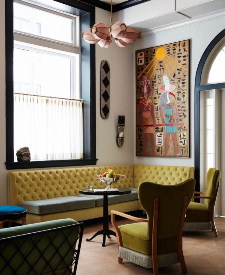
And, in the same way the emerald green of the sofa and chairs in the hotel at the top brings the space alive so too does this strong acid yellow. It’s a colour I would be nervous of using but it works really well here to zing everything up.
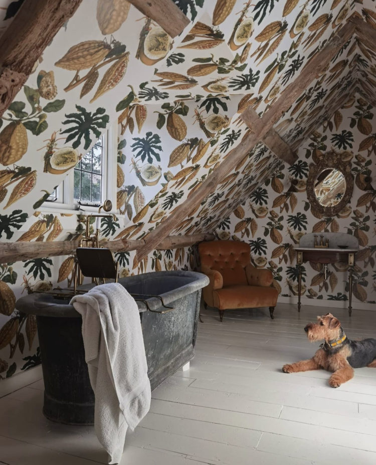
Somehow that yellow led me to this more muted yellow-toned wallpaper, and for all those who have sloping ceilings and have wondered where the wall ends and the ceiling starts, I thought you might take inspiration from this. Basically if it was paint you can start and stop where you like and if you fancy wallpaper then as long as you chose one that’s not too obviously directional then you can go where you like. Clearly trailing plants would work in here but anything with animals might get complicated as the angles might mean cutting them into odd shapes and placing them at odd angles. Note also the beams – no reason why you can’t have wallpaper between beams.
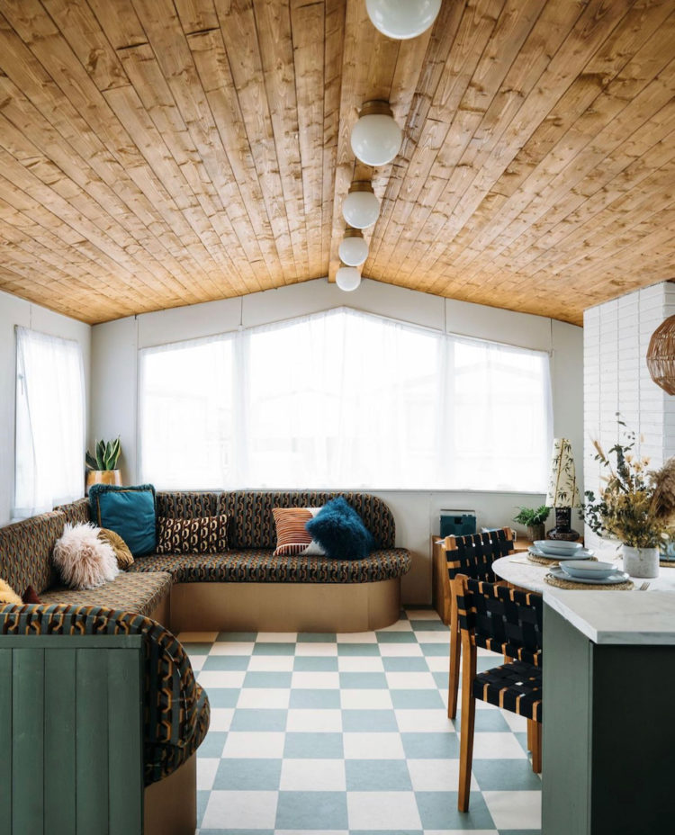
Finally, I wanted to show you this. Because firstly – that green – which is Nomad by Coat Paints – and secondly because if you are despairing of being able to have a holiday abroad this year this is for rent (although it’s nearly fully booked) so if you fancy a weekend in July then there are some slots available. And it’s by the sea in Margate. And it’s a caravan! I know. Haven’t the designers, Whinnie Williams, Emma Jane Palin and Anna Hart of Club Jupiter UK done an incredible job?
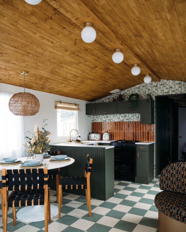
This is the other end of the three double bedroom (ignore eBay which says it’s one double and two singles – every time they try and change the listing it gets changed back!) caravan and there’s another banquette – this time upholstered in Chain of Fools fabric by Poodle and Blonde, of which Whinnie is a co-founder with Kierra Campbell. Incidentally, the same fabric has also just been used on a sofa at the newest venture by Soho House for their co-working space on The Strand.
But it’s the whole colour palette and pattern mixing that I love. Not to mention the variety of textures from the wooden clad ceiling to the brick style fireplace and panelled kitchen with the woven chairs and velvet seating. Texture is just as important as pattern when it comes to planning interiors and arguably, if like me, you tend towards a more restricted colour palette, you need to bring in more depth with a greater variety of materials.
So from hotels to caravans and some clever decor in between I hope that has helped your Monday get off to an enriching start. I will be back on Wednesday with a round up of all things new in interiors this month.


Many of these spaces were using various dark greens and I think it looks spectacular. I hadn’t really thought of it until now, but I really like it.
This. This is why I love your posts.The top photo , the arch , that green and boom instant inspiration that won’t necessarily break the bank.
Very inspiring! Being a child of the 70’s I have *issues* when it comes to archways between rooms but this one is stunning. What swayed me was seeing the ones in New York brownstones in the hallways esp the much photographed previous home of Jenna Lyons. Funny how things come back – such as checkerboard lino floors. A few decades in no-no land and now they look fantastic again. I’m really looking forward to find out what your new project is! Hopefully a new interior design TV show!!
I totally agree about the graceful arch, I ended up with a not so square, square. It then became a nightmare to fit the doors,
hindsight is a wonderful thing.
Really like the partition, particularly because it only has a top rail. I always thought they needed both.
Thanks for uplifting my Monday mood!