Well after a week of travel – first time on a plane for 20 months (I’ll tell you about it on Wednesday) when I flew to Mallorca to start a very exciting interiors job, I thought I’d come back to earth- literally – with a train today. But this isn’t just any train this (cue M&S advert voiceover) this is a Wes Anderson designed train.
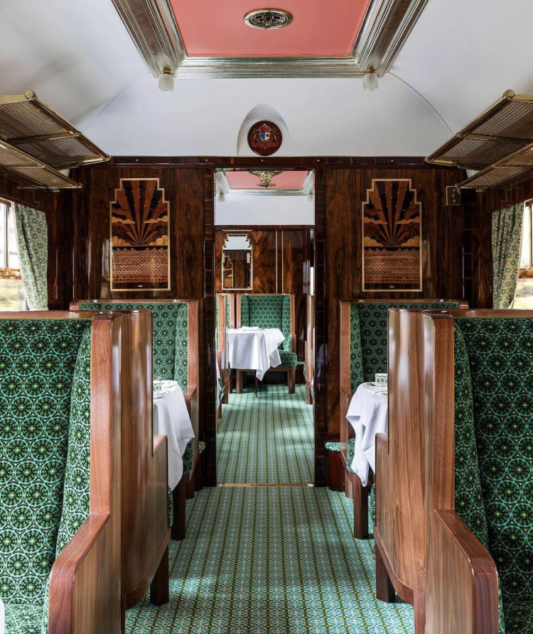
In honour of his new film The French Dispatch, and following his first interiors project the Bar Luce at the Fondazione Prada in Milan, the film director, whose distinctive style is instantly recognised and universally imitated the world over, has turned his attention to the Belmond Pullman train. He has re-designed the 1950s Cygnus carriage, one of 11 on the train. His signature pink and green look has been reinterpreted with a pink ceiling and emerald green upholstery. Should you be able to afford a ride (you can do day trips from Victoria station) you will also spot several swan references nodding to the carriage’s name. And to prevent heart attacks I suggest you take a deep breath before you click the link.
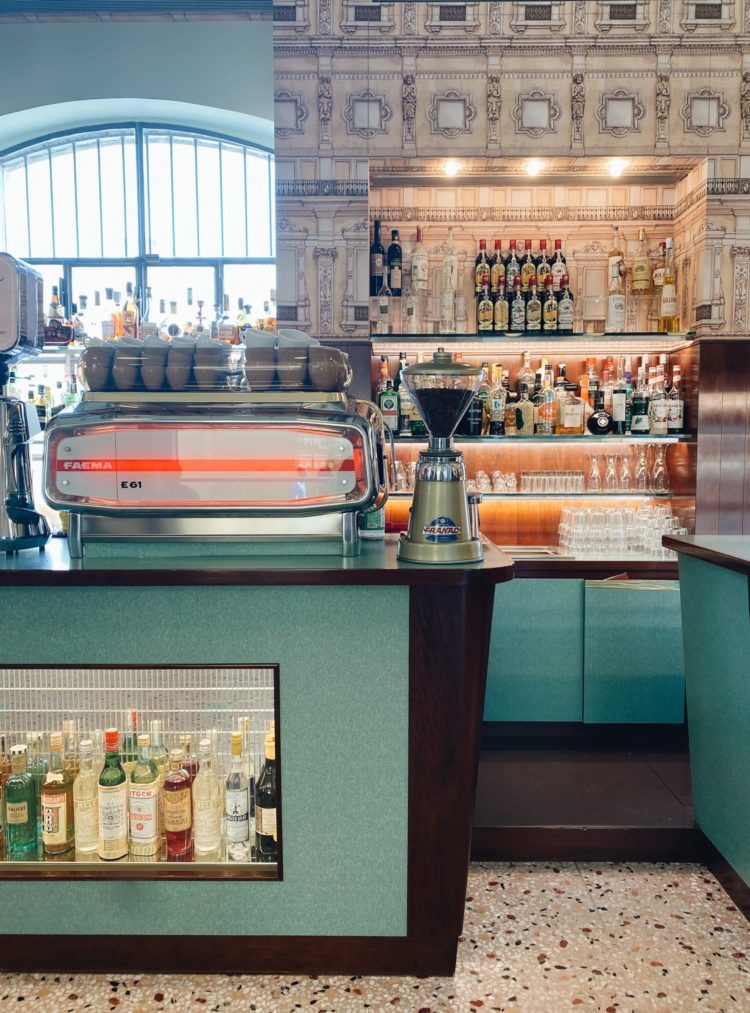
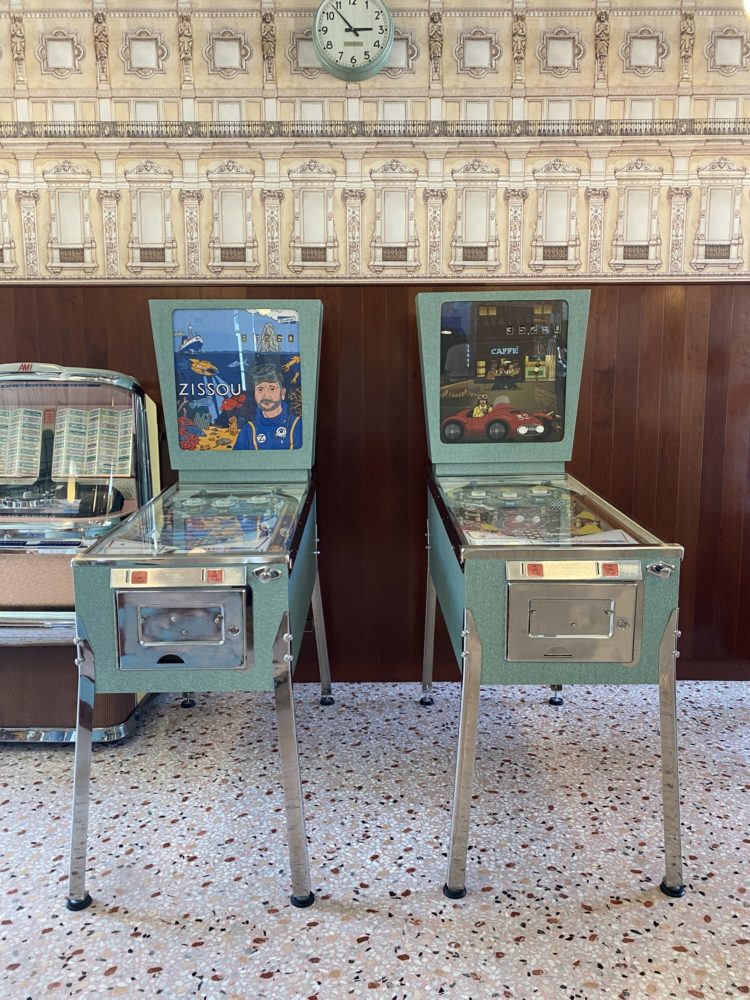
In the meantime you can look at my pictures of the Bar Luce for free if you like. I was particularly taken with the Life Aquatic Pinball machines. And, as always on these posts, it’s not that you may have a cafe to decorate (unless you do) but use these images for their colour combinations. As the saying goes there’s no such thing as the wrong colour only the wrong shade. So the coral pink and deep emerald green of the train fades to a softer mint green with splashes of pale pink deepening to orange in the cafe.
And if you’re ever unsure how to bring a palette of strong colours together, then a pattern will do it perfectly. In this case the terrazzo floor uses all of them on a pale background. On the train the combinations are mostly tonal – lots of green with dark pinkish wood and pink paint. So while it might at first appear to be very high contrast, the deepening and fading of the only two colours used give you more depth and tonality than might at first appear.
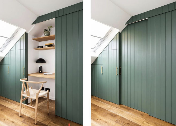
Staying with green I thought you might like to see this clever home office space by Interior Fox. This is perfect for a bedroom or oddly shaped space where you might want to hide work away at the end of the day. I appreciate that you might not want to sit in this corner for eight hours but a) there might be no choice and b) if there is then this at least makes for good work storage. It’s a great way to incorporate a homework space in a child or teen’s bedroom where you can, hopefully, persuade them to shut the door on their screens at night and leave them to charge (the batteries) and recharge (the children) overnight without the dreaded blue light.
If you have a room with an alcove you can create this and the door could slide along the chimney breast if it’s a period house with no fireplace. It could also just open outwards but make sure it’s not on the window side as that would cut the light. And, in fact, opening outwards can provide a sort of screen from the rest of the room so toys and distractions might be temporarily out of sight/mind. If you don’t have an alcove you can build a wall of storage (as has been done here) and use some of it for clothes or toys and leave some for the work space.
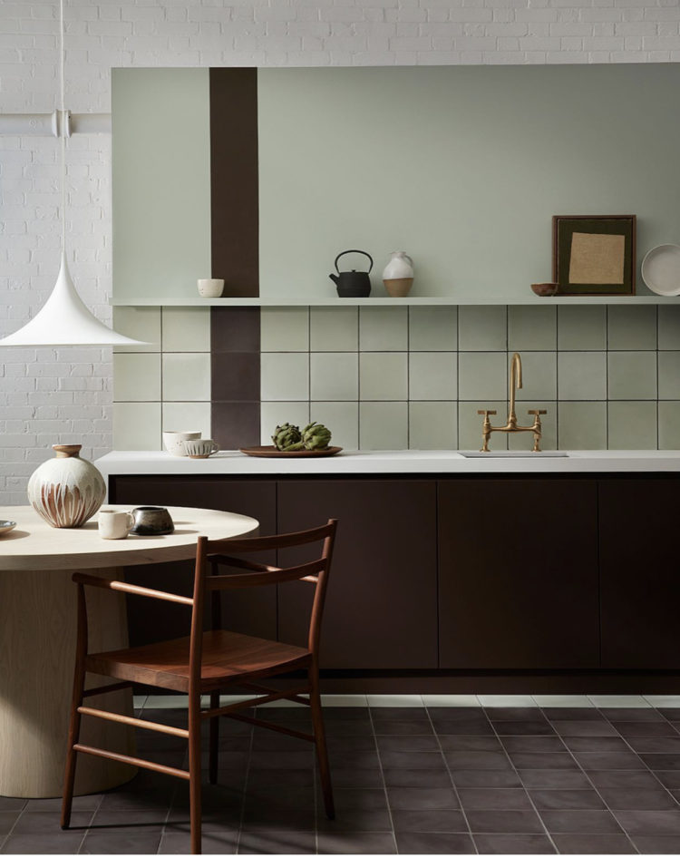
Moving to a paler green and I bring you news of a collaboration between the paint company Little Greene and the tile makers Bert & May. I saw the whole collection at Decorex the other week and it’s very lovely. Above is the gorgous paint Purple Brown (for which there is a matching tile) mixed with the Aquamarine tiles (for which is there is matching paint). There are eight tile colours which you can have in either glazed herringbone or chalky cement squares. It’s the first time Little Greene have put their colours on tiles and only the second time Bert & May have added to their core collection. Fans of Little Greene will recognise tiles named Chemise, Rolling Fog and Bassoon among others and given the fashion for colour drenching I imagine a painted wall with matching tiles to bring texture will be a good look. I’m already thinking tile the lower part of a hall wall for practicality and take the same colour in paint up over the rest of the walls. And suddenly I’m plotting a new scheme…
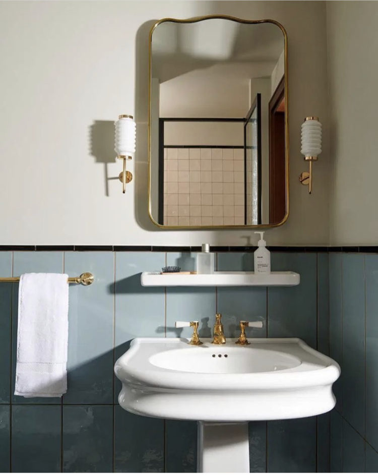
Leaving green and heading to a soft blue (but staying with tiles) this is one of the bathrooms at the newly opened Hoxton Hotel in Rome. Soho House has also just opened an outpost in this glorious city so maybe it’s the new place to see and be seen. I’m a big fan of Rome and while you will be familiar with Roman dishes such as Carbonara, you really need to try the Roman-Jewish dish of deep fried artichokes (carciofi all giudia).
Sorry, distracted myself there for a moment. Back to the tiles. And it was simply this – look at that black pencil tile across the top. Totally punches through the paler pastel shades and brings definition and style to this bathroom which, while elegant without it, is cooler with it. It also echoes the black Crittall shower screen, seen in the mirror but do it for the definition rather than the matching. Also, while we’re looking, there are a lot of straight lines on those tiles, that subtle wave on the the mirror is another tiny detail that punches way above its weight.
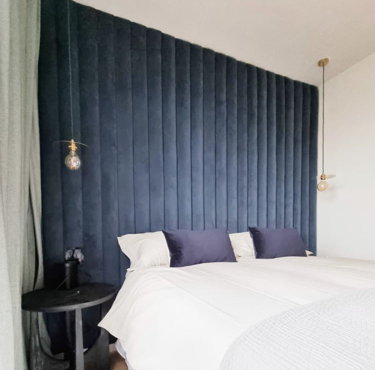
Straight lines and blue (honestly anyone would think I worked quite hard to link these images!) and we come to this fabulous padded headboard, or is it a wall by Pohmaluna upholstery. The bedside lights hang down in front and the sockets have been embedded so it’s still completely practical while bringing elegance and a really good focal point to a room. Yes you could paint a feature wall (within the rules of course!) but you could also create a feature and this is better.
Right I’m off to check on The Mad Husband who is isolating in the loft with Covid. He’s not ill he’s just tested positive while the rest of us are still, so far negative. Hurray for the loft.


Fab projects, nice to get stuck in sometimes! Maria Speake of Retrouvius does very high end eco interior design.
I love the hotel bathroom in Rome, particularly the concertina style wall lights and generously proportioned basin.
That train carriage is lovely, can’t imagine anyone putting their feet on that upholstery!
Absolutely love the Wes Train, such stunning interior.
Best,
/ LÖV Flowers
Sorry to hear about The Mad Husband, I hope he continues to feel well and that none of the rest of you test positive. You can pretend you are all in a period melodrama, except it’s a Mad Husband locked in the attic instead of a crazy wife…
I ❤️ The Wes Train.
I hope the Mad Husband doesn’t develop symptoms and makes a speedy recovery! Take care. X
Small correction: carciofi alla giudia.