Monday Morning rolls round again and this week we’re back in the kitchen because there are just so many good ones around and also it’s worth noting that just because it’s a kitchen doesn’t mean there aren’t elements of colour and styling that you can’t take into other rooms of your house.
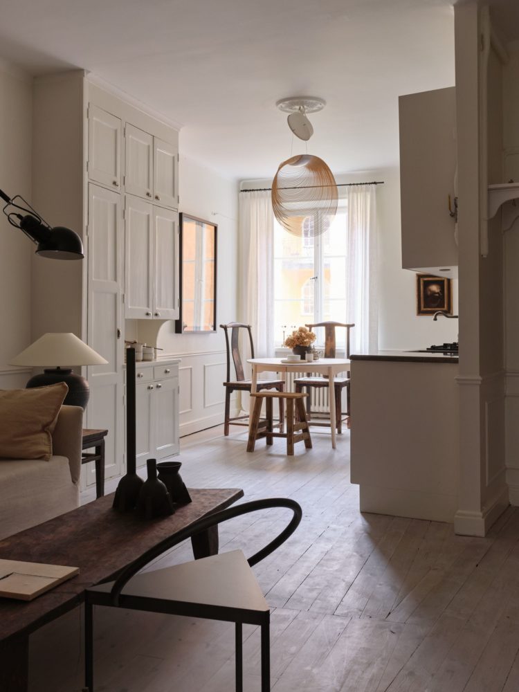
So, above is a very neutral palette in an open plan space. But more than the restful tones of cream and natural wood, it was the shapes I was drawn to. Shapes are the fourth dimension of interior design if you like. So often ignored, or perhaps instinctive for many, I feel that if you have “finished” a room (is that ever the case) and feel it’s missing something or something’s not quite right then take a moment to look at the shapes.
Rooms, as we have observed many times before, tend to be mostly square/rectangle and full of straight lines. And when there is an odd shape/corner at one end we tend to be cross about it because it makes it harder to furnish. So first up I’m going to say celebrate the quirk. Paint it, light it, put something interesting in it to show it off because that’s what gives it character.
But if you haven’t got that, then look to the furniture and lamp shapes in your room. Above, those chairs in the foreground are practically sculptures in their own right. And the curve leads you to the lampshade behind and from there to the pendant light over the table. But even the backs of the dining chairs are bent – which probably means they mould to the shape of your spine better making them more comfortable as well as more interesting to look at.
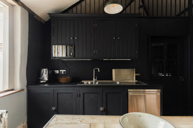
Moving on from shapes and the kitchens above and below both rely on tongue and groove panelling to add interest, warmth and character. Both are colour drenched – matching cupboards to walls. In the room above the dark makes the cupboards recede into the walls and will make the room feel larger and less cluttered.
Below, the same trick has been done with cream where the floor and ceiling also match. This allows the shelves to stand out and also, to stop it feeling too traditional, the island has been covered in a contrasting warm yellow. This is Pearl Lowe’s beach house so using yellow as a holiday coastal colour is perfect. It’s also a change from the ubiquitous blue and white of so many holiday homes.
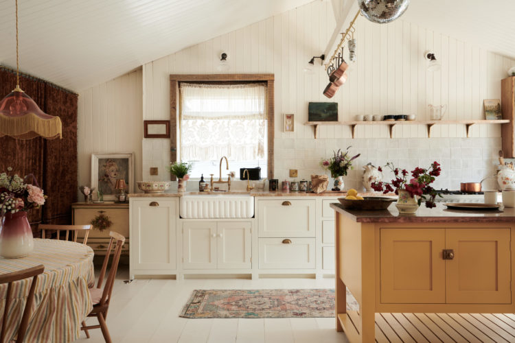
As a tiny detail the curtain to the left is a darker, more burgundy heavily patterned textile, the colour of which is picked up in the vase of flowers and chairs and the whole thing is brought together by the patterned rug. And, of course, when you decorate with wood against a neutral background like this you can change the colour of the island anytime you want to refresh the whole room at a (brush)stroke.
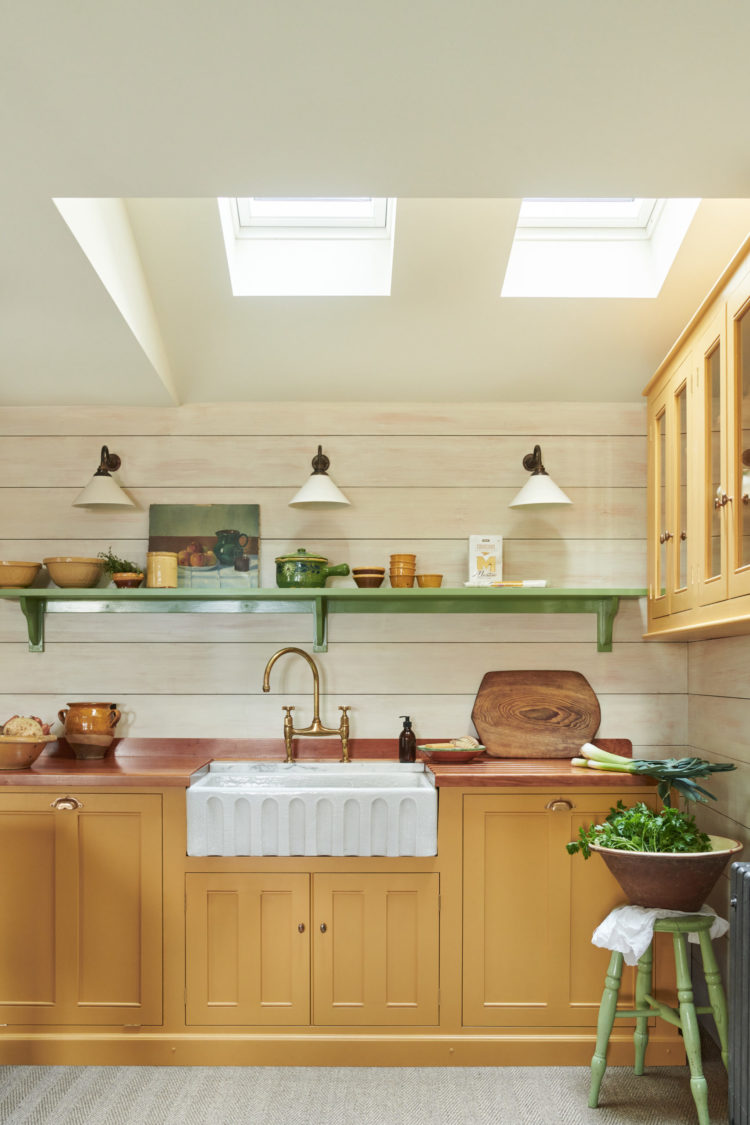
Staying with yellow and this time it’s the cupboards that are painted, while an accent of green ties it to the outside and gives this room a really summery feel. These are both muted shades – a slightly dirty ochre yellow with a pale olive, pistachio green. Emerald would work too but be careful of the yellow or it might all be a little too primary school.
If this is a colour scheme you like, and it’s a bold one, then take the time to experiment with lots of varieties of the colours you want and then stop and consider how each one makes you feel before you apply it to the walls. There’s a world of difference between what would be – for me – a warm calming ochre and a zesty energising lemon. Everyone will react differently so make sure you make a note of your samples and your reaction. And, because why not – my latest book The Planner was conceived with exactly that in mind as there is space to note all this sort of thing down when you are decorating.
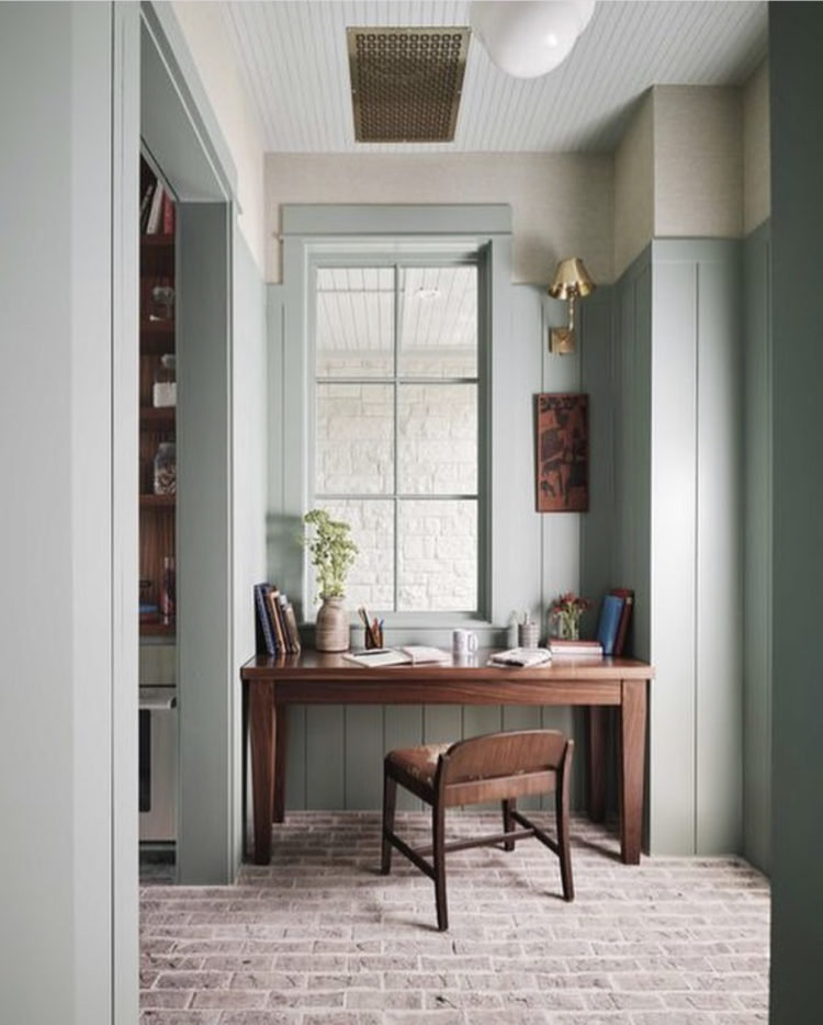
We’ll leave the kitchens now, although this hasn’t really been about kitchens so much as colour. But just look at this pretty work corner above. Now it’s possible this was an odd angle that has been turned into a desk area but it’s also possible that the cupboards were built to the left of the picture to mimic the wall shape to the right and then it lent itself to this working corner.
Many home offices are crammed into windowless spaces and research has found that natural light is key to inspiration and creativity so if you have a window that isn’t doing much – by which I mean doesn’t currently need to have furniture in front of it – then see if you can create something that might work as a desk area. And, this is important, the window isn’t central here so the owners have been slightly constrained by the building, but they have made it work by adding a wall/picture light and a narrow picture on the side so the entire thing looks considered and deliberate and may even mean that you hadn’t noticed the off-centre window until I mentioned it? I think it even looks better than it would if it was symmetrical?
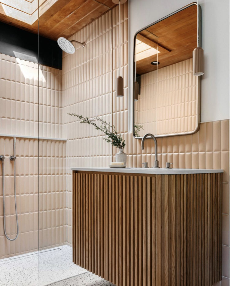
Lastly, we’ve all seen the trend for fluted glass which has moved over to “fluted” wood and now the tiles are catching up. No longer are bathrooms full of hard flat surfaces. Traditionally a room lacking in texture as, bar the towels, there’s no room for soft furnishings, the hard materials are now taking on that softening role by becoming themselves more textured. Above the tiles, the vanity and even the lights hanging down by the mirrors are fluted. You may think this is too much. You may think it’s an idea worth investigating and that, my friends, is the point of these posts.


Does anyone know when original fluted glass was manufactured? I have a Victorian stripped pine door with an ( I’m supposing non- original Victorian) old/ vintage fluted glass upper half, bought from a salvage yard that we installed in our shower room 37 years ago. For many years I was desperate to buy new frosted glass but now I can appreciate it. It’s not often I’m on-trend. The glass will still be here when this particular trend is over.
Hi. I wonder for how long the owners of the fluted bathroom will be happy with such ‘trendy trend’, before the tiles start screaming at them every morning and evening! Also, my very practical side says: nightmare tiles to clean! Despite the comments, love it though. For the moment!
My thoughts exactly on the fluted tiles. I have recently refurbished my bathroom and avoided metro tiles as they look as though each one has a tiny ledge to attract dust.