Maybe it’s January maybe it’s fashion, but either way I was drawn to these warm colours of vintage wood, rich cream and shades of chocolate this week. It all feels very cocooning and comforting but, at the same time, is essentially taking a classic black and white base and turning the dial round to the warm end. So it’s just as easy to add colours to this combination as it would be to black and white should you wish. This can be anything from ochre yellows to emerald green (always doable with plants) all the pinks and even cobalt blues. So while this might look like a safe scheme it’s actually just a great base from which to start. Or, in my case, stay.
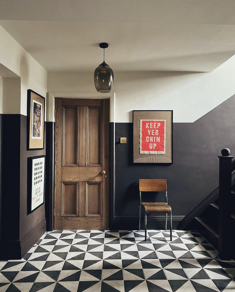
Come in to this gorgeous hallway by Hannah (@half_a_hall) and you can see, not only how it works with the classic black and white/ivory tiles but also with the vintage wooden chair and stripped back doors. But look also at the three quarter high paint. here is no dado rail; instead Hannah has picked a point on the wall and just changed colours over – no need for a physical separation. This has the effect of bringing the ceiling colour down over the top of the walls to make the space feel larger and lighter and the brown walls draw your shoulders up and will make you stand taller. As a rule of thumb – especially if you don’t have a pre-existing dado rail – a two thirds/one third balance will always make a space look taller than half and half. It also allows for more interesting picture hanging – you wouldn’t normally be able to hang a picture that low but there, with one above it looks perfect.
And to remember my starting point, look how the red of the artwork pops against this background. Red and brown might not be an obvious combination but it works perfectly here.
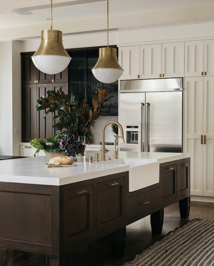
I have shown you this kitchen before but this is a new angle and I like it even more. The first point is one that I suspect will come too late for many of us (me included) and that is a kitchen island on legs. If you are redoing your kitchen, and if you have space for an island, then do think about this. Lots of the ones we see at the moment are like tables with drawers although you would lose an awful lot of storage which I suspect most of us can’t afford to do so this is a good halfway house as by revealing the legs and removing the plinths, or kickboards, you will make your kitchen feel bigger and lighter.
My island looks a bit like a heavy tanker landed in the middle of the room, and while I could remove the kickboards (and potentially replace the legs) I have a horrible feeling the floor might just be concrete under there so it’s a no go. That said I might just go and check as soon as I’ve finished writing this – if it’s about lying down and reaching under with a long roller brush to paint it then I could do it. And, believe me, when I say this would be transformative.
If you don’t have room for an island, and if your kitchen is small generally, then you can create a similar effect by removing the kickboards on your cupboards. Obviously the metal adustable legs aren’t pretty but you can either spray them in the colour of your choice, or look at places like Pretty Pegs who sell replacement legs for Ikea furniture. If that’s no good you can also replace your kickboards with a reflective metal or even mirror – try places like Magnet or even metal sheets who don’t offer ready-made kickboards but will make anything you want to order and you can choose from copper, bronze, zinc and brass. The point of mirror being that it will reflect the floor back and make the room feel bigger as well as giving the impression that the cupboards are floating rather than sinking into the floor.
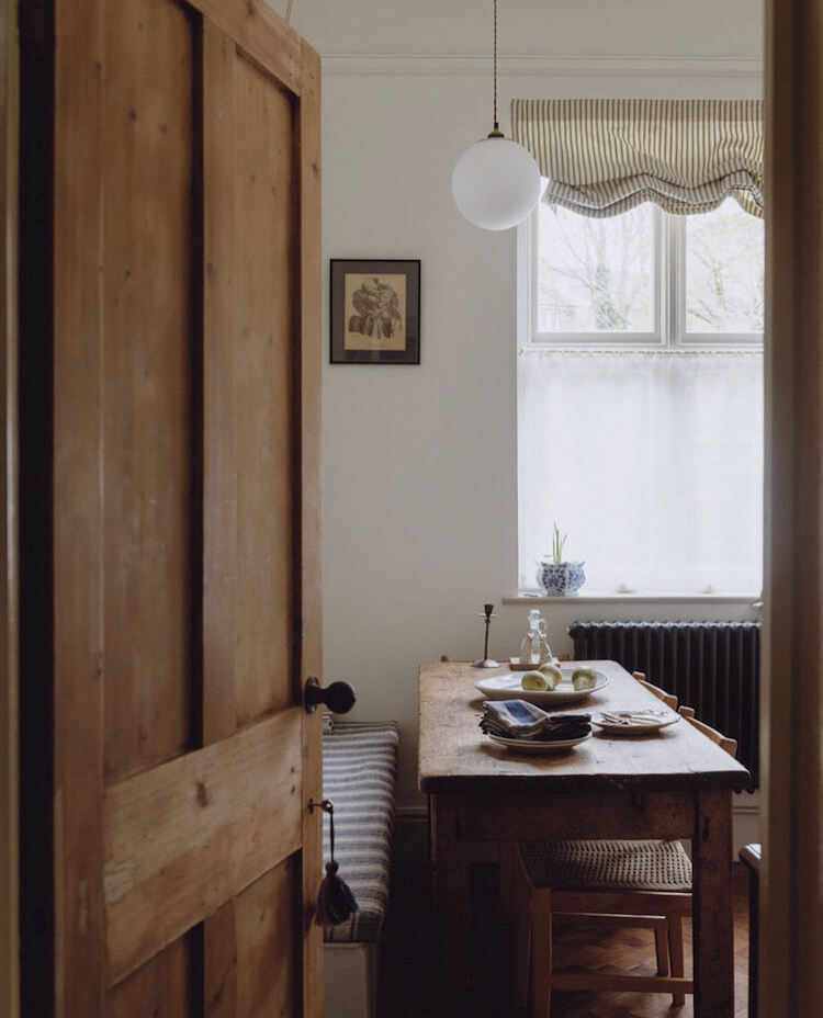
Moving into this dining area by Gemma Moulton from East London Cloth whose curtain making course with Create Academy I flagged last week. This view into her home shows not only the power of a fabulous wooden door and vintage table but the joy of a stripe too. If in doubt you will never go wrong with a simple mattress ticking fabric blind and you can see in this image how Gemma has softened the stripes by adding a pretty ruffle and then widened the stripes on the bench so the room is pulled together in the subtlest of ways.
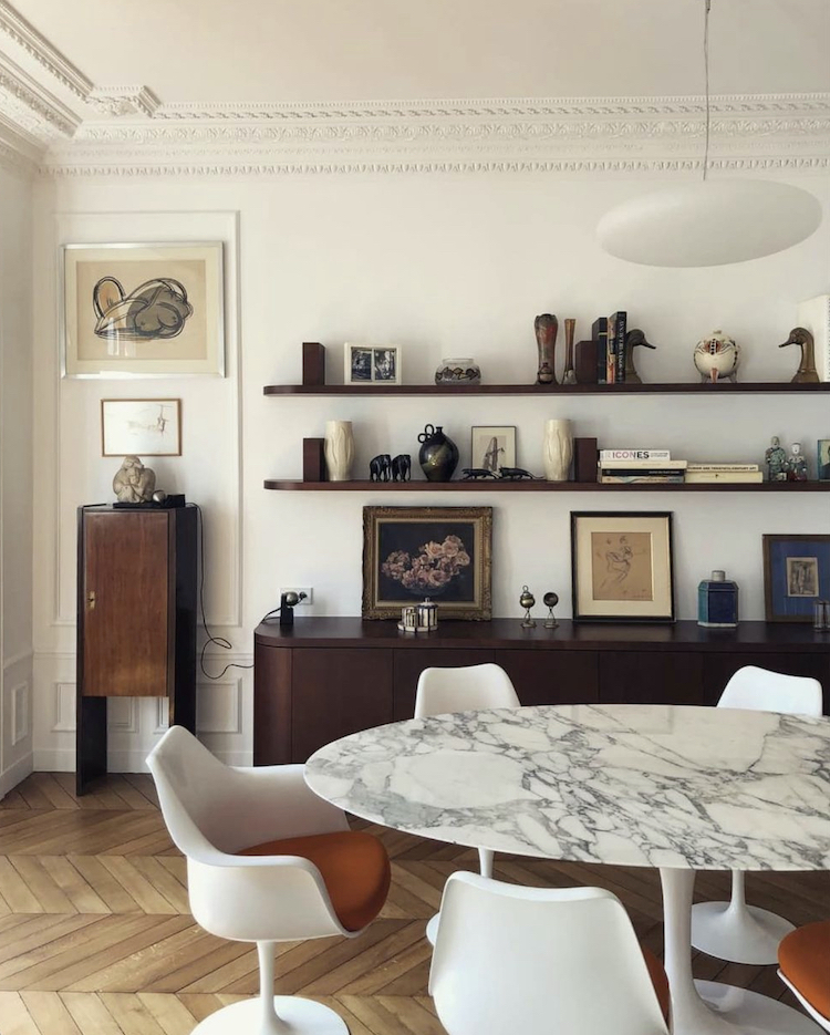
Staying with dining rooms, and one of the questions I am so often asked is about mixing woods and having too much of it in one room. And it’s easily done if you have a wooden floor (or, as above, a rather fabulous parquet) and then you want some shelves and obviously it’s a dining room so you need a table and chairs. First rule of thumb – which they haven’t done here – a good rug will always break up a fight between a table and a floor.
Second rule: if you want, or have, a wooden table, that isn’t precious you can paint it – or the chairs. Don’t do both. If you want to keep all the wood then you need to look at the colours and make sure they tone – wood is usually yellow-based or pinky-based – best to stick to one or the other. Or, if you’re not sure what you have and don’t want to risk a clash you need to start looking at different materials.
In the room above it’s the classic marble-topped Tulip table but you can use any marble top. If a Tulip is out of budget (yes exactly) then if you can pick up a good top (maybe buy a piece of marble worktop and have it cut to size or the edges rounded) you can mount it on legs from Tiptoe – a French company I have mentioned before but for new readers check it out. You buy legs in the colour of your choice and add your own top. You can choose either table or seat height – or both – a low table for a child can later become a bench seat for an adult – and it allows you to mix and match your materials. So, to return to this room ,you could have a wooden floor, plastic, or vintage plastic chairs, with coloured metal legs and a wooden table top. The possibilities are endless and the joy of this is that once you have bought the legs you can adjust the budget for the top to suit, so for some it maybe marble for others a large piece of birch ply or a trestle top from Ikea with a fabulous linen cloth and that’s really channelling Rose Uniacke so you can always spend the budget on the linen rather than the table top.

I have spoken before about the importance of texture in a restricted colour palette and here is a perfect example. The vintage bed is the thing here and everything else is there to enhance that. Now you can make up a bed like this if you find just a headboard or even a piece of decorative wood – like an old door – that you can fix to the wall and put a simple modern divan bed in front. That gets you the look. Now the colour scheme is basically – to sound a bit Masterchef – textures of cream – cotton, linen, wool and quilting with some checks in different sizes and shades and a hint of a ruffle, a tassel and some longhaired sheepskin for good measure. There are about eight different materials on there and yet the overall effect is one of warmth and cosiness and absolutely no textiles tiffs. It looks very simple but very rich at the same time and that’s the thing to aim for.
Back to the sitting room in the house where we came in and while I appreciate that this is a fabulous room with high ceilings and great panelling it is also decorated in the perfect colour scheme for smaller rooms with lower ceilings and fewer features. The walls are pale (Farrow & Ball bone, which the company calls grey but it’s warmer and softer than that) with a parquet floor. But, in a modern home, you could have a pale carpet or even a warm chocolate colour. When my sons were small we had a pinky brown carpet that was basically the colour of posh mud – we didn’t have posh mud – but it worked well to hide the basic brown mud they brought in from the park – which we teamed with a similar pinky brown slate in the hall and kitchen.
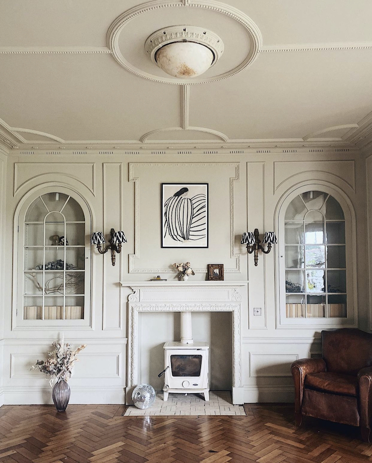
Now, of course you may not have these gorgeous arched cupboards but you may have an alcove you can cover with a glass door or a space for wall lights – Pooky really do have lovely ones like these – and you will never go wrong with a battered leather armchair. That said, Hannah, whose chocolate hallway we came in by, is thinking of adding more colour and this is the perfect warm base from which to start. So if you have cream walls and some wooden furniture and are wondering where to go from there the answer, my friends, is anywhere you want.


Fantastic informative post Kate. Full of sound sensible solutions. Loved it. And… sending it to a friend who is doing a kitchen job at the moment !!
Sigh. These rooms are my happy place. I have some colour in all the added extras and plantlife, but the more rich creams and timber the better.
“Simple but very rich..” when interiors and dating goals overlap.
Made me laugh!
What a fabulous post Kate. Loving the chocolate colours and the textures in that last bedroom! My problem now – where to start!!