Every year the interior design world gathers in Milan for the international trade show which takes place not only in eight airport hangars on the edge of the city, but also all around the central streets in pop up shops, gardens and palazzi. Nearly 500,000 people will fly in to see nearly 2,000 exhibitors and spend their time walking, drinking Prosecco and gathering inspiration for the year to come. I was only able to go for one day this year so I have gathered a selection of the best pictures from the experts to give you a flavour of the colours and trends that will be next up on a wall or cushion near you.
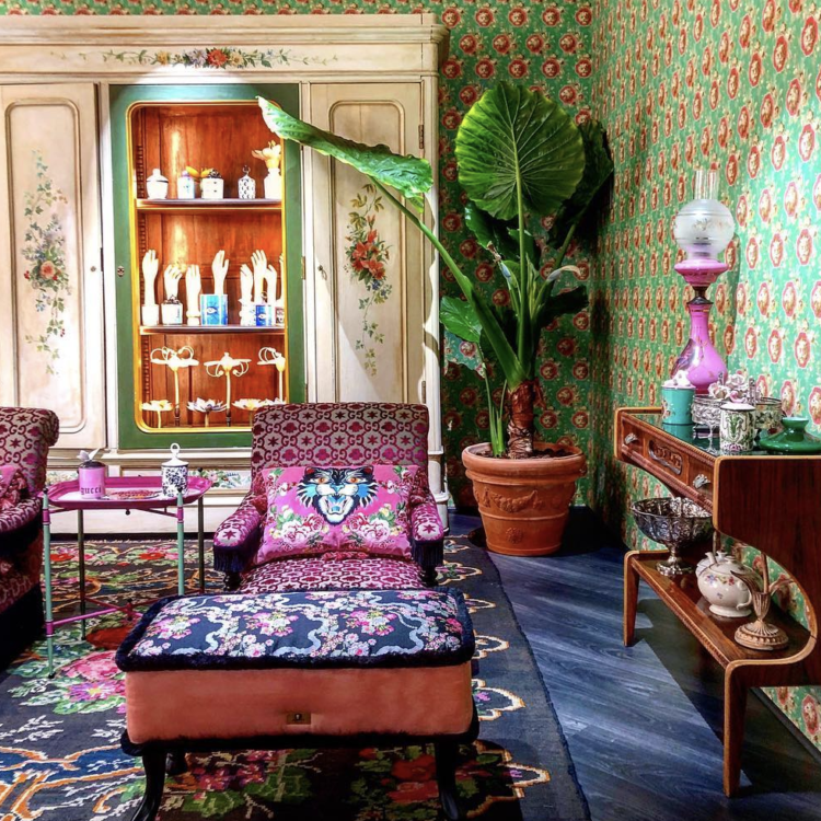
First up was the Gucci pop-up and while this may be a little too much for you all in one room, remember this show is a furniture catwalk. It’s designed to grab your attention and while there’s no doubt that maximalism is back you may want to dial down from this. It’s hard to pull off unless you really know what you’re doing because although I rather love this image I know I wouldn’t be able to do it in my own home.
So instead of looking at the whole image, look instead at the colours, the sizes of the patterns, the types of florals and the navy blue background or base colour. Then see if there are elements you might want to adopt.
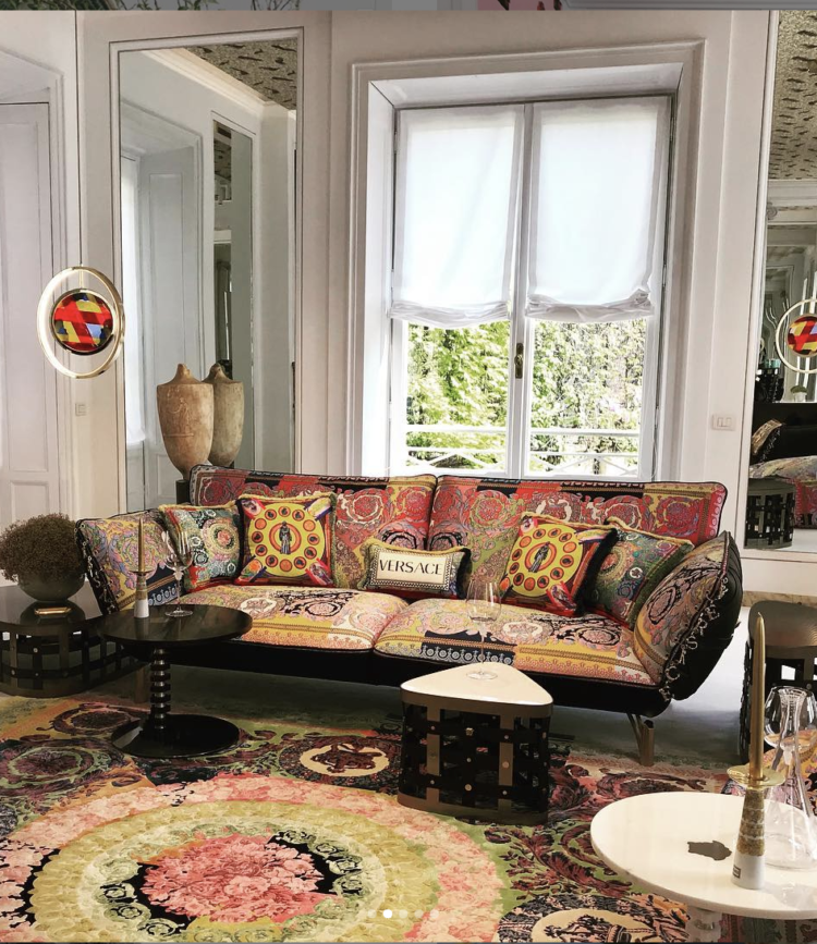
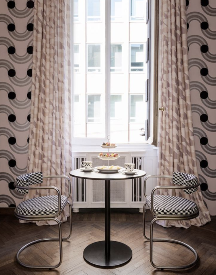
It was the same story at the Versace mansion designed by Sasha Bikoff. Again, you don’t have to take it all but note how the colours are all tonal which makes the overall effect less stressful to the eye. There are punches of black to anchor it and the overall theme is one of circles which, if you pay attention to such things you will know is one of the strongest shapes at the moment. Even the geometric or graphic designs are made with curves at the moment. Angles are out.
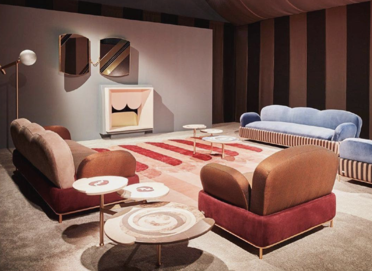
While many of the high end stores were pushing maximalism Cristina Celestino showed off the more prevalent trends at Fendi. So there were earth tones, curves and wait for this new one to poke through – baby blue. I mentioned this in my trend report from Paris and it’s beginning to gather pace. Here it is again at Studio Pepe.
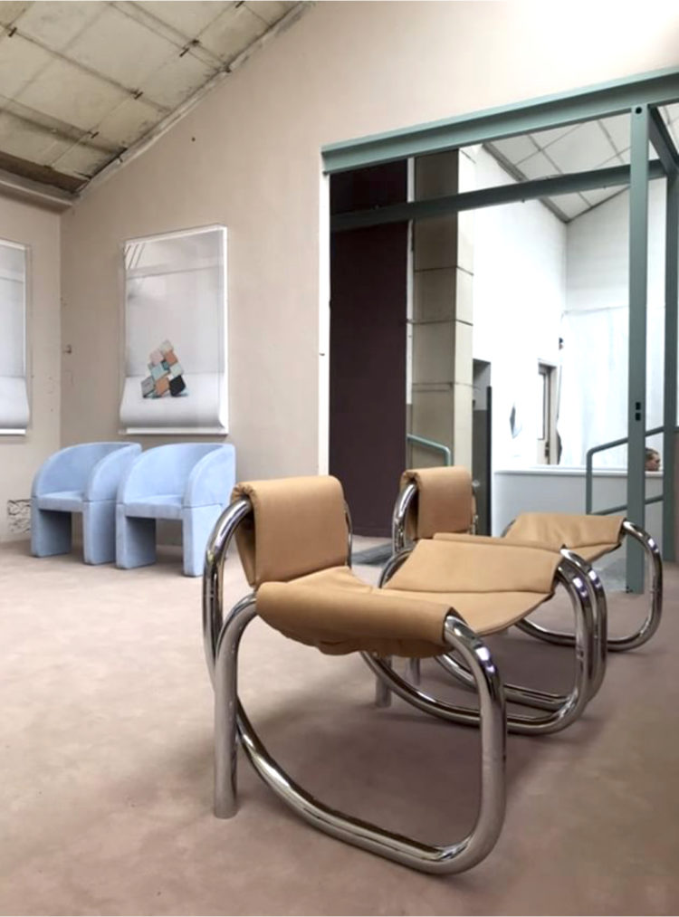
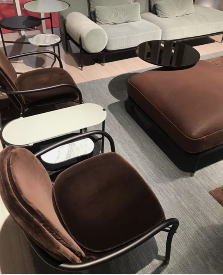
There was also lots of soft buttery leather – interestingly while wood has gone dark, the leather has gone light – a few years ago it was the other way round.
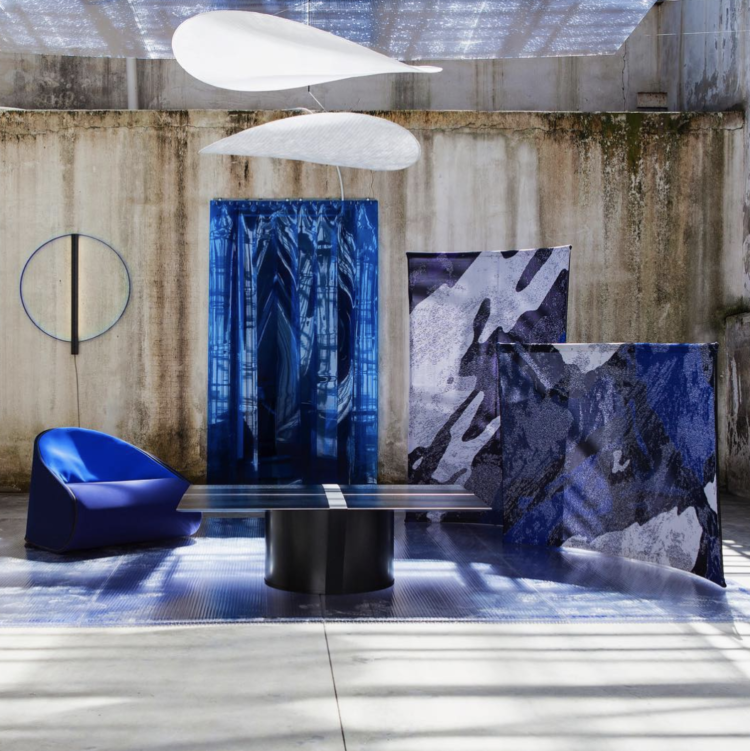
Blue was huge – from indigo and deep dark cobalt to that baby blue that I mentioned above. It’s still very new, if you use now you will be ahead of the curve but it’s coming.
Pink is still in evidence but there are lots of earth tones to go with it as we saw above but now with added – mint, toffee and chocolate to go with the burgundy and terracotta.
When it comes to shapes the curves still rule, as do the circles and the new elongated lozenge shape which emerged in Paris in January.
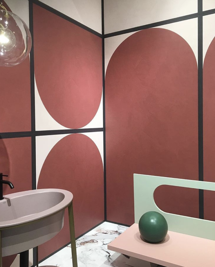
Finally, more lozenge shapes in warm earth tones from Cristina Celestino but note also the black taps. My spies on the ground reported that there was much less brass, much more black and even some chrome creeping back so if you never got round to replacing your chrome taps then you can sit back and relax. Note also the mint and green accents with the blush pink in this image below.
That’s not an exhaustive list but to sum up: more of the same with a few differences or plus ça change plus c’est la même chose as they say.


Quite an impressive collection.
Gucci and Versace really do my head in. Their busy busy fabric designs just look cheap and tarty to me. Always thought their clothes make young woman look (a) old and (b) tarty. Sorry! Just my take on them.
Cristina Celestino from the above lot would be more my style! A tad more restrained. I love a bit of colour but I always need to balance it with neutral.
Milan in one day, I think I’d have a panic attack. Love a trend update, great to see what’s coming through.