Right we’re really going for it this week. We’ve had lots of pale neutrals and calming colours making sure you choose the shades that are really right for you but this week we’re going to push some envelopes. Starting off with this new wallpaper…
Now, this is as much about working out what you might like to take from an image and understanding that you don’t have to take on board the full design lock stock and barrel – hold that thought you’re going to need it in a minute.
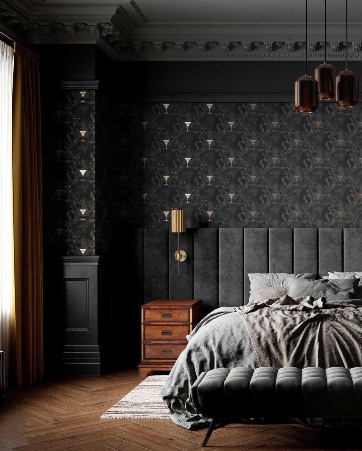
But sticking with this wallpaper – a new launch from the talented pair behind Divine Savages. The thing about wallpaper is that it can look great in detail and close up and when you move back it can lose definition or the pretty pattern you liked so much becomes blurry or makes your eyes wobble. That’s why it’s so hard to chose the right one as it has to work from near and far and that’s hard to pull off.
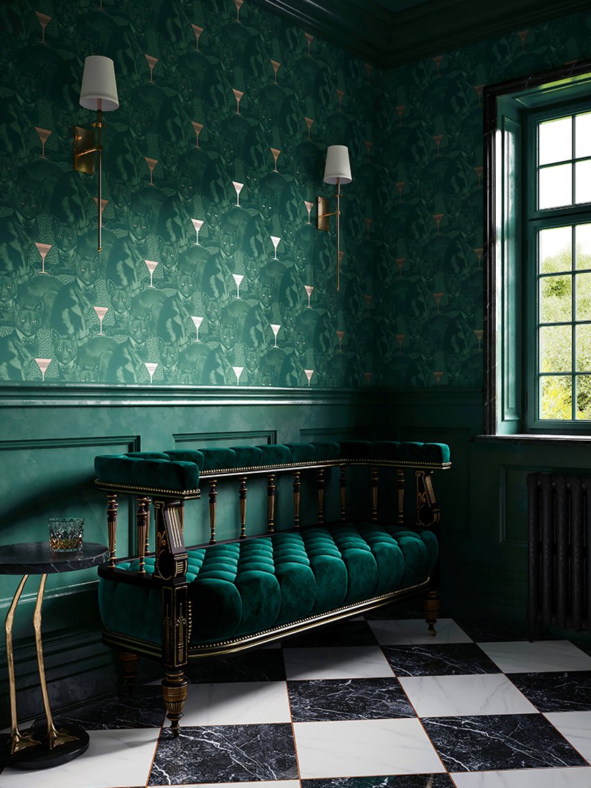
This however, while close up reveals a slightly malevolent cat, works from a distance thanks to the metallic gold martini glasses which catch the light and provide structure to the pattern. It’s a big bold choice but, as these images show, it could look really stunning. If you’re afraid of a big space think about the downstairs loo or perhaps the wall behind the bed – as shown where so you won’t see it when you’re lying down. As long as the skirting boards and woodwork round the rest of the room match a feature wall won’t look out of place.
This means, of course, you could go either black or gold for the woodwork and ceiling and leave the other walls paler if you fancied. So, for example, if you wanted a neutral pink on the other walls – by which I mean barely blush/mushroom rather than actual pink – you could have a black and white striped headboard or a pink one to match the other walls and you are still bringing the drama but knocking it back a little. Would you?
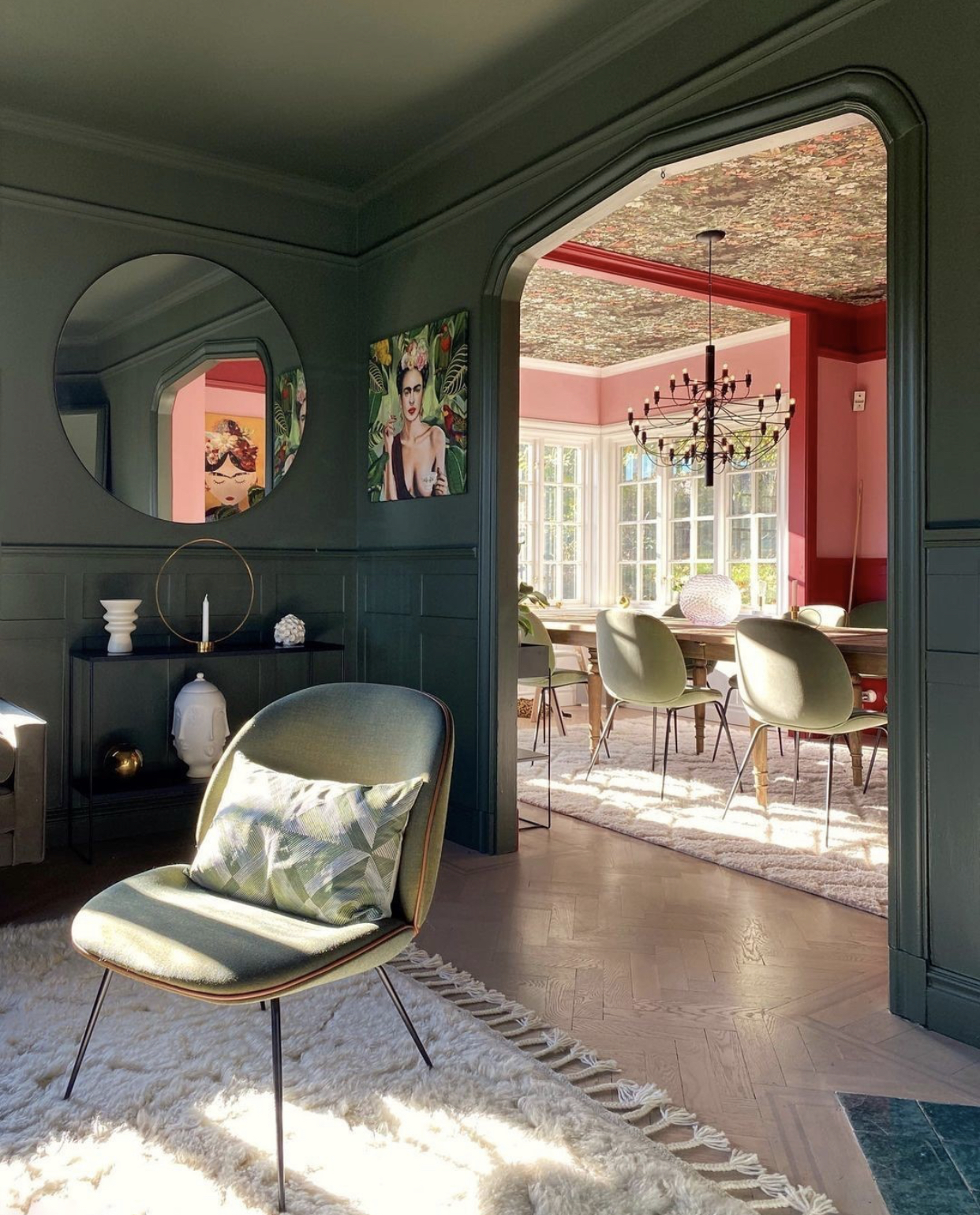
Next up, hold on because this is going to get wild before it gets calmer again. A bit like the world atm…. Above you just get a hint of the dining room in this publicity shot for Gubi chairs (shot by Hanna Sanglar). Firstly you can see how the dark hallway, with the walls, wood and ceiling all painted in green, serve to draw the eye to the room beyond. And then it’s all about the papered ceiling and the contrasting red and pink woodwork. And it’s easy to see how you could tone this down for your own spaces: lose the red or lighten the pink, or replace both with the green of the room next door.
It’s about properly taking inspiration from a space, which doesn’t just mean reproducing it, but looking at what you think might work in your own home and taking the parts that please you and ignoring the rest.
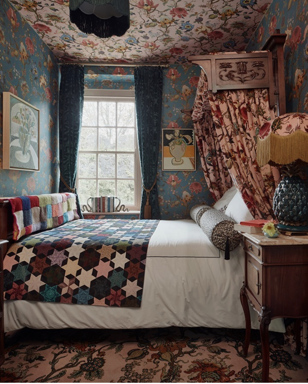
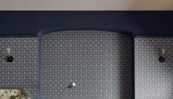
Now remember I said it was going to get wild… worrabout this by, of course, The House of Hackney. Yes it’s a lot, but break it down a little. It’s all the same pattern just in different colours. And suddenly I quite like the idea of matching the ceiling wallpaper to the carpet below. And, in my case, I might strip out all the rest of the pattern and have plain walls and woodwork – one colour only – and a matching canopy (or, let’s be realistic – assuming you don’t all sleep in a four poster than needs a canopy – we can’t all be Anne Boleyn.
I know some of these will be controversial but it’s good to look at things we think we will hate and decide if, actually, there are parts we quite like. That’s probably a metaphor for life right there.
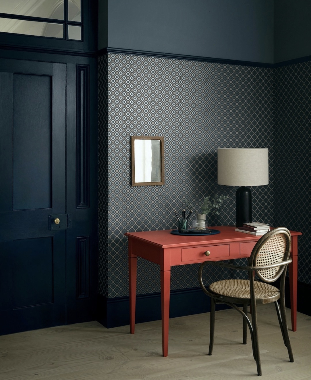
Anyway, we’re coming down the other side of the rollercoaster now. This office by Paint and Paper Library is dark (already quite difficult for some) but just look how that red desk makes it sing. The picture rail is Plimsoll, the wall is papered in Quatrefoil also Plimsoll, with Blue Blood above while the desk is Very Well Red. And again, you don’t have to paint your desk but consider a fabulous lamp base or shade and also image how much less fabulous this would be with white woodwork and ceiling.
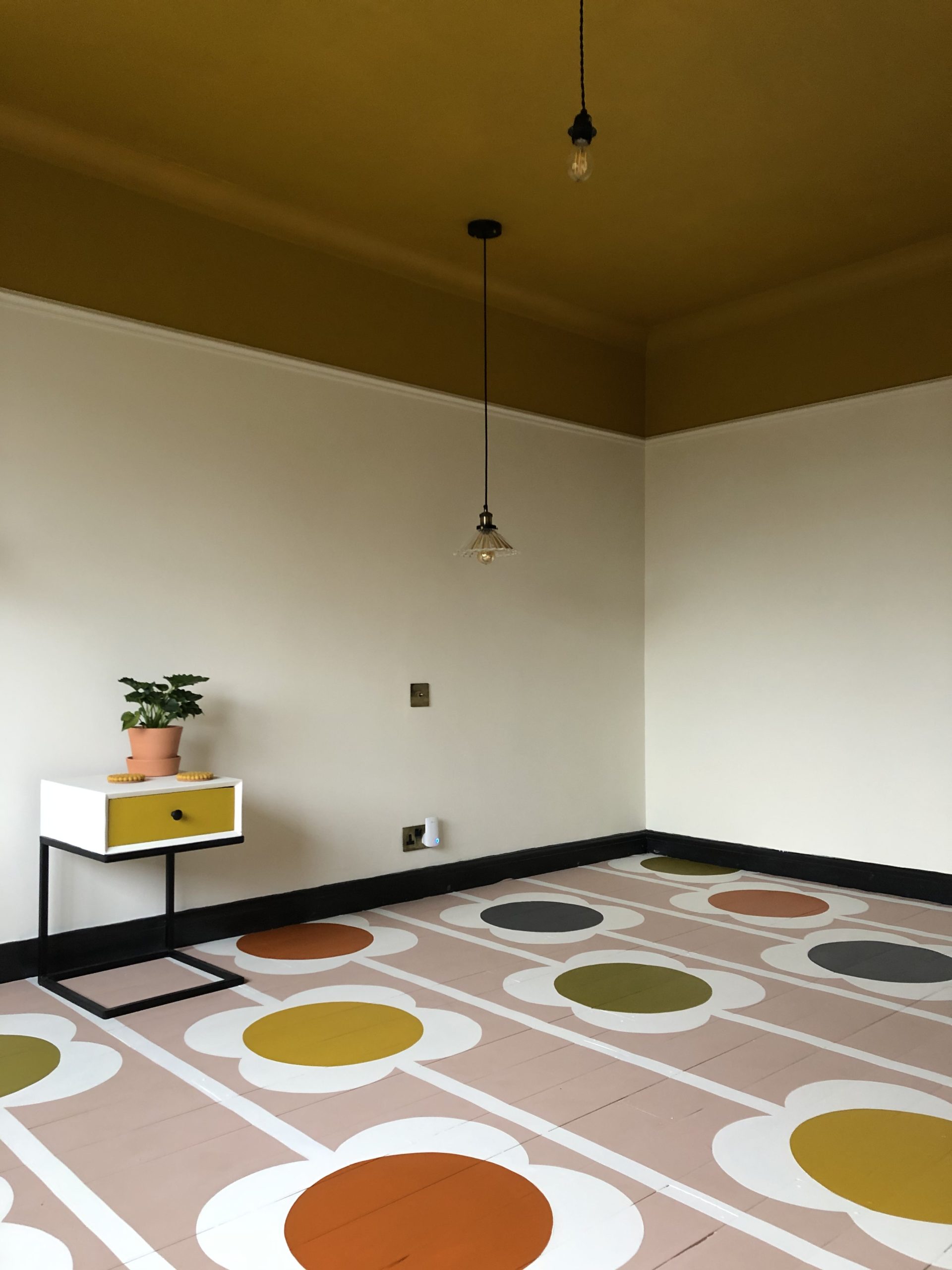
And finally, I love this painted floor by graphic designer Emma Colclough. I’m showing you the empty room above as she said she was so proud of it she didn’t want to put the bed back in but her husband objected! And this is a perfect example of taking one element as the walls are plain and pale, the skirting board acts as a sort of picture frame to the floor and the ceiling links to the same colour in the flowers.
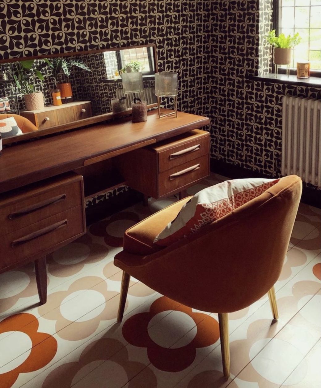
Below is her first attempt, a slightly simpler version which is also very pretty and more subtle. Although don’t forget the aforementioned bed in the room above, which will hide a lot of the pattern. If your boards are in reasonable nick (flat and even) and you don’t want to have a rug then this works really well. I’m in the process of doing up my office and pondering commissioning Emma to paint my floor although clearly it will have to wait until we are post-pandemic.
In case you wanted to try something similar I asked Emma how she did it. She said she plays around with colour and scale so it’s a not a direct copy. She also shared her tips: “Start with as smooth a surface as possible. We use bare wood floorboards, mid-range quality (Valspar) matt emulsion and then finish with 3 coats of Ronseal Diamond Hard floor varnish in satin finish. Obviously, we’re mindful of not doing anything that might damage them, so no shoes or dragging furniture around them, but the durability seems to be amazing.”
So what do you think? Boundaries pushed or have you retreated to the back of the room with an all white colour card and a valium?


Love this so much!!! Love the painted floors!!!!
Bold, interesting , inspiring , colourful and as you say Kate no need to do it all but a super combination to get the creative juices flowing. There are ideas here I love that I know I would never have thought of on my own. Cheers!
I love the Divine Savages prints – perfect for a home bar backdrop! The wallpaper behind the red desk is lovely (I have a very similar one behind my headboard), but I would really struggle with it behind my desk when working from home, as looking at it for an extended period of time makes you feel a bit seasick, particularly if the wall it is covering is not perfectly straight…
Really bold ideas in your post today! The Gubi beetle chair is a winner; I love the idea of colourful painted ceilings and floors and Emma’s style is innovative. The malevolent cat wallpaper is cool. It would definitely strike up conversation in many different settings. I can envision it on the walls of an elegant pub? Perhaps of the same name.
Wow, I wouldn’t usually like anything this full on but I absolutely love the painted floors and the house of hackney bedroom. I don’t think my husband would ever go for a bedroom like that, but I feel like I would sleep so deeply and comfortably in that room. I can’t even tell why. I like that it is small so I would feel wrapped up and cocooned in the patterns.
This entry was so much fun!
Liked how you described what we could do in our own houses to tone it down or adapt. Love that! Not just pretty pictures but advice as well!
Going back to the pictures. Loved the blue with the blue wallpaper and the red desk! Totally not my normal style and I am not usually that fond of blue but that picture! Lovely.
Thank you!
The first two images made my heart leap! Have looked up at my living room, all varying tones of grey, and thought ‘Oh’. Luckily, am about to decorate my hallway and bedroom so will absorb these ideas into my plan. Thanks!
There is lots to love here but you saved the best for last. Those floors are so pretty!
I feel a migraine coming on…………….so not soothing.
oh dear! I knew this would be quite polarising! It’s a fairly even split though!
The Divine Savages wallpaper is everywhere right now!
I love these. My particular favourite is the dining room.
I’m in the retreat with all white colour card camp, I”m afraid. BUT: the Orla Kiely floors give me pause (but I think of durability of a floor in terms of decades, so I’m not sure my idea of ‘amazing durability’ really coincides with hers), as does the coral painted desk. But actually, there again, no: these things belong in a day nursery, not my house. The loweringly dark rooms – I might be intrigued to spend a weekend in a hotel decorated like this, but would never want to live in it. Loathe all the wallpapers, and particularly loathe the room with patterns everywhere.
I love all of it. More is more!
Love it all! The more sedate painted floors aren’t my personal style but they work beautifully with the white walls. I’m a huge House of Hackney fan, though, and my kitchen woodwork is very dark green with lighter green tiles and walls (Farrow and Ball Studio Green and Blue Grey respectively). This leads on to a Studio Green and Crown gold dining room. Not really surprising that I love this post, is it?!
The first photo of the dark catitude wallpaper immediately reminded me of that Japanese fairy tale, The Boy Who Drew Cats in which a boy draws cats on a wall and they come to life at night and kill the giant goblin-rat. Then, I remembered a story in the the UK last summer about rats the size of cats terrorising a village. So, maybe this wallpaper is appropriate for our time. They seem watchful. Personally, I couldn’t live with it but I might like the green version in a bar.
Hi Kate,
I admire your dedication to your blog. You introduce lots of different themes and are not afraid to be controversial. The bedroom with the canopy I find claustrophobic to say the least. I liked the red desk with the Thonet chair and the wallpaper which are the quite the opposit of the former mentioned. I look forward to your next posts and I’m curious what is coming next. I am also curious about the reaction of your other subscribers.
Papered ceiling. Mind blown. Thanks!
I like these ideas, and love the painted floor. Definitely into painting skirting boards and ceilings darker colours to match or tone with wallpaper.