Now, as dedicated as I am to the cause of bringing you this blog I am not writing this after the result of last night’s sporting event so while we may indeed be singing the sporting blues (or not) this week’s post is about what has caught my eye this week. And in a week where there has been a lot of controversy about instagram’s announcement that it will now push video content over stills I wanted to bring you some gorgeous images, partly for those of you who “do” instagram that you might find more accounts to follow and partly for those who don’t to show you some lovely pictures to help your Monday along.
And a final word on the subject for those who do use the ‘gram – turning on notifications for your favourite accounts (the three dots on the top right hand corner of the image) means you should never miss a post by them again. It’s been tough for small businesses who have been encouraged to promote their businesses on this app and now find their work isn’t seen unless they pay to promote, or spend time creating video content which takes ages and doesn’t always lend itself to moving pictures. And now for the pictures.
I hope this will appease my green-hating reader but also there’s a reason blue is the world’s favourite colour. It’s the colour of the sky (on a good day) and the sea, which makes us think of holidays, which leads to relaxation and while holidays may be uncertain this year – we booked last summer to drive to Italy next month and, as yet don’t know if we will be able to go so I’m finding this week’s selection of pictures both calming and beautiful and that, at the start of another week of shifting sands, is enough for me.
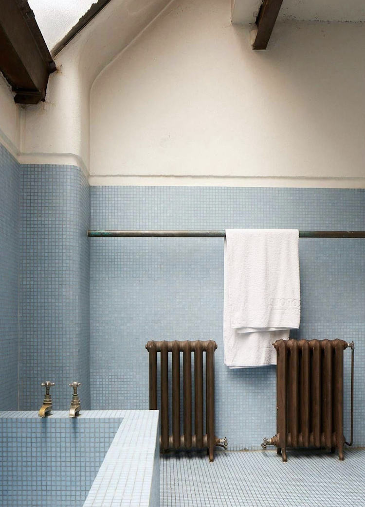
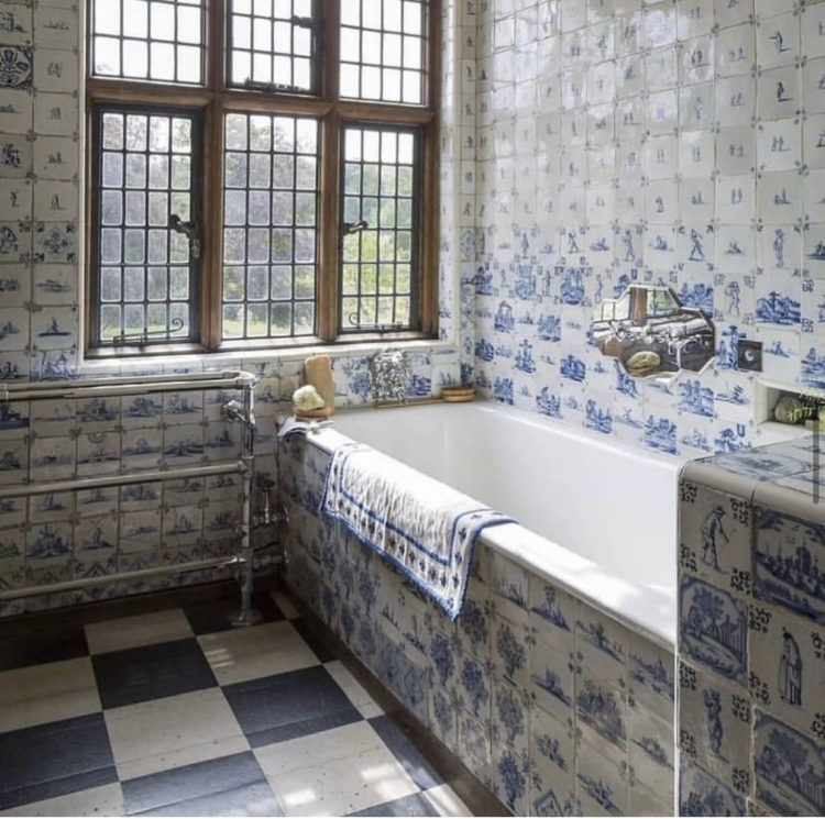
We’ll start with tiles and while blue can be cold in a bathroom – all that white sanitaryware doesn’t help – the opposite is true in the top image where the walls are a soft cream, the bathroom has also been tiled (probably not an option for most of us I appreciate) and the brass taps and bronze radiators all bring more warmth and character. You could certainly take some of this into your own space even if the inside of the bath has to stay white. I couldn’t immediately find the same tiles but these, at 10cm sq, are bigger but look, from the image at least to be a good colour.
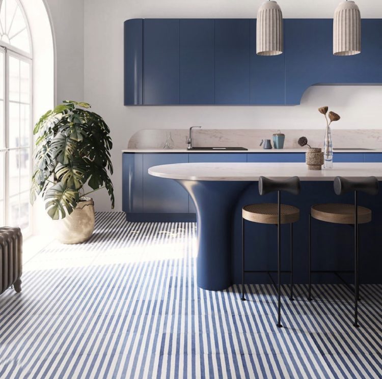
Above, this picture immediately stopped me in my scrolling tracks. I know we’ve all seen stripey floors before but they tend to be linoleum or vinyl and using tiles seemed like a really fresh idea. My own kitchen floor is painted floorboards and I long for something more interesting but have never yet seen a tile I felt I could commit to, this has definitely tickled my decorating synapses. I’m less keen on the curved units and while kitchens do tend to be straight lines and hard surfaces I prefer to soften that with lamps and accessories but that’s just my opinion. You, as they say, must do you.
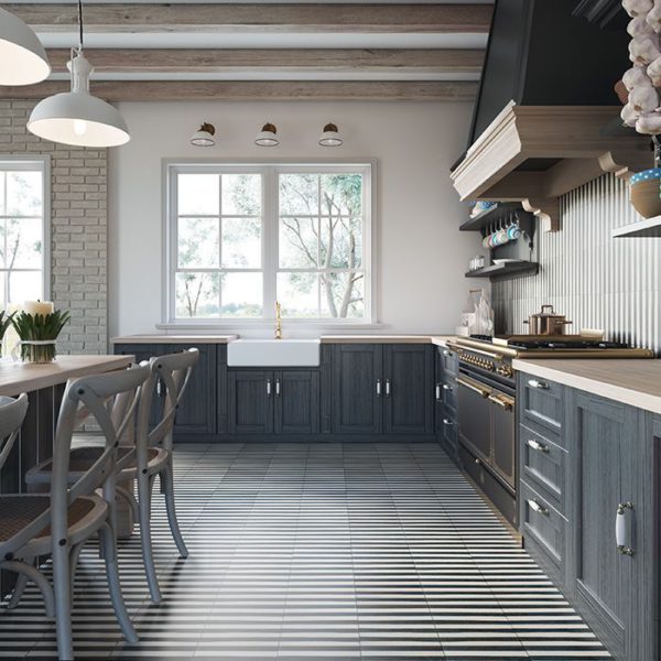
Another striped tile floor in this more conventional kitchen above (also by Otto Tiles) and I like this one too, although I might not do the wall as well. Also you could paint the cupboards in any colour you liked with this classic black and white – pink, green, cream… In the same way we tend to use stripes on stairs, which is partly why I went for spots, so we tend to see checkerboard on floors, which is perhaps why I am drawn to the stripes.
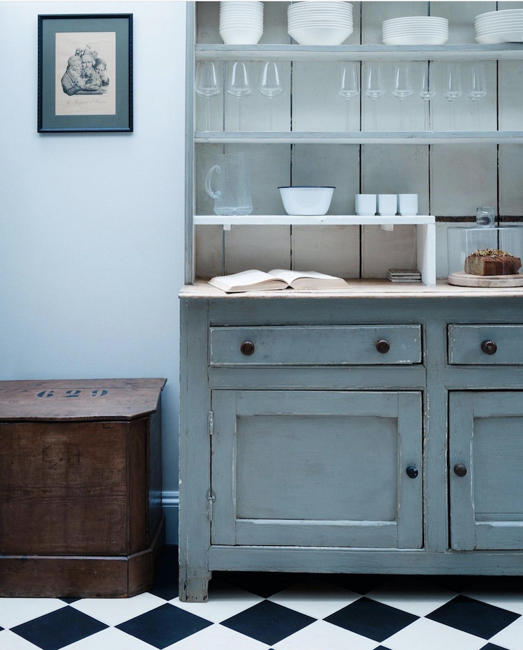
Below, a classic black and white check floor and you can’t go wrong. Here it has been put with some vintage wood and a soft blue chalky dresser. Again, it’s all quite classic but it feels fresh. Why? Well the blue feels vintage and like it has been there a long time -that’s to do with the colour. The picture on the wall serves to deepen the intensity of the shade. It’s impossible to say if the wall is white and reflecting the blue or if it is, indeed a soft shade of blue. I think I might keep the wall pale and do the woodwork in the deeper blue of the artwork.
Talking of whites that might be blue and vice versa leads me to this lovely bathroom by Cote de Folk. I suspect this wall might be a very pale grey but one that, in certain lights, reads blue and for that I would use Parma Grey by Farrow and Ball, which loves Wimborne White (a sort of milk colour that is warmer than actual white) and is actually blue rather than grey. I know – paint names – not always helpful.
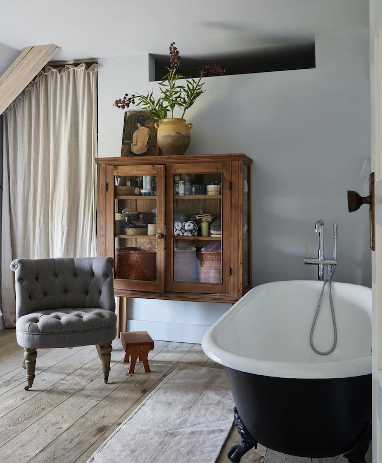
Now, as you may have read on these pages before (or even, some of you an entire book on the subject… ) choosing the right shade of grey is not always easy. I’m not going to repeat those posts here but I will just remind you that if you get it wrong and your chosen shade comes out cold, or purple, then you can influence it with the accessories. Note how in the images above and below how the vintage wooden furniture warms everything up. Even the grey chair below works well with the warm wood. So if you get it wrong and you can’t face repainting, or the budget won’t stretch to more paint, then see what you have already that might warm things up a bit – pink cushions or anything on that side of the spectrum, warm white as opposed to cool bright ones and cosy textures. And, if you’ve gone the other way and your grey has come out beige, then do the opposite – chrome and stainless steel in a kitchen, some black accents and cool shades rather than warm. Grey, by the way, is one of the easiest colours to work with if you go wrong as it is friends with every other colour on the spectrum in a way that the others aren’t.
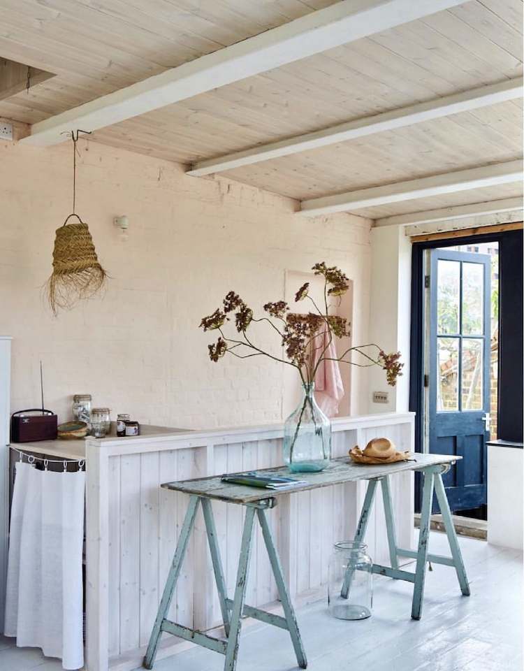
Moving to a more intense shade now and an example of painting everything in the same colour – woodwork, walls and ceilings. It’s called colour drenching according to my friend Kat Burroughs, who wrote about it in The Sunday Times this weekend, and while I hadn’t coined a natty name for it, regular readers will know that I have been talking about it for a long time.
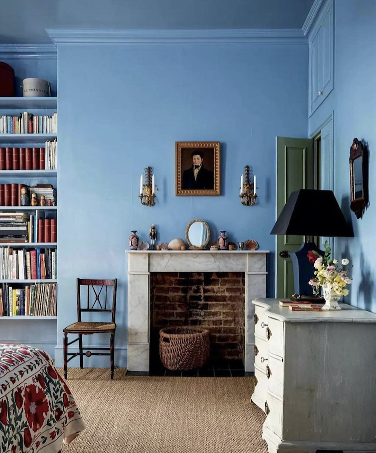
All the same tricks apply here though – warm wood, splashes of darker colours (the navy blue lamp) and the pale dresser and fireplace. As a final point you can see the door is green when open – this provides a lovely contrast but also proves the point that the door doesn’t have to be the same colour on both sides but can be painted to match the room it faces when closed. The edge of the door, by the way, needs to match the room it faces when open so in this case the handle side should be blue and the hinge side green. That said, there’s nothing to stop you choosing a contrasting colour that goes with both sides and using that instead – pink or white or gold for example.
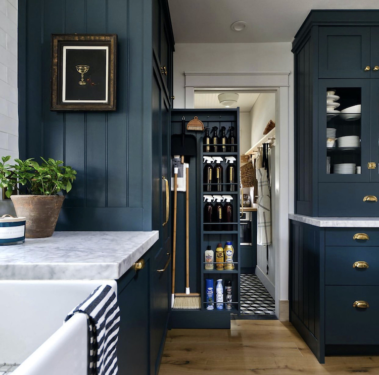
Going even darker in this kitchen and navy blue can be such a warm and dramatic colour that, in a kitchen and bathroom, which will have lots of natural white in the form of basins and baths, needn’t be overwhelming. I love the addition of checks and stripes on towels and floors too. This image by the way, was shared by Amy Azzarito, whose wonderful book Elements of a Home, was one my favourite publications of last year. This is her instagram account and if you love a bit of home history and fancy that then you must follow – gorgeous (still) images and interesting captions.
Finally, this lovely image by photographer Kristin Perers which shows how a punch of warm blue can really make a neutral background feel gorgeous – with an extra dash of pink as well. The dark blue door is such and unusual colour for exterior woodwork – we tend to see grey and black and occasionally green – which then links to a paler blue bench is a simple, easily, well, copied, idea that looks lovely. You could do this with curtains and a sofa or bed for example or woodwork and a rug. Remember these images are for inspiration and I hope, that by reading these pages, you are able to gain the confidence to take these ideas and build on them in ways that will work for you in your own homes.
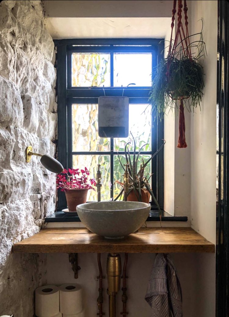
I should mention also Carole Poirot, a wonderful photographer (who taught me much of what I know) and who shared a picture of the dark blue window in her downstairs loo this week. She later informed me that it’s dark green but it sort of looks blue here and I’m taking it as inspiration – imagine a cobalt blue window frame in one of your own rooms. I saw a bit of Celebrity Gogglebox the other week and it featured the Great British Menu presenter Andi Oliver with her daughter Miquita, and showed the exterior window frames and front door of the house she was filming in ( I have no idea if it was actually hers or not as many of them use location houses to keep their own homes private) which was a wonderful deep blue and it did make me wonder why we don’t match our front doors to our window frames more often.
One more for the road, and, since I reduced the number of posts due to lack of time, I have tried to make this one longer so you can either spread it out till Wednesday or at least feel you are still getting lots of content and ideas. This bathroom in the National Trust run Packwood House has been doing the rounds. It felt very timely as I have revived the idea of interior consulting via Zoom (let me know if you might be interested in the comments below – it will either be one hour or one 40 minute session with a 20 minute follow-up when you’ve had time for the information to settle).
Am digressing madly, but during our Zoom session, the client, who is doing up her kitchen, said she lived in Deal, Kent and, as we had already come to the idea of a blue and white kitchen, a delft style tile felt appropriate – I have already featured the Dyrham Dairy tiles from Ca Pietra but there are lots of other versions around. What I like about this, which again you could do with lots of patterned tiles or even different shades of plain tiles, is how the pattern is more intense at the bottom and fades out the higher you go up the wall.
Right, I shall leave before my brain starts firing off in 17 other directions but do let me know about consultations below.


Hi Kate – I would definitely be keen on a Zoom video consultation, but for furniture pieces. The house is a Manhattan brownstone built in the 1900s that is being fully renovated. The previous owners unfortunately stripped out most/all of the original features, so I would love some advice on how to bring a bit of soul back in.
Your green-hating reader is indeed appeased! Love the blue mosaics, the navy kitchen and well, almost everything in this post. Thank you for the info about instagram – I didn’t know about the three dots.
A consultation? Yes please! Lighting and awkward corners still haunting me…
I, too, loved the exterior of Andi Oliver’s home with the blue window frames. I also love seeing their decor choices as well
Interesting post as usual. I’ve recently moved from a 1917 bungalow to an 80’s bi- level split house (at least that’s what the realtor called it) with some odd features and am deciding whether to renovate the kitchen or a bathroom first. So far saved by purchasing identical wallpaper from a UK business rather than US, even with shipping, and have found ways to use my 1917 house furniture with some mid-century pieces. A video consultation would be great!!
I’m not sure that mosaic tile tub would feel nice to sit in.
Fabulous post Kate! I tend to revert/lean towards the blue/green side of the interior palette spectrum, and this post demonstrates just how diverse blue can be. I too would be very much up for a video consultation!
Hi Kate,
Would definitely do a Zoom consultation for my living room. Sign me up!
Cheers…
Really interesting post as always Kate. I would definitely be interested in a video consultation. Need some help with a long, dark, panelled, anaglypta clad hallway (Victorian terrace). Figure you are the lady for the job!