I wanted to talk about the power of paint today, with a few examples of people thinking about how to harness its transformative power in more unusual ways than just sticking it all over four walls. Or, worse, just one…. Come!
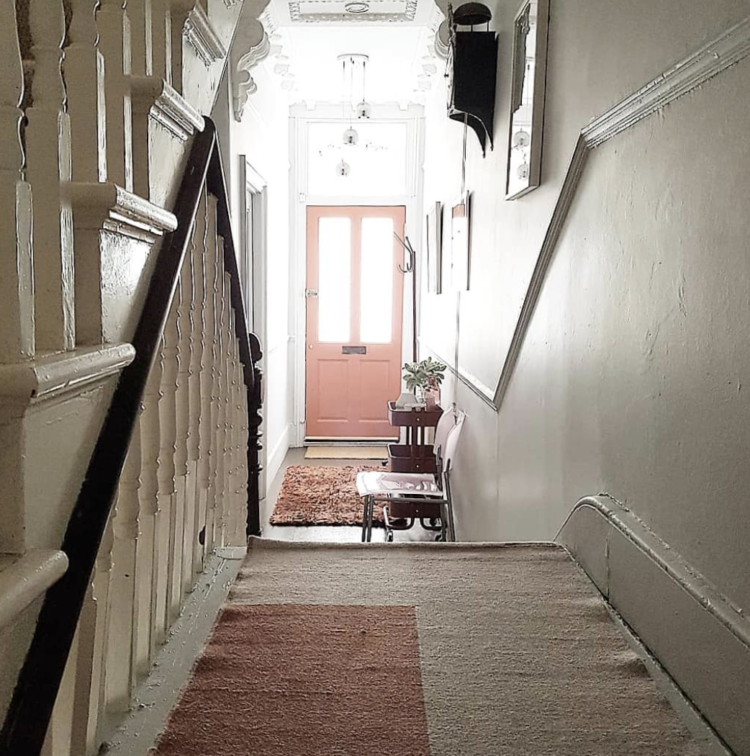
First up is this gorgeous pink from door by Mary of Mosey Home. A former curator at the V&A, Mary’s shop is a feast of mid-century delights and her north London home is also full of clever tricks. We’ve spoken before about the joy of painting the front door in a colour that makes your heart sing when it greets you every morning and this is a perfect example in an otherwise white space. But the rug in the foreground (might be last year’s H&M or Ferm Living) with its bold rectangle just echoes the shape and colour of the door and gives it even more impact.
It’s one of those touches that looks effortless but makes a huge difference to the overall effect of the space.

Now, the feature wall. You know I have said before that for me it’s a bit of a design crime. That doesn’t mean it has to be for you, but let’s look at ways that, I think, make it work better. I get that you might not want to cover a whole room in a single colour. That you might want to have a “pop” of said colour without overwhelming the whole space. That that might well be the chimney breast, or the wall behind the sofa.
I also know that if you live in an open plan space, using paint to define and “zone” said space can be a great idea. You will remember a couple of weeks ago I featured a dining space belonging to my client in the Hoover Building where we painted two “feature” walls rather than one to create a dining “room” by taking the paint round the corner. By wrapping the paint around another wall that creates a real sense of a dining room in the open space rather than just a wall with furniture in front that can feel a bit two dimensional – a bit stage set if you like. The glimpse of blue to the right of the image is a supporting pillar that we also painted by the way. You can see it in more detail here.
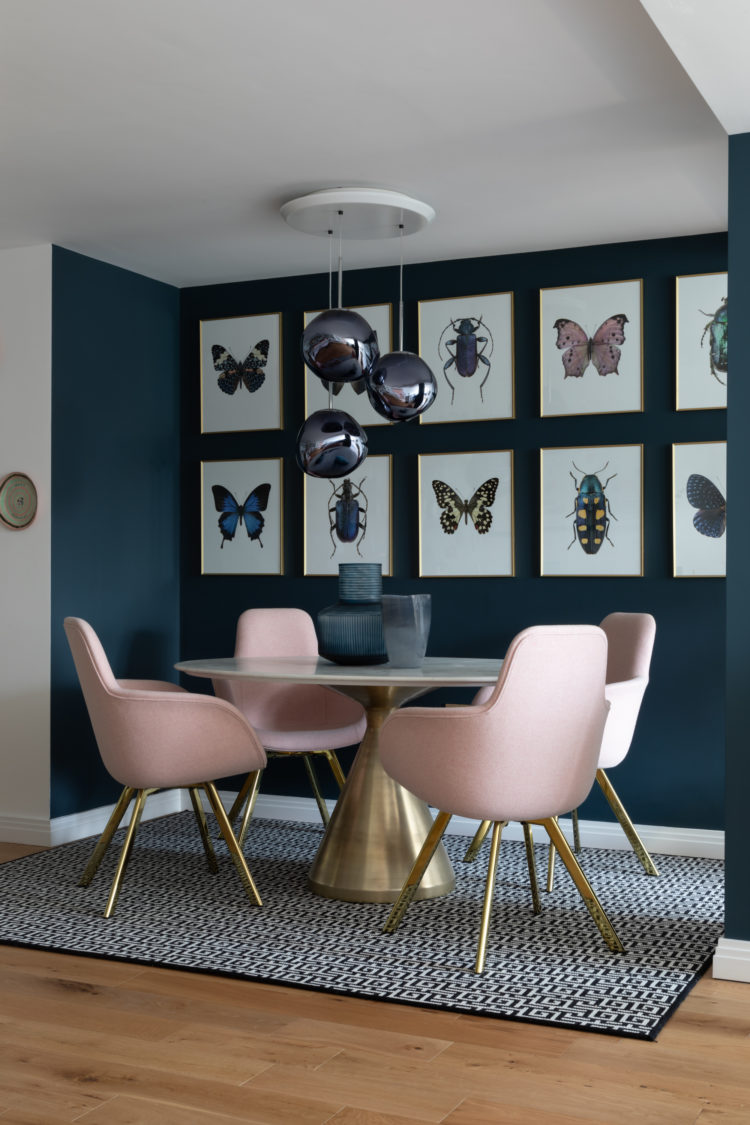
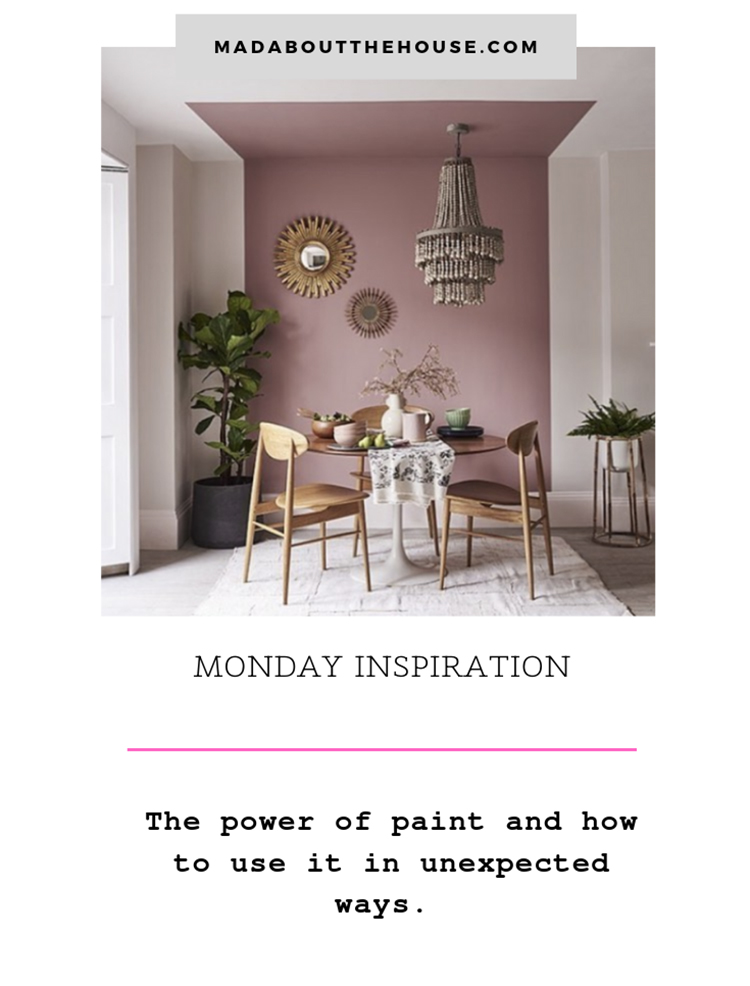
That’s one way to do it. Another, if you don’t have a corner, is to see what Dulux have done above with their pink wall. This works well on a high ceiling and also behind a bed if you don’t have a statement headboard. Here the pink, which is effectively in a giant stripe perfectly zones that space and provides a frame for the mirrors.
While we’re here, you can see that the light fitting is off centre. Let’s assume that wasn’t deliberate. That the room came like that, as you might well have a similar issue and not want to pay an electrician to move it a few centimetres. The mirrors on the wall, which are similar in style to the light fitting, have been hung to create a set of three with all three objects including the light, taken as a whole, in the middle of the pink. That’s definitely an idea to steal.
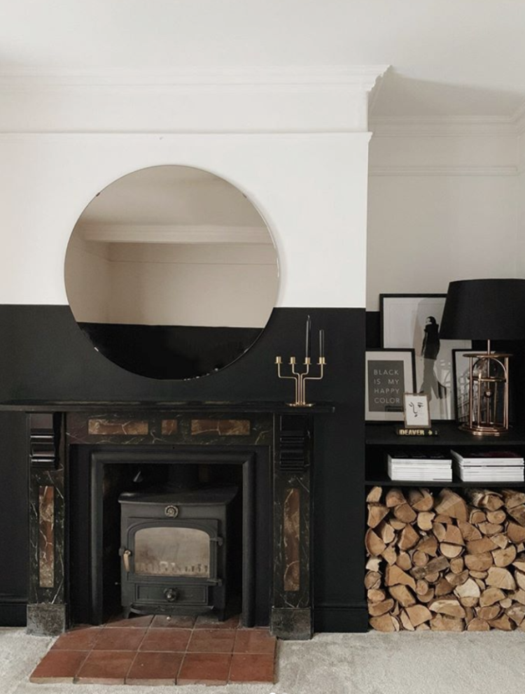
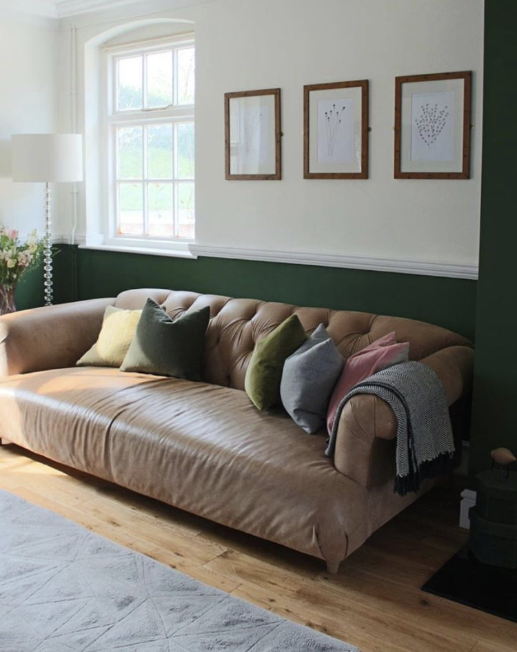
Two more examples of using strong colours that aren’t feature walls. Above, Chelsea of The House That Black Built, has simply taken a line and painted round the whole room. She has gone higher than the fireplace as otherwise it would have felt proportionally wrong – you need to go slightly over halfway up – and gone round all four walls. It’s not too dark (it would hide the telly if there was one) and the pale floor, top part of the walls and ceiling all balance out the dark.
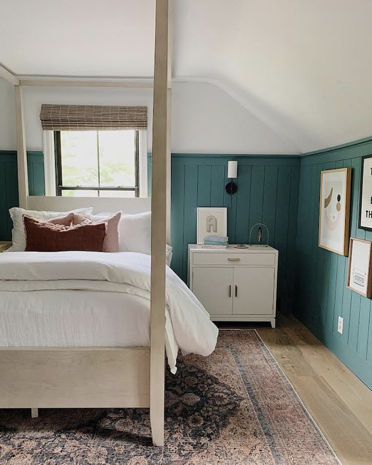
Below, Jen, at The Squiffy Mill, has taken yet another approach. She has painted her chimney breast (I know this from other pictures in her feed) but rather than just abandoning the green at the edges, she has taken it round the rest of the room under the dado rail where it finds a natural level with the window sill. Don’t worry if you don’t have a natural feature like a dado rail, you can just do what Chelsea did and pick a point to paint to.
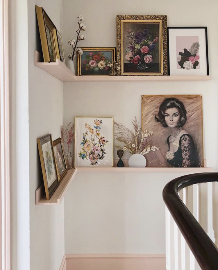
Finally, back to using paint for the details and the super-talented Melanie Lissack has created these shelves on her landing. The shelves are from Ikea and she painted them to match the skirting boards and door frame and if you visit her feed you will see there is a pink window frame beyond. It’s a pale colour so it’s not overkill and it brings a traditionally boring white space to life in the simplest of ways.
Paint. It’s brilliant stuff. I hope these images have inspired you to consider how you might use to create something wow in your own homes.


Hi Kate,
Thanks so much for this post, I’m really embracing paint right now, especially PINK! which has long been my favourite colour, its so exciting to see it being used all around the house. I’ve had a lot of clients wanting dark walls over the past couple of years and I’m finding that people are open to being more experimental with colour and using paint to create artwork on a wall now. Its good to see that we are being brave enough to go a little further than just the ‘feature wall’ which is still really popular. Are there templates you can buy to create these circular and arch shapes? not come across them yet, just need a steady hand I guess? Personally I’m dying to paint my upstairs landing skirting and architraves a pink. Weekend project when the autumn comes.
Morning Kate ! Those pink chairs are absolutely gorgeous. And I love the way the gold legs are picked up in the picture frames. So smart! So clever!
Paint of every type ….you name it …there is a paint. I was amazed when I saw a brochure from Craig & Rose (now part of Dulux) that showed special effect spray paints. Granite effect, diamond effect, frosted glass effect. Out door project spray paint. Then there was indoor paint …gold, copper, stainless steel, cement look and much much more. http://www.craig&rose.com.
Amazing inspiration! Love the idea of painting the chimney breasts then following the paint round half way. I have really high ceilings so was a little worried about it look disjointed with the paint ending after the chimney…
Hi i loved this Thankyou for writing about it!!
I want to paint our sitting room dark blue – it’s a Victorian terrace with the usual dado, picture rail and cornices. I’m stuck with where to stop the dark blue – do I go up to picture rail and paint lighter above or do I go up to ceiling/ including cornices or not? We also have one wall of shelves – should they be the dark or the light colour? I’m so scared of getting it wrong 🙊Any advice would be great please
It’s always hard to be sure without seeing the room but I would say do the skirtings and walls and picture rail in the dark blue and then take your ceiling colour down to meet the picture rail. Perhaps a soft white rather than a brilliant. If you feel that will be too much then you can go skirting board to dado rail inclusive in the navy and the top half of the walls, picture rail and ceiling in the off white/neutral of choice.
As for the shelves – I would tend to match them to the wall – that way they will disappear and what is on the shelves will be able to stand out. So I’m guessing navy blue.
Hi Kate,
Thanks so much for this post, I’m really embracing paint right now, especially PINK! which has long been my favourite colour, its so exciting to see it being used all around the house. I’ve had a lot of clients wanting dark walls over the past couple of years and I’m finding that people are open to being more experimental with colour and using paint to create artwork on a wall now. Its good to see that we are being brave enough to go a little further than just the ‘feature wall’ which is still really popular. Are there templates you can buy to create these circular and arch shapes? not come across them yet, just need a steady hand I guess? Personally I’m dying to paint my upstairs landing skirting and architraves a pink. Weekend project when the autumn comes.