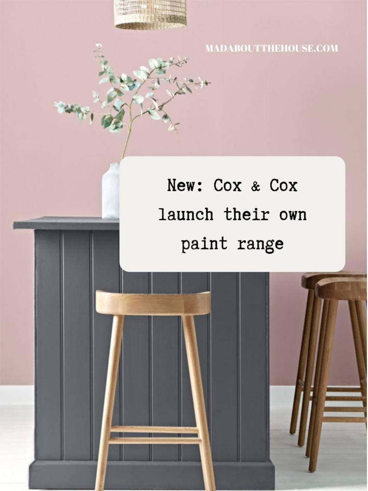
Many of you will be familiar with Cox & Cox, a homewares brand that has featured on these pages many times since the blog launched nearly 10 years ago. Today, for my Wednesday Ad Break, I have teamed up with them to tell you about their paint collection which has expanded this week to include 8 new shades. It’s high quality with a range of 24 colours which grew out of customer demand.

I spoke to Dani Taylor, their creative and product director to find out more about the collection. Dani joined Cox & Cox nine years ago when it was a company selling mostly gear for weddings and children’s parties. Since then, the brand has grown to offer an extensive range of furniture and homewares for both indoor and outdoor living and now they have added paint to the mix following a clamour from their customer base.
“Every time we released a new photoshoot of products we would get so many calls wanting to know what colour we had painted the wall behind, says Dani. “It just made sense that we would do this.”
It also makes sense to limit the palette. Who hasn’t looked at some of the paint charts, either online or in swatches and felt their heart sink a little at the sheer number of colours. Not to mention the post-painting stress when you worry that you should have gone a nuance to the left or right. I’m in in favour of keeping it tight. You want grey? Here’s a pale one and a mid and a dark. Same with pink. And blue.
“When we first started talking about this there were really only the big players and we knew we couldn’t compete with them so we made a decision that we would keep to a small range of colours and that it would be really good quality,” Dani said. And so the resulting collection has 4 neutrals, 4 definitive greys and 8 trend tones with a further 8 brand new shades launching this week.
“We are not trend-led and nor will you find bright colours like red and purple coming from us. It’s very much based around our collections of homewares and what colours sell well there,” says Dani.
A serial painter herself (“there is no easier or cheaper way to transform a room”) Dani was adamant the paint must be high quality. “It’s lovely and thick so it goes on really well. I just did my hall in Buckram and I only needed one coat although I always recommend two. Two is just better and also if you have good thick paint two coats will eliminate the brush strokes – I am perhaps unfashionable in that I always prefer to paint with a brush rather than a roller.
“Even on ceilings, which are always just horrible to do. And on that note; if you are painting a ceiling you must buy really good paint because it’s so painful to do you really only want to be doing two coats. Thin paint will need several.”
And that’s another key point. I am often asked if expensive paint is worth it and I would say that if you are not a serial painter redecorating every year (a job mostly confined to Instagrammers), then it’s always worth paying for quality paint. As Dani says; good paint, fewer coats, less labour. Some decorators will price in an extra day for applying a third or fourth coat of thin paint. Better to spend the money on the paint than the painter as the former is what you will be left looking at for the next few years.
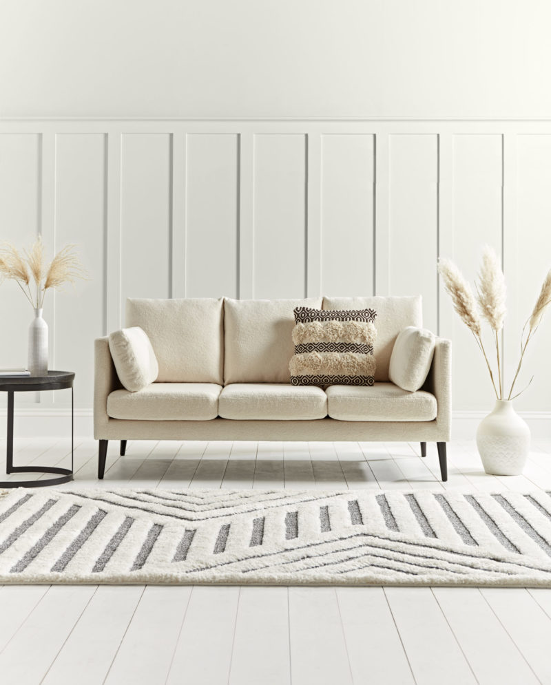
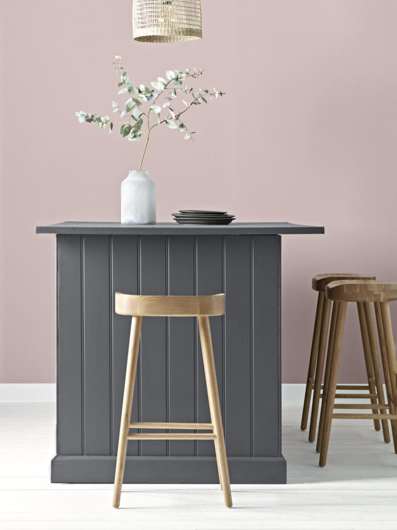
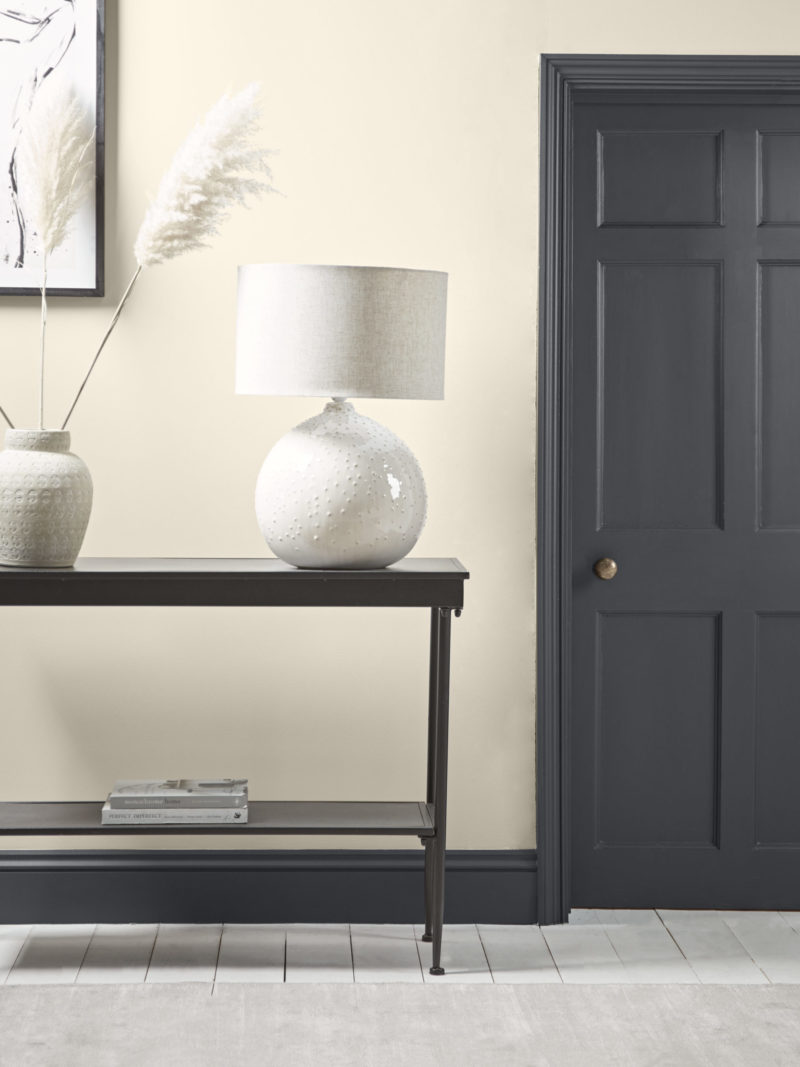
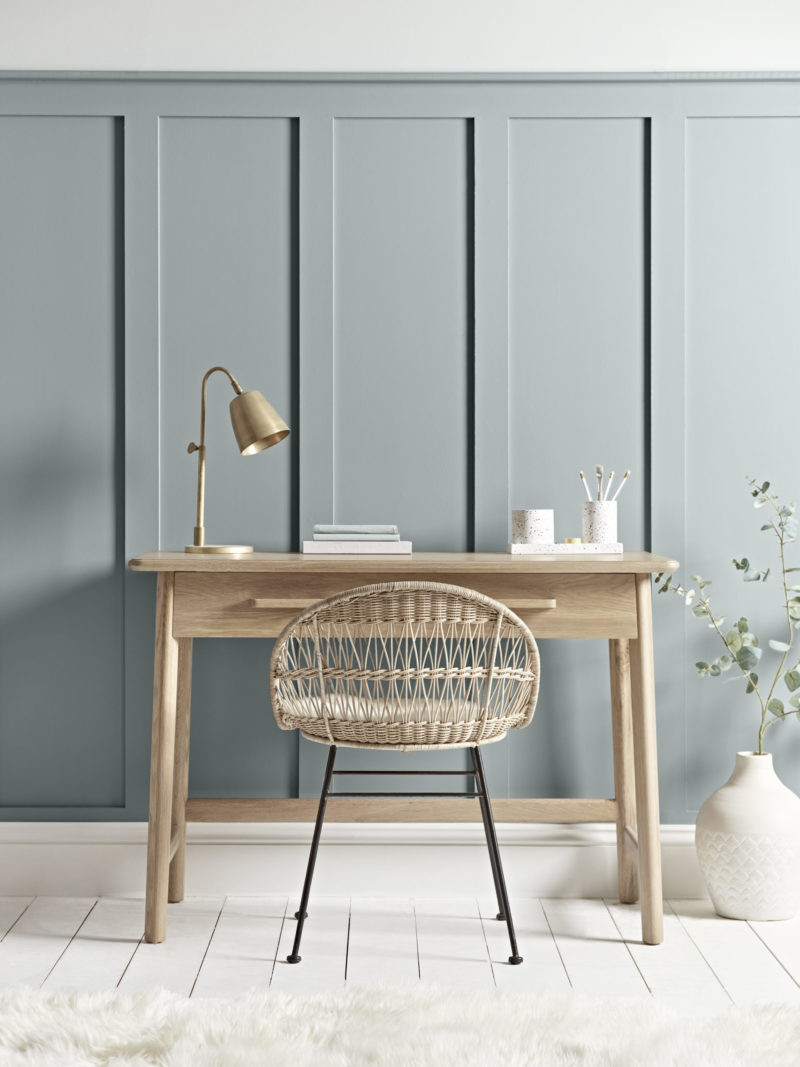
While stressing that the collection caters to customers, Dani also wants to push them a little out of their comfort zone. To that end the latest shoot has showcased three ways with Soot, their soft black shade which includes mixing it with a soft pink and a soft khaki. Currently, the best-selling shades are Smock, a soft pink that will work well in north-facing rooms, Hainsworth, a deep navy, and Swedish Blue. I’m currently eyeing Bay, a gorgeous soft olive green and Flaxen, a white with a hint of red ochre for warmth. Look also at Nocturne, a deep navy grey and Mineral for those (like me) who like a dollop of green in their grey to stop it being too yellow.
“As a nation we are being more adventurous with colours but we also recognise the importance of neutrals. We don’t want statement colours in every room,” says Dani.
It’s also a point worth nothing that these colours are perfect for the somewhat rain-washed palette of our northern hemisphere. The light is soft here and these gentle colours work well. That’s not to say you can’t use brights but these gentle shades do react well with the light outside.
And Dani shares my own views on white paint: “There isn’t a white skirting board in my entire house,” she declares joyfully. “I like neutrals but I also love contrast. Hopefully we can show people how to be more adventurous in their choices.”
So if you like pale walls (and let’s be honest, most people do) consider doing the woodwork in one of the darker greens or blues or even a gentle contrast with a pink. This will feel both fresh and contemporary but won’t darken the room. Alternatively, you could go for it and do a room in Bay with Smock or Slip woodwork and if I could persuade my 20-year-old that that is what he wanted I would.
These rich colours are obtained by using natural pigments in good quantity (which is what you are paying for giving the coverage a deep, almost velvety quality which you don’t see in cheaper paints. This can make it harder to find the right shade as it will react to the changing light as the day wears on but this depth is what makes a room sing.
The collection is, of course all ultra-low VOC and the tins are recyclable. But just what do you do with all the leftovers?
“Firstly, if you have a lot leftover do another coat,” says Dani. “Extra coverage is always good. Otherwise, you can paint a highlighting square on the wall to hang pictures on or shelves in front of. I’m a big fan of what I call the institutional line – a stripe halfway up the wall in a contrasting colour. And you can always have fun with leftovers in kids’ rooms. It’s like creating a feature of paint rather than a feature wall.”
And once you know you can use no more there’s no point hanging onto it for ages as it doesn’t last. Instead pour all the leftovers into a single tin and take it to your local tip where it can be recycled, or check your local council for donation schemes.
To see the full paint collection and order sample pots click here.


Thanks for that Kate. Gorgeous colours. I love Bay!! Lush looking 👍
Ooooh, these are just lovely, aren’t they?
Definitely lots of inspiration here – thank you for sharing!
I stopped right there at sisal and soot. So lovely and saturated. Bring them to Canada. Cheers!
Your green-hating reader here! You can have all the Bay and I’ll take the Swedish Blue, thank you very much! We moved house in December and our new abode is in dire need of painting. I have bits of lining paper taped all over the place with various try-outs of colours, but now I’ll give Cox and Cox’s colours a try. Thank you for this piece, very timely indeed.